前言
昨天完成框架跟HTML
今天當然就是希望可以順利完成CSS的部分,以及使用SCSS
讓樣式跟排版都順利完成啊~~~
先從最上方的首頁還有導覽列開始更改(當然不能忘記全域的基本設定)
全域設定在上次練習有說明Day 20
如果想回顧HTML的程式在Day 29這裡可以看
下面從SCSS版本開始練習起(記得VS code下方的Watch SASS要開啟喔)
//一樣從全域的基本設定開始
* {
  padding: 0;
  margin: 0;
  box-sizing: border-box;
//這裡是在Google Font的版本
  font-family: "Noto Sans TC", sans-serif;
}

h1,
h2,
h3,
h4,
h5,
h6 {
  font-weight: normal;//想讓h1~h6標籤都不是粗體回復成本來的樣子
}

header {
  display: flex;
  align-items: center;
  flex-wrap: wrap; //在伸縮螢幕的時候可以讓導覽列下移

  div.logo {
    display: flex;
    align-items: center; //把Logo旁的字置中跟Logo貼齊
    flex: 5 1 400px; //flex:flex-grow flex-shrink flex-basis;
    margin-left: 2rem; //讓Logo跟旁邊的版面增加空隙。
    img {
      width: 6vw; //使用vw讓Logo隨著網頁的大小改變而改
      height: 6vw;
    }
  }
  nav {
    flex: 2 1 400px; //flex:flex-grow flex-shrink flex-basis;
    ul {
		  //不可以設定在nav裡面,不然只會影響到ul,希望可以套用在li上面,就要放在ul裡面。
      display: flex;
      list-style-type: none; //這樣每個列表前面就不會有點。
      justify-content: space-around; //讓導覽列的字體中間產生距離。
      li {
        a {
          color: black;
          text-decoration: none;
          font-size: 1.35rem;
        }
      }
    }
  }
}
可以看到這時候版面的Logo還有導覽列水平放置好了,這樣只剛完成最上面一行而已~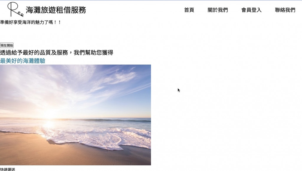
再來完成首頁的畫面,包含背景圖片中間的按鈕跟文字編輯。
main {
//先放上背景的圖片,然後針對背景圖片進行樣式的調整。
  section.backImage {
    min-height: 90vh;
    width: 100%; //寬度是100%跟網頁寬度一樣。
    background-image: url("../surf.jpg"); //連結背景圖案位置
    background-size: cover; //圖片放到最大,直到整個網頁畫面被填滿
    background-position: center;
    position: relative;
    z-index: 0;//z-index 數字越大其物件將越上層

    display: flex;
    justify-content: center; //讓字體放在圖片正中央
    align-items: center;
    flex-direction: column; //讓字體跟按鈕垂直排列
    text-align: center; //文字置中

    h3 {
      font-size: 3.5rem;
      color: white;
      margin: 2rem 0rem;
    }

    button.start {
      background-color: #88aab6;
      padding: 0.75rem 1.5rem;
      font-size: 1.5rem;
      color: white;
      border: none; //無外框
      border-radius: 1rem;
      cursor: pointer;//利用cursor屬性,改變滑鼠游標的形狀,可以讓使用者知道可以點選
    }
		//在圖片的上面有設定一個黑色的框把圖片覆蓋住,這樣字體可以更改成白色,在圖片上顯示比較明顯
    div.filter {
      background-color: rgba(0, 0, 0, 0.2);//前面三個都是0就是黑色,最後一個就是透明度
      width: 100%; //寬度設定跟網頁一樣100%
      min-height: 90vh; //原本高度是0,因為這個
      position: absolute;
      top: 0;
      z-index: -1; //讓這個黑色框下去,這樣浮在上面的按鈕才可以使用。
    }
  }
}
看到下圖順利讓按鈕移動到中間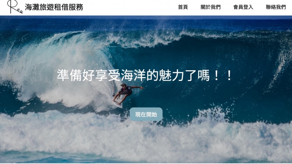
網頁縮小,導覽列下移,但是可以看到因為網頁縮小,讓Logo部分看起來變很小,那就設定@media。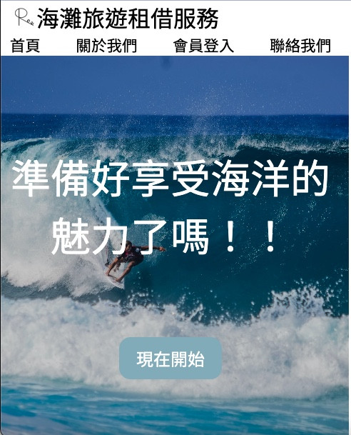
螢幕大小
//螢幕在550左右就會變太小,所以設定螢幕Logo的可視寬度跟高度增加到15vw。
@media screen and (max-width: 550px) {
  header {
    div.logo {
			//因為下面圖片變大,壓縮到字體空間,那就讓圖片變比較貼齊左邊,但依舊保有一點空間。
      margin-left: 0.5rem;
      img {
        width: 15vw;
        height: 15vw;
      }
    }
  }
}
再來針對header的第二個區塊開始設計。
 section.second {
    display: flex;
    flex-direction: column;
    align-items: center;
    text-align: center; //這個section裡的文字都置中。

    h2 {
      font-size: 2rem;
      margin: 2rem 0rem;
    }

    section.cards {
      display: flex; //原本是直行,更改成水平排列。
      width: 80%; //這裡希望可以調整至寬度大約8成。
      min-height: 80vh;
      flex-wrap: wrap;

			//針對名稱為card的div區塊進行設計
      div.card {
        display: flex;
        flex-direction: column;
        align-items: center; //圖片置中
				//先把圖片跟文字的距離抓出來,這樣才方便在下邊跟對文字大小進行更改
        justify-content: space-around;
        padding: 1rem; //跟邊界設定流出一些距離空間
        flex: 1 1 300px; //設定讓寬度距離一樣

        img {
          margin: 1rem 0rem;
          width: 15vw; //先設定都是15vw就表示會變成正方形。
          height: 15vw;
          border-radius: 50%;
        }
				//針對h4字體的大小進行更改
        h4 {
          font-size: 2rem;
          margin: 1rem 0rem;
        }
        p {
          font-size: 1.25rem;
        }
        a {
          margin: 1rem 0rem;
          text-decoration: none;
          padding: 1rem 1.5rem;
          background-color: #5DB5D3;
          color: white;
          font-size: 1.25rem;
        }
      }
    }
  }
可以看到第二頁的成果如下圖: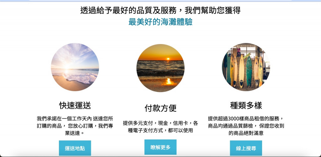
網頁縮小的時候,也會自動排列下去,但是圖片看起來被縮到有點小,那就一樣使用@media處理。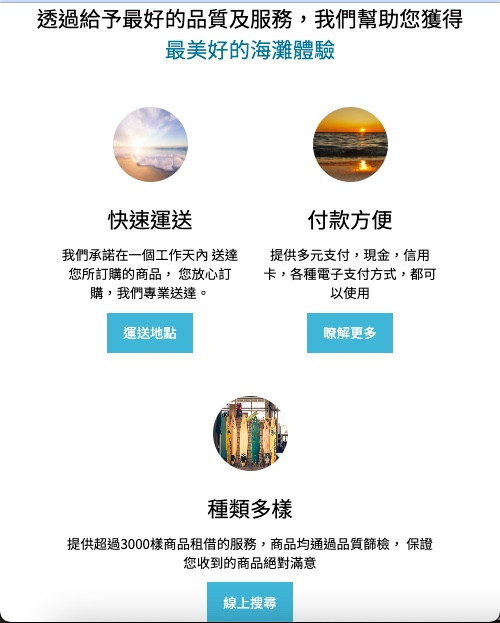
//希望可以提早就把第二頁的圖片給放大,希望螢幕寬度小於700px,下面的圖片就會自己放大
@media screen and (max-width: 700px) {
  main {
    section.second {
      section.cards {
        div.card {
          img {
            width: 40vw;
            height: 40vw;
          }
        }
      }
    }
  }
}
可以看到網頁縮小的時候,圖片就自動被放大了。(登登登登~有夠大!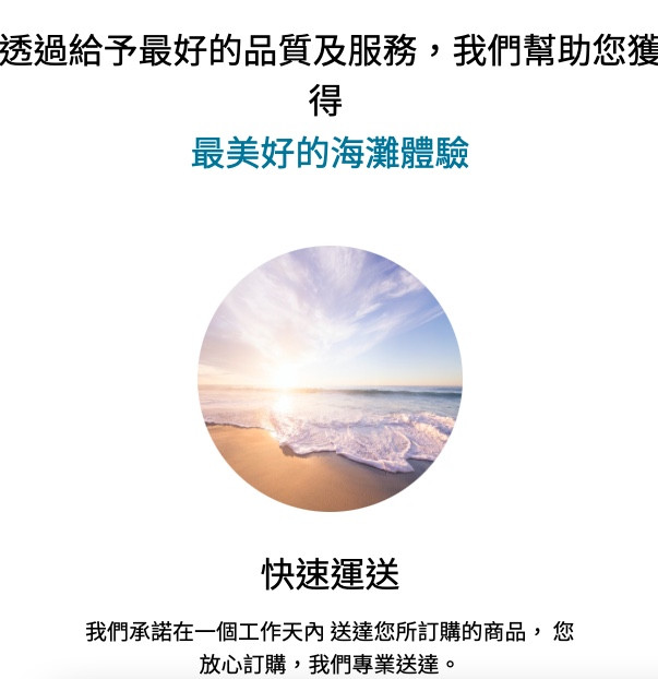
footer {
  display: flex;
  flex-direction: column;
  align-items: center;
  min-height: 40vh;
  justify-content: space-around;
  background-color: rgb(207, 207, 207);//背景設個灰白色好像比較像底的感覺
	//這裡的樣式設計就跟header的logo是一樣的
  div.logo {
    display: flex;
    align-items: center;
    img {
      width: 6vw;
      height: 6vw;
    }
  }

  nav {
    width: 35%;
    ul {
      display: flex;
      list-style-type: none; //一樣把列表前的點刪除掉
      width: 100%;
      justify-content: space-around;
      flex-wrap: wrap;
      li {
        flex-basis: 100px;
        a {
          color: black;
          font-weight: 600;
          text-decoration: none;
          font-size: 1.35rem;
        }
      }
    }
  }

  section.links {
    a {
      margin: 0rem 1rem;
      img {
        width: 5vw;
        height: 5vw;
      }
    }
  }
}
//螢幕在550左右就會變太小,所以設定螢幕Logo的可視寬度跟高度增加到15vw。
@media screen and (max-width: 550px) {
  header {
    div.logo {
      margin-left: 0.5rem;
      img {
        width: 15vw;
        height: 15vw;
      }
    }
  }

  footer {
    div.logo {
      img {
        width: 15vw;
        height: 15vw;
      }
    }
    section.links {
      margin-top: 1rem;
      a {
        img {
          width: 10vw;
          height: 10vw;
        }
      }
    }
  }
}
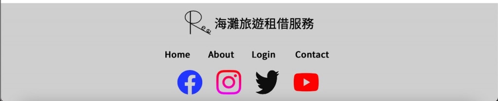
footer完成以後下面的底就會像這樣
接著SCSS會自動轉換成CSS檔案
* {
  padding: 0;
  margin: 0;
  box-sizing: border-box;
  font-family: "Noto Sans TC", sans-serif;
}

h1,
h2,
h3,
h4,
h5,
h6 {
  font-weight: normal;
}

header {
  display: flex;
  align-items: center;
  flex-wrap: wrap;
}
header div.logo {
  display: flex;
  align-items: center;
  flex: 5 1 400px;
  margin-left: 2rem;
}
header div.logo img {
  width: 6vw;
  height: 6vw;
}
header nav {
  flex: 2 1 400px;
}
header nav ul {
  display: flex;
  list-style-type: none;
  justify-content: space-around;
}
header nav ul li a {
  color: #09777d;
  text-decoration: none;
  font-size: 1.35rem;
}

main section.backImage {
  min-height: 90vh;
  width: 100%;
  background-image: url("../surf.jpg");
  background-size: cover;
  background-position: center;
  position: relative;
  z-index: 0;
  display: flex;
  justify-content: center;
  align-items: center;
  flex-direction: column;
  text-align: center;
}
main section.backImage h3 {
  font-size: 3.5rem;
  color: white;
  margin: 2rem 0rem;
}
main section.backImage button.start {
  background-color: #88aab6;
  padding: 0.75rem 1.5rem;
  font-size: 1.5rem;
  color: white;
  border: none;
  border-radius: 1rem;
  cursor: pointer;
}
main section.backImage div.filter {
  background-color: rgba(0, 0, 0, 0.2);
  width: 100%;
  min-height: 90vh;
  position: absolute;
  top: 0;
  z-index: -1;
}
main section.second {
  display: flex;
  flex-direction: column;
  align-items: center;
  text-align: center;
}
main section.second h2 {
  font-size: 2rem;
  margin: 2rem 0rem;
}
main section.second section.cards {
  display: flex;
  width: 80%;
  min-height: 80vh;
  flex-wrap: wrap;
}
main section.second section.cards div.card {
  display: flex;
  flex-direction: column;
  align-items: center;
  justify-content: space-around;
  padding: 1rem;
  flex: 1 1 300px;
}
main section.second section.cards div.card img {
  margin: 1rem 0rem;
  width: 15vw;
  height: 15vw;
  border-radius: 50%;
}
main section.second section.cards div.card h4 {
  font-size: 2rem;
  margin: 1rem 0rem;
}
main section.second section.cards div.card p {
  font-size: 1.25rem;
}
main section.second section.cards div.card a {
  margin: 1rem 0rem;
  text-decoration: none;
  padding: 1rem 1.5rem;
  background-color: #09777d;
  color: white;
  font-size: 1.25rem;
}

footer {
  display: flex;
  flex-direction: column;
  align-items: center;
  min-height: 40vh;
  justify-content: space-around;
  background-color: rgb(207, 207, 207);
}
footer div.logo {
  display: flex;
  align-items: center;
}
footer div.logo img {
  width: 6vw;
  height: 6vw;
}
footer nav {
  width: 30%;
}
footer nav ul {
  display: flex;
  list-style-type: none;
  width: 100%;
  justify-content: space-around;
  flex-wrap: wrap;
}
footer nav ul li {
  flex-basis: 100px;
}
footer nav ul li a {
  color: white;
  font-weight: 600;
  text-decoration: none;
  font-size: 1.35rem;
}
footer section.links a {
  margin: 0rem 1rem;
}
footer section.links a img {
  width: 5vw;
  height: 5vw;
}

@media screen and (max-width: 700px) {
  main section.second section.cards div.card img {
    width: 40vw;
    height: 40vw;
  }
}
@media screen and (max-width: 550px) {
  header div.logo {
    margin-left: 0.5rem;
  }
  header div.logo img {
    width: 15vw;
    height: 15vw;
  }
  footer div.logo img {
    width: 15vw;
    height: 15vw;
  }
  footer section.links {
    margin-top: 1rem;
  }
  footer section.links a img {
    width: 10vw;
    height: 10vw;
  }
}/*# sourceMappingURL=style.css.map */
第三十天挑戰完成
從最剛開始,有夠擔心猶豫到底要不要報名(要30天誒!不是3天誒!)
一直到現在挑戰完成
中間在挑戰的過程,真的經歷超多事情,拖著下班疲憊的身軀
依舊要想辦法努力挑戰完成
而且盡力督促自己把學到的都打出來
如果可以想辦法用自己的話解釋出來
跑圖書館,找資料
“這個版本講的,恩…不懂!好!換下一個”
“這個…好像懂那麼一點…啊啊啊啊啊~不懂!再來!“
對於一個零基礎零經驗的人,只能透過大量學習跟搜尋
而且還要不段更新學習的內容,不能懈怠
所以終於完成了30天,只是一個簡單開始表示自己也可以做到。

 iThome鐵人賽
 看影片追技術