React Native 提供一種名叫 Flexbox 的方式來管理版面, Flexbox 就像合併了網頁能使用 display: flex 搭配 flex-direction 、 justify-content 等設定並排方式,與 flex: 1 1 auto 收縮或延伸這兩種功能。
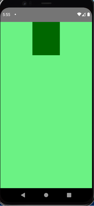
在網站中,必須設定 display: flex 後才能使用 flex-direction 等, React Native 則是已經預設好。要注意的是,他在 flexDirection 預設是 column ,而 alignContent 預設是 flex-start 。
flexDirection: column 會影響到什麼呢?要置中時使用 justifyContent 和 alignItems 要注意 justifyContent 是控制垂直, alignItems 是控制水平。
function App() {
  return (
    <View style={styles.container}>
      <View style={styles.item}></View>
    </View>
  );
}
const styles = StyleSheet.create({
  container: {
    width: '100%',
    height: '100%',
    backgroundColor: 'lightgreen',
    // justifyContent: 'center',
    alignItems: 'center',
  },
  item: {
    width: '30%',
    height: '20%',
    backgroundColor: 'darkgreen',
  },
});
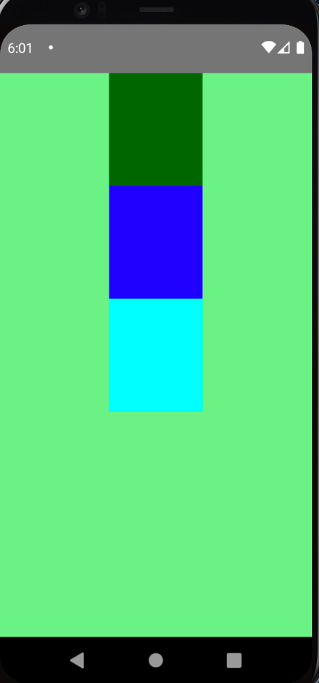
另外,他還有提供 alignContent 這個屬性。當元件有設定 flexWrap 時,裡頭的子元件們都能夠被這個屬性正確的控制擺放位置。
function App() {
  return (
    <View style={styles.container}>
      <View style={[styles.item, styles.item1]}></View>
      <View style={[styles.item, styles.item2]}></View>
      <View style={[styles.item, styles.item3]}></View>
    </View>
  );
}
const styles = StyleSheet.create({
  container: {
    width: '100%',
    height: '100%',
    backgroundColor: 'lightgreen',
    flexWrap: 'wrap',
    alignContent: 'center',
  },
  item: {
    width: '30%',
    height: '20%',
  },
  item1: {
    backgroundColor: 'darkgreen',
  },
  item2: {
    backgroundColor: 'blue',
  },
  item3: {
    backgroundColor: 'cyan',
  },
});

export default App;
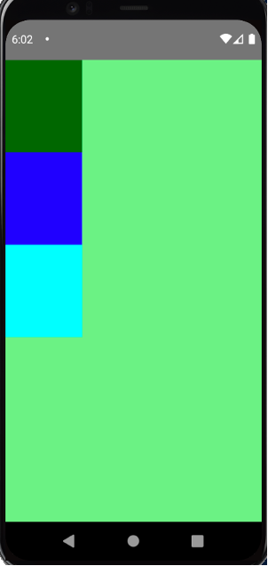
若改成 alignItems: center 則不會如預期顯示:
const styles = StyleSheet.create({
  container: {
    … 省略
    alignItems: 'center', // 改這句
  },
再來看第二種功能。在網站中我們能一次設定 flex: 1 1 auto ,不過在 React Native 中, flex 只支援數字值。舉例來說,如果只設定一個,那該項目會延伸直到填滿剩餘的畫面,其他沒設定的會照原先設好的 width 和 height 顯示。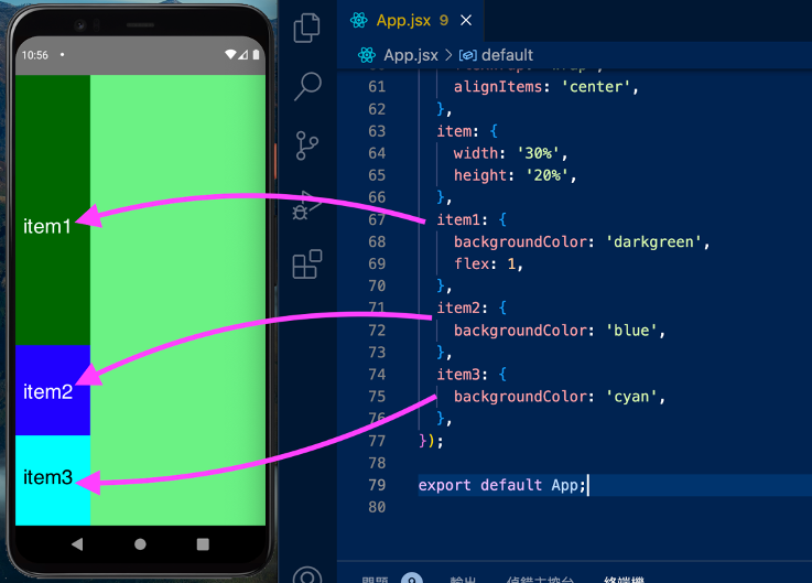
依此類推,如果設定兩個和三個都設,會分別呈現下面的畫面。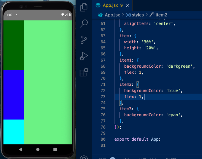
當然,既然三個都設 flex:1 了,也不用再設定 height ,因為會以 flex 為優先。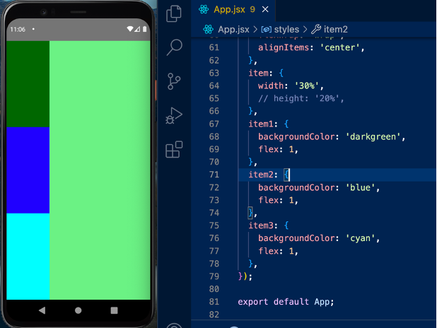
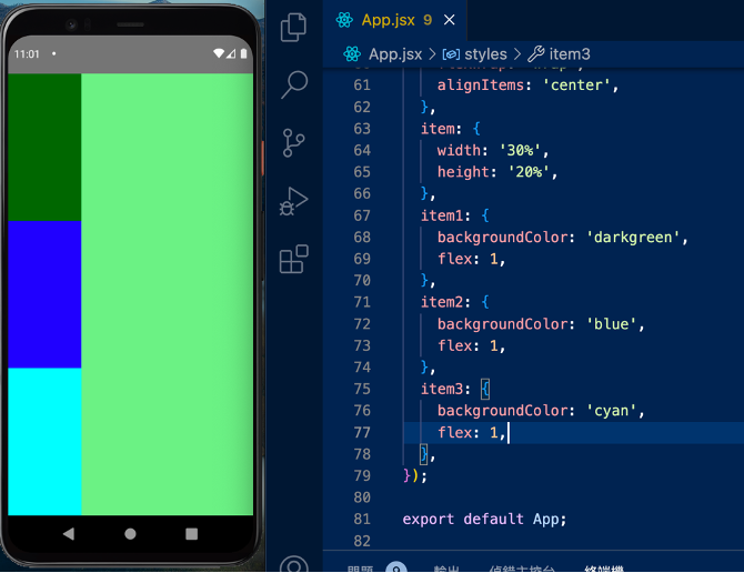
若其中一個需佔用 50% ,另兩個佔用 25% 則可以這樣設定: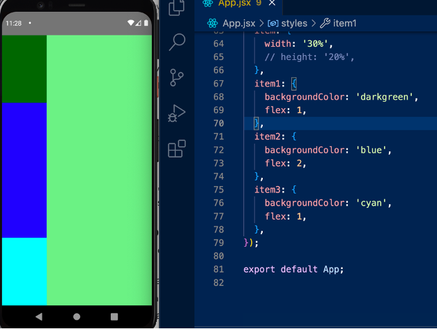
如果仍想設定 flex: 1 1 auto ,則必須分別透過 flexGrow 、 flexShrink 和 flexBasis 來各自設定。
以下圖的例子來說,雖然沒設定 height ,但因有 flexBasis ,項目有基本的高度 100 。除非有進一步設定 flex ,否則就以 flexBasis 顯示。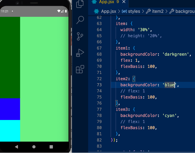
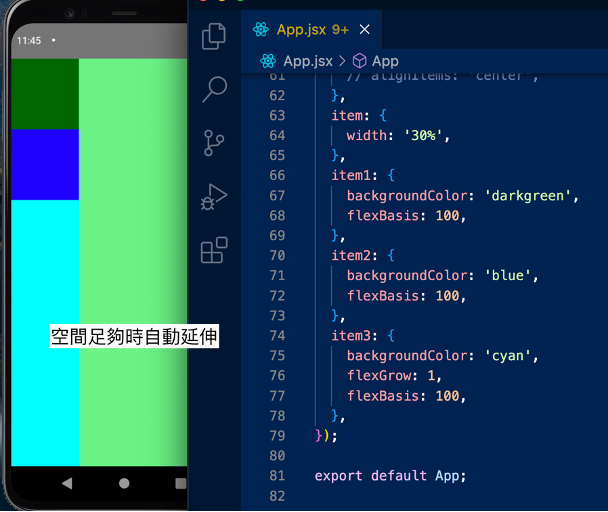
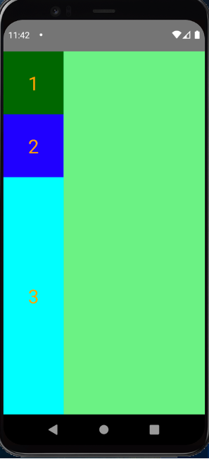
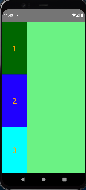
所謂的「空間足夠時,自動延伸」,指的是 item3 會被壓縮成剩餘高度。我們可以改寫程式碼,在 Item 中插入文字,並讓文字水平、垂直置中,來驗證上述的話。可以發現第三個項目的垂直置中,是建立在被延伸後的高度上:
function App() {
  return (
    <View style={styles.container}>
      <View style={[styles.item, styles.item1]}>
        <Text style={styles.itemText}>1</Text>
      </View>
      <View style={[styles.item, styles.item2]}>
        <Text style={styles.itemText}>2</Text>
      </View>
      <View style={[styles.item, styles.item3]}>
        <Text style={styles.itemText}>3</Text>
      </View>
    </View>
  );
}
const styles = StyleSheet.create({
  container: {
    width: '100%',
    height: '100%',
    backgroundColor: 'lightgreen',
  },
  item: {
    width: '30%',
    justifyContent: 'center',
    alignItems: 'center',
  },
  itemText: {
    color: 'orange',
    fontSize: 30,
  },
  item1: {
    backgroundColor: 'darkgreen',
    flexBasis: 100,
  },
  item2: {
    backgroundColor: 'blue',
    flexBasis: 100,
  },
  item3: {
    backgroundColor: 'cyan',
    flexGrow: 1,
    flexBasis: 100,
  },
});
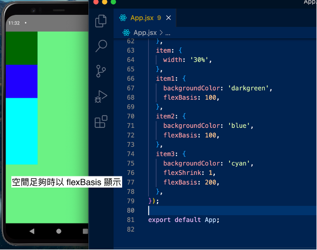
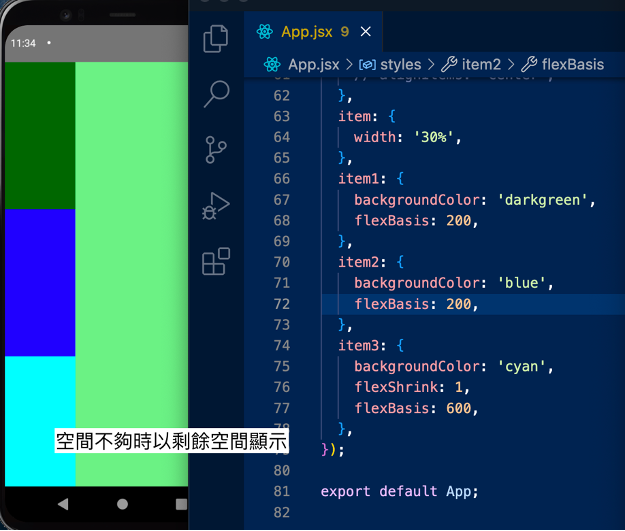
所謂的「空間不夠時,以剩餘空間顯示」,指的是 item3 會被壓縮成剩餘高度。我們可以改寫程式碼,在 Item 中插入文字,並讓文字水平、垂直置中,來驗證上述的話。可以發現第三個項目的垂直置中,是建立在被壓縮後的高度上:
function App() {
  return (
    <View style={styles.container}>
      <View style={[styles.item, styles.item1]}>
        <Text style={styles.itemText}>1</Text>
      </View>
      <View style={[styles.item, styles.item2]}>
        <Text style={styles.itemText}>2</Text>
      </View>
      <View style={[styles.item, styles.item3]}>
        <Text style={styles.itemText}>3</Text>
      </View>
    </View>
  );
}
const styles = StyleSheet.create({
  container: {
    width: '100%',
    height: '100%',
    backgroundColor: 'lightgreen',
  },
  item: {
    width: '30%',
    justifyContent: 'center',
    alignItems: 'center',
  },
  itemText: {
    color: 'orange',
    fontSize: 30,
  },
  item1: {
    backgroundColor: 'darkgreen',
    flexBasis: 200,
  },
  item2: {
    backgroundColor: 'blue',
    flexBasis: 200,
  },
  item3: {
    backgroundColor: 'cyan',
    flexShrink: 1,
    flexBasis: 600,
  },
});


 看影片追技術