iT邦幫忙

2023 iThome 鐵人賽

DAY 13
0
Modern Web

三十天持續努力挑戰py系列 第 13

Day_13 Flex幾種基本的小教學

  • 分享至 

  • xImage
  •  
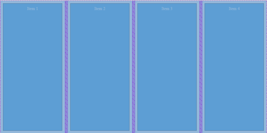
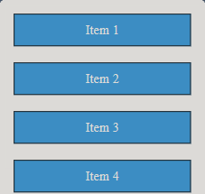
  • Flex是一種有利於html排版的一個布局,要使用flex布局的話必須把容器(div)的css裡面的display屬性設定為flex即可。
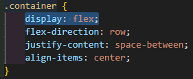
    https://ithelp.ithome.com.tw/upload/images/20230911/20162170AERjaSel6R.png

    • Flex佈局的核心思想是將容器內的空間劃分為一個或多個伸縮盒子(flex box),並通過定義如何分配和伸縮這些盒子來實現佈局。
    • 以下介紹幾點Flex比較常用的的幾個功能,justify-content、flex-wrap、align-items...
    • 效果如下
    <!DOCTYPE html>
    <html>
    
    <head>
        <style>
            .container {
                display: flex;
                height: 500px;
                flex-direction: row;
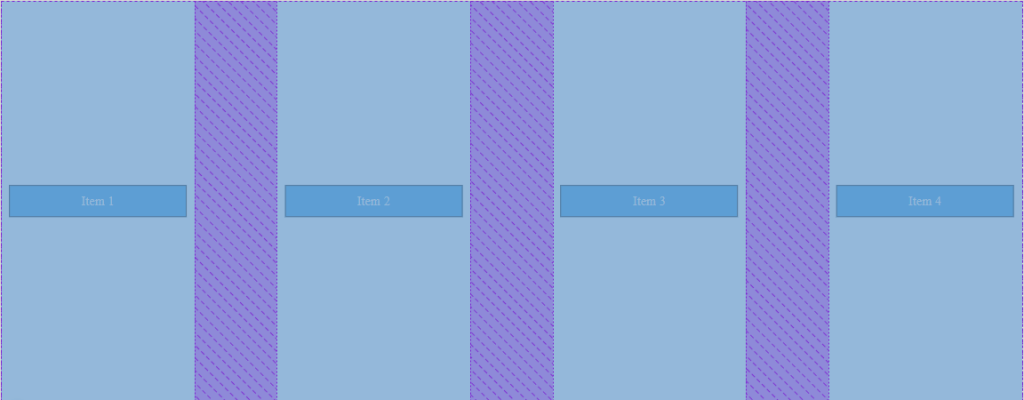
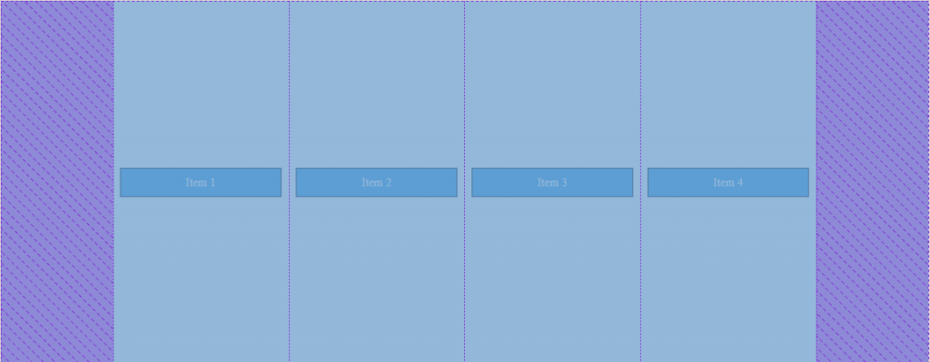
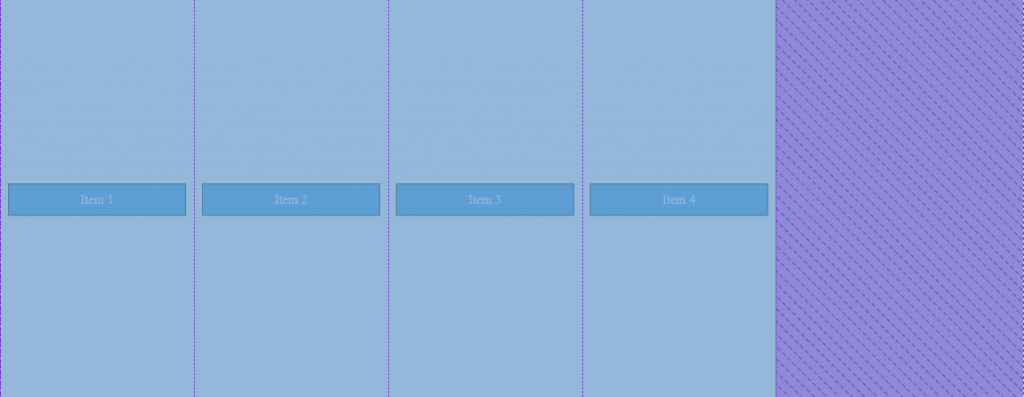
                justify-content: space-between;/*space-between center left right*/
                align-items: center; /* flex-end stretch center baseline*/
            /* flex-wrap: wrap; */
        }
    
        .item {
            padding: 10px;
            margin: 10px;
            width: 200px;
            border: black 1px solid;
            text-align: center;
            background-color: #3498db;
            color: #fff;
        }
    </style>
    </head>
    
    <body>
    
        <div class="container">
            <div class="item">Item 1</div>
            <div class="item">Item 2</div>
            <div class="item">Item 3</div>
            <div class="item">Item 4</div>
        </div>
    
    </body>
    
    </html>
    
    • justify-content 的 space-between center left right,簡單來說就是平均、置中、左、右。
      https://ithelp.ithome.com.tw/upload/images/20230912/20162170fV70CcoyJh.png
      https://ithelp.ithome.com.tw/upload/images/20230912/20162170yGbVnNECEa.png
      https://ithelp.ithome.com.tw/upload/images/20230912/20162170ZDU96z9VhX.png
      https://ithelp.ithome.com.tw/upload/images/20230912/20162170GJPXZ3PlHS.png
    • 比較屬於橫向的排版,而align-items就是偏向垂直的排版,以下就不上圖了。但是stretch比較特殊,我提一下,這會強制拉伸內部div至全版如圖。
      https://ithelp.ithome.com.tw/upload/images/20230912/20162170E2ZGaCm9xl.png
    • 接下來是warp,沒有給他的話不管怎麼拉伸視窗都不會換行。
      https://ithelp.ithome.com.tw/upload/images/20230912/20162170omYDH1RCeR.png
    • 但是如果有給warp的話。(這是只加上warp的變化
      https://ithelp.ithome.com.tw/upload/images/20230912/20162170CZlWGS0u5g.png

上一篇
Day_12 CSS 入門教學
下一篇
Day_14 SCSS & SASS 的基本架構示例
系列文
三十天持續努力挑戰py30
圖片
  直播研討會
圖片
{{ item.channelVendor }} {{ item.webinarstarted }} |
{{ formatDate(item.duration) }}
直播中

尚未有邦友留言

立即登入留言