
示範 Flutter ListView 實際例子
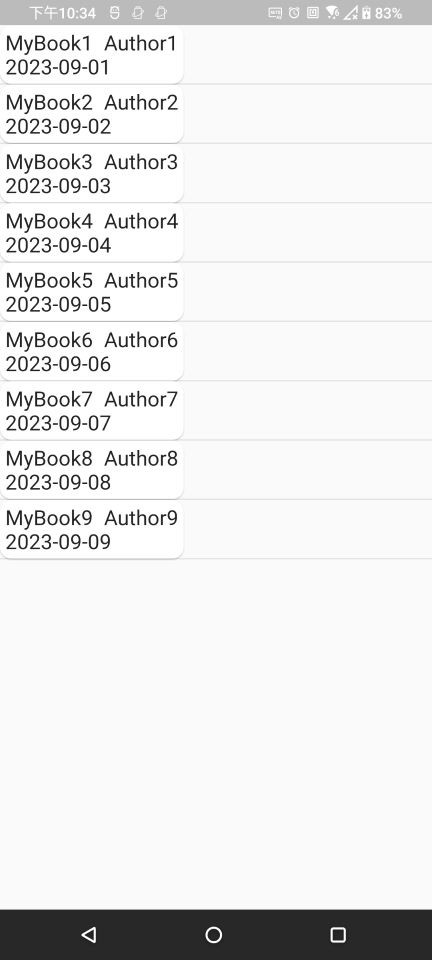
用 ListView 元件列出書名、作者和購買日期
以下為完成畫面截圖:
建立 ListView 的簡要步驟:於 main.dart 建立以下內容。
ListView 可能會刷新列表資料,所以用 StatefulWidget 元件建立頁面,而不是 StatelessWidget。Container, Text, Row 元件組合而成。
Container 元件:方便設定元件的 padding / margin。Text 元件:顯示文字。Row 元件:由左至右排列 child 元件,ex:書名和作者文字在同一列就會用到。Column 或 Row 元件排版,並用 Card 元件包住,以加上圓角框和陰影。
Card 元件:在 child 元件外,包上圓角框加陰影,預設外圍有 margin。Column 元件:由上至下垂直排列 child 元件,ex:書名作者文字與書籍購買日期垂直排列就會用到。ListView Item 元件 :由有圓角框的書籍資訊元件與 Divider 分隔線元件垂直由上到下排列構成。List.generate 方法建立有 9 個 ListView Item 元件的 List 資料結構。
StatefulWidget 元件 build 方法回傳 ListView 元件。List 資料結構(此結構包含 9 個 ListView Item 元件)傳入 ListView 元件 children 參數,即完成列表顯示。以下為 main.dart 檔案內容:
import 'package:flutter/material.dart';

void main() {
 runApp(const MyApp());
}

class MyApp extends StatefulWidget {
 const MyApp({super.key});

 @override
 _MyAppState createState() => _MyAppState();
}

class _MyAppState extends State<StatefulWidget> {

 ///設定文字大小
 double dTextSize = 20;

 @override
 Widget build(BuildContext context) {

   //建立 ListView
   return MaterialApp(
       debugShowCheckedModeBanner: false,
       home: Scaffold(
           body: ListView(
             //依 index 生成 9 個 List 元素並轉為 List 資料結構
         children: List.generate(9, (index) => _wListItem(index)),
       )));
 }

 ///ListView item 元件
 /// - [sNum] : 帶入的數字
 Widget _wListItem(int sNum) {

   //Column 元件將 child 元件由上到下垂直排列
   return Column(crossAxisAlignment: CrossAxisAlignment.start, children: [
     //Card 元件包著書籍資訊,
     //注意 Card 元件預設有 margin, 需要設為0才會完全貼齊其他元件
     Card(
       margin: EdgeInsets.zero,
       child: _wBookItem(sNum + 1),
       shape: RoundedRectangleBorder(borderRadius: BorderRadius.circular(11)),
     ),
     //分隔線
     const Divider(
       thickness: 1,
       height: 0.5,
     ),
   ]);
 }

 ///書籍 item 元件
 /// - [sNum] : 需帶入的數字
 Widget _wBookItem(int sNum) {
   //Container 元件會依據 child 元件大小包覆,方便設定 child 元件的 padding 或 margin
   return Container(
       padding: EdgeInsets.symmetric(vertical: 5, horizontal: 5),
       //Column 元件將 _wBookNameAuthor 和 _wBookBuyDate 元件由垂直排列
       // MainAxisSize.min 設定代表 只依 child 元件大小包住 child 元件,不會延伸到最大螢幕畫面
       // CrossAxisAlignment.start 設定代表 垂直靠左排列
       child: Column(
         mainAxisSize: MainAxisSize.min,
         crossAxisAlignment: CrossAxisAlignment.start,
         children: [
           _wBookNameAuthor("MyBook$sNum", "Author$sNum"),
           _wBookBuyDate("2023-09-0$sNum"),
         ],
       ));
 }

 ///書籍名稱與作者 元件
 /// - [sName] : 書籍名稱
 /// - [sAuthor] : 書籍作者
 Widget _wBookNameAuthor(String sName, String sAuthor) {
   return Container(
       child: Row(
     mainAxisSize: MainAxisSize.min,
     children: [
       // 文字元件
       Text(
         sName,
         style: TextStyle(fontSize: dTextSize),
       ),
       Container(
         width: 10,
       ),
       Text(
         sAuthor,
         style: TextStyle(fontSize: dTextSize),
       ),
     ],
   ));
 }

 ///書籍購買日期元件
 /// - [sDate] : 購買日期
 Widget _wBookBuyDate(String sDate) {
   return Container(
       child: Text(
     sDate,
     style: TextStyle(fontSize: dTextSize),
   ));
 }
}

 看影片追技術