
<div class="accordion" id="accordionExample">
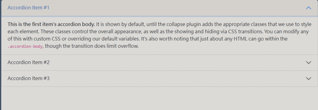
<div class="accordion-item">
<h2 class="accordion-header" id="headingOne">
<button class="accordion-button" type="button" data-bs-toggle="collapse" data-bs-target="#collapseOne" aria-expanded="true" aria-controls="collapseOne">
Accordion Item #1
</button>
</h2>
<div id="collapseOne" class="accordion-collapse collapse show" aria-labelledby="headingOne" data-bs-parent="#accordionExample">
<div class="accordion-body">
<strong>This is the first item's accordion body.</strong> It is shown by default, until the collapse plugin adds the appropriate classes that we use to style each element. These classes control the overall appearance, as well as the showing and hiding via CSS transitions. You can modify any of this with custom CSS or overriding our default variables. It's also worth noting that just about any HTML can go within the <code>.accordion-body</code>, though the transition does limit overflow.
</div>
</div>
</div>
<div class="accordion-item">
<h2 class="accordion-header" id="headingTwo">
<button class="accordion-button collapsed" type="button" data-bs-toggle="collapse" data-bs-target="#collapseTwo" aria-expanded="false" aria-controls="collapseTwo">
Accordion Item #2
</button>
</h2>
<div id="collapseTwo" class="accordion-collapse collapse" aria-labelledby="headingTwo" data-bs-parent="#accordionExample">
<div class="accordion-body">
<strong>This is the second item's accordion body.</strong> It is hidden by default, until the collapse plugin adds the appropriate classes that we use to style each element. These classes control the overall appearance, as well as the showing and hiding via CSS transitions. You can modify any of this with custom CSS or overriding our default variables. It's also worth noting that just about any HTML can go within the <code>.accordion-body</code>, though the transition does limit overflow.
</div>
</div>
</div>
<div class="accordion-item">
<h2 class="accordion-header" id="headingThree">
<button class="accordion-button collapsed" type="button" data-bs-toggle="collapse" data-bs-target="#collapseThree" aria-expanded="false" aria-controls="collapseThree">
Accordion Item #3
</button>
</h2>
<div id="collapseThree" class="accordion-collapse collapse" aria-labelledby="headingThree" data-bs-parent="#accordionExample">
<div class="accordion-body">
<strong>This is the third item's accordion body.</strong> It is hidden by default, until the collapse plugin adds the appropriate classes that we use to style each element. These classes control the overall appearance, as well as the showing and hiding via CSS transitions. You can modify any of this with custom CSS or overriding our default variables. It's also worth noting that just about any HTML can go within the <code>.accordion-body</code>, though the transition does limit overflow.
</div>
</div>
</div>
</div>
把data-bs-parent的屬性去掉即可達成,開啟其他時不關閉本身的效果。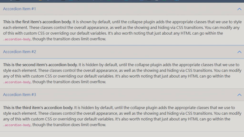
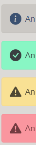
接下來介紹警告(alert)樣式,動態範例:
點擊下面的按鈕以顯示警報 (使用行內樣式隱藏以開啟),然後使用內建的關閉按鈕關閉 (並銷毀) 它。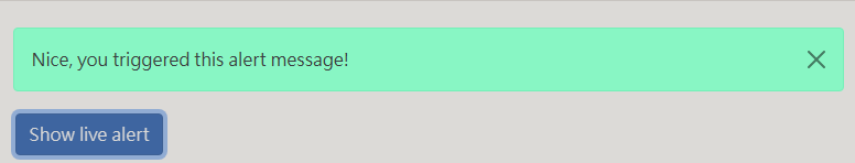
    <div id="liveAlertPlaceholder"></div>
    <button type="button" class="btn btn-primary" id="liveAlertBtn">Show live alert</button>
    <script>
        var alertPlaceholder = document.getElementById('liveAlertPlaceholder')
        var alertTrigger = document.getElementById('liveAlertBtn')

        function alert(message, type) {
            var wrapper = document.createElement('div')
            wrapper.innerHTML = '<div class="alert alert-' + type + ' alert-dismissible" role="alert">' + message + '<button type="button" class="btn-close" data-bs-dismiss="alert" aria-label="Close"></button></div>'

            alertPlaceholder.append(wrapper)
        }

        if (alertTrigger) {
            alertTrigger.addEventListener('click', function () {
                alert('Nice, you triggered this alert message!', 'success')
            })
        }
    </script>
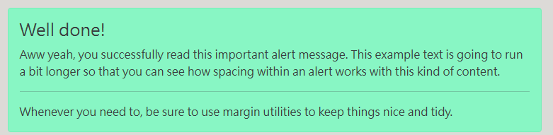
<div class="alert alert-success" role="alert">
  <h4 class="alert-heading">Well done!</h4>
  <p>Aww yeah, you successfully read this important alert message. This example text is going to run a bit longer so that you can see how spacing within an alert works with this kind of content.</p>
  <hr>
  <p class="mb-0">Whenever you need to, be sure to use margin utilities to keep things nice and tidy.</p>
</div>

<div class="alert alert-warning alert-dismissible fade show" role="alert">
  <strong>Holy guacamole!</strong> You should check in on some of those fields below.
  <button type="button" class="btn-close" data-bs-dismiss="alert" aria-label="Close"></button>
</div>

    <button type="button" class="btn btn-primary m-1">
        Notifications <span class="badge bg-secondary">4</span>
    </button>
    <button type="button" class="btn btn-primary position-relative m-1 bg-dark ">
        Inbox
        <span class="position-absolute top-0 start-100 translate-middle badge rounded-pill bg-danger">
            99+
            <span class="visually-hidden">unread messages</span>
        </span>
    </button>

    <button type="button" class="btn btn-primary position-relative rounded-pill m-2">
        Profile
        <span
            class="position-absolute top-0 start-100 translate-middle p-2 bg-danger border border-light rounded-circle">
            <span class="visually-hidden">New alerts</span>
        </span>
    </button>


 iThome鐵人賽
 看影片追技術