今天就來學學折線圖吧!
折線圖(Line Chart)是一種用來表示數據趨勢和變化的圖表類型,通常用於表示數據隨著時間、順序或連續變數的變化趨勢。
·清晰的趨勢呈現
·顯示變化的數據
·比較不同數據集
·突出極值和趨勢變化
·簡單直觀
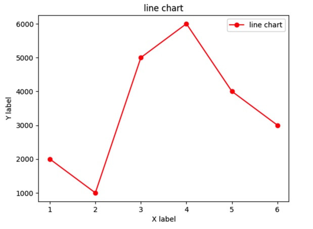
折線圖範例:
import matplotlib.pyplot as plt

x = [1, 2, 3, 4, 5, 6]  #x軸數值
y = [2000, 1000, 5000, 6000, 4000, 3000]  #y軸數值

plt.plot(x, y, marker='o', linestyle='-', color='red', label='line chart')#繪製折線圖

#新增標題和x,y軸
plt.title('line chart')
plt.xlabel('X label')
plt.ylabel('Y label')

plt.legend() #新增圖例

plt.show() #顯示折線圖
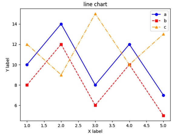
多條折線圖
import matplotlib.pyplot as plt

x = [1, 2, 3, 4, 5] #x軸數值

#多個y軸數值
y1 = [10, 14, 8, 12, 7]
y2 = [8, 12, 6, 10, 5]
y3 = [12, 9, 15, 10, 13]

# 繪製多條折線
plt.plot(x, y1, marker='o', linestyle='-', color='blue', label='a')
plt.plot(x, y2, marker='s', linestyle='--', color='red', label='b')
plt.plot(x, y3, marker='^', linestyle='-.', color='orange', label='c')

#新增標題和x,y軸
plt.title('line chart')
plt.xlabel('X label')
plt.ylabel('Y label')

plt.legend()#新增圖例

plt.show() # 顯示折線圖
竟然!不知不覺就過一半了!還剩15天,繼續加油~
目前進度:15/30···


 iThome鐵人賽