"Card"是一個常用的UI元素,它可以用於顯示信息或內容,通常被用於列表項目、訊息卡、面板和其他地方,以提供統一的外觀和風格。
組成部分:
1.形狀:常為矩型,也可自訂義形狀
2.圖片:可以在卡片上方或內部添加圖像
3.標題:卡片通常包含一個標題,用於簡要描述卡片的內容
4.內容:卡片的主要內容區域,通常包括文字、列表、圖表或其他UI元素
5.操作:卡片底部可以包含操作按鈕
6.陰影:卡片可以具有陰影效果,使用elevation添加陰影
範例程式(可用於聯絡人中)
Widget build(BuildContext context) {
    return MaterialApp(
      home: Scaffold(
        appBar: AppBar(
          title: Text('My Card Example'),
        ),
        body: Center(
          child: SizedBox(
            height: 200.0,
            child: Card( //創建卡片
              child: Column(
                children: <Widget>[
                  ListTile(
                    title: Text(  //列表項目的標題
                      '王小名',
                      style: TextStyle(fontWeight: FontWeight.w300), //設定字體粗細
                    ),
                    subtitle: Text('0912345678'), //列表副標題
                    leading: Icon(
                      Icons.account_box, //Flutter預定義圖標,用於表示帳戶或用戶個人資訊
                    ),
                  ),
                  new Divider(), //新增分隔線
                  ListTile(
                    title: Text(
                      '王大名',
                      style: TextStyle(fontWeight: FontWeight.w300),
                    ),
                    subtitle: Text('0987654321'),
                    leading: Icon(
                      Icons.account_box,
                    ),
                  ),
                  new Divider(),
                ],
              ),
            ),
          ),
        ),
      ),
    );
  }
結果: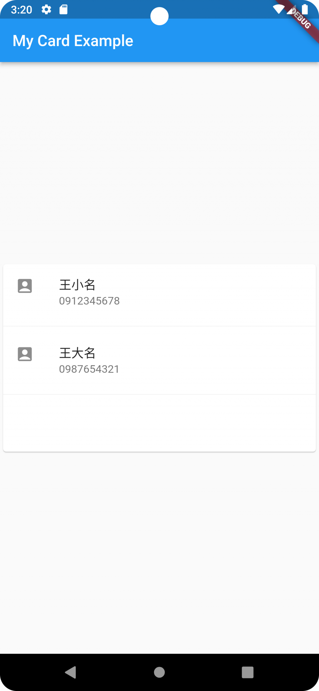

 iThome鐵人賽
 看影片追技術