這個單元繼續來討論表單的進階用法。
一個基礎的表單的 checkbox ,可能會這樣宣告:
<div class="flex min-h-screen w-screen flex-row items-center justify-center gap-4">
  <input type="radio" name="status" checked />
  <label>Selection A</label>

  <input type="radio" name="status" />
  <label>Selection B</label>
</div>
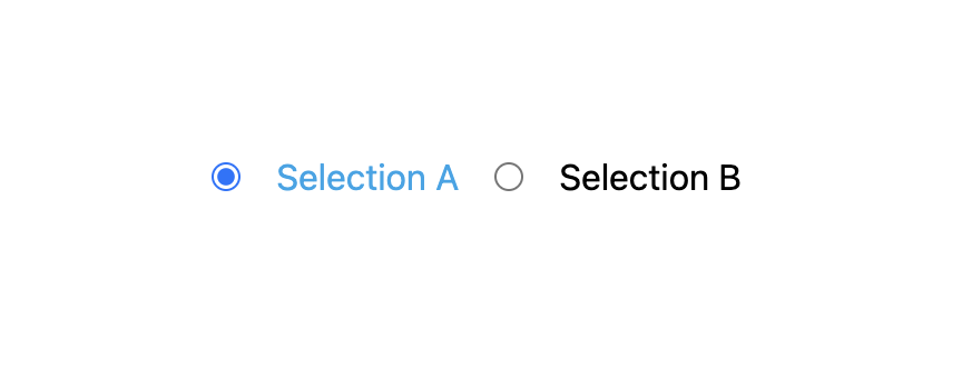
但這樣宣告之後,如果有選取某一個欄位,可以發現雖然已經選取了,但是其 label 並沒有產生樣式變化,如果要讓被選取的欄位其 label 也可以產生樣式的變化,可以使用 peer。
<div class="flex min-h-screen w-screen flex-row items-center justify-center gap-4">
  <input id="selectionA" class="peer/selectionA" type="radio" name="status" checked />
  <label for="selectionA" class="peer-checked/selectionA:text-sky-500">Selection A</label>

  <input type="radio" name="status" />
  <label>Selection B</label>
</div>
peer/ 後面帶入指定的 label 名稱,這裡帶入的是 selectionA,所以變成 class="peer/selectionA"。
然後在 label 的 class 加入 peer-checked/ 後方先帶入被指定的對象名稱 selectionA:,然後要產生的樣式,這裡帶入的是 text-sky-500 也就是文字顏色。
所以欄位被選取時,就可以連同 label 一起產生變化:
把另外一個欄位也宣告 peer:
<div class="flex min-h-screen w-screen flex-row items-center justify-center gap-4">
  <input id="selectionA" class="peer/selectionA" type="radio" name="status" checked />
  <label for="selectionA" class="peer-checked/selectionA:text-sky-500">Selection A</label>

  <input id="selectionB" class="peer/selectionB" type="radio" name="status" />
  <label for="selectionB" class="peer-checked/selectionB:text-sky-500">Selection B</label>
</div>
這個 peer 也可以產生另外一種變化,就是選取時,會出現某一段文字,沒有選取時,文字則消失:
<div class="hidden peer-checked/selectionA:block">Selection A 被選取了</div>
hidden 表示初始狀態為隱藏,加入 peer-checked/selectionA:block 則表示當 selectionA 被選取時,會使用 block。
tailwindcss - 從零開始學 - Day25 [完]


 看影片追技術