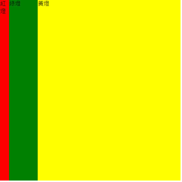
指定彈性容器項目在主軸上初始大小
* {
  margin: 0;
  padding: 0;
  box-sizing: border-box;
}
.box {
  width: 500px;
  height: 500px;
  display: flex;
}
.redbox {
    flex-basis: auto;
    background-color: red;
}
.greenbox {
    flex-basis: 100px;
    background-color: green;
}
.yellowbox {
    flex-basis: 100%;
    background-color: yellow;
}
指定彈性容器項目在主軸上伸展比例
* {
  margin: 0;
  padding: 0;
  box-sizing: border-box;
}
.box {
    border: black;
    width: 900px;
    height: 300px;
    display: flex;
}
.redbox {
    flex-grow: 0;
    background-color: red;
}
.greenbox {
    flex-grow: 1;
    background-color: green;
}
.yellowbox {
    flex-grow: 2;
    background-color: yellow;
}
.box {
border: black;
width: 900px;
height: 300px;
display: flex;
}
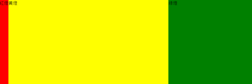
.redbox {
flex-basis: 100px;
flex-grow: 1;
background-color: red;
}
.greenbox {
flex-basis: 50px;
flex-grow: 2;
background-color: green;
}
width:900px height:300px
紅燈:100px 綠燈:50px
| 紅燈 | 綠燈 |
|---|---|
| 1 | 2 |
原本寬度 - flex-basis)900px-100px-50px=750px
可分配空間 / flex-grow總和)750 / 3 = 250
紅燈、綠燈分配比例寬度(Remaining Part X flex-grow)紅燈: 250 * 1 = 250
綠燈: 250 * 2 = 500
紅燈、綠燈總寬度(紅燈、綠燈分配比例寬度 + flex-basis)紅燈: 250 + 100 = 350
綠燈: 500 + 50 = 550
* {
margin: 0;
padding: 0;
box-sizing: border-box;
}
.box {
border: black;
width: 900px;
height: 300px;
display: flex;
}
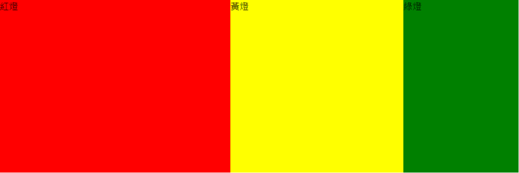
.redbox {
flex: 3 1 100px ;
background-color: red;
}
.greenbox {
flex: 1 1 100px;
background-color: green;
}
.yellowbox {
flex: 2 1 100px;
background-color: yellow;
}

width:900px height:300px
| redbox | yellowbox | greenbox |
|---|---|---|
| 100px | 100px | 100px |
| redbox | yellowbox | greenbox |
|---|---|---|
| 3 | 2 | 1 |
原本寬度 - flex-basis)900px-100px-100px-100px=600px
可分配空間 X flex-grow / flex-grow總和)紅燈:600 * 3 / 6 = 300
黃燈:600 * 2 / 6 = 200
綠燈:600 * 1 / 6 = 100
紅燈、綠燈、黃燈分配比例寬度紅燈: 300 * 1 = 300
黃燈: 200 * 1 = 200
綠燈: 100 * 1 = 100
紅燈、綠燈、黃燈分配比例寬度 + flex-basis)紅燈:300 + 100 = 400
黃燈:200 + 100 = 300
綠燈:100 + 100 = 200
指定彈性容器項目在主軸上收縮比例
* {
  margin: 0;
  padding: 0;
  box-sizing: border-box;
}
.box {
    border: black;
    width: 500px;
    height: 100px;
    display: flex;
  }
.redbox {
    width: 200px;
    flex-shrink: 2;
    background-color: red;
}
.greenbox {
    width: 400px;
    flex-shrink: 1;
    background-color: green;
}
width:500px height:100px
紅燈、綠燈寬度紅燈:200px 綠燈:400px
| 紅燈 | 綠燈 |
|---|---|
| 2 | 1 |
紅燈、綠燈寬度 X flex-shrink 後兩者相加)紅燈: 200 * 2 = 400
綠燈: 400 * 1 = 400
紅燈+綠燈: 400 + 400 = 800
紅燈寬度+綠燈寬度 - 原本寬度)(200px + 400px) - 500px = 100
紅燈、綠燈分別收縮(溢出空間 X flex-shrink X width / 總權重)紅燈: 100 * 2 * 200 / 800 = 50
綠燈: 100 * 1 * 400 / 800 = 50
紅燈、綠燈最後寬度紅燈: 200 - 50 = 150
綠燈: 400 - 50 = 350

* {
  margin: 0;
  padding: 0;
  box-sizing: border-box;
}
.box {
    border: black;
    width:  500px;
    height: 100px;
    display: flex;
  }
.redbox {
    flex:1 3 100px ;
    background-color: red;
}
.greenbox {
    flex:1 2 200px;
    background-color: green;
}
.yellowbox {
    flex:1 1 300px;
    background-color: yellow;
}
width:500px height:100px
紅燈、綠燈、黃燈寬度紅燈:100px 綠燈:200px 黃燈:300px
| 紅燈 | 綠燈 | 黃燈 |
|---|---|---|
| 3 | 2 | 1 |
紅燈、綠燈、黃燈寬度 X flex-shrink)| 紅燈 | 綠燈 | 黃燈 | Total |
|---|---|---|---|
| 100 X 3 | 200 X 2 | 300 X 1 | 1000 |
紅燈寬度+綠燈寬度+黃燈寬度 - 原本寬度)(100px + 200px + 300px) - 500px = 100px
紅燈、綠燈、黃燈分別收縮(溢出空間 X flex-shrink X width X 總權重)紅燈: 100 * 3 * 100 / 1000 = 30
綠燈: 100 * 2 * 200 / 1000 = 40
黃燈: 100 * 1 * 300 / 1000 = 30
紅燈、綠燈、黃燈最後寬度紅燈: 100 - 30 = 70
綠燈: 200 - 40 = 160
黃燈: 300 - 30 = 270

我用 紅綠燈、彩虹盒、水果盒 來寫出 CSS Flexbox,計算方式是透過網路搜尋來筆記學習,如果有錯誤可以跟我一下喔!
資料來源:詳解 flex-grow 與 flex-shrink
Flex 空間計算規則


 看影片追技術