本篇文章同步更新於個人部落格,歡迎交流指教~謝謝您的閱讀
CKEditor 版本:v39.0.0
CKEditor 是一套歷史悠久且功能完整、輕量的富文本編輯器(rich text editor),為使用者提供所見即所得(WYSIWYG)的編輯區域。與舊版不同,CKEditor 5 使用 MVC 架構、ES6 編寫、UI 簡潔,且因應現在的前後端分離趨勢,與前端框架 React、Angular、and Vue.js 做整合,讓我們可以更便利的開發應用。
接下來說明如何在 Nuxt3 + Vite 環境搭配 CKEditor 開發,分別介紹以下兩種安裝方式:
注意: CKEditor 只能在 client 端運作,否則會拋
self is not defined錯誤
提供兩個解法:
- 設定為
ssr: false,關閉 server 端渲染- 將 CKEditor 元件包在自訂元件內,檔名加上
.client後綴,限制元件在 client 端運作。EX:components/TheCkeditor.client.vue
提供以下幾種組合,各組合功能可以參考 官方文件
以 Classic editor 進行說明:
npm install --save \
  @ckeditor/ckeditor5-vue \
  @ckeditor/ckeditor5-build-classic
ckeditor components:
// components/TheCkeditor.client.vue
<template>
  <div>
    <ckeditor
      :editor="ClassicEditor"
      v-model="editorData"
      :config="editorConfig">
    </ckeditor>
  </div>
</template>

<script setup>
import CKEditor from '@ckeditor/ckeditor5-vue';
import ClassicEditor from '@ckeditor/ckeditor5-build-classic';

const ckeditor = defineComponent(CKEditor.component);
const editorData = ref('content of the editor');
const editorConfig = {
  placeholder: 'type the content here'
}
</script>
@ckeditor/ckeditor5-build-classic 將相關功能包裝成組件,使用方式非常簡單,但無法另外擴充功能,因 @ckeditor/ckeditor5-build-classic 已將相依套件安裝進去,重複安裝會拋錯誤:
CKEditorError: ckeditor-duplicated-modules
CKEditor 在初始化時因模組重複執行導致錯誤,需改用以下**「自行配置功能」**
選擇專案需要的功能,可以彈性的客製化組合文字編輯器
注意:所有 ckeditor 套件版本必須相同(除了
@ckeditor/ckeditor5-dev-*、@ckeditor/ckeditor5-vue跟@ckeditor/vite-plugin-ckeditor5),否則會發生 ckeditor-duplicated-modules 錯誤
npm install --save \
  @ckeditor/vite-plugin-ckeditor5 \
  @ckeditor/ckeditor5-vue
npm install --save @ckeditor/ckeditor5-theme-lark
自選功能(功能眾多不一一說明)
以下舉例:
@ckeditor/ckeditor5-editor-classic:toolbar style@ckeditor/ckeditor5-paragraph:paragraph style@ckeditor/ckeditor5-essentials:selectAll、undo、redo ...@ckeditor/ckeditor5-font:fontSize、fontFamily、fontColor、fontBackgroundColor@ckeditor/ckeditor5-basic-styles:bold、italic、underline、strikethrough、code …@ckeditor/ckeditor5-link:link、linkImagenpm install --save \
@ckeditor/ckeditor5-editor-classic \
@ckeditor/ckeditor5-paragraph \
@ckeditor/ckeditor5-essentials \
@ckeditor/ckeditor5-font \
@ckeditor/ckeditor5-basic-styles \
@ckeditor/ckeditor5-link
// nuxt.config.js
import ckeditor5 from '@ckeditor/vite-plugin-ckeditor5';

export default defineNuxtConfig({
  vite: {
    plugins: [
      ckeditor5({ theme: require.resolve('@ckeditor/ckeditor5-theme-lark') })
    ]
  }
});
ckeditor components:
|
// components/TheCkeditor.client.vue
<template>
  <div>
    <ckeditor
      :editor="ClassicEditor"
      v-model="editorData"
      :config="editorConfig">
    </ckeditor>
  </div>
</template>

<script setup>
import CKEditor from '@ckeditor/ckeditor5-vue';
import { ClassicEditor } from '@ckeditor/ckeditor5-editor-classic';
import { FontSize, FontFamily, FontColor, FontBackgroundColor } from '@ckeditor/ckeditor5-font';
import { Bold, Italic, Underline, Strikethrough } from '@ckeditor/ckeditor5-basic-styles';
import { Link } from '@ckeditor/ckeditor5-link';
import { Paragraph } from '@ckeditor/ckeditor5-paragraph';
import { Essentials } from '@ckeditor/ckeditor5-essentials';

const ckeditor = defineComponent(CKEditor.component);
const editorData = ref('content of the editor');
const editorConfig = {
  placeholder: 'type the content here',
  plugins: [
    FontSize, FontFamily, FontColor, FontBackgroundColor,
    Bold, Italic, Underline, Strikethrough,
    Link, Paragraph, Essentials
  ],
  toolbar: {
    items: [
      'fontSize', 'fontFamily', 'fontColor', 'fontBackgroundColor', '|',
      'bold', 'italic', 'underline', 'strikethrough', '|',
      'link', '|',
      'undo', 'redo', '|'
    ],
    shouldNotGroupWhenFull: true // RWD 自動換行
  },
  fontSize: { // 自訂義字級選項
    options: [ 12, 14, 16, 18, 20, 24, 28, 30, 32 ]
  },
  link: { // 點擊連結另起新分頁
    addTargetToExternalLinks: true
  }
};
</script>
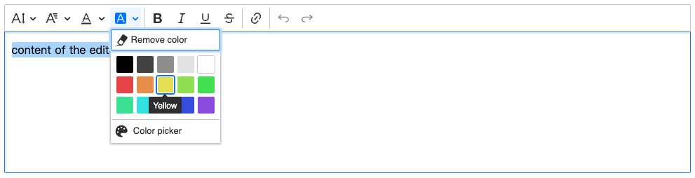
畫面呈現如下:
前面提到透過 @ckeditor/ckeditor5-theme-lark 定義了預設樣式,如果想依照專案需求調整配色,只要修改 CKEditor 的 CSS 自訂變數即可:
<style>
:root {
  /* Overrides the border radius setting in the theme. */
  --ck-border-radius: 4px;

  /* Overrides the default font size in the theme. */
  --ck-font-size-base: 14px;

  /* Helper variables to avoid duplication in the colors. */
  --ck-custom-background: hsl(177, 16%, 49%);
  --ck-custom-foreground: hsl(166, 21%, 65%);
  --ck-custom-border: hsl(161, 18%, 28%);
  --ck-custom-white: hsl(0, 0%, 100%);

  /* Overrides generic colors. */
  --ck-color-base-foreground: var(--ck-custom-background);
  --ck-color-focus-border: hsl(177, 16%, 49%);
  --ck-color-text: hsl(0, 0%, 98%);
  --ck-color-shadow-drop: hsla(0, 0%, 0%, 0.2);
  --ck-color-shadow-inner: hsla(0, 0%, 0%, 0.1);
  --ck-color-button-on-color: hsl(0, 0%, 100%);
  --ck-color-base-active: hsl(0, 0%, 100%);
  --ck-color-base-active-focus: hsl(0, 0%, 100%);

  /* Overrides the default .ck-button class colors. */
  --ck-color-button-default-background: var(--ck-custom-background);
  --ck-color-button-default-hover-background: hsl(177, 16%, 49%);
  --ck-color-button-default-active-background: hsl(177, 16%, 49%);
  --ck-color-button-default-active-shadow: hsl(177, 16%, 49%);
  --ck-color-button-default-disabled-background: var(--ck-custom-background);
  --ck-color-button-on-background: var(--ck-custom-foreground);
  --ck-color-button-on-hover-background: var(--ck-custom-foreground);
  --ck-color-button-on-active-background: var(--ck-custom-foreground);
  --ck-color-button-on-active-shadow: hsl(177, 16%, 49%);
  --ck-color-button-on-disabled-background: var(--ck-custom-foreground);
  --ck-color-button-action-background: hsl(168deg 76% 42%);
  --ck-color-button-action-hover-background: hsl(168deg 76% 38%);
  --ck-color-button-action-active-background: hsl(168deg 76% 36%);
  --ck-color-button-action-active-shadow: hsl(168deg 75% 34%);
  --ck-color-button-action-disabled-background: hsl(168deg 76% 42%);
  --ck-color-button-action-text: var(--ck-custom-white);
  --ck-color-button-save: hsl(120deg 100% 46%);
  --ck-color-button-cancel: hsl(15deg 100% 56%);

  /* Overrides the default .ck-dropdown class colors. */
  --ck-color-dropdown-panel-background: var(--ck-custom-background);
  --ck-color-dropdown-panel-border: var(--ck-custom-foreground);

  /* Overrides the default .ck-splitbutton class colors. */
  --ck-color-split-button-hover-background: var(--ck-color-button-default-hover-background);
  --ck-color-split-button-hover-border: var(--ck-custom-foreground);

  /* Overrides the default .ck-input class colors. */
  --ck-color-input-background: var(--ck-custom-background);
  --ck-color-input-border: hsl(257deg 3% 43%);
  --ck-color-input-text: hsl(24deg 21% 31%);
  --ck-color-input-disabled-background: hsl(255deg 4% 21%);
  --ck-color-input-disabled-border: hsl(250deg 3% 38%);
  --ck-color-input-disabled-text: hsl(0deg 0% 78%);

  /* Overrides the default .ck-labeled-field-view class colors. */
  --ck-color-labeled-field-label-background: var(--ck-custom-background);

  /* Overrides the default .ck-list class colors. */
  --ck-color-list-background: var(--ck-custom-background);
  --ck-color-list-button-hover-background: hsl(24deg 27% 54% / 20%);
  --ck-color-list-button-on-background: var(--ck-color-base-active);
  --ck-color-list-button-on-background-focus: var(--ck-color-base-active-focus);
  --ck-color-list-button-on-text: var(--ck-color-base-background);

  /* Overrides the default .ck-balloon-panel class colors. */
  --ck-color-panel-background: var(--ck-custom-background);
  --ck-color-panel-border: var(--ck-custom-border);

  /* Overrides the default .ck-toolbar class colors. */
  --ck-color-toolbar-background: var(--ck-custom-background);
  --ck-color-toolbar-border: var(--ck-custom-border);

  /* Overrides the default .ck-tooltip class colors. */
  --ck-color-tooltip-background: hsl(252deg 7% 14%);
  --ck-color-tooltip-text: hsl(0deg 0% 93%);

  /* Overrides the default colors used by the ckeditor5-image package. */
  --ck-color-image-caption-background: hsl(0deg 0% 97%);
  --ck-color-image-caption-text: hsl(0deg 0% 20%);

  /* Overrides the default colors used by the ckeditor5-widget package. */
  --ck-color-widget-blurred-border: hsl(0deg 0% 87%);
  --ck-color-widget-hover-border: hsl(43deg 100% 68%);
  --ck-color-widget-editable-focus-background: var(--ck-custom-white);

  /* Overrides the default colors used by the ckeditor5-link package. */
  --ck-color-link-default: hsl(190deg 100% 75%);

  /* Overrides the default content border. */
  --ck-color-base-border: var(--ck-custom-border);

  /* Configure the z-index of the editor UI, so when inside a Bootstrap modal, it will be rendered over the modal. */
  --ck-z-default: 100 !important;
  --ck-z-modal: calc( var(--ck-z-default) + 2000 ) !important;
}
</style>
調整後畫面:
參考資源:
https://ckeditor.com/docs/ckeditor5/latest/installation/integrations/vuejs-v3.html
https://ckeditor.com/docs/ckeditor5/latest/installation/advanced/alternative-setups/integrating-from-source-vite.html
https://ckeditor.com/docs/ckeditor5/latest/framework/deep-dive/ui/theme-customization.html


 看影片追技術