簡單介紹 react 裡面 style 的工具 emotion。
目前為止都盡量不動到 style 即使有用到也是使用 inline 或是 class 的方式來確保畫面上出現比較少的 code 以方便閱讀為主,今天來跟大家分享在 react 裡面常用到的 css-in-js Library - Emotion。
npm install @emotion/styled @emotion/react
oryarn add @emotion/styled @emotion/react
emotion 有兩種比較主要在 react 裡面撰寫 style 的方法。
第一個是 css 的語法,先從 "@emotion/react” 裡面引入 css function。
使用 emotion 可以在 JSX 標籤上額外新增一個 css 屬性,可以接收 css 字串或是 function。
/** @jsxImportSource @emotion/react */
import { useState } from "react";
import { css } from "@emotion/react";

function App() {
  const [isLight, setIsLight] = useState(false);

  function handleLight() {
    setIsLight(!isLight);
  }

  return (
    <div>
      <div
        css={css`
          padding: 32px;
          background-color: ${isLight ? "#ccc" : "#999"};
          color: ${isLight ? "#000" : "#fff"};
          font-size: 24px;
          border-radius: 4px;
          &:hover {
            background-color: #a00;
          }
        `}
      >
        Click button or hover to change color.
      </div>
      <button onClick={handleLight}>Toggle Light</button>
    </div>
  );
}

export default App;
css={css ``{css syntax}``}css={function}
透過 css 語法我們可以在 `` 裡面撰寫有點像是 SCSS 的語法來 style 我們的元素,另外如果有需要傳遞 props 的情況會需要在要放入變數的地方加上 ${} 才會進行處理。
看起來雖然有點像是寫 inline style 的語法,但是不一樣,inline style 是回傳一個 camelCase 的 style 物件,在 css 語法裡面寫的真的就是一般的 css。
另外如果你跟我一樣是使用 vite 進行打包,請記得在檔案的最上方加上 /** @jsxImportSource @emotion/react */ 這一行告訴 vite,這份檔案有使用 emotion 進行打包要另外處理,這樣我們的 css 語法才會起作用。

可以看到當狀態改變時我的 calss 也會隨之該變,那是因為這一類的 css-in-js 的 Library,都是透過 JavaScript 來產生 class 並幫我們主動掛上,而且會透過產生隨機的 class 名稱來避免元素出現 class 撞名污染的問題。
但是這樣寫跟我們寫 inline 沒有什麼太大的差別,在閱讀上沒有比較好讀,剛剛有提到我們 css 屬性也可以接收一個 function,這樣就可以透過 function 回傳 css 字串來把 style 拆開來處裡。
const style = (isLight: boolean) => {
  return css`
    padding: 32px;
    background-color: ${isLight ? "#ccc" : "#999"};
    color: ${isLight ? "#000" : "#fff"};
    font-size: 24px;
    border-radius: 4px;
    &:hover {
      background-color: #a00;
    }
  `;
};

function App() {
  const [isLight, setIsLight] = useState(false);

  function handleLight() {
    setIsLight(!isLight);
  }

  return (
    <div>
      <div css={() => style(isLight)}>
        Click button or hover to change color.
      </div>
      <button onClick={handleLight}>Toggle Light</button>
    </div>
  );
}
這樣就可以維持元件內的整潔,把 css 一到元件外部來處理了,因為是一個 function,所以也可以把 state 傳遞到 function 裡面。
接著是我個人比較常使用的 styled 語法,使用 styled 語法可以讓我們建立一個具備 styled 的 react 元件。
一樣從 @emotion/styled 引入 styled。
import { useState } from "react";
import styled from "@emotion/styled";

type props = {
  isLight: boolean;
};

const Div = styled.div<props>`
  padding: 32px;
  background-color: ${({ isLight }) => (isLight ? "#ccc" : "#999")};
  color: ${({ isLight }) => (isLight ? "#000" : "#fff")};
  font-size: 24px;
  border-radius: 4px;
  &:hover {
    background-color: #a00;
  }
`;

function App() {
  const [isLight, setIsLight] = useState(false);

  function handleLight() {
    setIsLight(!isLight);
  }

  return (
    <div>
      <Div isLight={isLight}>Click button or hover to change color.</Div>
      <button onClick={handleLight}>Toggle Light</button>
    </div>
  );
}

export default App;
const SomeComponent = styled.{htmlElement}``{css syntax}``
SomeComponent: 透過 styled 語法建立的 styled component 命名原則跟 react component 一樣必須維持 CamelCase 的寫法。
htmlElement: 你希望建立的 html 標籤。
既然建立的是 react 元件,一樣可以傳入到 props 到元件內,在 styled component 傳入的 props,可以透過在 ${} 裡面放入一個 function 來取得傳下去的 props。
上面切換成 styled 的語法結果會跟 css 的結果相同,但是使用 styled 語法就可以把這個註解移除 /** @jsxImportSource @emotion/react */。

結果相同。
另外 styled 還有繼承的寫法,如果有相同的 styled 大部分相同只有調整一小部分的話可以透過繼承來共用 style。
import { useState } from "react";
import styled from "@emotion/styled";

type props = {
  isLight: boolean;
};

const Div = styled.div<props>`
  padding: 32px;
  background-color: ${({ isLight }) => (isLight ? "#ccc" : "#999")};
  color: ${({ isLight }) => (isLight ? "#000" : "#fff")};
  font-size: 24px;
  border-radius: 4px;
  &:hover {
    background-color: #a00;
  }
`;

const DivTwo = styled(Div)`
  &:hover {
    background-color: #0a0;
  }
`;

function App() {
  const [isLight, setIsLight] = useState(false);

  function handleLight() {
    setIsLight(!isLight);
  }

  return (
    <div>
      <Div isLight={isLight}>Click button or hover to change color.</Div>
      <DivTwo isLight={!isLight}> Here is DivTwo component.</DivTwo>
      <button onClick={handleLight}>Toggle Light</button>
    </div>
  );
}
這邊我透過 styled(Div) 來讓 DivTwo 繼承所有 Div 的 style 並且修改 hover 時的背景色。
另外我傳入了不同的 props 來分別兩個不同的元件。

另外 styled component 所產生出來的 react 可以接收到一個特別的 props as 透過 as 可以修改元件的 html 標籤。
function App() {
  const [isLight, setIsLight] = useState(false);

  function handleLight() {
    setIsLight(!isLight);
  }

  return (
    <div>
      <Div isLight={isLight}>Click button or hover to change color.</Div>
      <DivTwo
        as="a"
        href="https://emotion.sh/docs/introduction"
        isLight={!isLight}
      >
        Here is DivTwo component.
      </DivTwo>
      <button onClick={handleLight}>Toggle Light</button>
    </div>
  );
}
我透過 as 屬性把我的 DivTwo 轉變成了 a 標籤並且給他 href 跳轉到 emotion 的文件網站。
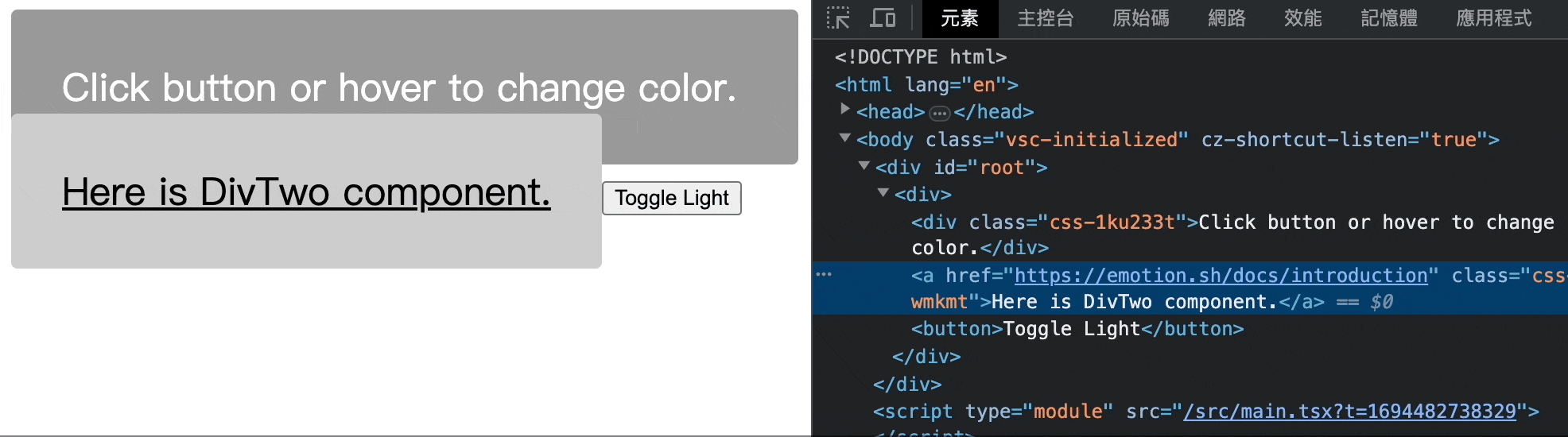
可以從開發者工具看到我的 div 確實被改變成了 a 標籤,並且點擊也真的出現了網頁跳轉的效果,但是因為 a 標籤預設 style 的問題,UI 的呈現上出現了一些不同的狀況。
我個人在開發時會避免使用 as 標籤來修改元件的標籤,因為每個標籤都會有自己預設的 style,如果透過 as 來修改標籤,有可能導致設定的 style 不起作用。
另外相似的工具還有 styled-component,語法跟用法非常接近,但是 emotion 在 package 的 size 上比 styled-component 來的要小一點。
下一篇簡單介紹全域管理工具 Zustand
如果內容有誤再麻煩大家指教,我會盡快修改。
這個系列的文章會同步更新在我個人的 Medium,歡迎大家來看看 👋👋👋
Medium


 iThome鐵人賽
 看影片追技術