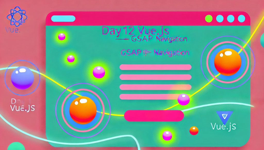
哈囉各位!今天我們要來搞點大動作,帶大家一起用 Vue.js 和 GSAP 打造一個超吸睛的導航欄!
✨導航不再只是靜靜地躺在頁面的角落,而是能夠呼吸、會動的互動小精靈~🚀
想像一下,一個會「呼吸」的背景、會輕輕起伏的導航欄,彷彿在隨時準備迎接你的點擊;
還有那個神奇的漢堡選單,點一下就像魔法般炫酷地淡入展開!🍔🎉
今天我們就要實作這個充滿品牌感的動效導航,讓你的網站瞬間躍升到下一個層次,絕對讓你愛不釋手!
準備好跟我一起探險了嗎?讓我們開始這場動效導航的奇幻旅程吧!🪄✨

結合 GSAP 與 Vue.js 對開發者而言有許多優勢:
GSAP 提供精確且高效的動畫控制,讓開發者輕鬆實現複雜的動畫效果,而 Vue.js 的響應式設計則能動態響應使用者行為。
縮短開發時間,還提高了程式碼的可維護性,讓動效的實現更加直觀和靈活,提升整體開發體驗。
安裝與下載指令
npm install gsap
npm install @types/greensock
@types/greensock為 Typescript 提供型別
這段程式碼讓我們的導航品牌菜單變得超級有活力!
透過 Vue.js 和 GSAP 的強大組合,為你打造了一個會呼吸的背景、互動感十足的選單項目滑動效果,還有那酷炫的漢堡選單開關動畫。
接下來就讓我帶你一起深入了解這些有趣的動畫設計,讓導航菜單成為頁面上的小明星吧!
<script lang="ts" setup>
import { ref, onMounted, nextTick } from 'vue';
import { gsap, Power1, Power2, Power4, Back } from 'gsap';

// Define the paths for the breathing animation
const breathingPath = "M 189,80.37 C 243,66.12 307.3,87.28 350.9,124.1 389.3,156.6 417,211.2 418.1,263.4 419.1,305.7 401.8,355.6 368.5,379.1 298.8,428 179.2,446.4 117.6,386.3 65.4,335.3 78.55,230.3 105.5,160.5 119.7,123.6 152.6,89.85 189,80.37 Z";

const menuInner = ref<HTMLElement | null>(null);
const menuTrigger = ref<HTMLElement | null>(null);
const menuInnerBackgroundItem = ref<NodeListOf<HTMLElement> | null>(null);
const menuItem = ref<NodeListOf<HTMLElement> | null>(null);
const menuItemsShape = ref<HTMLElement | null>(null);
const menuClose = ref<HTMLElement | null>(null);
const linksWrapper = ref<HTMLElement | null>(null);
const menuItems = ref<HTMLElement | null>(null);
const activeItem = ref<HTMLElement | null>(null);
const menuItemsShapePath = ref<SVGPathElement | null>(null);
const logoShape = ref<SVGPathElement | null>(null);

const menuText: string[] = ['Home', 'About', 'Hover Me', 'Contact'];

// Open Menu
const openMenu = () => {
  if (timeline) {
    timeline.play();
  }
};

// Close Menu
const closeMenu = () => {
  if (timeline) {
    timeline.timeScale(1.25);
    timeline.reverse();
  }
};

const handleMouseEnter =  (index: number) => {
  const items = menuItems.value?.querySelectorAll('li') as NodeListOf<HTMLLIElement> | undefined;
  const shape = menuItemsShape.value;

  // Check if both menuItems and menuItemsShape are defined
  if (!items || !shape) {
    console.error('menuItems or menuItemsShape is not defined.');
    return;
  }

  // Validate index is within bounds
  if (index < 0 || index >= items.length) {
    console.error(`Index ${index} is out of bounds.`);
    return;
  }

  const targetItem = items[index];

  // Validate targetItem is an HTMLElement
  if (!(targetItem instanceof HTMLElement)) {
    console.error('Target item is not an HTMLElement. Index:', index);
    return;
  }

  const itemPosition = targetItem.offsetTop;
  console.log('Target item position:', itemPosition);

  // Move shape to the hovered item position
  gsap.to(shape, {
    y: itemPosition,
    duration: 0.4,
    ease: 'power2.out',
  });
}


const handleMouseLeave = ()=> {
  // 這裡可以設置形狀回到預設位置或保持當前位置
  if (menuItemsShape.value && activeItem.value) {
    const activeItemPosition = activeItem.value.offsetTop;
    gsap.to(menuItemsShape.value, {
      y: activeItemPosition,
      duration: 0.4,
      ease: Power2.easeOut,
    });
  }
}

let timeline: gsap.core.Timeline;

onMounted(async () => {
  // 確保 DOM 完全渲染後再初始化 GSAP
  await nextTick();
  // 確認 menuItems 是否正確綁定並包含 <li> 元素
  console.log('menuItems:', menuItems.value); // 應該顯示 <ul> 元素

  // 檢查元素是否存在,防止 target not found 錯誤
  if (!menuInner.value || !menuTrigger.value || !menuClose.value || !logoShape.value) {
    console.error('GSAP target not found');
    return;
  }

  // Initialize GSAP timeline for the menu animation
  timeline = gsap.timeline({ paused: true });

  // 加入呼吸效果的動畫
  gsap.to(logoShape.value, {
    attr: { d: breathingPath },
    duration: 2,
    repeat: -1,
    yoyo: true,
    ease: "power1.inOut",
  });

  timeline
    .to(menuInner.value, {
      autoAlpha: 1,
      duration: 1,
      ease: Power4.easeOut,
      onStart: () => console.log('Animation started'),
    })
    .fromTo(
      menuItems.value, // 選單項目進入動畫
      { y: -50, autoAlpha: 0 }, // 從螢幕外的位置進入
      { y: 0, autoAlpha: 1, stagger: 0.1, ease: Power4.easeOut },
      'start'
    )
    .fromTo(
      menuInnerBackgroundItem.value,
      { x: '-100%', autoAlpha: 0 },
      { x: '0%', autoAlpha: 1, ease: Power1.easeOut },
      'start'
    )
    .fromTo(
      menuItem.value,
      { x: -30, autoAlpha: 0 },
      {
        x: 0,
        autoAlpha: 1,
        stagger: 0.15,
        delay: 0.35,
        duration: 0.4,
        ease: Back.easeOut.config(1),
      },
      'start'
    )
    .fromTo(
      menuItemsShape.value,
      { scale: 0.7, autoAlpha: 0 },
      {
        scale: 1,
        autoAlpha: 1,
        duration: 0.25,
        delay: 0.95,
        ease: Back.easeOut.config(1.7),
      },
      'start'
    )
    .fromTo(
      menuClose.value,
      { x: -10, autoAlpha: 0 },
      { x: 0, autoAlpha: 1, duration: 0.2, delay: 1, ease: Power1.easeOut },
      'start'
    );
});

</script>

<template>
  <!-- Main Menu Container -->
  <div class="menu font-mono">
    <!-- Menu Trigger Button -->
    <button ref="menuTrigger" @click="openMenu" class="menu__trigger js-menu-trigger">
      <span>MENU</span>
    </button>

    <!-- Logo Section -->
    <div class="menu__logo">
      <svg viewBox="0 0 500 500">
        <defs>
          <linearGradient id="main-gradient" x1="0%" y1="0%" x2="100%" y2="0%">
            <stop offset="0%" style="stop-color:#EE43BD;stop-opacity:1" />
            <stop offset="100%" style="stop-color:#FFD779;stop-opacity:1" />
          </linearGradient>
        </defs>
        <path ref="logoShape" class="js-logo-shape" fill="url(#main-gradient)"
          d="M 378.1,121.2 C 408.4,150 417.2,197.9 411,245.8 404.8,293.7 383.5,341.7 353.4,370.7 303.2,419.1 198.7,427.7 144.5,383.8 86.18,336.5 67.13,221.3 111.9,161 138.6,125 188.9,99.62 240.7,90.92 292.4,82.24 345.6,90.32 378.1,121.2 Z">
        </path>
      </svg>
      <h1>SUNNY CATT</h1>
    </div>
    <!-- End of Logo Section -->

    <!-- Inner Menu Container -->
    <div ref="menuInner" class="menu__inner js-menu-inner">
      <!-- Animated Background Elements -->
      <ul ref="menuInnerBackgroundItem" class="menu__inner-background js-menu-inner-background">
        <li v-for="index in 5" :key="index">
          <i class="after:content-empty after:block after:h-full after:w-[1px] after:bg-[#edeff5] after:z-2"></i>
        </li>

      </ul>
      <!-- End of Background Elements -->

      <!-- Menu Items Section -->
      <div ref="linksWrapper" class="relative pl-[22px]">
        <ul ref="menuItems" class="relative z-1">


          <li v-for="(item, index) in menuText" :key="index" class="js-menu-item mb-[8px]"
            @mouseenter="handleMouseEnter(index)" @mouseleave="handleMouseLeave">
            <a class="text-[#282828] no-underline text-[50px] leading-[50px] uppercase block tracking-[-1.2px] font-black"
              href="#">{{ item }}</a>
          </li>


        </ul>
        <!-- Shape that follows the hover -->
        <div ref="menuItemsShape" class="absolute left-[-32px] top-[-60px] js-menu-items-shape">
          <svg class="relative block w-[140px] h-[140px] min-h-[150px] m-0 mx-auto" viewBox="0 0 500 500">
            <path ref="menuItemsShapePath" id="object" class="js-items-shape-path" fill="url(#main-gradient)"
              d="M 418.1,159.8 C 460.9,222.9 497,321.5 452.4,383.4 417.2,432.4 371.2,405.6 271.3,420.3 137.2,440 90.45,500.6 42.16,442.8 -9.572,381 86.33,289.1 117.7,215.5 144.3,153.4 145.7,54.21 212.7,36.25 290.3,15.36 373.9,94.6 418.1,159.8 Z">
            </path>
          </svg>
        </div>
        <!-- End of Shape -->
      </div>
      <!-- End of Menu Items Section -->

      <!-- Close Button -->
      <button ref="menuClose" @click="closeMenu" class="menu__trigger menu__trigger--close ">
        <span>Close</span>
      </button>
      <!-- End of Close Button -->
    </div>
    <!-- End of Inner Menu Container -->
  </div>
  <!-- End of Main Menu Container -->
</template>

<style scoped>

@media only screen and (max-width: 600px) {
  body {
    display: block;
  }
}

<style>
主要元素介紹:
menuTrigger:
openMenu 函數,進而播放 GSAP 時間線上的菜單展開動畫。<button ref="menuTrigger" @click="openMenu" class="menu__trigger js-menu-trigger">
<span>MENU</span>
</button>
menuInner:
<div ref="menuInner" class="menu__inner js-menu-inner">
   <!-- 背景動畫、選單項目、關閉按鈕等 -->
</div>
menuItems:
handleMouseEnter 和 handleMouseLeave 函數來控制動畫效果。<ul ref="menuItems" class="relative z-1">
<li v-for="(item, index) in menuText" :key="index" class="js-menu-item mb-[8px]"
@mouseenter="handleMouseEnter(index)" @mouseleave="handleMouseLeave">
<a class="text-[#282828] no-underline text-[50px] leading-[50px] uppercase block tracking-[-1.2px] font-black"
href="#">{{ item }}</a>
</li>
</ul>
menuItemsShape:
<div ref="menuItemsShape" class="absolute left-[-32px] top-[-60px] js-menu-items-shape">
   <svg class="relative block w-[140px] h-[140px] min-h-[150px] m-0 mx-auto" viewBox="0 0 500 500">
      <path ref="menuItemsShapePath" id="object" class="js-items-shape-path" fill="url(#main-gradient)"
            d="M 418.1,159.8 C 460.9,222.9 497,321.5 452.4,383.4 417.2,432.4 371.2,405.6 271.3,420.3 137.2,440 90.45,500.6 42.16,442.8 -9.572,381 86.33,289.1 117.7,215.5 144.3,153.4 145.7,54.21 212.7,36.25 290.3,15.36 373.9,94.6 418.1,159.8 Z">
      </path>
   </svg>
</div>
menuClose:
closeMenu 函數,並倒轉時間線動畫,將菜單收回隱藏。<button ref="menuClose" @click="closeMenu" class="menu__trigger menu__trigger--close">
<span>Close</span>
</button>
GSAP 是這段程式碼的核心,負責處理導航菜單的各種動畫效果,包括開關菜單、滑鼠互動,以及背景的呼吸動畫。
主要 GSAP 動畫設計:
呼吸效果:
to 方法實現「呼吸」動畫,這個動畫會不斷地改變 logoShape(SVG)的路徑,製造出輕微的起伏效果。repeat: -1 表示動畫無限重複,yoyo: true 使動畫在播放完畢後反方向播放,創造出連續不斷的效果。gsap.to(logoShape.value, {
attr: { d: breathingPath },
duration: 2,
repeat: -1,
yoyo: true,
ease: "power1.inOut",
});
時間線動畫 (timeline):
timeline 是一個時間線物件,可以將多個動畫序列化並統一控制。menuInner 漸漸顯現,然後逐一播放選單項目進入、背景元素的滑動、形狀的展現等動畫。timeline = gsap.timeline({ paused: true });
timeline
.to(menuInner.value, {
autoAlpha: 1,
duration: 1,
ease: Power4.easeOut,
onStart: () => console.log('Animation started'),
})
.fromTo(
menuItems.value,
{ y: -50, autoAlpha: 0 },
{ y: 0, autoAlpha: 1, stagger: 0.1, ease: Power4.easeOut },
'start'
)
.fromTo(
menuInnerBackgroundItem.value,
{ x: '-100%', autoAlpha: 0 },
{ x: '0%', autoAlpha: 1, ease: Power1.easeOut },
'start'
)
.fromTo(
menuItem.value,
{ x: -30, autoAlpha: 0 },
{
x: 0,
autoAlpha: 1,
stagger: 0.15,
delay: 0.35,
duration: 0.4,
ease: Back.easeOut.config(1),
},
'start'
)
.fromTo(
menuItemsShape.value,
{ scale: 0.7, autoAlpha: 0 },
{
scale: 1,
autoAlpha: 1,
duration: 0.25,
delay: 0.95,
ease: Back.easeOut.config(1.7),
},
'start'
)
.fromTo(
menuClose.value,
{ x: -10, autoAlpha: 0 },
{ x: 0, autoAlpha: 1, duration: 0.2, delay: 1, ease: Power1.easeOut },
'start'
);
這段 GSAP 的 timeline 動畫設計了導航菜單開啟時的一連串動畫效果,透過細膩的設計讓各個元素以不同的方式進場,提升整體視覺效果和互動感。
以下是對各個動畫段落及其參數的詳細說明與設計用意:
timeline = gsap.timeline({ paused: true });
timeline.to(menuInner.value, {...})
autoAlpha: 1: 將 menuInner 元素的透明度和可見性調整為顯示狀態。duration: 1: 動畫持續 1 秒,給予使用者足夠的時間感受動畫的進場。ease: Power4.easeOut: 使用 Power4 緩動效果,讓動畫以快速進入、緩慢結束的方式出現,營造平滑的感覺。onStart: 開始動畫時觸發,這裡簡單打個 log 確認動畫開始。timeline.fromTo(menuItems.value, {...}, {...}, 'start')
from: 起始狀態設置為 y: -50 和 autoAlpha: 0,意味著選單項目從視窗外上方進入,且初始是隱藏的。to: 最終狀態設置為 y: 0 和 autoAlpha: 1,選單項目進場後回到正常位置且完全顯示。stagger: 0.1: 項目之間以 0.1 秒的間隔進入,讓進場效果更有節奏感。ease: Power4.easeOut: 使用柔和且有力度的緩動效果,進場的過程看起來自然不突兀。timeline.fromTo(menuInnerBackgroundItem.value, {...}, {...}, 'start')
from: 初始狀態設置為 x: '-100%' 和 autoAlpha: 0,意味著背景元素從左側滑入。to: 目標狀態為 x: '0%' 和 autoAlpha: 1,背景元素回到預設位置並完全顯示。ease: Power1.easeOut: 使用 Power1 緩動效果,使背景移動自然且迅速。timeline.fromTo(menuItem.value, {...}, {...}, 'start')
from: 起始位置為 x: -30 和 autoAlpha: 0,項目從畫面左側進入,且初始狀態為隱藏。to: 最終狀態為 x: 0 和 autoAlpha: 1,項目進場到正常位置並顯示。stagger: 0.15: 每個項目之間延遲 0.15 秒進入,讓項目出現更具節奏感。delay: 0.35: 整體動畫延遲 0.35 秒開始,使項目在背景出現後再進場。duration: 0.4: 動畫持續 0.4 秒,使得項目進場快速而不失細膩。ease: Back.easeOut.config(1): 使用帶有彈跳效果的 Back.easeOut,增加進場的活潑感。timeline.fromTo(menuItemsShape.value, {...}, {...}, 'start')
from: 起始狀態設為 scale: 0.7 和 autoAlpha: 0,形狀以縮小且隱藏狀態進入。to: 最終狀態設為 scale: 1 和 autoAlpha: 1,恢復正常尺寸並顯示。duration: 0.25: 動畫持續 0.25 秒,形狀快速展現。delay: 0.95: 延遲 0.95 秒開始,使形狀在背景和項目後才出現。ease: Back.easeOut.config(1.7): 使用彈跳感較強的緩動效果,使形狀展現時有點俏皮感。timeline.fromTo(menuClose.value, {...}, {...}, 'start')
from: 起始狀態為 x: -10 和 autoAlpha: 0,關閉按鈕從左側略微滑入。to: 目標狀態設為 x: 0 和 autoAlpha: 1,按鈕回到原位並顯示。duration: 0.2: 動畫持續 0.2 秒,按鈕迅速進場。delay: 1: 延遲 1 秒出現,保持在所有項目之後才顯示。ease: Power1.easeOut: 使用柔和的緩動效果,讓按鈕出現迅速但不突兀。互動動畫控制 (handleMouseEnter 和 handleMouseLeave):
handleMouseEnter 函數根據滑鼠移入的選單項目位置,使用 GSAP 將 menuItemsShape 移動到相應的位置。handleMouseLeave 則負責控制當滑鼠離開時形狀的位置,可以保持在當前位置或回到預設位置。const handleMouseEnter = (index: number) => {
const items = menuItems.value?.querySelectorAll('li') as NodeListOf<HTMLLIElement> | undefined;
const shape = menuItemsShape.value;
if (!items || !shape) {
console.error('menuItems or menuItemsShape is not defined.');
return;
}
if (index < 0 || index >= items.length) {
console.error(`Index ${index} is out of bounds.`);
return;
}
const targetItem = items[index];
if (!(targetItem instanceof HTMLElement)) {
console.error('Target item is not an HTMLElement. Index:', index);
return;
}
const itemPosition = targetItem.offsetTop;
gsap.to(shape, {
y: itemPosition,
duration: 0.4,
ease: 'power2.out',
});
}
今天的導航菜單是不是超有趣?
用 GSAP 和 Vue.js 給導航欄注入了滿滿的生命力,感覺整個網頁都在和你互動~💫
不管是氣泡呼吸還是滑動效果,這些小巧思都在告訴我們:動效真的可以讓程式變得更可愛、更有趣!
希望大家在學習的路上,也能跟這些動效一樣充滿活力,不怕挑戰、勇敢創新~💕
下次再來一起玩更厲害的效果,讓我們的程式碼閃閃發光吧!✨🎉


 看影片追技術