

在日常前端開發中,radio 和 checkbox 是非常常用的表單元素,但瀏覽器預設的樣式往往不符合設計需求。因此,學會如何客製化這些元素樣式是每個前端設計師的必備技能之一。在這篇教學文中,我們將介紹如何使用 CSS 來客製化 radio 和 checkbox,而且進一步用 checkbox 做出一個開關按鈕 (Switch Button)。
本篇同步發表於 我的部落格
在之前的文章,我們曾經有提過:
#32 CSS 顏色變數 currentcolor、checkbox/radio 顏色、input placeholder、閃動的光標顏色、文字反白的顏色,混色的 color-mix()
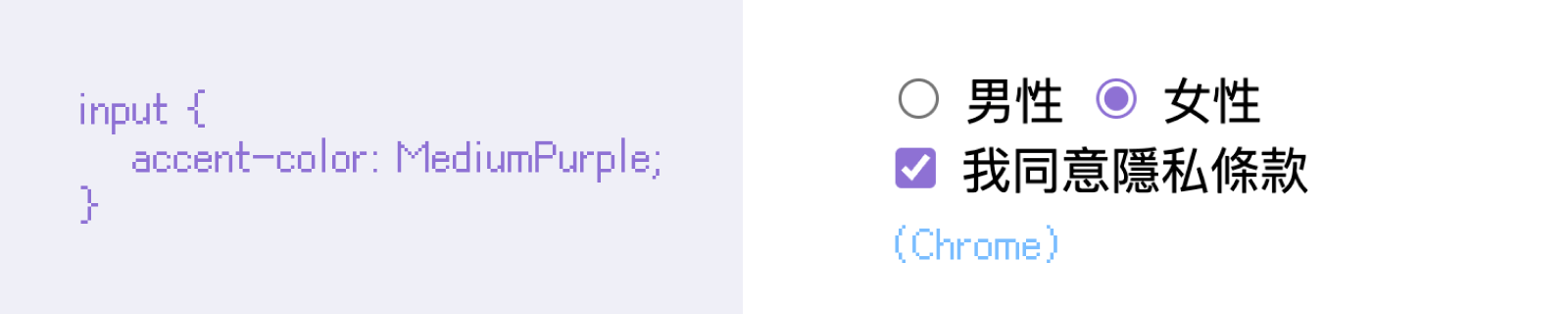
我們雖然無法改變瀏覽器中預設 input 勾選框的樣子,但是我們可以使用 CSS 中的
accent-color改變它們勾起來時的顏色,例如下面例子,我們將 radio 和 checkbox 改為紫色:
這是調整 radio 和 checkbox 最基本的方法,但是勾選框的樣子我們還是無法變更,會受到作業系統與瀏覽器的影響。
radio / checkbox 按鈕如果今天我們想要客製化自己的勾選框,必須善用:
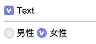
HTML 中 <label> 中的 for 屬性可以選取到 radio / checkbox 的 id 的特性,例如:
<div class="check-group">
    <input type="checkbox" id="check-1">
    <label for="check-1">Text</label> <!-- 點選文字可勾起 checkbox -->
</div>
CSS 中的選取兄弟的選擇器(~ 或 +),幫大家複習一下選擇器:
使用加號 + 是選取到後面的第一個
使用波浪號 ~ 是選取到後面全部兄弟
延伸閱讀:#08 CSS 選擇器總整理!id、class、:nth-child(n)、:not、:where、:is、:has 都難不倒我
CSS 中的偽類 ::checked。
DEMO: Custom radio/ checkbox
接著,有了這些知識後,我們就可以開始作出自訂的勾選框按鈕了!
我們的思路是:
首先,我們用 display: none 隱藏預設的 checkbox / radio 按鈕。
接著用選擇器 + 選到後面的 <label>,分別畫出「還沒勾選時」的按鈕圖形與文字樣式。
接著,用 :checked 調整「勾選時的樣子」,這邊使用多重背景設定了的勾勾圖片。
最後,做出 radio 與 checkbox 的分別,微調一下共用的樣式,並且補上一些 hover 效果就完成了。
<div class="check-group">
    <input type="checkbox" id="check-1">
    <label for="check-1" class="btn-check"></label>
    <label for="check-1" class="text-check">Text</label>
</div>
:root{
    --color-active: #7b84e1;
}

/* check style */
.check-group{
    input[type="checkbox"], input[type="radio"]{
        display: none;
        + label{
            vertical-align: middle;
        }
        + .btn-check{
            position: relative;
            display: inline-block;
            width: 0.9rem;
            height: 0.9rem;
            border: 2px solid #ccc;
            border-radius: .25rem;
            background-color: #eee;
            background-size: 60%;
            background-position: 50% 50%;
            background-repeat: no-repeat;
        }
        &:checked + .btn-check{
            background-color: var(--color-active);
            background-image: url(https://im1010ioio.github.io/super-easy-css/59/check-mark.svg);
            border-color: var(--color-active);
        }
    }
    input[type="radio"] + .btn-check{
        border-radius: 50%;
    }
}

/* hover and other style */
.check-group{
    display: inline-block;
    .btn-check, .text-check{
        cursor: pointer;
        transition: .3s;
    }
    &:hover {
        input[type="checkbox"], input[type="radio"]{
            + .btn-check{
                border-color: var(--color-active);
            }
            + .text-check{
                color: var(--color-active);
            }
        }
    }
}
我們可以用類似的概念去製作開關按鈕,不過有點不一樣的地方,就是:
這次我們使用 <label> 包住所有的內容,一樣也可以觸發裡面的 checkbox 。
使用 opacity: 0 隱藏預設的 checkbox,寬高都設為 0,並且加上 pointer-events: none 避免被誤按。
使用 .slider 來設計開關外觀,當 checkbox 被勾選後,透過 :checked 改變背景色及按鈕圓形位置(使用偽元素 ::before 做),達到開關按鈕的效果。
另外加上 :disabled 開和關時的樣式。

DEMO: Checkbox Switch Buttons
<label class="switch">
    <input type="checkbox">
    <span class="slider"></span>
</label>
.switch {
    position: relative;
    display: inline-block;
    width: 50px;
    height: 25px;
    input[type="checkbox"] {
        opacity: 0;
        width: 0;
        height: 0;
        pointer-events: none;
    }
}

.slider {
    position: absolute;
    top: 0;
    left: 0;
    right: 0;
    bottom: 0;
    background-color: #e9513a;
    transition: 0.4s;
    border-radius: 25px;
    cursor: pointer;
    &::before {
        content: "";
        position: absolute;
        width: 19px;
        height: 19px;
        top: 0;
        bottom: 0;
        margin: auto;
        left: 3px;
        background-color: white;
        transition: 0.4s;
        border-radius: 50%;
    }
}

.switch input[type="checkbox"]:checked + .slider {
    background-color: #4fbe79;
    &::before {
      transform: translateX(25px);
    }
}

.switch input[type="checkbox"]:disabled + .slider {
    cursor: not-allowed;
    background-color: #ccc;
}

.switch input[type="checkbox"]:disabled:checked + .slider {
    background-color: #545564;
}
這些小技巧能讓我們能夠製作出符合設計需求的 radio、checkbox 及開關按鈕 (Switch Button)。進一步,可以根據實際專案中的配色方案進行調整,搭配 CSS 變數一起管理樣式,讓你的 UI 元素更加一致。
不過,為了資安,有時可能會在表單不可編輯(Readonly)時,為避免有人使用前端偵錯工具,自行解除 input 的 disabled 狀態,再偷偷發送請求出去,所以會選擇在此時隱藏起 input。
然而,這樣一來,剛剛我們依賴著 input 所寫的樣式會全部壞掉。這時候就會需要另外寫 class 去處理,例如 .switch.is-checked 裡面的樣式和剛剛我們寫的 .switch input[type="checkbox"]:checked 一樣,所以修改後就會像下面這樣:
<label class="switch readonly">
    <span class="slider"></span>
</label>

<label class="switch readonly is-checked">
    <span class="slider"></span>
</label>
.switch input[type="checkbox"]:checked + .slider,
.switch.is-checked .slider{
    background-color: #4fbe79;
    &::before {
        transform: translateX(25px);
    }
}

.switch input[type="checkbox"]:disabled + .slider,
.switch.readonly .slider {
    cursor: not-allowed;
    background-color: #ccc;
}

.switch input[type="checkbox"]:disabled:checked + .slider,
.switch.readonly.is-checked .slider  {
    background-color: #545564;
}

 看影片追技術