<!DOCTYPE html>
<html lang="zh-Hant">
<head>
<meta charset="UTF-8">
<meta name="viewport" content="width=device-width, initial-scale=1.0">
<title>真實邏輯骰子翻轉</title>
<style>
body {
background: #fff0f6;
font-family: sans-serif;
display: flex;
flex-direction: column;
align-items: center;
justify-content: center;
min-height: 100vh; /* 改成 min-height,避免內容超出時截斷 */
padding: 2vh 4vw; /* 加入 padding 避免太擠 */
box-sizing: border-box; /* 確保 padding 不會影響布局 */
}
.dice-container {
width: 100px;
height: 100px;
perspective: 800px;
position: relative;
display: none; /* <-- 加這行:一開始隱藏 */
}
.dice {
width: 100%;
height: 100%;
position: absolute;
top: 0;
transform-style: preserve-3d;
}
.face {
position: absolute;
width: 100px;
height: 100px;
background: #e05555;
border: 2px solid #a55151;
border-radius: 20px;
font-size: 60px;
color: #ebebeb;
display: flex;
align-items: center;
justify-content: center;
font-weight: bold;
}
.face1 { transform: rotateY( 0deg) translateZ(50px); }
.face2 { transform: rotateY(180deg) translateZ(50px); }
.face3 { transform: rotateY( 90deg) translateZ(50px); }
.face4 { transform: rotateY(-90deg) translateZ(50px); }
.face5 { transform: rotateX( 90deg) translateZ(50px); }
.face6 { transform: rotateX(-90deg) translateZ(50px); }
button {
margin-top: 40px;
padding: 12px 24px;
font-size: 18px;
border: none;
border-radius: 10px;
background: #ff82aa;
color: white;
cursor: pointer;
box-shadow: 0 4px 10px rgba(0,0,0,0.15);
}
</style>
</head>
<body>
<div class="dice-container">
<div class="dice" id="dice">
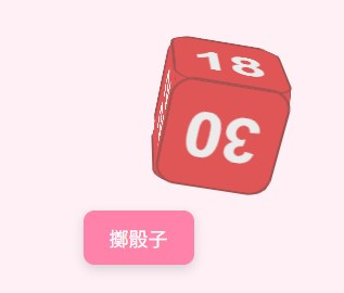
<div class="face face1">15</div>
<div class="face face2">18</div>
<div class="face face3">22</div>
<div class="face face4">25</div>
<div class="face face5">27</div>
<div class="face face6">30</div>
</div>
</div>
<button onclick="rollDice()">擲骰子</button>
<script>
const dice = document.getElementById('dice');
function isClose(a, b, tolerance = 20) {
return Math.abs(a - b) < tolerance;
}
function rollDice() {
const diceContainer = document.querySelector('.dice-container');
const display = getComputedStyle(diceContainer).display;
if (display === 'none') {
diceContainer.style.display = 'block';
}
const faces = {
1: [0, 0],
2: [0, 180],
3: [0, -90],
4: [0, 90],
5: [-90, 0],
6: [90, 0],
};
const result = Math.floor(Math.random() * 6) + 1;
const [baseX, baseY] = faces[result];
const offsetX = (Math.random() * 50 + 60 ).toFixed(0); // -100 ~ +100
const dropRotationX = 90 * (Math.random() > 0.5 ? 1 : -1);
const dropRotationY = 90 * (Math.random() > 0.5 ? 1 : -1);
// STEP 1: 初始狀態(在高處)
dice.style.transition = 'none';
dice.style.transform = `translateY(-300px) translateX(0px) rotateX(0deg) rotateY(0deg)`;
void dice.offsetWidth;
// STEP 2: 掉落 + 少量翻轉
dice.style.transition = 'transform 0.4s ease-in';
dice.style.transform = `
translateY(0px)
translateX(0px)
rotateX(${dropRotationX}deg)
rotateY(${dropRotationY}deg)
`;
// STEP 3: 彈開 + 主旋轉 + 結果面朝上
setTimeout(() => {
console.log(Math.floor(Math.random() * 1))
const extraX = 360 * (Math.floor(Math.random() * 1) + 0.5); // 轉1~2圈
const extraY = 360 * (Math.floor(Math.random() * 1) + 0.5);
const tiltX = -25; // 往上抬一點
const tiltY = 10; // 稍微往右
const finalX = baseX + extraX + tiltX;
const finalY = baseY + extraY + tiltY;
dice.style.transition = 'transform 1.2s ease-out';
dice.style.transform = `
translateY(0px)
translateX(${offsetX}px)
rotateX(${baseX + extraX + tiltX}deg)
rotateY(${baseY + extraY + tiltY}deg)
`;
// 判斷最終朝上哪面(加 tolerance)
setTimeout(() => {
const trueX = baseX + extraX;
const trueY = baseY + extraY;
const x = ((trueX % 360) + 360) % 360;
const y = ((trueY % 360) + 360) % 360;
let faceIndex = '?';
if (isClose(x, 90) && isClose(y, 0)) faceIndex = 6;
else if (isClose(x, 270) && isClose(y, 0)) faceIndex = 5;
else if (isClose(x, 0) && isClose(y, 0)) faceIndex = 1;
else if (isClose(x, 0) && isClose(y, 180)) faceIndex = 2;
else if (isClose(x, 0) && isClose(y, 270)) faceIndex = 3;
else if (isClose(x, 0) && isClose(y, 90)) faceIndex = 4;
if (faceIndex !== '?') {
const topValue = dice.querySelector(`.face${faceIndex}`).textContent;
console.log(`🎯 朝上的數字是:${topValue}`);
} else {
console.log(`❓ 無法判斷最終朝上的面`);
}
}, 1200);
}, 400);
}
</script>
</body>
</html>
 nlstudio

 看影片追技術