多年前,我總是追求如何將數據圖表畫得「漂亮」。但在閱讀多本資料視覺化的書籍後,我體會到它其實是科學與美學的結合,而更多時候是「科學」──如何幫助人們拉近與數據的距離,進而輔助決策。
在我多年臨床試驗資料分析的工作經驗中,數據量龐大、變數複雜,如果只停留在表格或統計結果,往往難以快速掌握重點。資料分析的最終目標,不只是整理資料,而是如何透過合適的圖表設計將「重點」突顯出來。
因此,「資料視覺化」是一門美麗的科學,也是縮短資料與決策之間距離的橋樑。因為自身的喜愛與工作需要,讓我開始深耕並希望與大家分享。
此次的 30 天分享,將以自身向 Statistics Globe / Joachim Schork 的《Data Visualization in R Using ggplot2 & Friends》以及 Claus O. Wilke 的《Fundamentals of Data Visualization》學習心得與工作經驗為基礎。這兩個資源皆以 R 與 ggplot2 為核心,因此我選擇以此作為系列的起點。
在 R 語言的生態系中,ggplot2 幾乎是製圖的必學工具。它的設計理念基於 Grammar of Graphics,透過資料、座標系統、圖層、標度等元素的組合,提供了一種結構化且彈性的方式來建構圖表。這樣的設計不僅讓程式碼具備高度可讀性,也讓使用者能靈活地創建各種圖表。
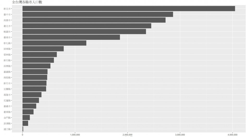
以下是一個最簡單的範例:
library(ggplot2)
library(scales)

ggplot(pop, aes(x = reorder(City, Population),
                y = Population)) +
  geom_col() +
  coord_flip() +
  scale_y_continuous(labels = comma) +
  labs(title = "全台灣各縣市人口數",
       x = "",
       y = "人口數")
https://ithelp.ithome.com.tw/upload/images/20250901/2017796477vdHDbOTT.jpg
只要短短幾行程式碼,就能生成一張清晰的長條圖,降低了資料探索的門檻,並幫助我們快速看出資料背後的模式。
這個系列的內容,預計包含三個層次:
ggplot2 的基本圖表開始,逐步延伸到進階技巧。此外,資料視覺化不只是「畫圖」,更包含設計原則。資料視覺化專家 Cara Thompson 就提出過 十個優化圖中文字的技巧,例如:減少對文字的依賴、簡潔化標註、善用顏色取代過度解釋、或給元素留白以提升可讀性。這些實務性的技巧將會在之後的文章逐步帶入,讓大家看到視覺化「技術 × 設計」的完整結合。
挑戰 30 天連續創作,對我來說不僅是紀律的鍛鍊,更是一趟技術與想法重新激盪的旅程。希望這個系列能幫助正在學 R 或對資料視覺化感興趣的讀者,一起體會如何讓數據說話,探索!資料背後的故事。
The journey of data visualization is not only about making charts look aesthetically pleasing, but more importantly about bridging the gap between data and decision-making. In my years of experience working with clinical trial data, I realized that massive and complex datasets often overwhelm readers if only presented as tables or raw statistics. Visualization, therefore, serves as a scientific yet artistic medium that highlights key insights and facilitates better communication.
For this 30-day challenge, I will build upon two foundational resources: Joachim Schork’s Data Visualization in R Using ggplot2 & Friends and Claus O. Wilke’s Fundamentals of Data Visualization. Both emphasize R and ggplot2, which is why this series begins with ggplot2 as the core tool. Its design philosophy, based on the Grammar of Graphics, allows data, aesthetics, layers, and scales to be combined flexibly and systematically.
The series will unfold in three layers: technical skills with ggplot2, real-world applications using clinical and business data, and design thinking such as storytelling and color schemes. Beyond code, I will also introduce practical design tips, like those summarized by data visualization expert Cara Thompson, to optimize the way we present text within visualizations. This journey will explore both the science and art of making data truly speak.
版主您好!非常感謝您分享如此專業且實用的文章。我很認同您將資料視覺化定義為「科學與美學的結合,更多是科學」,這句話點出了其核心價值在於輔助決策,而不是單純追求美觀。您從臨床試驗的實務經驗出發,並選擇 ggplot2 作為起點,非常具有說服力,也讓我對這個系列充滿期待!
特別期待在「設計思維」層次中,您將如何結合 Cara Thompson 的優化技巧,運用在 ggplot2 的實作上,想必能讓圖表不僅正確也更有效溝通。短短幾行程式碼就能繪製出清晰圖表的範例,也讓我感受到 ggplot2 的強大與彈性。
再次感謝您的無私分享,期待接下來的 30 天系列文!
也歡迎版主有空參考我的系列文「南桃AI重生記」:
https://ithelp.ithome.com.tw/users/20046160/ironman/8311


 iThome鐵人賽