大家好,歡迎來到第三天的旅程!在 Day2,我們定義了設計系統中最基礎的「原子」—顏色與字體排印。今天,我們要沿著「原子設計」的階梯向上,開始組合這些原子,創造出更具意義的
「分子 (Molecules)」。
但今天我們不只談論基礎的按鈕和輸入框。作為一位 Flutter 工程師,我們要探討的是 元件的藝術—如何運用Flutter 的進階特性,打造出既美觀又高效的 UI 分子。我們將深入探討:
這些技術不僅能讓你的元件更加精緻,更能體現出你對 Flutter 深度理解。
我們第一個要探討的,是如何設計一個類型安全、可擴展的按鈕系統。在我們的專案中,這個系統實作在lib/common/widgets/primary_button_widget.dart 和 button_types.dart,展現了清晰的架構思維。
在大型專案中,我們經常會遇到這樣的問題:
Color?double?解決方案:列舉驅動的設計系統
// lib/common/widgets/button_types.dart

/// 按鈕顏色主題 - 語義化的顏色選擇
enum ButtonColor {
  primary,    // 主要操作
  secondary,  // 輔助操作
  neutral,    // 一般操作
  disable,    // 禁用狀態
  warning,    // 警告操作
}

/// 按鈕尺寸 - 基於設計系統的標準尺寸
enum ButtonSize {
  small,   // 緊湊佈局
  medium,  // 一般佈局
  large,   // 重要操作
}

/// 按鈕樣式 - 視覺層次的漸進式設計
enum ButtonLevel {
  filled,  // 強調主要操作
  outline, // 次要操作
  text,    // 最輕量的操作
}

/// 按鈕狀態 - 支援狀態機模式
enum ButtonStatus {
  default_, // 正常狀態
  hover,    // 懸停狀態
}
💡 小知識:為什麼是
default_而不是default?眼尖的讀者可能會注意到我們用了 default_ 而非 default。這是因為 default 是 Dart 語言中的一個保留關鍵字,主要用於
switch 語句中。為了避免命名衝突,同時在語義上表達「預設」的含義,在變數或列舉值後方加上底線 _
是一種非常普遍且優雅的開發慣例。
這種設計的優勢:
思考完 API 設計後,我們就可以在 lib/common/widgets/ 下建立 primary_button_widget.dart
了。我們的實作比基礎版本更加完整,支援多種變體和狀態:
// lib/common/widgets/primary_button_widget.dart

// (imports omitted)

class PrimaryButtonWidget extends StatelessWidget {
  final String text;
  final VoidCallback? onPressed;
  final bool isLoading;
  final ButtonColor color;
  final ButtonSize size;
  final ButtonLevel level;
  final ButtonStatus status;
  final bool showIcon;
  final Widget? icon;
  final double? width;
  final double? height;

  const PrimaryButtonWidget({
    super.key,
    required this.text,
    this.onPressed,
    this.isLoading = false,
    this.color = ButtonColor.primary,
    this.size = ButtonSize.large,
    this.level = ButtonLevel.filled,
    this.status = ButtonStatus.default_,
    this.showIcon = true,
    this.icon,
    this.width,
    this.height,
  });

  @override
  Widget build(BuildContext context) {
    final bool isDisabled = _calculateDisabledState();
    final ButtonColor effectiveColor = _getEffectiveColor(isDisabled);
    final ButtonStatus effectiveStatus = _getEffectiveStatus(isDisabled);

    return SizedBox(
      width: width,
      height: height,
      child: _buildButton(effectiveColor, effectiveStatus, isDisabled),
    );
  }

  bool _calculateDisabledState() {
    return isLoading || onPressed == null;
  }

  ButtonColor _getEffectiveColor(bool isDisabled) {
    return isDisabled ? ButtonColor.disable : color;
  }

  ButtonStatus _getEffectiveStatus(bool isDisabled) {
    return isDisabled ? ButtonStatus.default_ : status;
  }

  Widget _buildButton(ButtonColor color, ButtonStatus status, bool isDisabled) {
    switch (level) {
      case ButtonLevel.filled:
        return _buildFilledButton(color, status, isDisabled);
      case ButtonLevel.outline:
        return _buildOutlineButton(color, status, isDisabled);
      case ButtonLevel.text:
        return _buildTextButton(color, status, isDisabled);
    }
  }

  // 其他輔助方法...
}
作為一位 Flutter 工程師,我們經常需要將設計師的創意精確地轉化為程式碼。當遇到複雜的 SVG 圖形時,CustomPainter 是我們的最佳武器。
在我們的專案中,我們有一個吉祥物 Cubi 的對話框,它需要精確地重現 Figma 設計稿的每一個細節。讓我們看看如何用CustomPainter 實現這個挑戰:
// lib/common/widgets/cubi_speech_bubble_widget.dart

class CubiSpeechBubbleWidget extends StatelessWidget {
  final String text;
  final Color? backgroundColor;
  final Color? borderColor;

  const CubiSpeechBubbleWidget({
    super.key,
    required this.text,
    this.backgroundColor,
    this.borderColor,
  });

  @override
  Widget build(BuildContext context) {
    return CustomPaint(
      painter: CubiSpeechBubblePainter(
        backgroundColor: backgroundColor ?? AppColors.orange200,
        borderColor: borderColor ?? AppColors.actionPrimary,
      ),
      child: Container(
        padding: EdgeInsets.only(
          top: AppSpacing.s,    // 12px
          bottom: AppSpacing.l, // 24px
          left: AppSpacing.xs,  // 8px
          right: AppSpacing.xs, // 8px
        ),
        child: Text(
          text,
          textAlign: TextAlign.center,
          style: AppTypography.heading4,
        ),
      ),
    );
  }
}
class CubiSpeechBubblePainter extends CustomPainter {
  final Color backgroundColor;
  final Color borderColor;

  @override
  void paint(Canvas canvas, Size size) {
    // 基於 Figma Union SVG (211x48) 的單一路徑重建
    final double scaleX = size.width / 211.0;
    final double scaleY = size.height / 48.0;

    final double bodyHeight = 39.0 * scaleY; // 矩形高度 (不含尾巴)
    final double r = 4.0 * (scaleX < scaleY ? scaleX : scaleY); // 4px 圓角

    // 尾巴座標(基於原始 SVG)
    final double tailLeftX = 99.8047 * scaleX;
    final double tailRightX = 110.195 * scaleX;
    final double tailTipX = 105.0 * scaleX;
    final double tailTipY = 48.0 * scaleY;

    final Path path = Path();

    // 從頂部左圓角開始,順時針繪製外輪廓
    path.moveTo(r, 0);
    path.lineTo(size.width - r, 0);
    path.arcToPoint(Offset(size.width, r), radius: Radius.circular(r));
    path.lineTo(size.width, bodyHeight - r);
    path.arcToPoint(Offset(size.width - r, bodyHeight), radius: Radius.circular(r));

    // 底邊:到尾巴右側起點
    path.lineTo(tailRightX, bodyHeight);
    // 尾巴:右 -> 尖 -> 左
    path.lineTo(tailTipX, tailTipY);
    path.lineTo(tailLeftX, bodyHeight);
    // 底邊:從尾巴左側到左下角前
    path.lineTo(r, bodyHeight);
    path.arcToPoint(Offset(0, bodyHeight - r), radius: Radius.circular(r));
    path.lineTo(0, r);
    path.arcToPoint(Offset(r, 0), radius: Radius.circular(r));
    path.close();

    // 填色
    final Paint fillPaint = Paint()
      ..color = backgroundColor
      ..style = PaintingStyle.fill;
    canvas.drawPath(path, fillPaint);

    // 邊框(單一路徑描邊,不會有交界線)
    if (borderColor != backgroundColor) {
      final Paint strokePaint = Paint()
        ..color = borderColor
        ..style = PaintingStyle.stroke
        ..strokeWidth = 1.0;
      canvas.drawPath(path, strokePaint);
    }
  }

  @override
  bool shouldRepaint(covariant CustomPainter oldDelegate) => false;
}
關鍵技術要點:
shouldRepaint 返回 false 避免不必要的重繪眼尖的讀者可能會發現,我們目前的 CubiSpeechBubblePainter 實作是基於 Figma 提供的固定寬高比 (211x48)
進行等比縮放的。這種做法的優點是能快速且精確地還原設計稿,但在面對不同寬高比的容器時,可能會導致圖形不成比例地拉伸。一個更健壯、更具響應性的做法是:不依賴任何固定的原始尺寸,而是將圓角、尾巴高度等定義為固定值,並讓所有繪製座標都動態地根據傳入的
size 參數來計算。那為什麼我們在這裡選擇了前一種做法呢?
主要是出於教學目的。本文的重點在於演示「如何將設計師提供的複雜 SVG Path 座標,精確地轉譯為 Flutter 中的
Path物件」這一核心技巧。基於固定比例的縮放,最能直接體現這一轉換過程。在理解了這個基礎之後,讀者們可以挑戰自己,嘗試實現一個完全響應式的版本,那將會是對 CustomPainter
更深層次的掌握!
下一個我們要探討的是如何用狀態機模式設計一個智能的輸入框。在我們的專案中,這個元件實作在lib/common/widgets/custom_input_field_widget.dart,展現了狀態機的強大威力。
在開始實作前,我們必須回答一個問題:為什麼不直接在每個頁面使用 TextFormField 並客製化其InputDecoration
呢?答案在於一致性、可維護性與邏輯封裝。我們客製化 CustomInputFieldWidget 的目的主要有三點:
統一全 App 的設計系統:我們希望 App 中所有的輸入框都有完全相同的視覺風格、動畫和互動行為。透過建立一個共用元件,我們可以確保設計的一致性,避免在
20 個不同的地方寫出 20 種微小差異的 InputDecoration。封裝複雜的狀態邏輯:一個輸入框的視覺狀態(如邊框顏色)可能取決於多個條件:是否聚焦(isFocused)
、是否有內容 (hasText)、是否有誤 (hasError) 等。如果用傳統的 if-else 來處理,邏輯會變得非常混亂。我們的
CustomInputFieldWidget將這些複雜的判斷全部封裝在一個清晰的「狀態機」(InputFieldStatus)
內部,讓元件的狀態轉換變得極其乾淨且可預測。這正是本節的重點。減少重複的樣板程式碼 (Boilerplate)
:每次都手動設定InputDecoration非常繁瑣。將其封裝後,我們只需要使用
,就能得到一個功能齊全、樣式統一的輸入框,大幅提升了開發效率。
傳統的輸入框設計通常用簡單的 boolean 來控制狀態,但這會導致:
isFocused && hasError && isTyping 等複雜條件解決方案:狀態機模式
/// 輸入框狀態列舉 - 定義所有可能的狀態
enum InputFieldStatus {
  default_,  // 預設狀態
  focus,     // 聚焦狀態
  typing,    // 輸入中狀態
  typed,     // 已輸入狀態
  error,     // 錯誤狀態
  overLimit  // 超出限制狀態
}
以下是我們的 CustomInputFieldWidget 狀態機的視覺化表示:
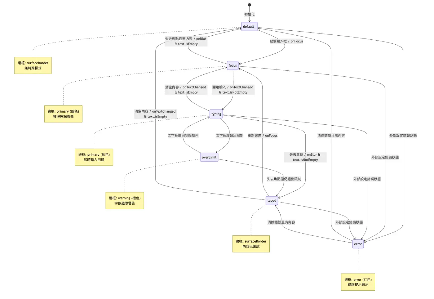
狀態轉換說明:
| 觸發條件 | 從狀態 | 到狀態 | 視覺變化 |
|---|---|---|---|
| 點擊輸入框 | default_ |
focus |
邊框變藍色 |
| 開始輸入 | focus |
typing |
保持藍色邊框 |
| 失去焦點(有內容) | typing |
typed |
邊框變回灰色 |
| 失去焦點(無內容) | focus |
default_ |
邊框變回灰色 |
| 清空內容 | typed |
default_ |
回到初始狀態 |
| 外部錯誤 | 任何狀態 | error |
邊框變紅色 |
| 字數超限 | typing |
overLimit |
邊框變橙色 |
class _CustomInputFieldState extends State<CustomInputFieldWidget> {
  late FocusNode _focusNode;
  bool _isFocused = false;

  /// 獲取當前狀態 - 狀態機的核心邏輯
  InputFieldStatus get _currentStatus {
    // 優先使用外部傳入的狀態(用於錯誤顯示等)
    if (widget.status != InputFieldStatus.default_) {
      return widget.status;
    }

    // 根據內部狀態智能判斷
    if (_isFocused && widget.controller.text.isNotEmpty) {
      return InputFieldStatus.typing;
    }
    if (_isFocused) {
      return InputFieldStatus.focus;
    }
    if (widget.controller.text.isNotEmpty) {
      return InputFieldStatus.typed;
    }
    if (widget.maxLength != null &&
        widget.controller.text.length > widget.maxLength!) {
      return InputFieldStatus.overLimit;
    }
    return InputFieldStatus.default_;
  }

  /// 根據狀態獲取邊框顏色 - 狀態驅動的樣式
  Color get _borderColor {
    switch (_currentStatus) {
      case InputFieldStatus.focus:
      case InputFieldStatus.typing:
        return AppColors.primary;  // 聚焦時使用主色
      case InputFieldStatus.typed:
        return AppColors.surfaceBorder;  // 已輸入時使用邊框色
      case InputFieldStatus.error:
        return AppColors.error;  // 錯誤時使用錯誤色
      case InputFieldStatus.overLimit:
        return AppColors.warning;  // 超出限制時使用警告色
      case InputFieldStatus.default_:
        return AppColors.surfaceBorder;  // 預設狀態
    }
  }
}
狀態機的優勢:
在 lib/features/activity/presentation/widgets/ 下建立 custom_input_field_widget.dart
。我們的實作比基礎版本更加完整,支援多種狀態和樣式:
// lib/features/activity/presentation/widgets/custom_input_field_widget.dart

// (imports omitted)

/// 輸入框狀態列舉
enum InputFieldStatus { default_, focus, typing, typed, error, overLimit }

class CustomInputFieldWidget extends StatefulWidget {
  final TextEditingController controller;
  final String? hintText;
  final String? labelText;
  final bool required;
  final int? maxLength;
  final int maxLines;
  final bool obscureText;
  final TextInputType? keyboardType;
  final TextInputAction? textInputAction;
  final String? Function(String?)? validator;
  final void Function(String)? onChanged;
  final void Function(String)? onSubmitted;
  final VoidCallback? onTap;
  final bool enabled;
  final bool readOnly;
  final bool autofocus;
  final TextCapitalization textCapitalization;
  final List<TextInputFormatter>? inputFormatters;
  final Widget? suffixIcon;
  final Widget? prefixIcon;
  final bool showCharacterCount;
  final FocusNode? focusNode;
  final InputFieldStatus status;
  final String? errorText;
  final String? helperText;

  const CustomInputFieldWidget({
    super.key,
    required this.controller,
    this.hintText,
    this.labelText,
    this.required = false,
    this.maxLength,
    this.maxLines = 1,
    this.obscureText = false,
    this.keyboardType,
    this.textInputAction,
    this.validator,
    this.onChanged,
    this.onSubmitted,
    this.onTap,
    this.enabled = true,
    this.readOnly = false,
    this.autofocus = false,
    this.textCapitalization = TextCapitalization.none,
    this.inputFormatters,
    this.suffixIcon,
    this.prefixIcon,
    this.showCharacterCount = false,
    this.focusNode,
    this.status = InputFieldStatus.default_,
    this.errorText,
    this.helperText,
  });

  @override
  State<CustomInputFieldWidget> createState() => _CustomInputFieldState();
}

class _CustomInputFieldState extends State<CustomInputFieldWidget> {
  late FocusNode _focusNode;
  bool _isFocused = false;

  @override
  void initState() {
    super.initState();
    _focusNode = widget.focusNode ?? FocusNode();
    _focusNode.addListener(_onFocusChanged);
  }

  @override
  void dispose() {
    if (widget.focusNode == null) {
      _focusNode.dispose();
    }
    super.dispose();
  }

  void _onFocusChanged() {
    setState(() {
      _isFocused = _focusNode.hasFocus;
    });
  }

  InputFieldStatus get _currentStatus {
    if (widget.status != InputFieldStatus.default_) {
      return widget.status;
    }
    if (_isFocused && widget.controller.text.isNotEmpty) {
      return InputFieldStatus.typing;
    }
    if (_isFocused) {
      return InputFieldStatus.focus;
    }
    if (widget.controller.text.isNotEmpty) {
      return InputFieldStatus.typed;
    }
    return InputFieldStatus.default_;
  }

  Color get _borderColor {
    switch (_currentStatus) {
      case InputFieldStatus.focus:
        return AppColors.primary;
      case InputFieldStatus.typing:
        return AppColors.primary;
      case InputFieldStatus.typed:
        return AppColors.surfaceBorder;
      case InputFieldStatus.error:
        return AppColors.error;
      case InputFieldStatus.overLimit:
        return AppColors.warning;
      case InputFieldStatus.default_:
        return AppColors.surfaceBorder;
    }
  }

  @override
  Widget build(BuildContext context) {
    return Column(
      crossAxisAlignment: CrossAxisAlignment.start,
      children: [
        if (widget.labelText != null) ...[
          Row(
            children: [
              if (widget.required)
                Text(
                  '*',
                  style: AppTypography.body2.copyWith(
                    color: AppColors.textAccent,
                  ),
                ),
              Text(
                widget.labelText!,
                style: AppTypography.body2.copyWith(
                  color: AppColors.textPrimary,
                ),
              ),
            ],
          ),
          SizedBox(height: AppSpacing.xs),
        ],
        Container(
          decoration: BoxDecoration(
            color: AppColors.surfaceWhite,
            borderRadius: BorderRadius.circular(4),
            border: Border.all(color: _borderColor, width: 1),
          ),
          child: TextFormField(
            controller: widget.controller,
            focusNode: _focusNode,
            maxLength: widget.maxLength,
            maxLines: widget.maxLines,
            obscureText: widget.obscureText,
            keyboardType: widget.keyboardType,
            textInputAction: widget.textInputAction,
            validator: widget.validator,
            onChanged: widget.onChanged,
            onFieldSubmitted: widget.onSubmitted,
            onTap: widget.onTap,
            enabled: widget.enabled,
            readOnly: widget.readOnly,
            autofocus: widget.autofocus,
            textCapitalization: widget.textCapitalization,
            inputFormatters: widget.inputFormatters,
            style: AppTypography.body1.copyWith(
              color: widget.enabled
                  ? AppColors.textPrimary
                  : AppColors.textTertiary,
            ),
            decoration: InputDecoration(
              hintText: widget.hintText,
              hintStyle: AppTypography.body1.copyWith(
                color: AppColors.textTertiary,
              ),
              prefixIcon: widget.prefixIcon,
              suffixIcon: widget.suffixIcon,
              border: InputBorder.none,
              enabledBorder: InputBorder.none,
              focusedBorder: InputBorder.none,
              errorBorder: InputBorder.none,
              focusedErrorBorder: InputBorder.none,
              disabledBorder: InputBorder.none,
              filled: false,
              contentPadding: EdgeInsets.symmetric(
                horizontal: AppSpacing.m,
                vertical: AppSpacing.s,
              ),
              counterText: '',
            ),
          ),
        ),
        if (widget.showCharacterCount && widget.maxLength != null) ...[
          SizedBox(height: AppSpacing.xxs),
          Align(
            alignment: Alignment.centerRight,
            child: Text(
              '${widget.controller.text.length}/${widget.maxLength}',
              style: AppTypography.caption.copyWith(
                color: AppColors.textTertiary,
              ),
            ),
          ),
        ],
      ],
    );
  }
}
今天,我們深入探討了 Flutter 元件的藝術,從基礎的按鈕設計到進階的 CustomPainter
實作,從狀態機模式到效能優化技巧。這些技術不僅能讓你的元件更加精緻,更能體現出你對 Flutter 的深度理解。
技術要點總結:
把東西做成「分子」:可複用、可組合、可維護
與其關注元件應該放在哪個資料夾,更重要的是把元件設計成「分子 (Molecules)」:
當元件具備「分子」的特性時,它自然能在專案中正確落位:真正通用者可被多處重用,特定情境者則作為更大「有機體」的一部分被使用。重點是設計品質,而非目錄位置。
現在,我們的「樂高」零件箱裡已經有了幾個高品質的積木。明天,我們將把焦點轉向多國語系與本地化
,讓這些元件在不同語言與文化情境下依然保持一致、易讀且好用。
在 Day 4,我們會實作完整的國際化基礎設施:包含 flutter_localizations 與 intl 的整合、ARB
翻譯資源管理、動態語言切換,以及日期與數字等常見格式化的最佳實踐,並說明如何讓 UI 元件在多語系下自然排版與顯示。
期待與您在 Day 4 相見!

 看影片追技術