認真的研究一下發現對前端工程師來說,一值都這樣寫啊
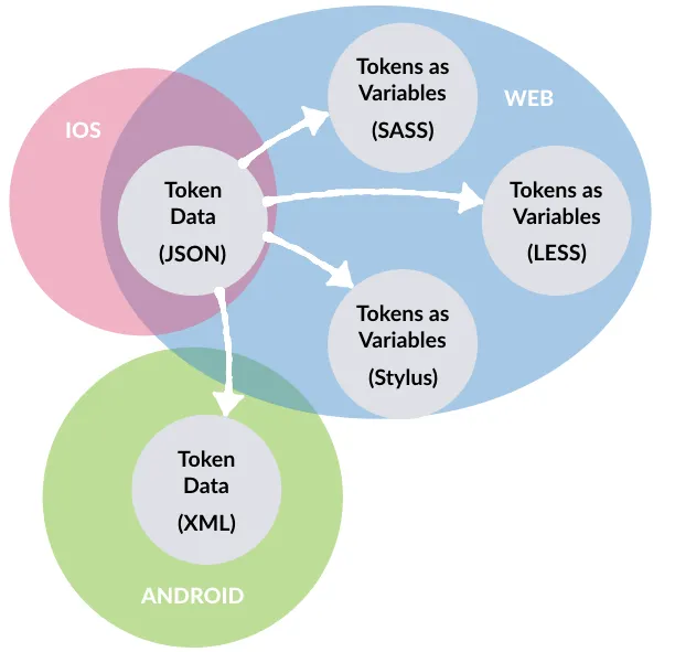
對Token這個單字並不陌生,在驗證身分系統中可以理解為識別證,在加密貨幣中可以理解為數字資產,在LLM中他是語言文本的基本單位。簡單來說,Design Tokens 的目的主要有兩個:
color.brand.primary、space.md),改動一次即可在整個產品線同步。參考了Nathan Curtis的文章來列出時間點後,發現在十年前的文章中就已經基礎概念 — 「透過JSON讓這些Token重複使用在不同平台中」。
以下透過按紐來呈現差異
 {
   "color": {
     "brand": {
       "primary": { "default": "#2C3E50", "hover": "#334A5E", "active": "#243444" }
     },
     "text": { "onBrand": "#FFFFFF" }
   },
   "radius": { "md": "10px" },
   "spacing": { "sm": "8px", "lg": "16px" },
   "font": { "size": { "md": "16px" }, "weight": { "bold": 700 } }
 }
 :root {
   /* Colors */
   --color-bg: #F8F7F3;
   --color-paper-edge: #E9E6DB;
   --color-text: #2A2A2A;
   --color-text-muted: #6F6B63;
   --color-brand: #2C3E50;
   --color-brand-hover: #334A5E;
   --color-brand-active: #243444;
   --color-accent: #C97C2E;
   --color-border: #D9D4C8;

   /* Typography */
   --ff-heading: Georgia, serif;
   --ff-body: Inter, system-ui, -apple-system, Segoe UI, Roboto, sans-serif;
   --ff-typewriter: 'Special Elite', ui-monospace, SFMono-Regular, Menlo, monospace;
   --fs-xs: 12px; --fs-sm: 14px; --fs-md: 16px; --fs-lg: 20px; --fs-xl: 32px;
   --fw-regular: 400; --fw-medium: 500; --fw-bold: 700;
   --lh-tight: 1.2; --lh-normal: 1.6;

   /* Spacing, radius, shadow */
   --sp-xs: 4px; --sp-sm: 8px; --sp-md: 16px; --sp-lg: 24px; --sp-xl: 48px;
   --radius-sm: 6px; --radius-md: 10px;
   --shadow-card: 0 8px 20px rgba(0,0,0,.06);
 }

 :root[data-theme="dark"] {
   --color-bg: #121212;
   --color-paper-edge: #1B1B1B;
   --color-text: #EDEDED;
   --color-text-muted: #A7A7A7;
   --color-brand: #9BB7D7;
   --color-brand-hover: #A6C1DE;
   --color-brand-active: #86A5C3;
   --color-accent: #E6A86B;
   --color-border: #2A2A2A;
   --shadow-card: 0 8px 20px rgba(0,0,0,.5);
 }

 /* Base usage (optional examples) */
 body {
   background: var(--color-bg);
   color: var(--color-text);
   font-family: var(--ff-body);
 }

 /* Button using tokens */
 .btn {
   display: inline-flex; align-items: center; justify-content: center;
   font-size: var(--fs-md); font-weight: var(--fw-bold);
   padding: var(--sp-sm) var(--sp-lg); border-radius: var(--radius-md);
   user-select: none; border: 0; cursor: pointer;
   transition: filter .15s ease, transform .1s ease, background-color .15s ease;
 }
 .btn--primary {
   background: var(--color-brand); color: #fff;
 }
 .btn--primary:hover  { background: var(--color-brand-hover); }
 .btn--primary:active { background: var(--color-brand-active); transform: translateY(.5px); }
 .btn--primary:disabled { opacity: .6; cursor: not-allowed; }
省略一下設定
<button class="btn btn-primary">Get Started</button>
以前端的角度來說基本上就是「CSS Variables」,改一個地方全部 UI 就會跟著更新,這幾年開發的方式一直都是這樣,只是不知道原來這就是最近經常聽到的Design token。
近年討論升溫,主因包括:
對我而言,第 3 點與第 5 點特別關鍵:Figma 今年加入 AI 生成功能,而在使用 AI Agent 時,若能提供一套清楚的規格,才能穩定輸出一致的結果;Design Tokens正是最適合的輸入格式與約束。
明天想嘗試使用LLM和AI協作來產生Design token,透過這些token讓 Figma AI服務產生更符需求的個人網站 UI。


 看影片追技術