在使用 Animate UI 時,若想打造更具個人風格的動畫效果,MotionGrid 是非常實用的元件。它能讓我們以點陣的方式靈活排列元素,進而組合出獨特的動畫呈現。
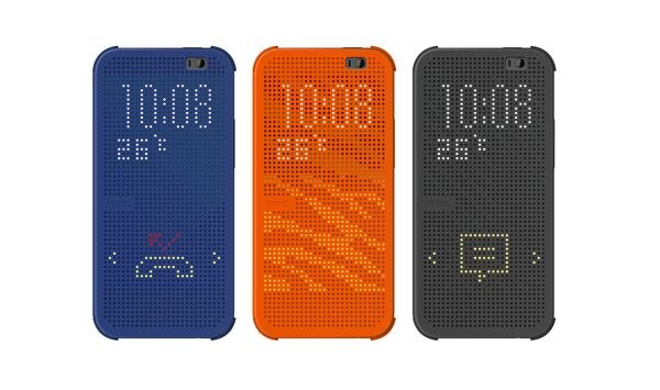
這種設計概念並不陌生,像是過去 HTC 推出的 DOT VIEW 炫彩顯示保護套,便是透過點陣排列展現出兼具趣味與實用的效果。
近期大熱的 Nothing Phone 與其 Nothing OS 介面中,也廣泛融入點陣設計,展現出簡潔又具辨識度的視覺風格。

▲ 10 Widgets 10 Days 2.0 | Widget Concepts for NothingOS
透過 framer-motion 提供的動畫屬性,結合 Animate UI 整合方便的參數控制,使我們可以輕鬆控制點陣列,讓整體排版既富創意又兼具實用性。

使用 Shadcn CLI 加入 Motion Grid
npx shadcn@latest add @animate-ui/primitives-animate-motion-grid
製作想要的點元素陣列
前往 Animate UI Motion Grid Editor 可以創造出自己喜歡的點陣圖元素。

製作完成後,按下 Copy Animation

Small Tips 1: 可以透過用滑鼠拖曳的方式來畫點元素,不過記得隨時存檔,用拉動的蠻容易讓網頁 Crash
Small Tips 2: 按下儲存只會存在 Local 的瀏覽器內部,不會對外流出 🤗
Import 元件並將元件放在想要的位置上
import {
    MotionGrid,
    MotionGridCells,
    type Frames,
} from '@/components/animate-ui/primitives/animate/motion-grid';

const frames = <剛剛 Copy Animation> as Frames;

<MotionGrid gridSize={[5, 5]} frames={frames}>
    <MotionGridCells />
</MotionGrid>
frames 的用途是定義點陣列的排列,可從步驟 2 複製出來
這邊若有想要搭配其他元件作使用 e.g. Button,為了減少不必要的元件包裝,這邊使用 motion.button 作為 Button 使用。
這邊來示範幾個客製的 Motion Grid
const arrowUp = [[], [[3, 6]], [[3, 5], [3, 6], [2, 6], [4, 6]], [[3, 4], [3, 5], [3, 6], [2, 5], [4, 5], [1, 6], [2, 6], [4, 6], [5, 6]], [[3, 3], [3, 4], [3, 5], [3, 6], [2, 5], [1, 5], [2, 4], [4, 4], [4, 5], [5, 5]], [[3, 2], [3, 3], [3, 4], [3, 5], [3, 6], [2, 4], [1, 4], [2, 3], [4, 3], [4, 4], [5, 4]], [[3, 2], [3, 3], [3, 4], [3, 5], [3, 1], [2, 2], [4, 2], [1, 3], [2, 3], [4, 3], [5, 3], [3, 6]], [[3, 2], [3, 3], [3, 4], [3, 5], [3, 1], [2, 2], [4, 2], [2, 1], [3, 0], [1, 2], [4, 1], [5, 2]], [[3, 2], [3, 3], [3, 4], [3, 1], [2, 1], [3, 0], [4, 1], [2, 0], [1, 1], [4, 0], [5, 1]], [[3, 2], [3, 3], [3, 1], [3, 0], [2, 0], [4, 0], [1, 0], [5, 0]], [[3, 2], [3, 1], [3, 0]], [[3, 1], [3, 0]], [[3, 0]], []] as Frames;


export default function Home() {

return (
    ...

    <motion.button
        layout
        whileHover={{ scale: 1.05 }}
        whileTap={{ scale: 0.95 }}
        className="px-3 h-11 gap-x-3 relative bg-primary inline-flex items-center justify-center"
    >
        <motion.div layout="preserve-aspect">
        <MotionGrid
            gridSize={[7, 7]}
            frames={arrowUp}
            className="w-fit gap-0.5"
        >
            <MotionGridCells className="size-[3px] rounded-full aspect-square bg-white/20 dark:bg-black/20 data-[active=true]:bg-white/70 dark:data-[active=true]:bg-black/70" />
        </MotionGrid>
        </motion.div>

        <RotatingTextContainer
            text={'Arrow Up'}
            className="absolute left-[60px] top-1/2 -translate-y-1/2"
        >
        <RotatingText
            layout="preserve-aspect"
            className="text-primary-foreground"
        />
        </RotatingTextContainer>

        <span className="invisible opacity-0" aria-hidden>
            {'Arrow Up'}
        </span>
    </motion.button>
);
這邊的 <span> 用處比較像是確保 Button 有足夠空間可以把字放進去

const snakeFrames = [[[1, 5], [6, 7], [5, 7], [7, 7]], [[1, 5], [6, 7], [5, 7], [4, 7]], [[1, 5], [5, 7], [4, 7], [3, 7]], [[1, 5], [4, 7], [3, 7], [2, 7]], [[1, 5], [3, 7], [2, 7], [1, 7]], [[1, 5], [2, 7], [1, 7], [1, 6]], [[1, 5], [1, 7], [1, 6], [1, 4], [4, 3]], [[1, 5], [1, 6], [1, 4], [4, 3], [1, 3]], [[1, 5], [1, 4], [4, 3], [1, 3], [2, 3]], [[1, 3], [2, 3], [3, 3], [1, 4], [4, 3]], [[1, 3], [2, 3], [3, 3], [4, 3], [5, 3]], [[4, 3], [2, 3], [3, 3], [5, 3], [6, 3]], [[4, 3], [3, 3], [5, 3], [6, 3], [7, 3]], [[4, 3], [5, 3], [6, 3], [7, 3]], [[5, 3], [6, 3], [7, 3]], [[6, 3], [7, 3]], [[7, 3]], [], [], [[1, 1], [2, 1], [3, 1], [4, 1], [5, 1], [6, 1], [0, 2], [1, 2], [2, 2], [3, 2], [4, 2], [5, 2], [6, 2], [7, 2], [0, 3], [3, 3], [4, 3], [7, 3], [0, 4], [3, 4], [4, 4], [7, 4], [1, 5], [3, 5], [2, 5], [4, 5], [5, 5], [6, 5], [1, 6], [2, 6], [5, 6], [6, 6], [2, 7], [5, 7]], [[1, 1], [2, 1], [3, 1], [4, 1], [5, 1], [6, 1], [0, 2], [1, 2], [2, 2], [3, 2], [4, 2], [5, 2], [6, 2], [7, 2], [0, 3], [3, 3], [4, 3], [7, 3], [0, 4], [3, 4], [4, 4], [7, 4], [1, 5], [3, 5], [2, 5], [4, 5], [5, 5], [6, 5], [1, 6], [2, 6], [5, 6], [6, 6], [2, 7], [5, 7]], [[1, 1], [2, 1], [3, 1], [4, 1], [5, 1], [6, 1], [0, 2], [1, 2], [2, 2], [3, 2], [4, 2], [5, 2], [6, 2], [7, 2], [0, 3], [3, 3], [4, 3], [7, 3], [0, 4], [3, 4], [4, 4], [7, 4], [1, 5], [3, 5], [2, 5], [4, 5], [5, 5], [6, 5], [1, 6], [2, 6], [5, 6], [6, 6], [2, 7], [5, 7]], [[1, 1], [2, 1], [3, 1], [4, 1], [5, 1], [6, 1], [0, 2], [1, 2], [2, 2], [3, 2], [4, 2], [5, 2], [6, 2], [7, 2], [0, 3], [3, 3], [4, 3], [7, 3], [0, 4], [3, 4], [4, 4], [7, 4], [1, 5], [3, 5], [2, 5], [4, 5], [5, 5], [6, 5], [1, 6], [2, 6], [5, 6], [6, 6], [2, 7], [5, 7]], [[1, 1], [2, 1], [3, 1], [4, 1], [5, 1], [6, 1], [0, 2], [1, 2], [2, 2], [3, 2], [4, 2], [5, 2], [6, 2], [7, 2], [0, 3], [3, 3], [4, 3], [7, 3], [0, 4], [3, 4], [4, 4], [7, 4], [1, 5], [3, 5], [2, 5], [4, 5], [5, 5], [6, 5], [1, 6], [2, 6], [5, 6], [6, 6], [2, 7], [5, 7]]] as Frames;

<motion.button
      layout
      whileHover={{ scale: 1.05 }}
      whileTap={{ scale: 0.95 }}
      className="px-3 h-16 gap-x-3 relative bg-primary inline-flex items-center justify-center"
    >
      <motion.div layout="preserve-aspect">
        <MotionGrid
          gridSize={[8, 8]}
          frames={snakeFrames}
          className="w-fit gap-0.5"
        >
          <MotionGridCells className="size-[3px] rounded-full aspect-square bg-white/20 dark:bg-black/20 data-[active=true]:bg-white/70 dark:data-[active=true]:bg-black/70" />
        </MotionGrid>
      </motion.div>

      <RotatingTextContainer
        text={'貪吃蛇🐍'}
        className="absolute left-[60px] top-1/2 -translate-y-1/2"
      >
        <RotatingText
          layout="preserve-aspect"
          className="text-primary-foreground"
        />
      </RotatingTextContainer>

      <span className="invisible opacity-0" aria-hidden>
        {'貪吃蛇🐍'}
      </span>
</motion.button>
這邊有微調 motion.button 高度,讓邊緣較合理。詳細 motion.button 參數可以參考 Motion Component
若還有想要微調,可以增加更多參數 (? 表示為選填參數)
此為 MotionGrid 參數
| 參數 | 參數型態 | 說明 |
|---|---|---|
| gridSize | number |
網格大小,{5, 5} 表示為 5x5 大小 |
| frames | number[] |
動畫的幀序列,定義每個網格區塊 |
| duration? | number |
動畫持續時間(毫秒 ms),預設為 200 |
| animate? | boolean |
是否啟用動畫,預設為 true |
| asChild? | boolean |
是否將元件作為子元素渲染,方便與其他組件結合,預設為 false |
其餘參數可以透過
MotionGridCells>className定義,像是是否圓角、點大小、顏色等等皆從這邊控制。
MotionGrid 提供一種以點陣方式組合元素的彈性方法,讓動畫不僅能展現規律感,也能透過多層次的排列方式,結合 Day 6 的 Rotating Text,增添設計的趣味性。
居然可以在這邊看到 DOT VIEW 炫彩顯示保護套,時代的眼淚
沒想到筆者年紀...
這概念很棒,很可惜現在都沒有人要做了🥲

 看影片追技術