經過前幾天學習了 :host、CSS 變數、::part 和 ::slotted 後,今天我們要將這些知識整合起來,建立一個功能完整且具有良好樣式接口的 Modal 元件。
今天我們要將學習到的幾種方法應用於第二個元件 modal 中。
使用 CSS variable 搭配 :host 定義整個元件的基礎樣式,讓使用者不用進入 Shadow DOM,就能改變外觀。
思考一下,想要開放什麼樣式讓外部可以調整呢?
我們先開放四種可以讓使用者調整的顏色變數:
既然元件名為 custom-modal,就讓 CSS 變數的前綴使用 --cm 吧。
大家應該都還記得,:host 就有點像是 CSS 中的 :root 吧?
modal.js
class CustomModal extends HTMLElement {
  constructor() {
    super();

    const shadowRoot = this.attachShadow({ mode: 'open' });
    const cloneNode = this.render().cloneNode(true);
    shadowRoot.appendChild(cloneNode);
  }

  render() {
    const template = document.createElement('template');

    template.innerHTML = `
      <style>
        :host {
          /* 定義 modal 的 css variable */
           --cm-overlay-rgb: 231, 230, 230;
           --cm-bg-color: #f3f2f0;
           --cm-radius: 4px;
           --cm-box-shadow: 0 4px 8px rgba(90, 90, 90, .1);
         }
         /* 給予 overlay 基本樣式 */
         .modal-overlay {
           display: flex;
           position: fixed;
           top: 0;
           left: 0;
           right: 0;
           bottom: 0;
           justify-content: center;
           align-items: center;
           background-color: rgba(var(--cm-overlay-rgb), .8);
         }

        /*給予 modal-container 基本樣式*/
        .modal-container {
          display: flex;
          flex-direction: column;
          gap: 4px;
          padding: 32px;
          border-radius: var(--cm-radius);
          background-color: var(--cm-bg-color);
          box-shadow: var(--cm-box-shadow);
          min-width: 200px;
        }
      </style>

      <!-- HTML 結構請詳下方程式碼 -->
    `

    return template.content;
  }
}

customElements.define('custom-modal', CustomModal);
modal.js
<div class="modal-overlay">
  <div class="modal-container" part="modal-container">
    <div class="modal-header" part="modal-header">
      <slot name="header"></slot>
    </div>

    <div class="modal-content" part="modal-content">
      <slot name="content"></slot>
    </div>

    <div class="modal-footer" part="modal-footer">
      <slot name="footer"></slot>
    </div>
  </div>
</div>
index.html
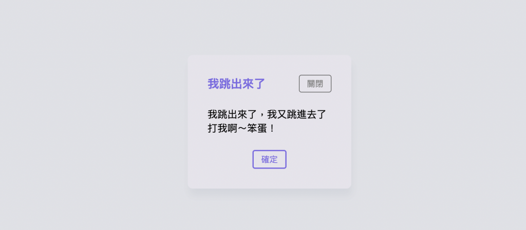
<custom-modal>
  <div slot="header" class="modal-header">
    <h3 style="margin: 0">我跳出來了</h3>
    <button>關閉</button>
  </div>

  <div slot="content">
    <p>我跳出來了,我又跳進去了</p>
    <p>打我啊~笨蛋!</p>
  </div>

  <div slot="footer">
    <button>確定</button>
  </div>
</custom-modal>
這次並沒有加入任何 ::slotted 所以沒有賦予插槽預設的樣式(因為外部可以透過 class 就覆蓋掉預設樣式)。
我們先看看不在外部加入任何 CSS 的樣子:
來說說我踩到的地雷吧:
當時想說,就是直接在外部 css 的 :root 中覆蓋掉元件的樣式就好呀,這樣 modal 元件顏色就會變了吧。
index.html
<style>
  :root {
    /*在 root 改掉 custom-modal 原本的樣式*/
    --cm-overlay-rgb: 200, 200, 200;
    --cm-bg-color: #651d1d;
    --cm-radius: 8px;
    --cm-box-shadow: 0 8px 12px rgba(100, 100, 100, .1);
  }
</style>
結果打開瀏覽器發現,樣式竟然沒有變化。 崩╰(〒皿〒)╯潰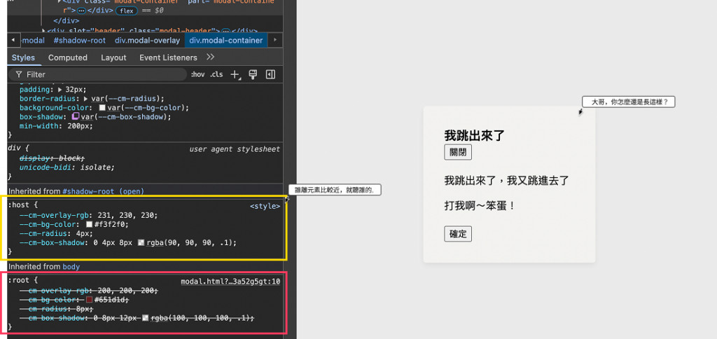
為什麼會這樣呢?
是因為 css 的就近原則:
CSS variable 的規則跟一般 CSS 一樣,誰離元素比較近就聽誰的。
如果這個元素已經定義自己的變數,那就優先用自己定義的,如果沒有,就去找父元素,如果再沒有,那就是在往上找,直到找到 :root。
所以我們如果要覆寫樣式,還是要寫在 host element 上才可以正確覆蓋。
index.html
custom-modal {
  /*在 host-element 改掉 custom-modal 原本的樣式*/
  --cm-overlay-rgb: 216, 217, 224;
  --cm-bg-color: #e6e4ec;
  --cm-radius: 8px;
  --cm-box-shadow: 2px 12px 12px rgba(109, 127, 147, .1);
}

如果在外部 <custom-modal> 上設定變數,那麼 host element 就有了這些值,然後這些變數會自動被 shadow DOM 繼承進去。
而且這個繼承的值會比 shadow DOM 裡的 :host {} 更優先。
因為外部對 host element 的 inline style 或 CSS selector,比 Shadow DOM 內部的 :host 預設更近!
<style>
  custom-modal {
    /*在 host-element 改掉 custom-modal 原本的樣式*/
    --cm-overlay-rgb: 216, 217, 224;
    --cm-bg-color: #e6e4ec;
    --cm-radius: 8px;
    --cm-box-shadow: 2px 12px 12px rgba(109, 127, 147, .1);
  }

  custom-modal::part(modal-container) {
    display: flex;
    flex-direction: column;
    gap: 24px;
  }

  p {
    margin: 0;
  }

  .modal-header {
    display: flex;
    align-items: center;
    justify-content: space-between;
    color: #7c6ae5;
  }

  .modal-content {
    display: flex;
    flex-direction: column;
    justify-content: center;
  }

  .modal-footer {
    display: flex;
    justify-content: center;
  }

  button {
    padding: 4px 12px;
    background-color: transparent;
    border-radius: 4px;
    border: 2px solid #7c6ae5;
    color: #7c6ae5;
  }

  .gray {
    color: gray;
    border: 1px solid #656565;
  }
</style>
呼...基本的樣式我們算是加完了~
各位可以試試看,加入自己喜歡的樣式,在插槽內插入自己想要的內容,並且使用 class 讓這個 modal 變得更有感覺~
Modal 元件也就告一段落囉!
出個小題目:
:host[open] 定義關閉 modal 時的樣式(display:none;)open 的屬性取消及確定按鈕


 看影片追技術