在完成 Easy Data Table 的基本應用後,今日將整合 Day20 v-slot 進一步延伸並進行功能改造,主要目標如下:
共用元件化
將資料表整合至跳窗 (Modal) 中,改造成可重複使用的共用元件,以利未來在不同場景下套用。
選取列功能
為員工清單新增「選取列」設計,使使用者能勾選特定員工資料。選取完成後,將資料回傳至父層元件,方便後續進一步操作與應用。
<script> 區塊新增以下內容,並另存為獨立元件DialogsSelectEmps.vue:
<v-dialog>:改為對話框,scrollable卷軸式對話框。dialog 參數(prop):用於控制跳窗的開啟與關閉。headers:加入「選取列」。defineEmits:透過 employee-selected 事件將已選取的員工資料回傳給父元件。selectedEmp() 方法:在選取員工時觸發,並將所選項目的資料透過 employee-selected 事件傳遞至父層元件。const dialog = ref(false);
const emit = defineEmits(['employee-selected']);
const headers: Header[] = [
{ text: '選取', value: 'radio', sortable: false }, //增加選取列
{ text: '公司', value: 'compNm', sortable: true },
{ text: '部門', value: 'deptName', sortable: true },
{ text: '姓名', value: 'userName', sortable: true},
];
const selectedEmp = (selectedItem :Item) => {
//console.log('in selectEmployee', selectedItem);
emit('employee-selected', selectedItem);
dialog.value = false;
};
Easy Data Table 中新增以下功能:v-slot:activator="{ props }"(Vuetify 的語法),將 props 傳給按鈕,讓按鈕自動綁定開啟對話框的事件。當父層元件點擊「選取員工」按鈕時,dialog 變數會設為 true,對話框便會顯示。item-radio 插槽:自訂每一列的「選取」圖示按鈕。點擊後會呼叫 selectedEmp(item) 方法,並將該員工的資料傳遞出去。 <div>
<v-dialog v-model="dialog" scrollable width="800px">
<template v-slot:activator="{ props }">
<v-btn color="primary" variant="flat" v-bind="props"> 選取員工 </v-btn>
</template>
<v-card>
<v-card-title>請輸入查詢條件</v-card-title>
<v-col lg="6" cols="12">
<v-card-text style="height: 400px" class="overflow-auto">
<EasyDataTable
:headers="headers"
:items="EmpDatas"
table-class-name="customize-table"
:theme-color="themeColor"
:rows-per-page="10"
alternating
>
<template #item-radio=" item ">
<v-btn
icon
size="x-small"
aria-label="button"
variant="elevated"
color="primary"
class="primary-shadow"
@click="() => selectedEmp(item)"
>
<SvgSprite name="custom-plus" style="width: 20px; height: 15px" />
</v-btn>
</template>
</EasyDataTable>
</v-card-text>
<v-divider></v-divider>
<v-card-actions>
<v-btn color="error" variant="text" @click="dialog = false">Close</v-btn>
</v-card-actions>
</v-card>
</v-dialog>
</div>
</template>
<script> 區塊新增以下內容:updateDepository() 方法:作為事件處理器傳給共用元件;當使用者在共用元件中選取員工時觸發,用來更新父層的資料。<script setup lang="ts">
import DialogsSelectEmp from '@/components/shared/DialogsSelectEmps.vue';
const MaintainApNM = ref('');
const updateDepository= (item: Item) => {
MaintainApNM.value = item.userName; //將收到的 itme 資料內容回寫到指定的參數中
};
</script>
<template> 區域增加以下:<v-text-field> 標記:新增文字輸入框,用來顯示選取後員工的姓名,並透過 v-model 與參數 MaintainApNM 進行雙向綁定。<DialogsSelectEmp> 標記:使用 DialogsSelectEmp 元件以完成元件渲染。<DialogsSelectEmp /> 上綁定 updateDepository 方法,當子元件完成員工選取後,會觸發事件並調用父層的 updateDepository 方法。<v-col cols="12" md="6" sm="6">
<v-text-field color="primary" class="mb-4" aria-label="保管人"
v-model="MaintainApNM" label="保管者" placeholder="" variant="outlined" readonly>
</v-text-field>
</v-col>
<v-col cols="12" md="2" sm="6">
<DialogsSelectEmp @employee-selected="updateDepository" />
</v-col>
圖21-1:在父層的文字輸入框後方,透過元件渲染出「選取員工」按鈕。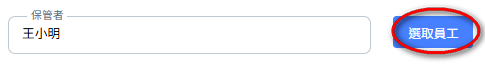
圖21-2:點擊「選取員工」按鈕後,會開啟員工選取視窗並列出目前的員工清單;點擊紅框中的任一筆資料,即可將該員工資料回傳至父層頁面。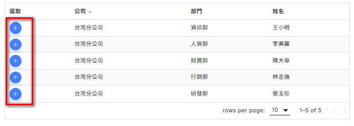
圖21-3:點選任一筆資料後,會透過 updateDepository 方法,將所選取的資料更新到文字輸入框中。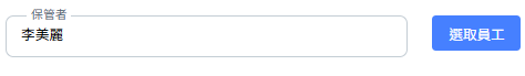
圖21-4:子元件 → 父元件 → 畫面更新關係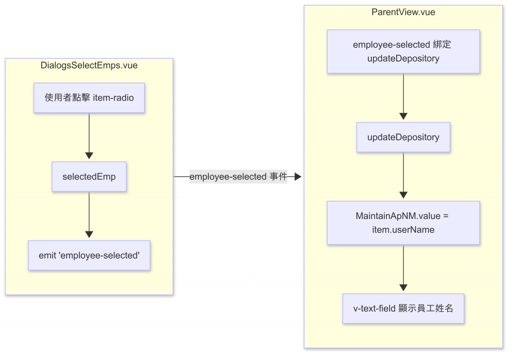


 iThome鐵人賽
 看影片追技術