前一天講了 Gradio 的身世以及簡單的用法,所以今天來講 Gradio 有哪些元件,以及這些元件可以怎麼用
那麼基本上 Gradio 分三種類型的元件,Building、Layout 跟 Component
首先是 Building,他是用來乘載元件的容器,以下舉例:
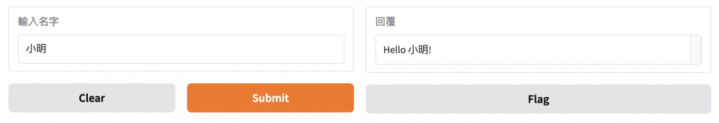
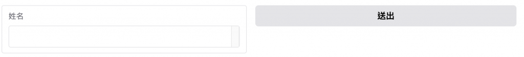
Interface
從以下的例子可以看出來,你只能非常有限的定義一個輸入元件與輸出元件,但取而代之的是,你可以透過幾行非常簡單的程式碼去渲染一個頁面
import gradio as gr

def greet(name):
    return f"Hello {name}!"

demo = gr.Interface(
    fn=greet,
    inputs=gr.Textbox(label="輸入名字"),
    outputs=gr.Textbox(label="回覆")
)

demo.launch()
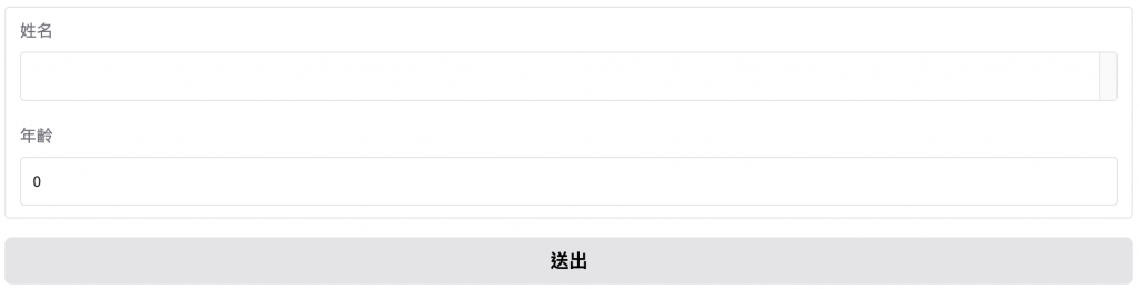
Blocks
從以下的例子可以看出來,雖然程式碼多了幾行,但是除了一般的元件之外,我們也可以看到 Row 與 Column 的元件,即是分別控制橫排與直列的元件
import gradio as gr

def greet(name):
    return f"Hello {name}!"

with gr.Blocks() as demo:
    with gr.Row():
        with gr.Column():
            name = gr.Textbox(label="輸入名字")
            btn = gr.Button("打招呼")
        with gr.Column():
            output = gr.Textbox(label="回覆")

    btn.click(fn=greet, inputs=name, outputs=output)

demo.launch()
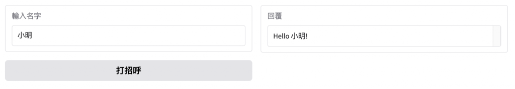
所以透過以上兩者的範例程式碼可以看到說,Interface 雖然給予了非常簡單的輸入跟輸出,但同時也限制了我們能控制的排版,如果要用更多元件的話,使用 Blocks 是相對好的選擇,雖然程式碼構成變得比較複雜,但同時我們能有更大限度的去修改元件的排版
再來是 Layout,是用來控制介面佈局與結構
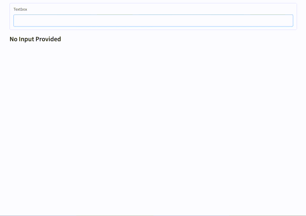
Render
常見於動態生成 UI 或需要重複渲染的情境
可以把一個元件的定義延遲到後面再顯示出來
適合模組化應用,例如根據需求切換不同的 UI 元件
import gradio as gr

with gr.Blocks() as demo:
    input_text = gr.Textbox()

    @gr.render(inputs=input_text)
    def show_split(text):
        if len(text) == 0:
            gr.Markdown("## No Input Provided")
        else:
            for letter in text:
                with gr.Row():
                    text = gr.Textbox(letter)
                    btn = gr.Button("Clear")
                    btn.click(lambda: gr.Textbox(value=""), None, text)

demo.launch()
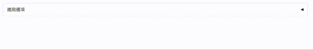
Accordion
建立可展開 / 收合的區塊,預設只顯示標題,而使用者可以點擊展開內容,能保持介面乾淨,避免資訊過於擁擠
Column
Column 裡面的元件會自上而下排列
Row
一個 Row 裡的元件會自左而右排列
Group
在排版上不會自動改變排列方式(不像 Row 或 Column 那樣控制方向),並且不會有任何 gap(間距)
Tab
適合多功能的應用,將元件分到不同的分頁裡,可切換不同的頁面
幫助將介面拆分成多個主題或模組,避免單一頁面過於雜亂
今天好像講的有點多,那麼 Component 的部分分到明天再講吧~~


 看影片追技術