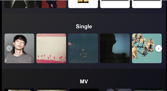
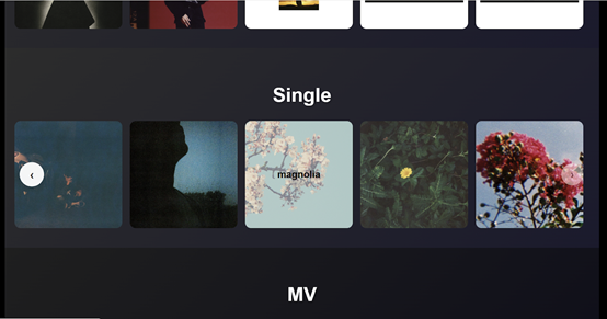
今天要完成的目標是:製作單曲展示區。
結構格式和「專輯展示區」一樣,但不同的是:
今天先完成首頁的單曲展示區,明天會繼續完成單曲歌詞頁面。
<!-- 單曲展示區 -->
            <div class="single-section">
                <h2>Single</h2>

                <div class="single-carousel-container">
                    <!-- 左箭頭 -->
                    <button class="carousel-btn left" id="singlePrevBtn">‹</button>

                    <!-- 卡片區域 -->
                    <div class="single-carousel-track" id="singleCarouselTrack">
                        <a href="lyrics.html?song=song1" class="single-card">
                            <img src="images/WANTCHU.png" alt="Single 1">
                            <div class="overlay">
                                <h3>WANTCHU</h3>
                            </div>
                        </a>
                        <a href="lyrics.html?song=song2" class="single-card">
                            <img src="images/Beside you.jpg" alt="Single 2">
                            <div class="overlay">
                                <h3>beside you</h3>
                            </div>
                        </a>
                        <a href="lyrics.html?song=song3" class="single-card">
                            <img src="images/onoffonoff.jpg" alt="Single 3">
                            <div class="overlay">
                                <h3>onoffonoff</h3>
                            </div>
                        </a>
                        <a href="lyrics.html?song=song4" class="single-card">
                            <img src="images/just friends.jpg" alt="Single 4">
                            <div class="overlay">
                                <h3>just friends</h3>
                            </div>
                        </a>
                        <a href="lyrics.html?song=song5" class="single-card">
                            <img src="images/magnolia.jpg" alt="Single 5">
                            <div class="overlay">
                                <h3>magnolia</h3>
                            </div>
                        </a>
                        <a href="lyrics.html?song=song6" class="single-card">
                            <img src="images/as long as it takes you.jpg" alt="Single 6">
                            <div class="overlay">
                                <h3>as long as it takes you</h3>
                            </div>
                        </a>
                        <a href="lyrics.html?song=song7" class="single-card">
                            <img src="images/over u.jpg" alt="Single 7">
                            <div class="overlay">
                                <h3>over u</h3>
                            </div>
                        </a>
                    </div>

                    <!-- 右箭頭 -->
                    <button class="carousel-btn right" id="singleNextBtn">›</button>
                </div>
            </div>
說明:
.single-section → 整個單曲展示區的容器。.single-carousel-container → 包住所有卡片與左右箭頭。.single-carousel-track → 橫向排列的卡片軌道,裡面放多張 .single-card。.single-card → 單曲卡片,包含圖片和一層 .overlay 遮罩。href="lyrics.html?song=song1" → 點擊卡片後會跳到 lyrics.html,並透過 URL 參數傳遞是哪首歌,方便後續動態載入歌詞。/* 單曲展示區 */
.single-section {
text-align: center;
padding: 40px 20px;
background: linear-gradient(135deg, #2c2c2c 0%, #1a1a2e 100%);
color: white;
}
.single-section h2 {
font-size: 2.5em;
margin-bottom: 30px;
text-shadow: 2px 2px 4px rgba(0,0,0,0.3);
}
/* 輪播容器 */
.single-carousel-container {
position: relative;
width: 100%;
max-width: 1200px;
margin: 0 auto;
overflow: hidden;
}
/* 輪播軌道 */
.single-carousel-track {
display: flex;
gap: 16px;
transition: transform 0.5s ease-out;
}
/* 單曲卡片 */
.single-card {
position: relative;
flex: 0 0 auto;
width: 220px;
height: 220px;
overflow: hidden;
border-radius: 12px;
}
.single-card img {
width: 100%;
height: 100%;
object-fit: cover;
transition: transform 0.3s ease;
}
.single-card:hover img {
transform: scale(1.05);
}
/* 遮罩效果 */
.single-card .overlay {
position: absolute;
top: 0;
left: 0;
width: 100%;
height: 100%;
background: rgba(218, 216, 216, 0.6);
display: flex;
align-items: center;
justify-content: center;
opacity: 0;
transition: opacity 0.3s ease;
}
.single-card:hover .overlay {
opacity: 1;
}
/* 遮罩文字 */
.single-card .overlay h3 {
font-size: 20px;
font-weight: bold;
color: rgb(0, 0, 0);
text-align: center;
padding: 0 10px;
}
/* 左右箭頭 */
.carousel-btn {
position: absolute;
top: 50%;
transform: translateY(-50%);
background: rgba(255, 255, 255, 0.95);
border: none;
border-radius: 50%;
font-size: 24px;
cursor: pointer;
width: 55px;
height: 55px;
box-shadow: 0 4px 15px rgba(0,0,0,0.2);
transition: all 0.3s ease;
z-index: 100;
display: flex;
align-items: center;
justify-content: center;
color: #333;
font-weight: bold;
}
.carousel-btn:hover {
background: white;
transform: translateY(-50%) scale(1.1);
box-shadow: 0 6px 20px rgba(0,0,0,0.3);
}
.carousel-btn:active {
transform: translateY(-50%) scale(0.95);
}
.carousel-btn.left {
left: 10px;
}
.carousel-btn.right {
right: 10px;
}
/* 禁用狀態 */
.carousel-btn:disabled {
opacity: 0.3;
transform: translateY(-50%) scale(0.9);
}
.carousel-btn:disabled:hover {
transform: translateY(-50%) scale(0.9);
background: rgba(255, 255, 255, 0.95);
box-shadow: 0 4px 15px rgba(0,0,0,0.2);
}
/* 響應式設計 */
@media (max-width: 768px) {
.single-card {
width: 180px;
height: 180px;
margin-right: 10px;
}
.carousel-btn {
width: 45px;
height: 45px;
font-size: 20px;
}
}
@media (max-width: 480px) {
.single-card {
width: 160px;
height: 160px;
margin-right: 8px;
}
}
說明
.single-section → 使用漸層背景,讓單曲區塊和其他區域有區隔感。.single-card → 固定寬高的卡片,圖片採 object-fit: cover,確保不變形。.overlay → hover 時才會浮現,呈現出歌曲名稱。.carousel-btn → 左右箭頭有 hover 與 active 的縮放效果,更有互動感。套用之前寫的通用函式
// 單曲展示區
createCarousel({
    trackId: 'singleCarouselTrack',
    prevBtnId: 'singlePrevBtn',
    nextBtnId: 'singleNextBtn',
    cardSelector: '.single-card',
    gap: 16
});
說明


 看影片追技術