昨天我們已經成功將元件發布到 npm 了,但各位有沒有發現少了一個很重要的東西?
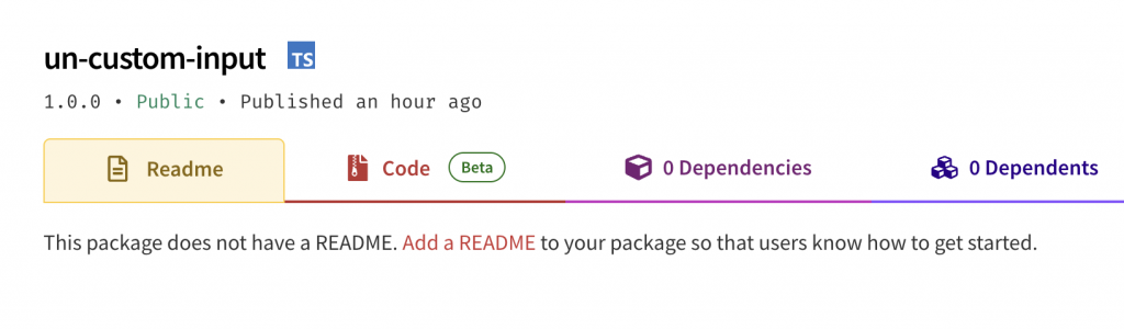
在上傳成功後,npm 其實有給了一段提示文字:"This package does not have a README. Add a README to your package so that users know how to get started."
當使用者進入這個畫面想要下載時,他不知道這個元件是什麼,也不知道該如何開始使用!
所以我們必須替他加上一個重要的使用說明書,告訴使用者這個元件是什麼,該怎麼使用。
我認為 readme 是一個看似簡單,但寫起來並不簡單的東西,要如何讓使用者透過 readme 就能快速知道如何開始,真的是很大的學問。
因為目前公司正在開發共用元件的關係,其實也接觸到了不少關於撰寫元件 readme 的知識,雖然不一定是對的,但大方向可以提供大家參考參考!
其實可以從之前的文章中發現,每一步的基礎概念都可以體現在 readme 中,包含之前所學的屬性、樣式、方法,再到安裝及使用,你其實都學過了!現在就差把它們組合在一起。
先一步一步拆解區塊架構:
那麼接下來為了讓元件更通用更符合國際化需求,所以我們使用英文來撰寫 readme 吧 XD!
首先,你需要在專案的根目錄先建立 README.md 的檔案。
This is a form input web component that supports multiple types and content validation.
You can add your own validation settings and style types.
You can install un-custom-input with npm, or just get started quickly with CDN.
npm i un-custom-input
After the package is installed, then you can import the input web component into you code:
// import element in your JS file
import 'un-custom-input';
<!-- use element in HTML -->
<un-custom-input></un-custom-input>
<script type="module" src="https://unpkg.com/un-custom-input/dist/custom-input.mjs"></script>
<!-- use element in HTML -->
<un-custom-input></un-custom-input>
defaultVlaue & min/max length
<un-custom-input
  name="basicInput"
  value="default value"
  max-length="5"
  min-length="2"
>
</un-custom-input>
required attribute<un-custom-input
name="password"
placeholder="請輸入密碼"
required
type="password"
>
</un-custom-input>
pattern and pattern message
<un-custom-input
  name="email"
  placeholder="your@email.com"
  pattern="^[^\s@]+@[^\s@]+\.[^\s@]+$"
  pattern-message="invalid email pattern"
  required>
</un-custom-input>
| Attribute | Description | Default Value |
|---|---|---|
| value | Initial value of the input. | "" |
| placeholder | when the input is empty, will show placeholder. | "請輸入文字..." |
| disabled | Disables the input. | false |
| required | Must fill with value. | false |
| type | Input type: text | password |
"text" |
| multiline | Allows multiline input. | false |
| max-length | Maximum number of input value. | 0 (no limit) |
| min-length | Minimum number of input value. | 0 (no limit) |
| pattern | A regex pattern for input validation (e.g., [A-Za-z]+). |
"" |
| pattern-message | Custom error message, when the pattern validation fails. | "格式不符合要求" |
| Method | Description |
|---|---|
| checkValidity() | Checks if the input passes validation. Returns true if valid, false otherwise. |
| reportValidity() | Checks validity and displays the error message if invalid. Returns true if valid. |
| touchAndValidate() | Marks the input as dirty and triggers validation. |
| setCustomError(msg) | Sets a custom error message and marks the input as invalid. |
| getErrorMsg() | Returns the current validation error message, if any. |
| reset() | Resets the input to its default value and clears errors. |
| Property | Description |
|---|---|
| currentValue | Getter/setter for the input's current value. |
| inputDirty | Returns true if the user has interacted with the input. |
| Event | Description | Details |
|---|---|---|
| value-changed | Fired when the input value changes. | { value: string } |
| input-focus | Fired when the input gains focus. | { value: string } |
| input-blur | Fired when the input loses focus. | { value: string } |
| input-reset | Fired when the input is reset. | None |
Three parts that can be styled using the ::part() pseudo-element:
| name | Description |
|---|---|
| ::part(container) | The outer wrapper <div> that contains the input and error message. |
| ::part(custom-input) | The <div> element acting as the editable input field. |
| ::part(error-msg) | The <span> element that displays validation error messages. |
example:
In your style.css overwrite style.
custom-input::part(container) {
  display: flex;
  flex-direction: column;
  gap: 8px;
  background-color: #f0f0f0;
  padding: 10px;
  border-radius: 8px;
}
MIT License.
以上,就一起一步一步的完成自訂元件的使用說明了!
但由於我們更新了 README, 所以我們需要重新發布新的版本。
npm version patch 更新版本號,從 v1.0.0 變為 v1.0.1。npm publish,重新發布。那麼,這個元件也算是完整的發布成功囉~✧*。٩(ˊᗜˋ*)و✧*。


 看影片追技術