在前一篇文章,我們已經發布完成第一個 Web Component。
還記得在 Day 2 時有提到過:
使用 Web Component 開發的元件可以在 React、Vue、Angular 或 Vanilla JS 中使用,所以可以讓不同框架之間能夠更好地彼此合作,利用小小的共享元件,來增加開發的效率。
所以接下來的幾篇文章,會針對 Web Component 與三大框架的應用來做討論!
這一篇我們先來聊聊 Web Component 與 Angular。
第一個框架選擇 Angular,主要是因為對於 Angular 比較熟悉,而且 Angular 可以說是三大框架中對於 Web Component 最友善的框架了,並沒有太多複雜的設定值,基本上只要安裝完自訂元件就可以開始使用了。(絕對不是因為我都用 Angular 開發才這樣說的)。
接下來在我們要在 Angular 內把 un-custom-input 當作註冊帳號的表單的欄位使用。
其中需要包含姓名、帳號、email、密碼,還有一顆送出按鈕,再整合原生的 <form> 元件來開發。
其實 Angular 裡面還有另一個方法,也就是 FormGroup,但這部分在這系列先不做討論。有興趣的大家,可以使用關鍵字 NG_VALUE_ACCESSOR 來找到相關資訊。
首先,你需要先有一個 Angular 的專案
開始實作前,你需要先安裝 Angular CLI,並且利用 ng new 建立一個 angular 專案。
安裝自訂元件 un-custom-input
npm install un-custom-input
main.ts (Angular bootstrap 的入口) 中引入 un-custom-input,確保自訂元件在 Angular component render 前就已註冊好。import { bootstrapApplication } from '@angular/platform-browser';
import { appConfig } from './app/app.config';
import { AppComponent } from './app/app.component';
import 'un-custom-input';
bootstrapApplication(AppComponent, appConfig)
.catch((err) => console.error(err));
CUSTOM_ELEMENTS_SCHEMA要能夠在 Angular 專案中使用自訂元件,需要加入一個的 Schema:CUSTOM_ELEMENTS_SCHEMA。
在沒有加入前,Angular 模板檢查時會把他不認識的未知元素當成錯誤,所以需要把 CUSTOM_ELEMENTS_SCHEMA 加到 module 的 schemas。
這樣 Angular 就可以允許模板使用包含有 - 的自訂元素(是否記得之前提過 Web Component 的命名規則是至少要有一個 -,所以是符合這個規則的)。
在 Angular 不同的版本會有不同的加入方式:
@Component 中引入。import { Component, CUSTOM_ELEMENTS_SCHEMA } from '@angular/core';
@Component({
selector: 'app-root',
standalone: true,
imports: [
// 略...
],
templateUrl: './app.component.html',
styleUrl: './app.component.css',
schemas: [
CUSTOM_ELEMENTS_SCHEMA
]
})
@NgModule 中引入。import { NgModule, CUSTOM_ELEMENTS_SCHEMA } from '@angular/core';
@NgModule({
declarations: [ /* ... */ ],
imports: [ /* ... */ ],
schemas: [CUSTOM_ELEMENTS_SCHEMA]
})
export class AppModule {}
先試著加入一個元件在 template:
<un-custom-input></un-custom-input>
使用 ng s 來查看元件是否有出現:
做到這一步,其實你已經成功的在 Angular 中使用自訂元件了。
那麼接下來就是實作打造完整的註冊表單囉!
<form class="form" #form>
  <div class="input-container">
    <label>姓名</label>
    <un-custom-input
      placeholder="請輸入暱稱"
      required
      pattern=".{2,}"
      pattern-message="暱稱至少 2 個字元"
    >
    </un-custom-input>
  </div>

  <div class="input-container">
    <label>帳號</label>
    <un-custom-input
      placeholder="請輸入帳號"
      required
      pattern="^[a-zA-Z0-9_]{4,}$"
      pattern-message="帳號至少 4 碼,僅能含英文、數字與底線"
    >
    </un-custom-input>
  </div>

  <div class="input-container">
    <label>Email</label>
    <un-custom-input
      placeholder="請輸入 Email"
      required
      pattern="^[^\\s@]+@[^\\s@]+\\.[^\\s@]+$"
      pattern-message="請輸入有效的 Email"
    >
    </un-custom-input>
  </div>

  <div class="input-container">
    <label>密碼</label>
    <un-custom-input
      #password1
      type="password"
      placeholder="請輸入密碼"
      required
      pattern="(?=.*[A-Z])(?=.*[0-9]).{8,}"
      pattern-message="密碼至少 8 碼,需包含大寫字母與數字"
    >
    </un-custom-input>
  </div>

  <div class="input-container">
    <label>確認密碼</label>
    <un-custom-input
      #password2
      type="password"
      placeholder="請再次輸入密碼"
      required
    >
    </un-custom-input>
  </div>

  <button class="submit-btn">註冊</button>
</form>
/* 改變 un-custom-input 的 CSS Variable */
un-custom-input {
  --ci-border-color: #cccccc;
}

/* 利用 ::part(custom-input) 來改變 input 輸入框的樣式 */
un-custom-input::part(custom-input) {
  padding: 6px 12px;
  border-radius: 8px;
  font-size: 16px;
}

/* 賦予表單基本的樣式 */
.form {
  display: flex;
  flex-direction: column;
  gap: 12px;
  padding: 16px;
}

.input-container {
  display: flex;
  flex-direction: column;
  gap: 4px;
}

.input-container label {
  font-weight: 500;
  color: #333333;
}

.submit-btn {
  margin-top: 16px;
  padding: 10px 16px;
  background-color: #8c67c9;
  color: white;
  border: none;
  border-radius: 8px;
  font-size: 16px;
  cursor: pointer;
}
目前的雛形還有樣式都有了!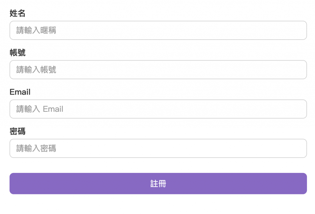
// 在 class 內加入 ViewChild 取得 <form> 元素
@ViewChild('form') formRef!: ElementRef;
  onSubmit(event: Event) {
    event.preventDefault();
    const inputs = this.formRef.nativeElement.querySelectorAll('un-custom-input');
    let allValid = true;

    // 觸表單內每個自訂元件的 touchAndValidate 方法
    inputs.forEach((input: CustomInputElement) => {
      input.touchAndValidate();

      if (!input.checkValidity()) {
        allValid = false;
      }
    });

    // 如果沒有通過,就不往下走
    if (!allValid) {
      return;
    }

    console.log('表單可以送出了!')
  }
那麼初步在 Angular 加入自訂元件的方法就學完囉。
明天,我們一起看看第二個框架 Vue 是如何實作的吧!


 看影片追技術