
昨天做完開瓶跟光珠飛出去的動畫後,回頭看了一下產生的色卡,我發現一個很明顯的盲點:昨天的做法是用 new Set() 把有出現過的顏色抓出來,然後每個顏色都給一個固定的光斑半徑(65%)。這會導致就算整個月存了 29 顆金色、只有 1 顆粉色,兩者在畫面上分到的面積是完全一樣大的。
真實生活是有比重的。如果不把「出現次數」轉成畫布上的「比例」,每張卡片看起來都差不多,就失去了每個月獨一無二的意義。
所以今天主要來搞定這幾件事:
Set 邏輯:算好每種顏色的實際數量與百分比,讓出現最多次的「主導色」決定底色,並依照佔比動態放大光暈半徑。在動手改演算法前,我們先解決昨天留下的跨月測試。要測試「1 號補領橫幅」,我們需要:
因為我的瓶子裡本來就有九月的光珠了,如果你的瓶子目前是空的或是只有十月的,要依照下列步驟加入光珠,若本來就有九月的光珠可以直接進行日期修改的步驟就好。
在瀏覽器 Console 貼上這段測試指令,放入幾顆上個月的光珠:
const testGems = JSON.parse(localStorage.getItem('store_gems') || '[]')
testGems.push(
  { id: 1, date: '2026-09-10', color: '#E3B341', note: '九月達成目標', offsetX: 0, offsetY: 0 },
  { id: 2, date: '2026-09-20', color: '#64B5F6', note: '夜晚吹風散步很舒服', offsetX: 0, offsetY: 0 }
)
localStorage.setItem('store_gems', JSON.stringify(testGems))
接著暫時將程式碼裡的日期假裝設成 10 月 1 號(Vue 的GemJar.vue):
// 原本是:const todayStr = getLogicalDate()
// 暫時改為測試日期:
const todayStr = '2026-10-01'
重新整理網頁後,頂部會順利浮現黃色橫幅:
「新月份開始了!上個月的記憶已經總結。」

點擊「回顧上月色卡」,彈出的卡片目標月份也顯示在 2026-09。
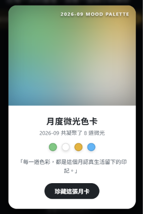
補領測試通過,測試完記得將 todayStr 改回原本的 getLogicalDate() !
這裡要特別說明一下,isAutoGenerated 這個標記,在專案裡有兩種不同的使用方式:
統計各顏色的次數與百分比,並由多到少排序:
// 計算目標月份各色彩的統計數據(顆數與百分比)
const colorStats = computed(() => {
  const total = targetMonthGems.value.length
  if (total === 0) return []

  const counts = {}
  targetMonthGems.value.forEach(g => {
    counts[g.color] = (counts[g.color] || 0) + 1
  })

  return Object.entries(counts)
    .map(([color, count]) => ({
      color,
      count,
      ratio: Math.round((count / total) * 100)
    }))
    .sort((a, b) => b.count - a.count) // 出現最多的排在第一個
})
monthlyGradientStyle:動態調整光暈擴散半徑讓出現比例最高的「主導色」擁有最大的擴散半徑,偶爾出現的顏色則化作角落的小點綴:
const monthlyGradientStyle = computed(() => {
  const stats = colorStats.value
  if (stats.length === 0) {
    return { background: 'linear-gradient(135deg, #2d3748 0%, #1a202c 100%)' }
  }

  const dominant = stats[0]
  const anchorPoints = ['25% 25%', '80% 75%', '75% 25%', '20% 80%', '50% 50%']

  const radialLayers = stats.map((item, idx) => {
    const pos = anchorPoints[idx % anchorPoints.length]
    const renderColor = item.color.toLowerCase() === '#ffffff'
      ? 'rgba(255, 255, 255, 0.9)'
      : item.color

    // 依佔比動態擴大半徑(50% ~ 90%)
    const radius = Math.min(90, Math.max(50, item.ratio + 30))
    return `radial-gradient(circle at ${pos}, ${renderColor} 0%, rgba(255, 255, 255, 0) ${radius}%)`
  })

  return {
    backgroundImage: radialLayers.join(', '),
    backgroundColor: dominant.color // 直接以當月主色打底
  }
})
<template>:色票清單加入比例標籤在拍立得色卡下方,將原本單純的色票圓點,變為帶有百分比數值的標籤:
<!--- 下方留白區 -->
<div class="card-meta">
  <h3 class="meta-title">月度微光色卡</h3>
  <p class="meta-stats">{{ cardMonthTarget }} 共採集了 {{ targetMonthGems.length }} 道微光</p>

  <!-- 顯示顏色與百分比 -->
  <div class="palette-swatches">
    <div
      v-for="(item, index) in colorStats"
      :key="index"
      class="swatch-item"
    >
      <span class="swatch-bubble" :style="{ backgroundColor: item.color }"></span>
      <span class="swatch-ratio">{{ item.ratio }}%</span>
    </div>
  </div>
<style scoped>:微調色票標籤排版為百分比色票補上排版:
.palette-swatches {
  display: flex;
  justify-content: center;
  align-items: center;
  gap: 12px;
  flex-wrap: wrap;
  margin-bottom: 14px;
}

.swatch-item {
  display: flex;
  align-items: center;
  gap: 5px;
}

.swatch-bubble {
  width: 14px;
  height: 14px;
  border-radius: 50%;
  border: 1px solid rgba(0, 0, 0, 0.1);
  box-shadow: 0 2px 4px rgba(0, 0, 0, 0.12);
}

.swatch-ratio {
  font-size: 0.72rem;
  font-weight: 600;
  color: #57606a;
}
這邊我有將昨天寫的程式碼做一個小小的修正。
原本是想用 rgba(0, 0, 0, 0.25) 做出色卡四周微微暗角的復古效果,但遇到淺色或金色時,這層黑影在視覺上反而有種髒髒的感覺。
於是把原本的:
.aurora-inner-glow {
  position: absolute;
  inset: 0;
  box-shadow: inset 0 0 40px rgba(0, 0, 0, 0.25);
}
改成:
.aurora-inner-glow {
  position: absolute;
  inset: 0;
  box-shadow: inset 0 0 30px rgba(255, 255, 255, 0.2);
}
這樣會讓顏色看起來融合得比較自然。
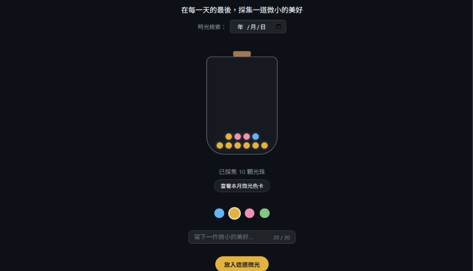
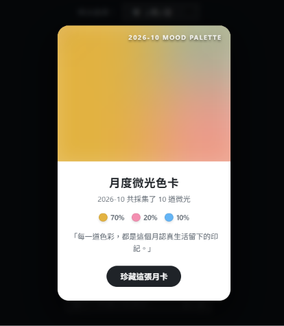
為了驗證「情緒佔比演算法」與動態光暈的效果,我們使用兩組比例不同的假資料進行對比:
情境 A:
在 Console 輸入這段程式碼:
const gems70 = [
  ...Array(7).fill(null).map((_, i) => ({ id: `g-${i}`, date: '2026-10-01', color: '#E3B341', note: '成就', offsetX: 0, offsetY: 0 })),
  ...Array(2).fill(null).map((_, i) => ({ id: `p-${i}`, date: '2026-10-02', color: '#F48FB1', note: '溫暖', offsetX: 0, offsetY: 0 })),
  { id: 'b-1', date: '2026-10-03', color: '#64B5F6', note: '平靜', offsetX: 0, offsetY: 0 }
]
localStorage.setItem('store_gems', JSON.stringify(gems70))
location.reload()
情境 B:
在 Console 輸入這段程式碼:
const gems60 = [
  // 6 顆藍色(10/01)
  ...Array(6).fill(null).map((_, i) => ({ id: `b-${i}`, date: '2026-10-01', color: '#64B5F6', note: '平靜', offsetX: 0, offsetY: 0 })),
  // 2 顆留白(10/02)
  ...Array(2).fill(null).map((_, i) => ({ id: `w1-${i}`, date: '2026-10-02', color: '#FFFFFF', note: '留白', offsetX: 0, offsetY: 0, isAutoGenerated: true })),
  // 2 顆留白(10/03)
  ...Array(2).fill(null).map((_, i) => ({ id: `w2-${i}`, date: '2026-10-03', color: '#FFFFFF', note: '留白', offsetX: 0, offsetY: 0, isAutoGenerated: true }))
]

localStorage.setItem('store_gems', JSON.stringify(gems60))
location.reload()
拍立得下方的色票也精確標上了 70%、20% 等百分比圓點標籤,讓使用者可以在每個月的最後知道自己的哪些情緒佔了生活的多少。
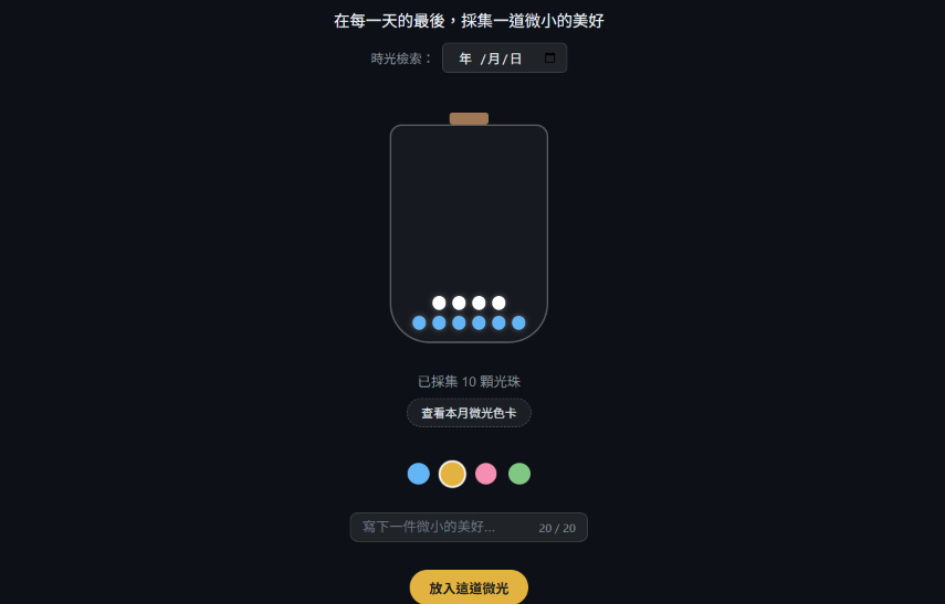
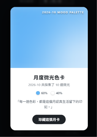
備註:以上測試資料是以「今天為 10/04」為基準設計,若是在其他日期測試,記得將日期銜接好,避免觸發先前實作的「未登入自動補發白色微光」,導致總顆數與比例出現偏差。
每個月呈現出來色卡這麼漂亮,如果看過一次關掉就找不到了,是不是有些可惜呢?
明天(Day 21),我們要打造「時光畫廊」,把每個月總結出來的微光色卡一張張收納在專屬的展覽頁面中,讓你可以隨時回顧過去每一趟光陰的色彩軌跡!



 iThome鐵人賽
 看影片追技術