最近剛開始接觸D3.js(不是暗黑破壞神..)
不過我第一次接觸就直接是4版的
而不是3版
但網路上範例都是3版的..
偏偏4版與3版差異有些大..= =
4版的做法又是趨勢...
所以只能透過比較3版文件與4版文件
加上查詢3版與4版差異的紀錄文件
這過程...有點累阿...= =
我學到目前的程度是...
基本簡單(單純)的圖可以畫出來..
現在開始要根據老闆的構想來做點變化...
然後就開始卡關了= =
繪製X軸Y軸的方法如下:參考範例(一條軸的畫法)
// set the ranges
var x = d3.scaleTime().range([0, width]);
var y = d3.scaleLinear().range([height, 0]);

// Scale the range of the data
x.domain(d3.extent(data, function(d) { return d.date; }));
y.domain([0, d3.max(data, function(d) { return d.y; })]);

// Add the x Axis
svg.append("g")
  .attr("transform", "translate(0," + height + ")")
  .call(d3.axisBottom(x));

// Add the y Axis
svg.append("g")
  .call(d3.axisLeft(y));
然後根據老闆要求..需要不只一條Y軸..
於是我找到這個範例(複數軸畫法)
其實概念挺簡單的~就同樣的方法多宣告一次就多一條~
大致程式如下:
// set the ranges
var x = d3.scaleTime().range([0, width]);
var y0 = d3.scaleLinear().range([height, 0]);
var y1 = d3.scaleLinear().range([height, 0]);

// Scale the range of the data
x.domain(d3.extent(data, function(d) { return d.date; }));
y0.domain([0, d3.max(data, function(d) {return Math.max(d.y0);})]);
y1.domain([0, d3.max(data, function(d) {return Math.max(d.y1); })]);

// Add the X Axis
svg.append("g")
  .attr("transform", "translate(0," + height + ")")
  .call(d3.axisBottom(x));

// Add the Y0 Axis
svg.append("g")
  .attr("class", "axisSteelBlue")
  .call(d3.axisLeft(y0));

// Add the Y1 Axis
svg.append("g")
  .attr("class", "axisRed")
  .attr("transform", "translate( " + width + ", 0 )")
  .call(d3.axisRight(y1));
不過老闆覺得Y軸分兩邊難看..
而且..根據我們的資料...不只一條Y軸
而是有5條..也就是有5筆資料..
上頭的設計就是"搜尋一個時間區間的五種資料,並將五種資料以折線圖方式一並呈現"
畫五種不同資料的線段我可以做到(雖然還有一道關卡需要突破.就是時間的問題)
但是畫X-Y軸就卡住了
如下圖範例: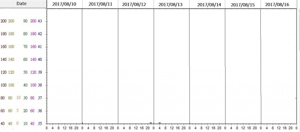
是否有D3高手或是也有在研究的新手幫忙解答或是一起研究找方法~
補充:
其實將Y軸都移到同一邊也很容易..
拿上面複數Y軸的例子來說..
只要將右邊Y軸的axisRight改成axisLeft..
並將這段attr("transform", "translate( " + width + ", 0 )")拿掉或是改變X位置(這段是在處理Y軸位移位置的)
不過這做法離我的目標卻只完成一半..
還需突破的一點是......
這個方法會連同線段一起畫出來..
但是我的目標卻只要顯示一條軸..複數的值域..如圖那樣..
已邀請的邦友 {{ invite_list.length }}/5
最近也在玩D3.js,幾個想法可以提供。
1.D3.js有事件,應該可以用事件去切換Y軸,指到那條線,就顯示出相對的Y軸,這樣你就不用五條Y軸在那,更醜。
2.資料點應該要能pop up出數值。
實做的話,要等我有時間才能試。剛開始玩不知道寫不寫得出來。哈
以你給的範例網頁來說,如果要你說的效果,加上這兩行就可以把另外一條Y2軸的線取消掉,剩下你自己改吧。
svg.select(".axisRed").select(".domain").attr("opacity", 0);
svg.select(".axisRed").selectAll(".tick").selectAll("line").attr("opacity", 0);
其實觀察一下SVG的結構就寫得出來了。
只有一條作切換...確實是個好方法~~(以設計的角度來說)
以使用者的角度來說...
我這份折線圖...使用者會想要直接一覽全部資訊~
不會想要用滑鼠滑來滑去才能看到對應的值域~
再加上..未來會輸出成PDF..所以這方法可能不適用..
至於彈出數值~~我會做..
不過為了符合上述使用者情況..
我會再圖表下方再放個grid對應上方的日期表格
把各個線條的細項數值顯示在grid中..
這也是為了之後轉出PDF需要的~
要是我寫的話,mouseout的時候讓他顯示全部的軸,指向的時候會特別突顯現在的軸。
這樣就回到我補充的問題了~
重點在...我雖然可以利用translate位移每個Y軸...
但是..結過會是每個軸都畫出來~
但..我只要畫一條軸..剩下都是數字..
我看了一下結構..
我append一次..
會產生一個<g>
裡面包了一個<path>(就是那條軸) + 多個<g>(每個數值)
包在裡面的每個<g>包含了一個<line>(每個數值上的那條線段) + 一個<text>(每個數值)
而我的目標...
只需要最後的<text>
...我的code只是不想改變結構,讓他隱藏,你把attr的部份改remove()應該就行了。
DOM操作是網頁的基本喔,基本上跟v3、v4無關。
不過順便吐一下D3.js的文件,實在有夠不友善的。
最好新手可以從那些沒有簡單範例的api去看出code要怎麼寫。
然後D3.js的那些範例又一堆炫技,應該挑幾個簡單明瞭的圖來做系統性說明吧。
極度認同~!!!!!!
4版的模式也是一模模一樣樣....= =
我這個第一次接觸的..只有折磨而已啊~~XD
回到正題~
你的方法...我修改後解決了~
聽你用隱藏的..
(太執著於是否有內建方法可以使用..= =)
我另外給了一個hideclass
然後用你的方法select(".hideclass")
再分別往裡面選擇path和line對他們設定透明度..
只剩下一關要突破..
如圖..X軸是以時間24小時為主
每4小時一個間隔..
如果只有顯示一天..
只要使用ticks(6)就可以解決
但一次顯示7天的時間..= =
其次..
根據老闆畫給我的構想..
線條會有延伸..
意思是說..
資料除了顯示的7天..
若前一天的最後時段有資料..則線段會從0邊界延續
若最後一天的第一個時段有資料..則線段也會延續往後連到邊界後截斷
一步一步找方法囉~XD
如果要從內建的下手,可能要覆寫axisLeft方法,或用axis去自訂。
不過用這些框架,就是要學著把框架當黑盒子用,多習慣處理output的結果吧。
時間間隔問題找到方法了
把原本的.ticks(6)改成.ticks(d3.timeHour,4)間隔都是四小時為單位
後面再接變化格式.tickFormat(d3.timeFormat("%H"))只顯示小時
上面講到說..線條要有延伸
我想到一招..
因為我圖表是只要顯示7天的資料
但為了要有延伸出去..勢必要前後各抓一天資料
也就是9天資料
然後..我想到用zoom縮放時間區間
將原本顯示9天的資料縮到中間的7天
可是zoom結合不起來..= =
我是拿這個當範例..看不懂= =
而且我還得拿掉滾輪和滑鼠拖曳功能...= =
又卡了...
1.你乾脆畫一張完成預想圖給大家看吧。
2.這個範例裡,var zoom那裡拿掉最後的on,拖曳那些就不見了。
froce
我一開始的提問後面有附一張圖~
如圖..
目前我關於座標部分都已經完成
線條部分若只單純線條也沒問題了
從附圖上可以看到資料日期是從8/10至8/16日
如果資料每天都有的話
那麼..折線會從8/10的00時開始畫到8/16的最後一個時段
可是..為了讓前後資料有所延續
我想到Zoom這個功能方法
並且..資料的取得改成自8/9最後一個時段的資料到8/17第一個時段的資料
然後使用zoom方法縮放X時間軸(縮到8/10至8/16)
以下提供我的程式:
script:
// set the dimensions and margins of the graph
var margin = {top: 10, right: 30, bottom: 60, left: 85},
    width = 960 - margin.left - margin.right,
    height = 500 - margin.top - margin.bottom;

var datebegin = new Date("2017/08/09 00:00"),
    dateendin = new Date("2017/08/18 00:00");
var dateShowbegin = new Date("2017/08/09 00:00"),
    dateShowendin = new Date("2017/08/18 00:00");
dateShowbegin = new Date(dateShowbegin.setDate(dateShowbegin.getDate()+1));
dateShowendin = new Date(dateShowendin.setDate(dateShowendin.getDate()-1));

// parse the date / time
var parseTime = d3.timeParse("%Y-%m-%d %H:%M");

// set the ranges
var x = d3.scaleTime().range([0, width]);
var x0 = d3.scaleTime().range([0, width]);
var y0 = d3.scaleLinear().range([height, 0]);
var y1 = d3.scaleLinear().range([height, 0]);
var y2 = d3.scaleLinear().range([height, 0]);

// define the 1st line
var valueline = d3.line()
    .x(function(d) { return x(d.datetime); })
    .y(function(d) { return y0(d.RR); });

// define the 2nd line
var valueline2 = d3.line()
    .x(function(d) { return x(d.datetime); })
    .y(function(d) { return y1(d.BT); });

// define the 3rd line
var valueline3 = d3.line()
    .x(function(d) { return x(d.datetime); })
    .y(function(d) { return y2(d.PR); });

// append the svg obgect to the body of the page
// appends a 'group' element to 'svg'
// moves the 'group' element to the top left margin
var svg = d3.select("#drawChart").append("svg")
    .attr("width", width + margin.left + margin.right)
    .attr("height", height + margin.top + margin.bottom)
  .append("g")
    .attr("transform",
          "translate(" + margin.left + "," + margin.top + ")");

// Get the data
d3.csv("data.csv", function(error, data) {
    if (error) throw error;

    // format the data
    data.forEach(function(d) {
        d.datetime = parseTime(d.datetime);
        d.RR = +d.RR;
        d.BT = +d.BT;
        d.PR = +d.PR;
    });

    // Add animate runtime
    var t = d3.transition()
        .duration(1500)
        .ease(d3.easeLinear)
        .on("start", function(d){ console.log("transiton start") })
        .on("end", function(d){ console.log("transiton end") });

    // Scale the range of the data
    x.domain([datebegin, dateendin]);
    x0.domain([datebegin, dateendin]);
    y0.domain([10, 100]);
    y1.domain([35, 44]);
    y2.domain([40, 220]);

    // Add the valueline path.
    svg.append("path")
        .data([data])
        .attr("class", "line l1")
        .attr("d", valueline)
        .attr("stroke-dasharray", function(d){ return this.getTotalLength() })
        .attr("stroke-dashoffset", function(d){ return this.getTotalLength() });

    // Add the valueline2 path.
    svg.append("path")
        .data([data])
        .attr("class", "line l2")
        .style("stroke", "red")
        .attr("d", valueline2)
        .attr("stroke-dasharray", function(d){ return this.getTotalLength() })
        .attr("stroke-dashoffset", function(d){ return this.getTotalLength() });

    // Add the valueline3 path.
    svg.append("path")
        .data([data])
        .attr("class", "line l3")
        .style("stroke", "purple")
        .attr("d", valueline3)
        .attr("stroke-dasharray", function(d){ return this.getTotalLength() })
        .attr("stroke-dashoffset", function(d){ return this.getTotalLength() });

    // Add the X Axis
    svg.append("g")
        .attr("transform", "translate(0," + height + ")")
        .call(d3.axisBottom(x).ticks(d3.timeHour, 4).tickFormat(d3.timeFormat("%H")))
        .selectAll("line")
        .attr("y2", -height)
        .attr("class", "line-dash");

    // Add the X0 Axis
    svg.append("g")
        .attr("transform", "translate(0," + height + ")")
        .call(d3.axisBottom(x).ticks(d3.timeDay, 1).tickFormat(d3.timeFormat("")))
        .selectAll("line")
        .attr("y2", -height)
        .attr("class", "line-solid");

    // Add the Y0 Axis
    svg.append("g")
        .attr("class", "axisSteelBlue")
        .call(d3.axisLeft(y0).ticks(9).tickFormat(d3.format(1,"%")))
        .selectAll("line")
        .attr("x2", width)
        .attr("class", "line-dash");

    // Add the Y1 Axis
    svg.append("g")
        .attr("class", "axisRed hideaxis")
        .attr("transform", "translate(-25, 0)")
        .call(d3.axisLeft(y1).ticks(9).tickFormat(d3.format(1,"%")));

    // Add the Y2 Axis
    svg.append("g")
        .attr("class", "axisPurple hideaxis")
        .attr("transform", "translate(-45, 0)")
        .call(d3.axisLeft(y2).ticks(9).tickFormat(d3.format(1,"%")));

    // select another Y-axis and hide path and line
    svg.selectAll(".hideaxis").selectAll("path").attr("opacity", 0);
    svg.selectAll(".hideaxis").selectAll("line").attr("opacity", 0);

    // let the path line run animate
    svg.selectAll(".l1").transition(t).attr("stroke-dashoffset", 0)
    svg.selectAll(".l2").transition(t).attr("stroke-dashoffset", 0)
    svg.selectAll(".l3").transition(t).attr("stroke-dashoffset", 0)

});
html:
<div id="drawChart"></div>
css:
.line {
    fill: none;
    stroke: steelblue;
    stroke-width: 2px;
}

.line-dash {
    stroke: #444;
    stroke-dasharray: 3,5;
    stroke-width: 1px;
}

.line-solid {
    stroke: #000;
    /*stroke-dasharray: 1,1;*/
    stroke-width: 1px;
}

.axisSteelBlue text{
    fill: steelblue;
}

.axisRed text{
    fill: red;
}

.axisPurple text {
    fill: purple;
}
data.csv:
datetime,RR,BT,PR
2017-08-10 10:13,18,37.2,78.5
2017-08-10 11:43,18.2,37.2,78.5
2017-08-10 12:00,17.3,37.5,81.2
2017-08-10 16:03,20,37.6,84.5
2017-08-10 20:00,20.1,37.1,96.8
2017-08-11 00:00,15,37.8,96
2017-08-11 04:00,16,37.4,108.2
2017-08-11 08:05,15.2,37.8,100
2017-08-11 12:00,13.9,37.2,102.8
2017-08-11 16:06,15.5,37.2,101.8
2017-08-11 20:05,14.8,37.8,96.2
2017-08-12 00:05,19.2,37.8,98.5
2017-08-12 04:05,19,37.8,101.9
2017-08-12 12:05,13,37.3,104.1
2017-08-12 16:05,12.5,37.6,76.8
2017-08-12 20:00,19.5,37.9,80.1
2017-08-12 22:16,11.5,37.2,76.7
2017-08-13 00:02,12.5,37.4,75.1
2017-08-13 04:05,11.3,37.5,76.7
2017-08-13 08:13,15.2,,81.9
2017-08-13 12:00,13.3,,76.1
以上..資料可以隨便設定隨便玩
zoom的方法我按照範例去做都沒有反應
至於一些觸發事件拿掉on我有成功(可以成功是因為拿範例直接修改)
至於資料中..
會看到最後兩筆的BT沒有值..
是因為我想嘗試如果沒有值..折線到那個點應該中斷
當然..如果之後的資料有值..折線就要繼續畫出來
也就是說..若無值..線段在沒有值的那個時段會是沒有線的
補充:
抱歉..之前失敗後就把當初做的縮放程式碼刪掉..
這邊補上..
var zoom = d3.zoom()
    .scaleExtent([1, 32])
    .translateExtent([[0, 0], [width, height]])
    .extent([[0, 0], [width, height]]);


   //......
   //(省略)
   //......

// Gratuitous intro zoom!
  svg.call(zoom).transition()
      .duration(1500)
      .call(zoom.transform, d3.zoomIdentity
          .scale(width / (x(dateendin) - x(datebegin)))
          .translate(-x(datebegin), 0));
我就只加這兩段..0.0
畫面沒有反應..= =
我為什麼叫你畫預想圖,是因為我不懂你所謂延伸的意思。不過看起來你是要能改變尺度。
最近公司很忙,大概沒時間研究,這個可能要靠你自己慢慢try了。
建議去買一本d3的書,會比較好。
https://bl.ocks.org/jroetman/9b4c0599a4996edef0ab
這個範例應該比較簡單一點。
先不管用什麼畫。你老闆要求的,感覺是:
哇!!果然是高手~~
一張圖就了解老闆要的需求~!!!
是說..
Y軸不一定是0~200
雖然資料呈現多半是0到200..
像我提供的圖片右邊的藍色數值..最低從35開始..不會是0;最高就只到44或45
X軸確實是日期區間的資料..
不過我有提到我需要突破的部分..
就是X軸細部資料包含了時間..
拿個範例來說...
這就像..要幫家中長輩每天固定幾個時段量血壓一樣..
補充:
其實將Y軸都移到同一邊也很容易..
拿上面複數Y軸的例子來說..
只要將右邊Y軸的axisRight改成axisLeft..
並將這段attr("transform", "translate( " + width + ", 0 )")拿掉或是改變X位置(這段是在處理Y軸位移位置的)
不過這做法離我的目標卻只完成一半..
還需突破的一點是......
這個方法會連同線段一起畫出來..
但是我的目標卻只要顯示一條軸..複數的值域..如圖那樣..
