我用css @media screen 分辨手機板的網頁,在電腦上拉網頁都無問題,正常顯示,但到了手機上就會出現排版問題,請問要如何解決?
先感謝各位大大!!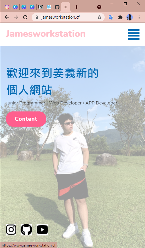
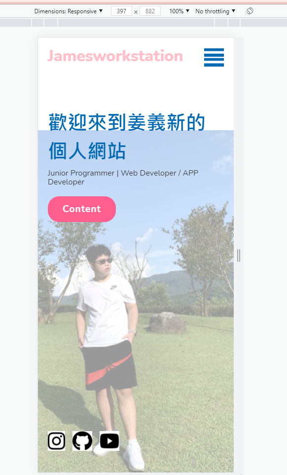
上圖為電腦拉伸網頁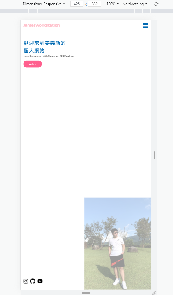
上圖為手機板看網頁
<!DOCTYPE html>
<html lang="en" >
<head>
  <meta charset="UTF-8">
  <title>姜義新 | 個人網站</title>
  <link rel="stylesheet" href="https://cdnjs.cloudflare.com/ajax/libs/normalize/5.0.0/normalize.min.css">
<link rel="stylesheet" href="./style.css">

</head>
<body>
<!-- partial:index.partial.html -->
<!DOCTYPE html>
<html lang="en">
 <head>
   <meta charset="UTF-8">
   <title>姜義新 個人網站</title>
   <link rel"stylesheet" href = "style.css">
 </head>
 <body>
   <section>
     <img src="https://i.imgur.com/khDyxAs.jpg" class="mosque" >
     <header>
       <a href="https://www.jamesworkstation.cf" class="logo">Jamesworkstation</a>
       <div class = "toggle"></div>
       <ul class = "navigation">
         <li><a href="content.html" style="--i:1;" class="active">Content</a></li>
         <li><a href="https://www.jamesch.cf/" style="--i:2;">Blog</a></li>
         <li><a href="https://github.com/jabee0228" style="--i:3;" >Github</a></li>
        </ul>
     </header>

     <div class="content">
       <div class="textBox">
         <h2>歡迎來到姜義新的</h2>
         <h2>個人網站</h2>
         <p>Junior Programmer | Web Developer / APP Developer</p>
         <a href="content.html">Content</a>
       </div>
     </div>
     <ul class="sci">
       <li><a href="https://www.instagram.com/jabee0228/" ><img src="https://i.imgur.com/96BFIGF.png" height="40" width="35"></a><li>
       <li><a href="https://github.com/jabee0228" ><img src="https://i.imgur.com/xQ3hVFh.png" height="40" width="40"></a><li>
       <li><a href="https://www.youtube.com/channel/UCbg0HQ82YygkxFxiLtBWwtQ" ><img src="https://i.imgur.com/EX7h8dI.png" height="40" width="40"></a><li>
     </ul>
   </section>
   <script>
     const menuToggle = document.querySelector('.toggle');
     const navigation = document.querySelector('.navigation');
     menuToggle.onclick = function(){
       menuToggle.classList.toggle('active');
       navigation.classList.toggle('active');
     }
   </script>
 </body>
 </html>
<!-- partial -->

</body>
</html>
© 2021 GitHub, Inc.
Terms
Privacy
Security
Status
Docs
Contact GitHub
Pricing
API
Training
Blog
About
@import url('https://fonts.googleapis.com/css2?family=Nunito:wght@200;300;400;500;600;700;800&display=swap');
*
{
  margin: 0;
  padding: 0;
  box-sizing: border-box;
  font-family: 'Nunito', sans-serif;
}
section
{
  position: relative;
  width: 100%;
  min-height: 100vh;
  padding: 220px 70px;
  display: flex;
  justify-content: flex-start;
  aligh-items: center;
}
header
{
  position: fixed;
  top: 0;
  left: 0;
  width: 100%;
  padding: 40px 100px;
  display: flex;
  justify-content: space-between;
  align-items: center;
  z-index: 1000;
}
header .logo
{
  position: relative;
  color: #ffc0cb;
  display: inline-block;
  font-size: 2em;
  text-decoration: none;
  font-weight: 800;
  opacity: 0;
  animation: slide_l 0.5s linear forwards;
  animation-delay: 0.2s;

}
@keyframes slide_l
{
  0%
  {
    transform: translateX(-100px);
    opacity: 0;
  }
  100%
  {
    transform: translateX(0px);
    opacity: 1;
  }
}
header ul
{
  position: relative;
  display: flex;
}
header ul li
{
  list-style: none;
}
header ul li a
{
  display: inline-block;
  color: #ffc0cb;
  font-size:1.1em;
  margin-left: 10px;
  display: inline-block;
  padding: 8px 18px;
  text-decoration: none;
  user-selcet: none;
  opacity: 0;
  animation: slide_t 0.5s linear forwards;
  animation-delay: calc(0.2s * var(--i));
}
@keyframes slide_t
{
  0%
  {
    transform: translateY(100px);
    opacity: 0;
  }
  100%
  {
    transform: translateY(0px);
    opacity: 1;
  }
}
header ul li a.active,
header ul li a:hover
{
  background: #0169b2;
  color: #fff;
  border-radius: 30px;
}
.content
{
  position: relative;
}
.content .textBox
{
  position: relative;
  max-width: 550px;
}
.content .textBox h2
{
  color: #0169b2;
  font-size: 3.5em;
  margin-bottom: 10px;
  line-height: 1.2em;
  font-weight: 700;
  opacity: 0;
  animation: slide_l 0.5s linear forwards;
  animation-delay: 0.2s;
}
.content .textBox h3
{
  color: #0169b2;
  font-size: 2em;
  margin-bottom: 10px;
  line-height: 1.2em;
  font-weight: 700;
  opacity: 0;
  animation: slide_l 0.5s linear forwards;
  animation-delay: 0.2s;
}
.content .textBox p
{
  font-size: 1.2em;
  color: #333;
  opacity: 0;
  animation: slide_l 0.5s linear forwards;
  animation-delay: 0.2s;
}
.content .textBox a
{
  display: inline-block;
  margin-top: 20px;
  padding: 15px 30px;
  background: #ff5e8e;
  color: #fff;
  font-size: 1.2em;
  border-radius: 1.2em;
  font-weight: 700;
  Letter-spacing: 1px;
  text-decoration: none;
  opacity: 0;
  animation: slide_l 0.5s linear forwards;
  animation-delay: 0.2s;
}
.sci
{
  position: absolute;
  bottom: 40px;
  display: flex;
  justify-content: center;
  aligb-items: center;
}
.sci li
{
  list-style:none;
}
.sci li a
{
  position: relative;
  display: inline-block;
  margin-right: 15px;
  opacity: 0;
  animation: slide_t 0.5s linear forwards;
  animation-delay: 0.2s;
}
.sci li a:hover
{
  background: #ff5e8e;
  transform: translateY(-10px);
}
.mosque
{
  position: absolute;
  bottom: 0;
  right: 0;
  max-width: 600px;
  animation: fi 1s linear forwards;
  animation-delay: 0s;
}
.mosque1
{
  position: absolute;
  bottom: 0;
  right: 0;
  max-width: 745px;
  animation: fi 1s linear forwards;
  animation-delay: 0s;
}
@keyframes fi
{
  0%
  {
    opacity: 0;
  }
  100%
  {
    opacity: 1;
  }

}
@media (max-width: 990px)
{
  section
  {
    padding: 150px 20px;
  }
  header
  {
    padding: 20px;
  }
  .navigation
  {
    display:none;
  }
   .navigation.active
  {
    position: fixed;
    top: 0;
    left: 0;
    width: 100%;
    height: 100%;
    background: #fff;
    display: flex;
    justify-content: center;
    align-items: center;
    flex-direction: column;
  }
  header ul li
  {
    margin: 10px 0;
  }
  header ul li a
  {
    margin-Left: 0;
  }
  .toggle
  {
    position: fixed;
    top: 20px;
    right: 20px;
    width: 40px;
    height: 40px;
    background: #0169b2 url(menu.png);
    background-size: 30px;
    background-repeat: no-reapeat;
    background-position: center;
    cursor: pointer;
    z-index: 1000;
    border-radius: 2px;
  }
  .toggle.active
  {
    background: #0169b2 url(close.png);
    background-size: 25px;
    background-repeat: no-reapeat;
    background-position: center;

  }
  .mosque
  {
    max-width: 500px;
  }
  .mosque1
  {
    max-width: 500px;
  }
  .content .textBox h2
  {
    font-size: 2.5em;
  }
  .content .textBox p
  {
    font-size: 1rem;
  }
}
@media (max-width: 1120px)
{
  .mosque
  {
    opacity: 0.4 !important;
  }
  .mosque1
  {
    opacity: 0.4 !important;
  }
}
已邀請的邦友 {{ invite_list.length }}/5
你手機版面的宣告在Head少放這個~
版面寬度根據手機寬度而設定~
<meta name="viewport" content="width=device-width" />
對耶!我都沒注意到使用 RWD 卻沒放這個 meta
平常 emmet 太習慣忽略了
不過我發現蘋果手機無法正常顯示ㄟ 用安卓手機正常 但用iphone下面照片沒有虛化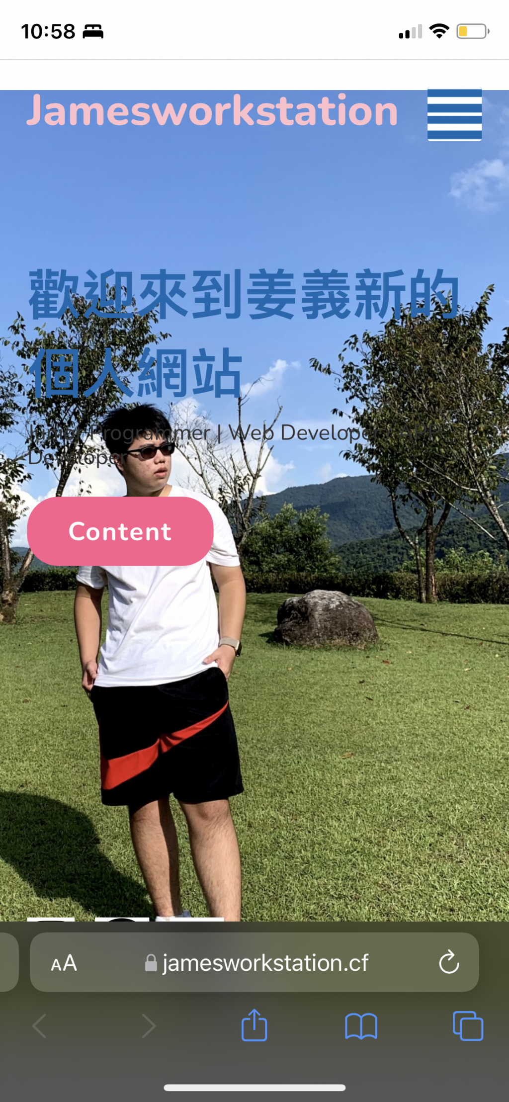
想詢問大大這個怎麼解決?
謝謝
剛剛查了一下 似乎opacity無法用在蘋果系統上 但我使用webkit仍然無法正常用 想詢問大大們這個要如何解決?
謝謝
姜義新
基本你查Google的opacity 在IOS問題就可以找到答案了~
參考網址
https://stackoverflow.com/questions/7548833/ios-css-opacity-visibility-transition
.mydiv {
        visibility:hidden;
        opacity: 0;
        transition: all 1s ease-out;
        -webkit-transition: all 1s ease-out;
        -moz-transition: all 1s ease-out;
        -o-transition: all 1s ease-out;
}
.mydiv:hover {
            visibility:visible;
            opacity: 1;
}
.mydiv:active {
            -webkit-transition: opacity 1s ease-out;
}
不太懂您的意思 是要加入 visibility:visible; 嗎?
因為我剛剛又翻了一下 opacity 這個屬性蘋果應該支援呀
是否能示範給我看?
萬分感謝!
你要確認一下~是否你的手機剛好不支援opacity 這個屬性
https://www.itread01.com/p/642674.html
因為我後來查了很久 目前蘋果系統應該支援opacity才對 但我的卻無法使用 目前猜測 有可能是!important 的問題 不過我想請問大大 為何我的網頁把!important拿掉就會出錯呢?
———— 10 / 21 更新————
如同樓下大大說的沒錯
使用 RWD @media screen 這個語法,
需要再 <head> 下 <meta name="viewport" ...> 標籤
<head>
    <meta charset="UTF-8">
    <title>姜義新 | 個人網站</title>
    <meta name="viewport" content="width=device-width" />
</head>
把最佳解答給樓下的大大吧~
平常 emmet 用習慣了,沒注意到 RWD 要使用的 <meta> 標籤,著實太慚愧了...
———— 舊的 ————
應該是 max-width 這個語法影響了顯示
看你的排版方式,應該是想讓圖片滿版
可以考慮別用 max-width 改用 height: 100%; 應該就好
記得 @media screen 裡面的 max-width 刪掉
如果導航條想要白色背景,就幫導航條上 background-color
.mosque
{
  position: absolute;
  bottom: 0;
  right: 0;
  /* max-width: 600px; 改成使用 height*/
  height: 100%;
  animation: fi 1s linear forwards;
  animation-delay: 0s;
}

 看影片追技術