先前在 SVG 研究之路 (7) - fill 填色 有介紹過 SVG 的 fill 填色,文章後面介紹了基本的漸層填色,但並沒有深入的介紹進一步的設定,然而高深莫測的漸層填色 ( Gradient ) 在 SVG 的 fill 裡面學問還真是不少,所以專門用一篇文章來解釋漸層填色,如此使用 fill 也才能更正確更靈活。( oxxostudio.tw 同步發表:SVG 研究之路 (25) - 再談漸層填色 )

廢話不多說,立馬來看漸層 Gradient ,漸層有兩種,第一種是線性漸層 ( Linear gradients ) ,第二種是放射漸層 ( Radial gradients ) ,因為是漸層,所以要這樣子定義:
<defs>
<linearGradient id="L" x1="0%" y1="0%" x2="100%" y2="100%">
<stop offset="5%" stop-color="#F00" />
<stop offset="95%" stop-color="#ff0" />
</linearGradient>
<radialGradient id="R" cx="20%" cy="40%">
<stop offset="5%" stop-color="#ff0" />
<stop offset="95%" stop-color="#f00" />
</radialGradient>
</defs>
看到上述的定義,會發現有許多屬性在裏頭,因為兩種漸層分別具有以下這些屬性:
1. 線性漸層
1.1. gradientUnits = "userSpaceOnUse | objectBoundingBox"
1.2. gradientTransform
1.3. x1
1.4. y1
1.5. x2
1.6. y2
1.7. spreadMethod = "pad | reflect | repeat"
1.8. xlink:href
2. 放射漸層
2.1. gradientUnits = "userSpaceOnUse | objectBoundingBox"
2.2. radientTransform
2.3. cx
2.4. cy
2.5. r
2.6. fx
2.7. fy
2.8. spreadMethod = "pad | reflect | repeat"
2.9. xlink:href
其實兩種漸層大同小異,差別只在於線性漸層是用 x1,y1,x2,y2、放射漸層是用 cx,cy,r,fx,fy,因此我們先從相同的屬性來談起:
[ gradientUnits = "userSpaceOnUse | objectBoundingBox" ]
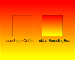
gradientUnits 定義了漸層的座標系統,預設為 objectBoundingBox,也就是以我們要套用漸層的物件為單位上色 ( 物件左上座標為漸層的 0% 0% ),而 userSpaceOnUse則是以整個 SVG 視區 ( viewport ) 為座標系統,如果還不清楚,可以看看下方的示意圖,我把 SVG 放上兩個矩形,套用跟 SVG 視區一樣的漸層,只是 gradientUnits 設定不同,就可以發現漸層的位置有很明顯的差異,設定為 userSpaceOnUse的矩形漸層色跟背景完全相同。 ( 附帶一提,如果是用 illustrator 產生的漸層,是採用 userSpaceOnUse)
<defs>
<linearGradient id="bg" x1="0%" y1="0%" x2="0%" y2="100%">
<stop offset="5%" stop-color="#F00" />
<stop offset="95%" stop-color="#ff0" />
</linearGradient>
<linearGradient id="userSpaceOnUse" x1="0%" y1="0%" x2="0%" y2="100%" gradientUnits="userSpaceOnUse">
<stop offset="5%" stop-color="#F00" />
<stop offset="95%" stop-color="#ff0" />
</linearGradient>
</defs>
<rect width="70" height="70" x="40" y="50" stroke="#000" fill="url(#userSpaceOnUse)" />
<rect width="70" height="70" x="140" y="50" stroke="#000" fill="url(#bg)" />
[ gradientTransform ]
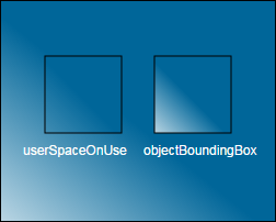
可以把漸層套用 transform 的效果,也就是可以縮放、旋轉、傾斜、Matrix...等,不過用到的時間點還真的不常見,畢竟漸層都已經可以手動調整方向了,實際用到 gradientTransform 的機會也不多,下面是範例,把漸層旋轉 45 度。( 你一定會發現,明明是藍到白的漸層,旋轉後為什麼藍色區域變多了呢?因為旋轉以後,藍色後面沒有漸層,延伸出去是一片藍色,藍色區域就增加了 )
<defs>
<linearGradient id="bg" x1="0%" y1="0%" x2="0%" y2="100%" gradientTransform="rotate(45)">
<stop offset="5%" stop-color="#069" />
<stop offset="95%" stop-color="#fff" />
</linearGradient>
<linearGradient id="userSpaceOnUse" x1="0%" y1="0%" x2="0%" y2="100%" gradientUnits="userSpaceOnUse" gradientTransform="rotate(45)">
<stop offset="5%" stop-color="#069" />
<stop offset="95%" stop-color="#fff" />
</linearGradient>
</defs>
<rect width="250" height="200" x="0" y="0" fill="url(#bg)" />
<rect width="70" height="70" x="40" y="50" stroke="#000" fill="url(#userSpaceOnUse)" />
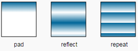
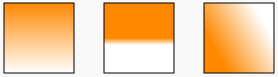
[ spreadMethod = "pad | reflect | repeat" ]
這是個對於漸層來說頗重要也頗特別的屬性,可以下達三種指令,第一個 pad 是預設值,也就是按照我們的漸層填色,第二個 reflect 是鏡射,就是按照鏡射的方式用我們定義的漸層,補滿漸層的頭尾,第三個 repeat 就是重複,就是使用重複的漸層來補滿頭尾,看看下圖會比較清楚:
<defs>
<linearGradient id="pad" x1="0%" y1="0%" x2="0%" y2="30%">
<stop offset="0%" stop-color="#069"></stop>
<stop offset="100%" stop-color="#fff"></stop>
</linearGradient>
<linearGradient id="reflect" x1="0%" y1="0%" x2="0%" y2="30%" spreadMethod="reflect">
<stop offset="0%" stop-color="#069"></stop>
<stop offset="100%" stop-color="#fff"></stop>
</linearGradient>
<linearGradient id="repeat" x1="0%" y1="0%" x2="0%" y2="30%" spreadMethod="repeat">
<stop offset="0%" stop-color="#069"></stop>
<stop offset="100%" stop-color="#fff"></stop>
</linearGradient>
</defs>
<rect width="70" height="70" x="30" y="50" stroke="#000" fill="url(#pad)"></rect>
<rect width="70" height="70" x="130" y="50" stroke="#000" fill="url(#reflect)"></rect>
<rect width="70" height="70" x="230" y="50" stroke="#000" fill="url(#repeat)"></rect>
[ link:href ]
讓漸層可以引用其它元素的設定,也就是說我們可以先定義漸層的顏色,,就可以套用在不同的起始點和終點,例如下面的範例:
<defs>
<linearGradient id="a1">
<stop offset="0%" stop-color="#0c0"></stop>
<stop offset="100%" stop-color="#fff"></stop>
</linearGradient>
<linearGradient id="b1" x1="0" y1="0" x2="0" y2="1" xlink:href="#a1" />
<linearGradient id="b2" x1="0" y1="1" x2="0" y2="0" xlink:href="#a1" />
<radialGradient id="b3" x1="0" y1="0" x2="0" y2="1" xlink:href="#a1" />
</defs>
<rect width="70" height="70" x="30" y="50" stroke="#000" fill="url(#b1)"></rect>
<rect width="70" height="70" x="130" y="50" stroke="#000" fill="url(#b2)"></rect>
<rect width="70" height="70" x="230" y="50" stroke="#000" fill="url(#b3)"></rect>
OK,以上就是線性漸層和放射漸層的共通屬性,接下來就要討論它們兩個個別的屬性了,剛剛的範例幾乎都是用線性漸層做的,就讓我們先來看看線性漸層 linearGradient 吧!
[ x1,y1,x2,y2 ]
這個非常容易理解, x1,y1就是漸層色的起點, x2,y2就是漸層色的終點,數值是 0~1 的數字 ( 可以小數 ),或是 0%~100% 的數值,至於要如何和內容的 stop offset 做區分呢?可以參考下面這張示意圖, x1,y1,x2,y2是指整個漸層填色的區域位置,而stop offset 則是在填色區域內的 0% ~ 100% 。
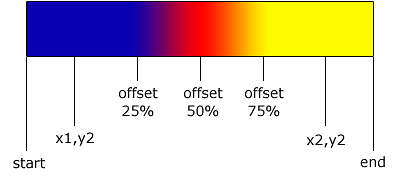
x1="0",y1="0" 或 x1="0%" y1="0%" 表示從左上開始,x2="1" y2="1" 或 x2="100%" y2="100%" 表示結束在右下角,如果這樣設定就會變成左上到右下的漸層,了解之後就可以做出許多變化:
<defs>
<linearGradient id="a1">
<stop offset="0%" stop-color="#f80"></stop>
<stop offset="100%" stop-color="#fff"></stop>
</linearGradient>
<linearGradient id="b1" x1="0" y1="0" x2="0" y2="1" xlink:href="#a1" />
<linearGradient id="b2" x1="0" y1=".5" x2="0" y2="0.6" xlink:href="#a1" />
<linearGradient id="b3" x1="0" y1="0.4" x2="0.7" y2="0" xlink:href="#a1" />
</defs>
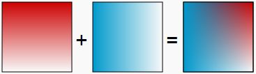
你也可以運用 stop-opacity 改變漸層透明度,結合多種漸層:
<defs>
<linearGradient id="b1" x1="0" y1="0" x2="0" y2="1">
<stop offset="0%" stop-color="#c00"></stop>
<stop offset="100%" stop-color="#c00" stop-opacity="0"></stop>
</linearGradient>
<linearGradient id="b2" x1="0" y1="0" x2="1" y2="0">
<stop offset="0%" stop-color="#09c"></stop>
<stop offset="100%" stop-color="#09c" stop-opacity="0"></stop>
</linearGradient>
</defs>
<rect width="100" height="100" x="0" y="0" stroke="#000" fill="url(#b1)"></rect>
<rect width="100" height="100" x="0" y="0" stroke="#000" fill="url(#b2)"></rect>
看完了 linearGradient,就來研究一下 radialGradient。
[ cx,cy,r ]
這是 radialGradient 最好理解的參數,顧名思義,從圓心出發一直到半徑結束的放射漸層,請注意,單位仍然是小數點或是百分比,這邊最容易出錯的地方在 r,因為如果你設為 1 或是 100%,半徑就是矩形的寬度喔!( 如果不設定,則預設值為 50%,如果不是圓形,則會按照長寬變成同等比例的橢圓半徑 )
<defs>
  <radialGradient id="r1" cx=".5" cy=".5" r=".5">
    <stop offset="0%" stop-color="#f80"></stop>
    <stop offset="100%" stop-color="#fff"></stop>
  </linearGradient>
  <radialGradient id="r2" cx=".5" cy=".5" r=".5">
    <stop offset="50%" stop-color="#f80"></stop>
    <stop offset="100%" stop-color="#fff"></stop>
  </linearGradient>
  <radialGradient id="r3" cx=".9" cy=".9" r="1">
    <stop offset="0%" stop-color="#f80"></stop>
    <stop offset="100%" stop-color="#fff"></stop>
  </linearGradient>
</defs>
<rect width="100" height="100" x="5" y="50" stroke="#000" fill="url(#r1)"></rect>
<rect width="100" height="100" x="115" y="50" stroke="#000" fill="url(#r2)"></rect>
<rect width="100" height="100" x="225" y="50" stroke="#000" fill="url(#r3)"></rect>
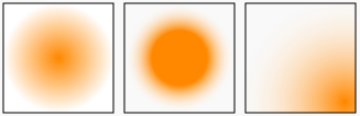
[ fx,fy ]
這兩個參數很有意思,這兩個參數預設是沒有值的,如果我們設定了這兩個參數,則剛剛的 cx,cy就會變成放射漸層填色的「 範圍」圓心,然後漸層色會填滿這個「圓的範圍」
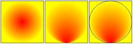
<defs>
  <radialGradient id="r1" cx=".5" cy=".5" r=".5">
    <stop offset="0%" stop-color="#f00"></stop>
    <stop offset="100%" stop-color="#ff0"></stop>
  </linearGradient>
  <radialGradient id="r2" cx=".5" cy=".5" r=".5" fx=".5" fy="1">
    <stop offset="0%" stop-color="#f00"></stop>
    <stop offset="100%" stop-color="#ff0"></stop>
  </linearGradient>
</defs>
<rect width="150" height="150" x="5" y="10" stroke="#000" fill="url(#r1)"></rect>
<rect width="150" height="150" x="160" y="10" stroke="#000" fill="url(#r2)"></rect>
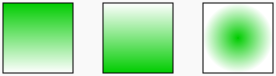
如果搭配剛剛的鏡射或重複的屬性,就會發生有趣的變化
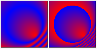
<defs>
  <radialGradient id="r1" cx=".5" cy=".5" r=".4" fx=".75" fy=".75" spreadMethod="reflect">
    <stop offset="0%" stop-color="#f00"></stop>
    <stop offset="100%" stop-color="#00f"></stop>
  </linearGradient>
  <radialGradient id="r2" cx=".5" cy=".5" r=".4" fx=".75" fy=".75" spreadMethod="repeat">
    <stop offset="0%" stop-color="#f00"></stop>
    <stop offset="100%" stop-color="#00f"></stop>
  </linearGradient>
</defs>
<rect width="150" height="150" x="5" y="10" stroke="#000" fill="url(#r1)"></rect>
<rect width="150" height="150" x="160" y="10" stroke="#000" fill="url(#r2)" ></rect>
以上就是詳細的漸層用法,如果熟練了 radialGradient,也可以輕鬆做出立體的球喔!
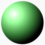
<defs>
  <radialGradient id="r1" cx=".3" cy=".3" r=".7">
    <stop offset="0%" stop-color="#fff"></stop>
    <stop offset="30%" stop-color="#9f9"></stop>
    <stop offset="70%" stop-color="#373"></stop>
    <stop offset="100%" stop-color="#000"></stop>
  </linearGradient>
</defs>
<<circle cx="85" cy="85" r="75" fill="url(#r1)"/
IT 鐵人的發文編輯器快搞死我了,發文之後發現圖片不見格式錯亂,再度進入編輯,結果文章竟然 1/2 消失不見,後半段整個重打,打完之後格式又錯亂無限迴圈... ( 想看好閱讀的真正版本請上 http://www.oxxostudio.tw/articles/201409/svg-25-gradients-patterns.html )

 看影片追技術