昨天筆記了各種 flexbox 的屬性,
今天決定用這個新的 layout mode 來練習排版,希望以後能告別 float 地獄 ヽ(✿ ゚▽゚)ノ
目標:完成 這個動態 的切版
粗略的規劃中,會用到三個 flex container。如圖: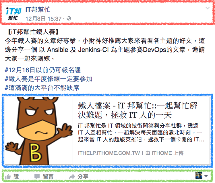
首先,先把圖片、文字 copy 一份,並寫出大致的 html ( step 0 )
現在的版面還是裸奔的狀態。
step 1 加上貼文主體的樣式,目前還跟 flexbox 沒有關係。
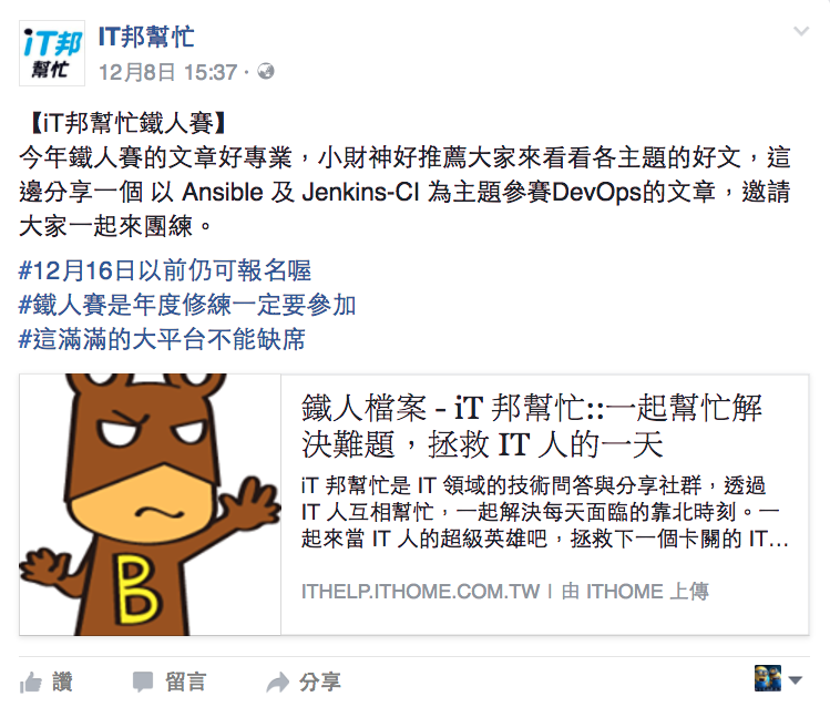
接著從 header 開始著手,規劃如下:
- 整個 header 是一個 flex container
- 粉絲專頁連結 / 此篇貼文連結也包在一個 flex container 裡面
html 架構為:
<header class="article__header">
    <img src="圖片網址" alt="" />
    <div class="article__info">
        <a class="article__author" href="#">粉絲專頁名稱</a>
        <a class="article__time" href="#"><time>發文日期</time></a>
    </div>
</header>
/* 讓 大頭貼 跟 兩個連結 並排顯示 */
.article__header {
    display: flex;
}

/*
 * 兩個連結從上排到下,並且:
 * 1. 紛絲專頁名稱對齊大頭貼上方
 * 2. 貼文連結對其大頭貼下方
 */
.article__info {
    display: flex;
    flex-direction: column;
    justify-content: space-between;
}
這時候就會覺得,flexbox 好自在!! 直接設定成 space-between 真的非常方方便 =D
其他的樣式設定 ( 例如 color / margin / font / ... ) 就跳過了
經過剛剛的 step 2 後,現在 header 已經看起來有模有樣了: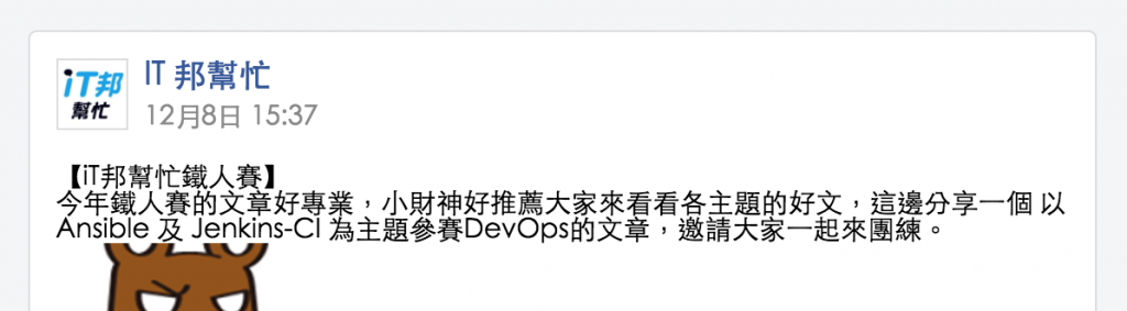
step 3 微調貼文文字樣式
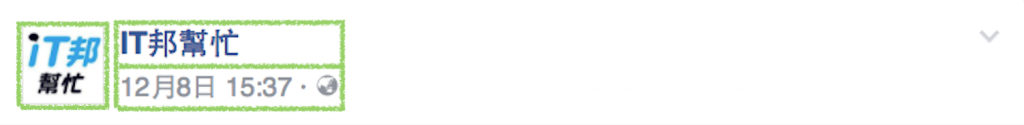
再來是處理貼文中的分享連結,主要規劃是: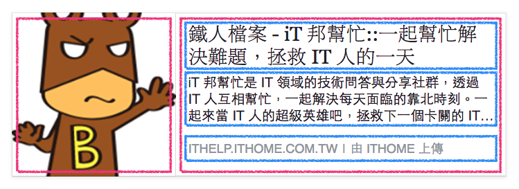
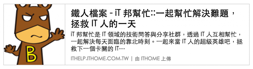
我這邊寫的 html 是:
<a class="main-link" href="#">
    <img src="文章縮圖" alt="縮圖">
    <div class="main-link__text">
        <h2>鐵人檔案 - iT 邦幫忙::一起幫忙解決難題,拯救 IT 人的一天</h2>
        <p>iT 邦幫忙是 IT 領域的技術問答與分享社群,透過 IT 人互相幫忙,一起解決每天面臨的靠北時刻。一起來當 IT 人的超級英雄吧,拯救下一個卡關的 IT…</p>
        <p class="main-link__info">ITHELP.ITHOME.COM.TW | 由 ITHOME 上傳</p>
    </div>
</a>
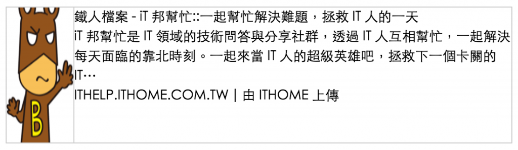
與 step 3 相同,先將 .main-link 設為 display: flex 後,就會發現...
圖片被壓縮了:
這是因為目前 .main-link 下有另一個元素 .main-link__text 內容較多,因此會吃掉一些圖片的空間。
這時候的解決方案就是在圖片上設定 "不要收縮":
.main-link {
    img {
        flex-shrink: 0;
    }
}
現在的效果就好一些了
而連結另一側的文字,也與 header 的排版方式相似。
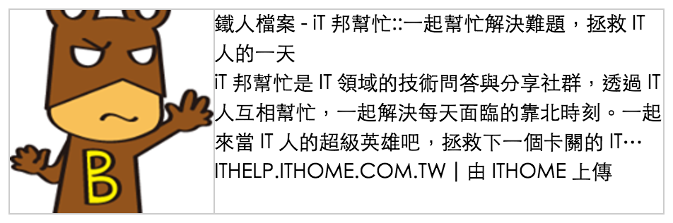
經過 step 4 後,分享連結的外觀是這個樣子:
最後則是使用者操作到區塊:
<footer class="article__footer">
    <div>
        <button><span></span>讚</button>
        <button><span></span>留言</button>
        <button><span></span>分享</button>
    </div>
    <button>
        <img src="大頭貼圖片" alt="您的大頭貼">
        <span></span>
    </button>
</footer>
.article__footer {
    display: flex;
    justify-content: space-between;
}
一樣設定 justify-content: space-between; 後,就能讓操作按鈕靠左、大頭貼靠右了。
最後的成果在:https://jsfiddle.net/lazy_shyu/ktyfLefz/9/
( icon 就沒放了,可以用 pseudo 配合 background-image 呈現出來。 )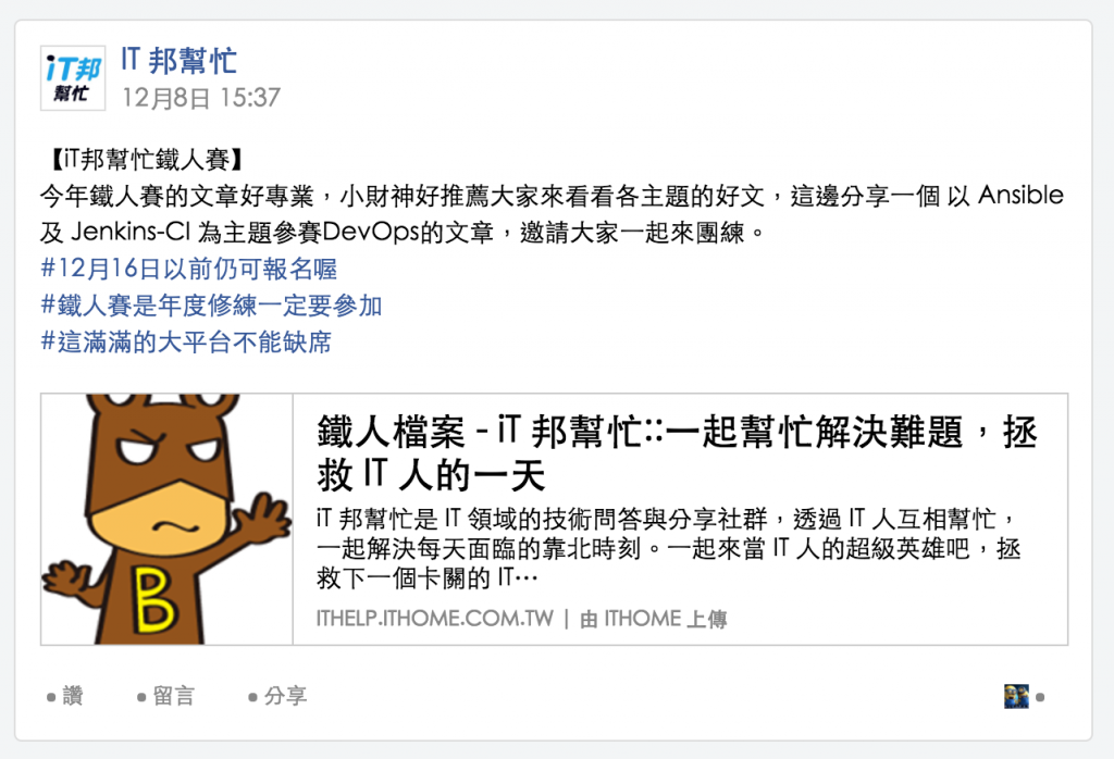


 iThome鐵人賽
 看影片追技術