今天要來寫的是彈跳球
拆解動畫效果,物件做 y 軸方向位移,物件隨動畫時間縮放長寬
(原本長寬1:1/下落時球體長度拉長/觸碰到地面球體寬度變寬),背景不動。
首先先把架構跟class依序安排好
<div class="wrapper">
  <div class="shadow"></div>
  <div class="ball bouncing-ball"></div>
</div>
<div class="floor"></div>
然後來寫球+陰影的css
.ball {
  background: #3d5b35;
  width: 50px;
  height: 50px;
  border-radius: 100%;
  margin: auto;
  position: relative;
  top: 1em;
}

 .shadow{
  position: relative;
  background:rgba(35,35,35,0.3);
  width: 50px;
  height: 20px;
  border-radius: 100%;
  margin: auto;
  top:15em;
  animation: shadow-ani .4s  cubic-bezier(.5,.2,.8,.8) infinite alternate;
}
這邊都寫完後,球+陰影的雛形就出來了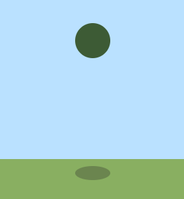
接下來寫球的動畫
/*把動畫效果寫在這個class上*/
.bouncing-ball {
  animation: bounce .4s  cubic-bezier(.5,.2,.8,.8) infinite alternate;
  -webkit-animation: bounce .4s  cubic-bezier(.5,.2,.8,.8) infinite alternate ;
}

@keyframes bounce {
  0% {
    top: 1em;
    scale(1, 1)
  }
  10% {
    transform: scale(1, 1.1);
  }
  90% {
    transform: scale(0.8, 1.3);
  }
  95% {
    transform: scale(1.2, 0.8);
  }
  100% {
    top: 12em;
    transform: scale(1.2, 0.6);
  }
}
接下來寫陰影的動畫
@keyframes shadow-ani {
  0% {
     top: 15.5em;
    transform: scale(1.5,1);
     opacity:0.3;
  }
  95% {
opacity:0.8;
  }
  100% {
    transform: scale(0.8, 0.6);
  }
}
這樣基本上就完成了,附上本次實作的codepen網址~
https://codepen.io/UHU/pen/GYEerm
貝茲曲線可以參考這個網站來調出理想的值
http://cubic-bezier.com/#.17,.67,.83,.67總算撐到第 7 天了XD 剩23天 加油啊

 iThome鐵人賽
 看影片追技術