這次要來寫的是火焰的效果
一樣把基本架構寫好
<div class="centered">
  <div class="fire-wrapper">
    <div class="wood"></div>
    <div class="fire-ani">
      <div class="red fire"></div>
      <div class="orange fire"></div>
      <div class="yellow fire"></div>
      <div class="wh fire"></div>
    </div>
  </div>
</div>
然後設定 css 樣式
這邊會用到先前提過的 多重box-shadow
body {
  background: #232323;
}

.centered {
  position: absolute;
  left: 50%;
  top: 50%;
  transform: translate(-50%, -50%);
}

.fire {
  width: 6em;
  height: 6em;
  border-radius: 100% 0 100% 100%;
  position: absolute;
  bottom: 0;
}

.red {
  background: #ff4141;
  transform: scale(1.2);
  box-shadow: 0 0 10px 10px rgba(255, 65, 65, 0.9),
    0 0 20px rgba(255, 65, 65, 0.6), 0 0 40px rgba(255, 65, 65, 0.6),
    0 0 60px rgba(255, 65, 65, 0.2);
}

.orange {
  background: #f6663d;
  transform: scale(0.9);
  box-shadow: 0 0 5px 5px rgba(246, 102, 61, 0.5),
    0 0 10px rgba(246, 102, 61, 0.6), 0 0 20px rgba(246, 102, 61, 0.6),
    0 0 40px rgba(246, 102, 61, 0.2);
}

.yellow {
  background: rgba(239, 194, 83, 0.8);
  transform: scale(0.6);
  box-shadow: 0 0 15px 10px rgba(239, 194, 83, 0.4),
    0 0 10px rgba(239, 194, 83, 0.6), 0 0 20px rgba(239, 194, 83, 0.6),
    0 0 40px rgba(239, 194, 83, 0.2);
}

.wh {
  background: rgba(255, 255, 255, 0.8);
  transform: scale(0.4);
  box-shadow: 0 0 10px 10px rgba(255, 255, 255, 0.3),
    0 0 10px rgba(255, 255, 255, 0.2), 0 0 20px rgba(255, 255, 255, 0.5),
    0 0 40px rgba(255, 255, 255, 0.5);
}
.fire-wrapper {
  position: relative;
  transform: rotate(-45deg);
}

.fire-wrapper:after {
  content: "";
  width: 1em;
  height: 5em;
  background: #7f4318;
  position: absolute;
  top: -1em;
  left: 1em;
  z-index: -1;
}
.fire-wrapper:before {
  content: "";
  width: 1em;
  height: 5em;
  background: #7f4318;
  position: absolute;
  top: -4em;
  right: 1em;
  z-index: -1;
  transform: rotate(90deg);
}

.wood {
  width: 1em;
  height: 4em;
  background: #7f4318;
  position: absolute;
  top:-1em;
  left: -2em;
  z-index: -1;
  transform:translateX(50%)rotate(45deg);
}
到這邊火焰+木堆的雛型就出現了
木頭細節要更豐富的話,可以使用 svg 來做會更省事一點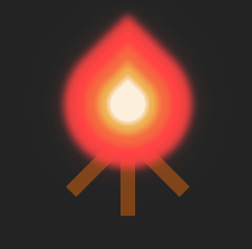
接下來把動畫寫進來
動畫的內容是讓火焰有些微晃動跟縮放的感覺
.fire-ani {
  animation: fire-move 2s 0.2s linear infinite alternate;
  transform-grgin: center bottom;
}

@keyframes fire-move {
  0% {
    transform: rotate(-1deg);
  }
  20% {
    transform: rotate(1deg);
  }
  40% {
    transform: rotate(-1deg);
  }
  60% {
    transform: rotate(1deg);
    transform: scale(1.02);
  }
  80% {
    transform: rotate(-2deg);
    transform: scale(0.97);
  }
  100% {
    transform: rotate(1deg);
  }
}
到這邊就完成了
一樣附上本次的 codepen 如下
https://codepen.io/UHU/pen/WYbbeX
明天是最後一天了,總算可以鬆口氣寫感言了哈哈


 看影片追技術