今天的主題是色塊遮擋文字的效果
使用偽元素(after)產生的色塊將文字蓋住,再依時間將色塊縮小至無寬度
就能顯示出原本的文字
一樣把基本架構寫好
<div class="wrapper">
  <div class="centered">
    <h1 class="reveal-text">
      <span>被遮住的標題</span>
    </h1>
  </div>
</div>
然後設定好基本的 css
/*import noto sans*/
@import url(https://fonts.googleapis.com/earlyaccess/notosanstc.css);
* {
  font-family: "Noto Sans TC";
  margin: 0;
  padding: 0;
  font-weight: 400;
}

body {
  background: #232323;
}

.centered {
  position: absolute;
  left: 50%;
  top: 50%;
  transform: translate(-50%, -50%);
}

h1 {
  font-size: 3rem;
}
/*先把文字設透明 不然色塊一消失 文字這部分會看起來很怪*/
.reveal-text span {
  color: #fff;
  opacity: 0;
}

.reveal-text:after {
  content: "";
  position: absolute;
  width: 0%;
  height: 100%;
  background: #ff4141;
  right: 0;
  top: 0;
}
先把 after 的寬度設成100%
就可以看到色塊蓋住文字區域的樣子
如下圖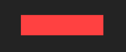
然後把動畫的效果加進來
這邊希望色塊由右往左消失
.reveal-text:after {
  animation: hiding-text-ani 0.5s cubic-bezier(0, 0.8, 0.6, 0.8) forwards;
  animation-delay: 1s;
}

@keyframes hiding-text-ani {
  0% {
    width: 0%;
    left: 0;
  }

  50% {
    width: 100%;
    left: 0%;
  }

  100% {
    left: 100%;
    width: 0%;
  }
}
另個動畫則是控制文字的透明度由 0 到 1
.reveal-text span {
  animation: appear-text .0001s linear forwards;
  animation-delay: 1.45s;
}
@keyframes appear-text {
  0% {
    opacity: 0;
  }
  100% {
    opacity: 1;
  }
}
到這裡就完成了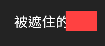
最後附上本次的 codepen 如下
https://codepen.io/UHU/pen/xyzrvL


 iThome鐵人賽
 看影片追技術