
前面三天都是在談 Redux 關於前端的資料流,今天要談一個「非必要」的 react component 套件:Material-UI。它是Material Design 的 react 實作套件,它用來提供畫面的組件 (component),像是 Button, Input, Dialog…等,充分地體現出 React component 讓我們以組件的概念組裝畫面。
我們曾在Day 12 - 二周目 - 準備起程深入後端 中提到設計師做完設計稿後,會由一個前端工程師,做「切版」的工作,一般會寫出 HTML + CSS + Javascript。若前端框架採用 React,我們會把他們割一割封裝在各個 component,最後用 component 組裝畫面。
然而,不是每家公司都有「切版」的工程師。若只是單純的做後台網站,沒有對廣大的用戶,就不會講求畫面多絢麗、使用者體驗多利害,所以就有這種已經做好的畫面樣式的 component 可以直接使用,像是:Material-UI(Google),Ant Design (螞蟻金服)…等。
Grid 排版Material-UI 功能特色:
withStyles 這個 HOC(high order component),可以注入/覆寫樣式Grid
Material-UI 歷經多次的 API 改版,現在的套件變的比較有組識了,基本元件全放到 @material-ui/core 中
hello-react
material-ui/core: 安裝 npm install @material-ui/core --save
material-ui/icons(可選): 安裝 npm install @material-ui/icons --save, 這套件提供一些svg(Scalable Vector Graphics) icon我們之前在 hello-react 中加入了一個 button 來發出一個 action,如圖 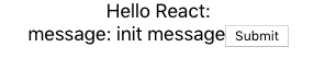
現在我們來換成 Material-UI Button。修改前試想一下,我們要改的是畫面,所以應該改哪個資料夾的檔案呢?actions/stores/reducers/components/containers 哪一個?
若你之前有跟上文章的內容應該可以想到,答應就是
components
它是掌管畫面的資料夾,所以改 components/LoginBox.js
// components/LoginBox.js
import React, { Component } from 'react';
import Button from '@material-ui/core/Button';

class LoginBox extends Component {
  render() {
    return (
      <div>
        message: {this.props.message}
        <Button onClick={this.props.onClickSubmit}>Submit</Button>
      </div >
    );
  }
}
我們把 html tag button,換成是 Material-UI component Button。存檔後就完成了,看結果
如何?很容易吧! 有沒有體驗到下面的感覺呢?
一打開 Component API 有沒有嚇一跳呢?要怎麼把它們組起來?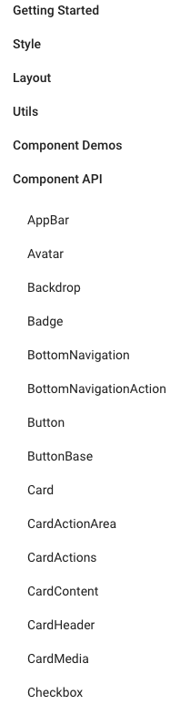
其實,可以不用一個個查,常用的 Demo 都有人整理好了,只要開 Component Demos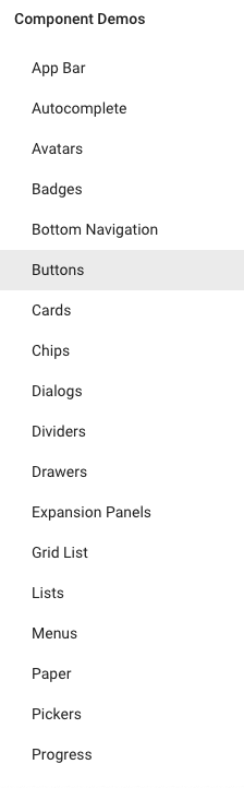
選你要的畫面 Demo,然後找到 Show the source 按鈕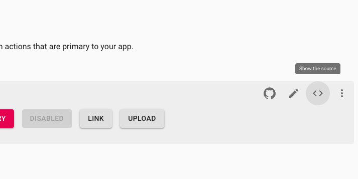
就可以查到原始碼了,再貼到自己的專案中,就可以用了。
每個 Demo 頁面最下面還很貼心的附上相關的 API 連結,就可以進去看更多 component 用法。
幾乎所有的 Demo code 最後面都會看到 withStyles 這個 HOC,如下圖: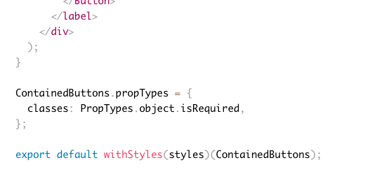
這是那來封裝 sytle 或 overwrite style 用的,它的簽章如下:
styles => component => component
當 withStyles(styles) 時就是函數:
component => component
它把 component (class) 送入,產生新的 component (class)。不僅如此,它還把注入的 styles,放在 classes prop 中,你就可以在 component 使用注入的 style。
因為 withStyles 會把樣式注入 classes prop 中,所以 component 的 prop 定義 (propTypes) 要有 classes: PropTypes.object.isRequired。沒加入的話, Material-UI 也會警告你。
注意看到 styles 是巢狀物件,屬性名是 css class name,屬性值是 CSS 物件 (見 CSS Object Model)。 透過 withStyles(styles)(Component) 後,它會把 css class name 也當做 classes prop 的屬性名但是 值是字串,也就是:
const styles = {
  myRoot: {
    backgroundColor: 'red',
  }
}
變成
this.props.classes.myRoot = '某個含有 myRoot 的字串的 css class name'
舉個使用 withStyles 例子:
const styles = {
  myRoot: {
    backgroundColor: 'red',
  }
}

const Box = (props) => (
  <div className={props.classes.myRoot}>  <------ this.props.classes.myRoot 是字串,不是 styles.myRoot (CSS 物件)
    hi
  </div>
);

const withStyleBox = withStyles(styles)(Box);

// uasge: <withStyleBox />
當你知道事實
this.props.classes.<style anme> = <string>
你會知道 component 如何加載多個 style:
const styles = {
  myRoot: {
    backgroundColor: 'red',
  },
  myLayout: {
    text: 'center',
  }
}

const Box = (props) => (
  <div className={props.classes.myRoot + ' ' + props.classes.myLayout}>  <------ 就和加載多個 class name 一樣
    hi
  </div>
);

const withStyleBox = withStyles(styles)(Box);

// uasge: <withStyleBox />
若你希望 props.classes.myRoot + ' ' + props.classes.myLayout 是動態的,可以使用 classnames 套件,有條件的控制名稱是否出現,如:
classNames({ [props.classes.myRoot]: true, [props.classes.myLayout]: true }); // =>  props.classes.myRoot + ' ' + props.classes.myLayout
classNames({ [props.classes.myRoot]: true, [props.classes.myLayout]: false }); // =>  props.classes.myRoot
假如我們打開 Button,往下看到 CSS API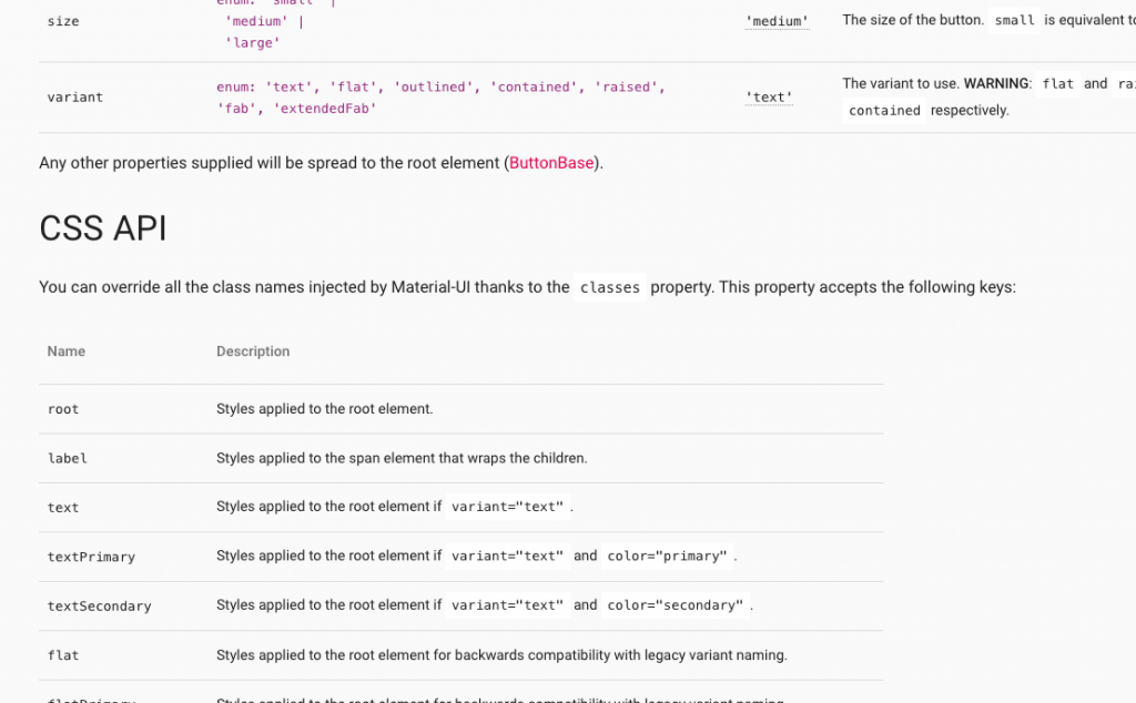
這就是你可以覆寫原始 component 樣式的 API。
直接舉個官網例子:
const StyledButton = withStyles({
  root: {
    background: 'linear-gradient(45deg, #FE6B8B 30%, #FF8E53 90%)',
    borderRadius: 3,
    border: 0,
    color: 'white',
    height: 48,
    padding: '0 30px',
    boxShadow: '0 3px 5px 2px rgba(255, 105, 135, .3)',
  },
  label: {
    textTransform: 'capitalize',
  },
})(Button);
用 withStyles 就可以替換 root 和 label 原來的樣式。
最後一個功能是:排版(layout)。
Material-UI 和 bootstrap 一樣,它提供 Responsive API,只不過是 component 版本的。
Grid 就是拿來做 responsive layout。它和 bootstrap 一樣採用 12-column grid layout(12欄網格系統)。
不管螢幕大小,一個 row 就是被切成 12 欄,你要設定排版怎麼分配欄位數。直接看例子:
<Grid container className={classes.root} spacing={16}>
  <Grid item xs={6} sm={4}>
    A
  </Grid>
  <Grid item xs={6} sm={4}>
    B
  </Grid>
  <Grid item xs={6} sm={4}>
    C
  </Grid>
</Grid>
你就知道怎麼用了,更多例子見 Grid Demos。
我們的心力還要花在設定 Breakpoints,每個 breakpoint 有固定的螢幕大小
xs, extra-small: 0px or larger
sm, small: 600px or larger
md, medium: 960px or larger
lg, large: 1280px or larger
xl, extra-large: 1920px or larger
以上面例子來說:
xs 指的是當螢幕大於等於 0px 時要採用的「分配欄位數」,所以上面的結果是:
A B
C
A 和 B 的 Grid 各佔了6欄,它們剛好就是一個 row,所以 C 的 Grid 就會在下一 row。sm 指的是當螢幕大於等於 600px 時,結果是:
A B C
A 、 B 和 C 可以剛好放滿一個 row 共 12 欄。Hidden component有時你會需要只有特定的螢幕大小,component 才會要出現/隱藏,這時候可以用 Hidden component。
文件中給個例子:
innerWidth  |xs      sm       md       lg       xl
            |--------|--------|--------|--------|-------->
width       |   xs   |   sm   |   md   |   lg   |   xl

smUp        |   show | hide
mdDown      |                     hide | show
若
<Hidden smUp>
  ...may hidden dependent on screen size
</Hidden>
你的螢幕大小若大於等於 600px ,Hidden 內的東西就會隱藏。反之,小於 600px 時會顯示。
若
<Hidden mdDown>
  ...may hidden dependent on screen size
</Hidden>
你的螢幕大小若小於 1280px ,Hidden 內的東西就會隱藏。反之,大於等於 1280px 時會顯示。
今天介紹了 Material-UI 的常用功能
withStyles 樣式注入Grid 操作12欄網格系統當沒有人寫做切版時,Material-UI 是一個可選方案。若你想做的畫面很絢麗、酷炫或太過客製化的 component,請花時間在 HTML + CS + Javascript中。若你願意包成 component 提供別人使用(如:React Date Picker),會有人感謝你的,

 看影片追技術