今天要寫的主題是理髮店旋轉燈
如下圖的這種東西↓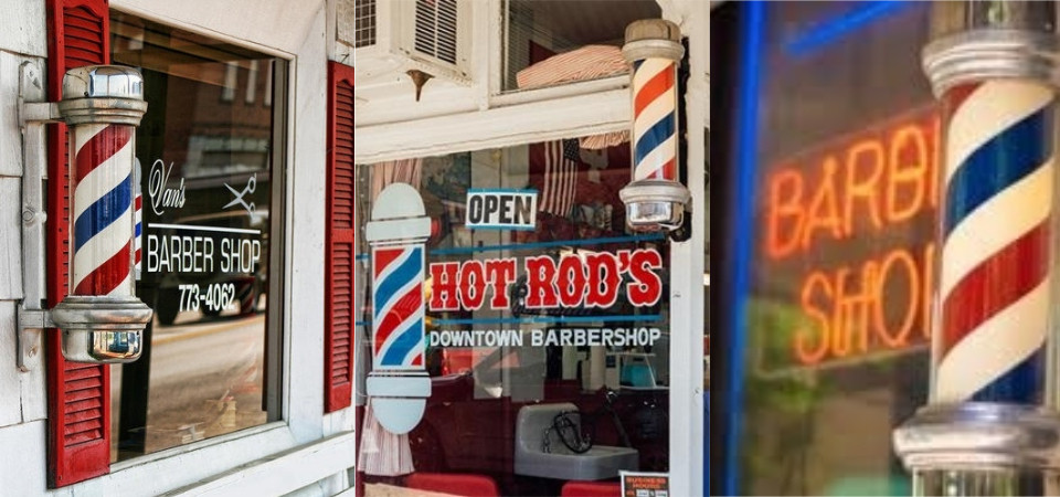
一樣把基本架構寫好
<div class="centered-wrapper">
  <div class="pole-wrapper">
    <div class="pole-top"></div>
    <div class="pole-sec-part"></div>
    <div class="pole-light-out">
      <div class="pole-light-inner pole-ani"></div>
    </div>
    <div class="pole-sec-part"></div>
    <div class="pole-bottom"></div>
  </div>
</div>
然後把基本的 css 設定好
燈的部分區塊使用偽元素來製作
.centered-wrapper{
  position:absolute;
  left:50%;
  top:50%;
  transform:translate(-50%,-50%);
}

.pole-wrapper{
  text-align:center;
  -moz-box-sizing:border-box;
  -webkit-box-sizing:border-box;
  box-sizing:border-box;
}

.pole-top,.pole-bottom{
  background:#cccccc;
  width:1.6em;
  height:1.6em;
  border-radius:100%;
  position: relative;
  border:3px solid #a3a3a3;
  margin:auto;
  z-index:1;
}

.pole-top:before,.pole-bottom:before{
  content:"";
  background:rgba(255,255,255,0.5);
  width:0.5em;
  height:0.5em;
  position: absolute;
  left:5px;
  top:5px;
  border-radius:100%;
}

.pole-sec-part{
 background:#cccccc;
  width:4.5em;
  height:1.4em;
  border-radius:0px 0px 2em 2em;
  border:3px solid #a3a3a3;
  margin:-8px 0px;
  position: relative;
  z-index:5;
}

.pole-sec-part:nth-of-type(2){
  transform:rotate(180deg);
}

.pole-sec-part:before{
  content:"";
  background:#cccccc;
  width:5em;
  height:0.8em;
  border-radius:0.5em;
  border:3px solid #a3a3a3;
  position:relative;
  display:block;
  left:-0.4em;
  top:-0.6em;
}

.pole-light-out{
  border:3px solid #a3a3a3;
  width:3.5em;
  height:9.5em;
  margin:auto;
}

.pole-light-inner:before{
  content: "";
    background: rgba(255,255,255,0.5);
    width: 1em;
    height: 9em;
    position: absolute;
    left: 1em;
    bottom: auto;
}

.pole-light-inner{
  width:100%;
  height:100%;
  background:
  repeating-linear-gradient(
    33deg,
    #ffffff 0,
    #ffffff 1em,
    #ff4141 0,
    #ff4141 2em,
    #ffffff 0,
    #ffffff 3em,
    #2989d8 0,
    #2989d8 4em
  );
}
這裡用到比較特別的方法是漸層的背景色 repeating-linear-gradient
詳細的介紹可以參考這裡
https://css-tricks.com/stripes-css/
寫到這邊 基本燈的架構就出現了
然後讓背景色的區塊動起來
.pole-ani{
  animation:spinning-light 1.5s linear infinite;
}

 @keyframes spinning-light{
  0%{background-position:0px 0px;}
  100%{background-position:0px -9.5em;
}
到這邊就完成了
附上 codepen 如下
https://codepen.io/UHU/pen/rqQgzM

 iThome鐵人賽
 看影片追技術