11月11日台北天氣很棒
調整的最終篇,就來介紹一下如何調整ggplot中的格線
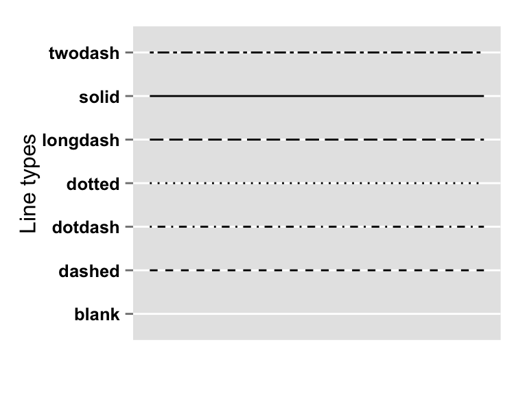
先附上線的類型
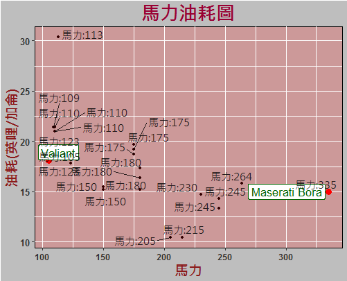
ggplot(dat,aes(x = hp , y = mpg , label = car))+
  geom_point(color = ifelse(dat$car == "","#330000","red") , size =ifelse(dat$car == "",1,3))+
  labs(x = "馬力" , y = "油耗(英哩/加侖)",title = "馬力油耗圖")+
  geom_label_repel(col = "darkgreen",size = 4.5)+
  geom_text_repel(aes(label = dat$label),, alpha = 0.8,
                  nudge_x = -8,nudge_y = 0.4,family = "A" )+
  theme(axis.text.x=element_text(face="bold",size=9.2,angle=360,color="#333333"))+#x軸字型
  theme(axis.text.y=element_text(face="bold",size=10,color="#333333"))+#y軸字型
  theme(axis.title.x =element_text(hjust = 0.5,color="firebrick4",face="bold",size=15,family = "A"))+#X軸標題改成酒紅色
  theme(axis.title.y =element_text(hjust = 0.5,color="firebrick4",angle=90,face="bold",size=15,family = "A"))+#Y軸標題

  theme(panel.background=element_rect(fill='#cc9999', color="#000000",col = "red"))+#改背景顏色和線
  theme(plot.background = element_rect("gray"))+
  theme(plot.title=element_text(hjust = 0.5,face="bold",size=20,family = "A",color = "#990033"))
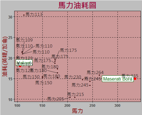
由上圖可以得知目前圖中的線是 實線 ,
我們先調整 主網格線
theme(panel.grid.major=element_line(colour='black',linetype="dashed"))#網格線
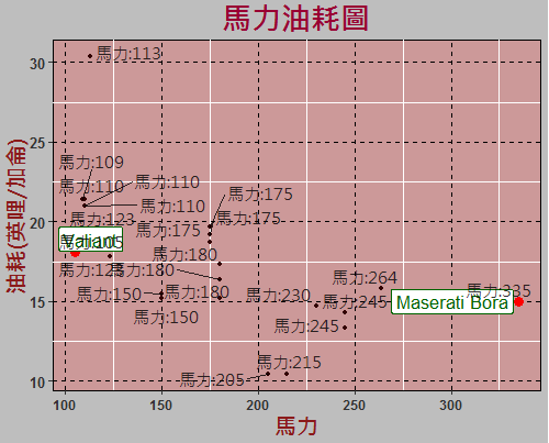
再調整次網格線 , 並把次網格線隱藏!
theme(panel.grid.minor=element_blank())
ggplot各部分都可以藉由參數等等去調整,有興趣的朋友可以再試試看!
End.