Hi! 大家好,我是Eric,這次要練習R語言中的shiny套件!
shiny是協助我們運用R語言直接作出一個互動式網頁,完成不需要了解網頁語言
緣起:農曆春節為臺灣重要習俗,每逢春節時總是造成國道回堵數公里,難免消磨大家出遊的好心情,而據高速公路局2018年2月「春節連假國道重點壅塞路段時段旅行時間倍數表」,我們挑選出旅行時間倍數最高之路段─北上頭城坪林(6倍),並著重在農曆初一及初二期間,運用R語言重要的互動式圖表套件shiny,產生2016-2019年間的互動式圖表。
方法:運用[R語言]的[shiny]套件。
使用資料:交通部高速公路局交通資料庫ETC(Electronic Toll Collection )資料─各類車種通行量統計(TDCS_M03A),2016-2019年。
1. 載入套件。
library(magrittr)
library(shiny)
library(dplyr)
2. 載入資料與前置處理。
setwd("C:/Users/User/Desktop/R practice")   #設定檔案路徑
THSR<-read.csv("HSR96-106.csv")        #載入資料

pr<-as.character(THSR$Punctuality.rate) %>% substr(1,5) %>% as.numeric()
#%>%為精簡程式碼的方法,例如:a2<-a1 %>% sum()會等同 a2<-sum(a1)
#substr(1,5)為取出位置1到5的字串

THSR1<-THSR         #複製THSR到THSR1
THSR1[6]<-pr            #將pr新增到TSHR的第6個欄位
THSR1$passenger<-THSR1$passenger/1000   #將載客數改為載客數(千人計),這樣我們資料的易讀性會比較高
THSR1$Seat.Kilometers<-THSR1$Seat.Kilometers/1000000 #同上,將座位公里改為座位公里(百萬計)

colnames(THSR1)<-c("year","month","passenger.thousand","train.times","Seat.Kilometers.million","Punctuality.rate")              #命名欄位名稱

THSR2<-aggregate(cbind(passenger.thousand,train.times,Seat.Kilometers.million,Punctuality.rate)~year,THSR1,mean)     #aggregate(a~b,c,d)使用資料為c,依照a欄位以d函數計算b,若a有多個欄位,則a改為cbind(a)
3. shny
ui是shiny中定義使用者看到的網頁樣子,fluidPage是表示物件呈現浮動的佈局,較不會因為每個人電腦螢幕的尺寸不同,導致物件錯位:
ui<-fluidPage(

  # shiny的大標題
  titlePanel("operation data of Taiwan High Speed Rail in 2007-2017"),

  # 將頁面區分為主區塊及側區塊,分別由mainPanel()與sidebarPanel()函數來控制
  sidebarLayout(

    # 控制輸入的部分
    sidebarPanel(
#產生可供勾選的方塊,方塊編號是option;標籤是Option:;可勾選的選項是THSR2的所有欄位名稱(除了第一個欄位)
      selectInput("option", "Option:",choices=colnames(THSR2)[-1]),
      hr(),        #增加水平分隔線
      helpText("statistical data of Taiwan High Speed Rail from Railway Bureau")  #增加註解
    ),

    # 控制輸出的部分
    mainPanel(
    #產生THSRPlot參數
      plotOutput("THSRPlot")
    )
  )
)
server是背後的程式碼,負責依照輸入執行程式碼,並將輸出回傳:
server<-function(input, output) {

  # THSR為前面ui中的ETCPlot,這邊定義他的功能
  output$THSRPlot <- renderPlot({

    # 用barplot製作長條圖,並設定顏色(col)、標題(main)、y軸標題(ylab)、x軸標題(xlab)
    barplot(THSR2[,input$option],
            col=3,
            main=input$option,
            ylab="statistical data",
            xlab="time")
  })
}
啟動shiny應用程式
shinyApp(ui = ui, server = server)
4. 大功告成
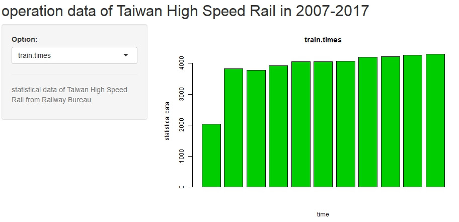
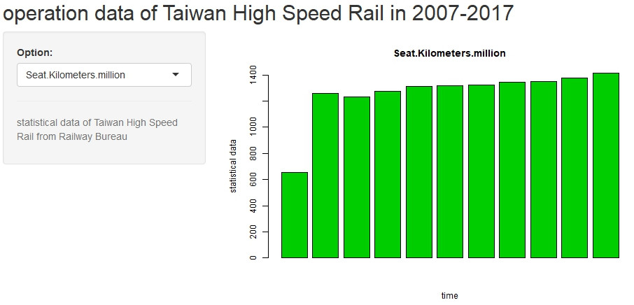
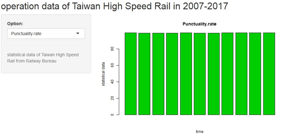
以下為設定的四個輸入項目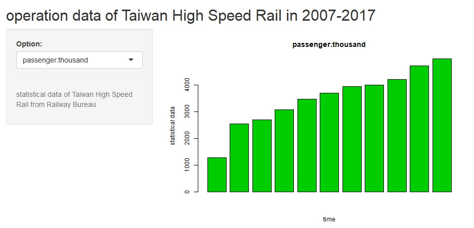
 Eric HSIEH


 iThome鐵人賽