由於不管是在做model或者分析人員視覺化都是非常重要的,因此今天會來說一些視覺化工具,一樣主要會使用三個資料集:
Python的視覺化package主要會使用,seaborn、Matplotlib、plotly等套件,下面視覺化程式。
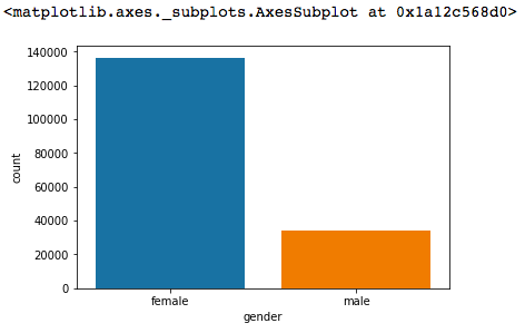
因為男女資料的原始資料通常為類別型資料
Ex:
| ID | Gender |
|---|---|
| Ricky | 男 |
| Lucy | 女 |
所以可以直接使用seaborn做出Bar Chart
sb.countplot('gender',data=df_sex[['gender']])
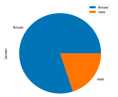
或者,可以使用pie chart來表現性別比列
age.plot(kind='pie', subplots=True, figsize=(6, 6))
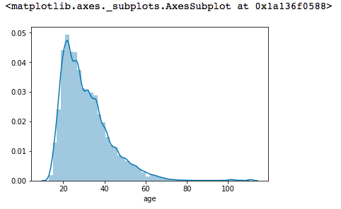
年齡的部分第一個可以嘗試使用histogram,看分佈:
sb.distplot(age['age'])
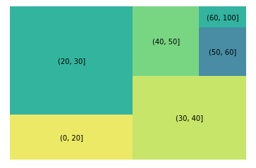
或者是使用treemap做一些不一樣的視覺化
squarify.plot(sizes=g['count'], label=g.index, alpha=.8)
plt.axis('off')
plt.show()
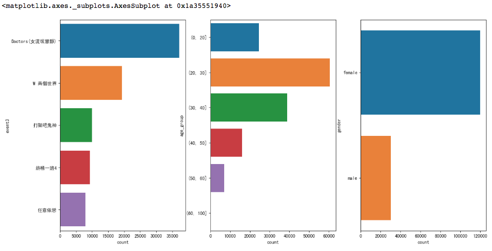
這時,我們可以將bar放在一起並一次show給老闆看整個概況
fig, axs = plt.subplots(ncols=3,figsize=(16,8))
sb.barplot(x='count', y=top_drama.index, data=top_drama, ax=axs[0])
sb.barplot(x='count', y=top_age.index, data=top_age, ax=axs[1])
sb.barplot(x='count', y=top_sex.index, data=top_sex, ax=axs[2])
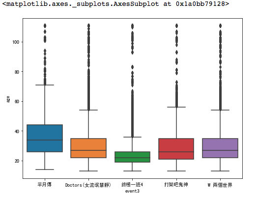
針對數值分析,我們會常用box chart來看分析,並且將針對不同的type的categorical資料進行分佈分析
Ex:
f, ax = plt.subplots(figsize=(8, 6))
sb.boxplot(x='event3', y="age", data=data)
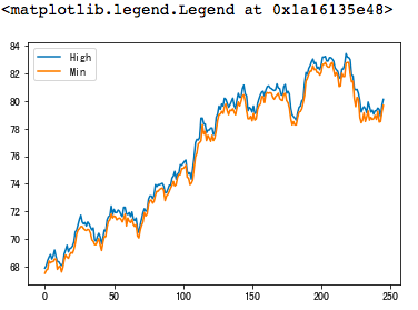
針對時間序列的資料,我們可以很輕易的直接利用line chart 或者 histogram 來呈現 (以0050為資料範例)
Ex:
plt.plot(stock[['High','Min']])
plt.legend(["High","Min"], loc=0)
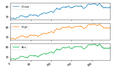
Ex:
stock[['Close','High','Min']].plot(subplots = True)
plt.show()
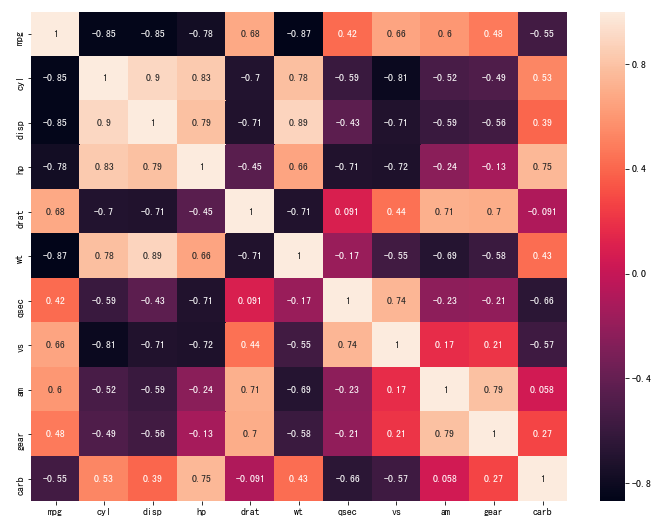
對於分析,很常會使用Correlation chart或者heatmap來呈現圖。
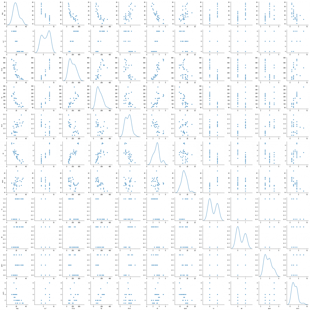
這邊直接會使用常用的UCI - Car dataset來呈現
Ex:
sb.pairplot(mtcars, diag_kind="kde")
或者可以使用heatmap將correlation matrix視覺化
corrmat = mtcars.corr()
f, ax = plt.subplots(figsize=(12, 9))
sb.heatmap(corrmat, annot=True)
資料視覺化以及EDA等,通常是需要花最長時間去處理,因為要了解Data,才能防止garbage in garbage out的狀況。所以當您對資料有任何假設,第一步可以馬上資料視覺化確認是否分佈如所想像的樣子。
小結:
今天的資料視覺化實戰到這邊,相信任和不管是Data Scientist或者Machine learning Scientist一定都要常常去視覺化資料或者模型結果去跟老闆溝通,視覺化工具對於和他人溝通是非常重要的工具,希望這篇對大家有幫助,感謝您漫長的閱讀,若有任何問題都歡迎在下方提出討論,感謝您~


 iThome鐵人賽