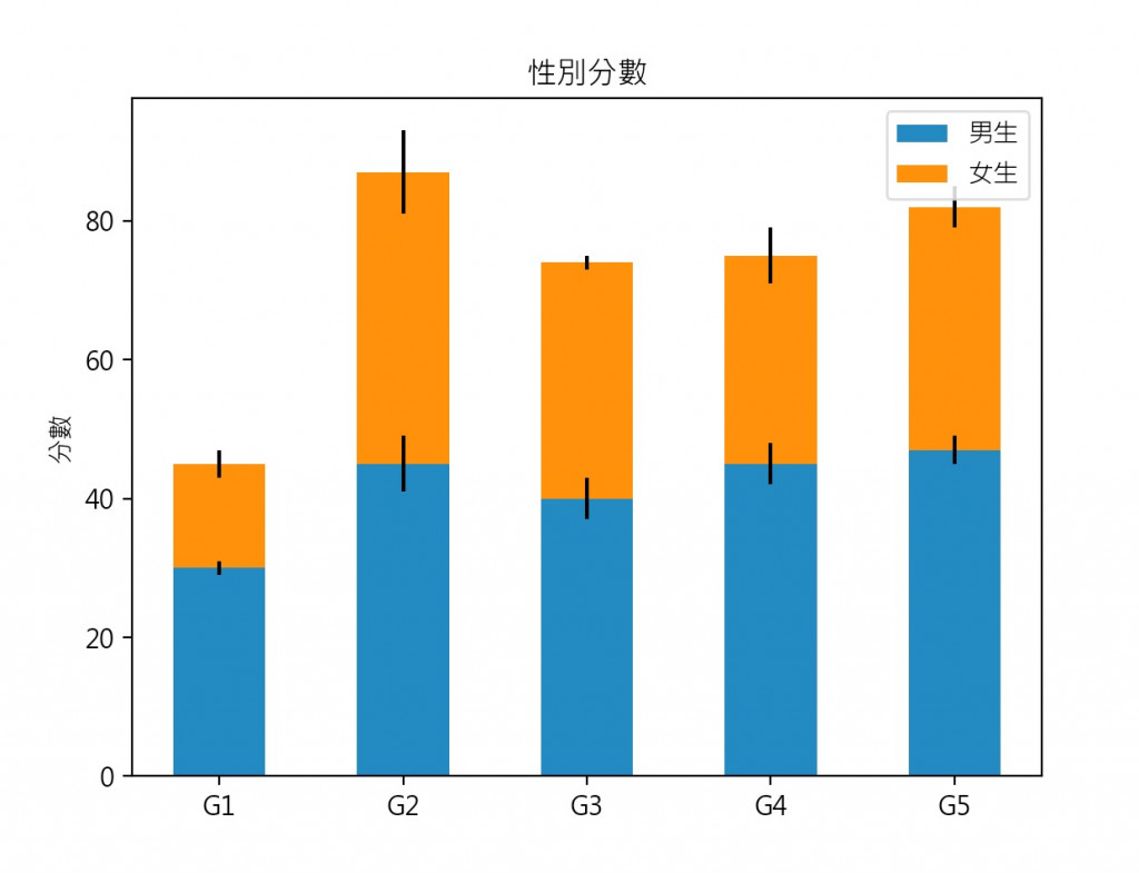
使用matplotlib函式庫實作plot繪圖。
pip install matplotlib
#載入matplotlib函式庫
import matplotlib.pyplot as plt
#解決中文字型
plt.rcParams['font.sans-serif'] = ['Microsoft JhengHei']
plt.rcParams['axes.unicode_minus'] = False
#X軸標籤
labels = ['G1', 'G2', 'G3', 'G4', 'G5']
#男生平均
men_means = [30, 45, 40, 45, 47]
#女生平均
women_means = [15, 42, 34, 30, 35]
#男生標準差
men_std = [1, 4, 3, 3, 2]
#女生標準差
women_std = [2, 6, 1, 4, 3]
#bar的寬度
width = 0.5

fig, ax = plt.subplots()

ax.bar(labels, men_means, width, yerr=men_std, label='男生')
ax.bar(labels, women_means, width, yerr=women_std, bottom=men_means,
       label='女生')
ax.set_ylabel('分數')
ax.set_title('性別分數')
ax.legend()

plt.show()