
一、Layout和Page的關係
二、lab 程式碼
三、<q-page-container>
四、<q-page>、<q-page-sticky>
五、總結
六、延伸閱讀:Bootstrap Sidebar
昨天的內容我們有談到
透過Layout Builder建立Layout時
一開始會讓我們選擇Layout底下需不需要「Header」、「Sidebar」、「Footer」
也就是<q-header>、<q-drawer>、<q-footer>
QLayout is the component used to encapsulate pages, so that multiple pages will share the same header, drawers and so on. However, you can also configure per page header/footer/drawers, but they all must be children of the QLayout component.
https://quasar.dev/layout/routing-with-layouts-and-pages
<template>
  <q-layout view="hHh LpR fFf">

    <q-header>

    </q-header>

    <q-drawer>

    </q-drawer>

    <q-page-container>
      <router-view />
    </q-page-container>

    <q-footer></q-footer>
  </q-layout>
</template>
其中你看到當中有一段程式碼:
<q-page-container>
  <router-view />
</q-page-container>
任何套用這個版型的頁面,都會渲染在<q-page-container></q-page-container>當中的<router-view />
我們可以在router/route.js,定義哪些頁面(src/pages),要使用哪一個版型(src/layouts)
{
    path: '/',
    component: () => import('layouts/Layout01.vue'),
    children: [
      { path: '', name: 'index' component: () => import('pages/index.vue') },
      { path: '', name: 'page02' component: () => import('pages/Page02.vue') }
    ]
},
<q-page-container>、<q-page>這兩個元件標籤
是<q-layout>當中很重要的組成元素
幫我們處理了版面跟頁面上的細節
我們透過幾個簡單的Lab,來理解這兩個標籤之間的關係
假設我們在src/MainLayout.vue的程式碼如下:
<template>
  <q-layout view="hHh LpR fFf">

    <q-header elevated class="bg-grey-10 text-white" height-hint="98">
      <q-toolbar>
        <q-btn dense flat round icon="menu" @click="left = !left" />

        <q-toolbar-title>
          <div class="flex items-center">
            <q-avatar>
              <img src="https://cdn.quasar.dev/logo/svg/quasar-logo.svg">
            </q-avatar>
            <div class="q-ml-sm">Title</div>
          </div>
        </q-toolbar-title>

      </q-toolbar>
    </q-header>

    <q-drawer behavior="desktop" content-class="bg-grey-2" show-if-above v-model="left" side="left" bordered>
      <!-- drawer content -->
    </q-drawer>

    <q-page-container>
      <router-view />
    </q-page-container>

    <q-footer elevated class="bg-grey-8 text-white">
      <q-toolbar>
        <q-toolbar-title>
          <q-avatar>
            <img src="https://cdn.quasar.dev/logo/svg/quasar-logo.svg">
          </q-avatar>
          Title
        </q-toolbar-title>
      </q-toolbar>
    </q-footer>
  </q-layout>
</template>

<script>
export default {
  data () {
    return {
      left: false
    }
  }
}
</script>
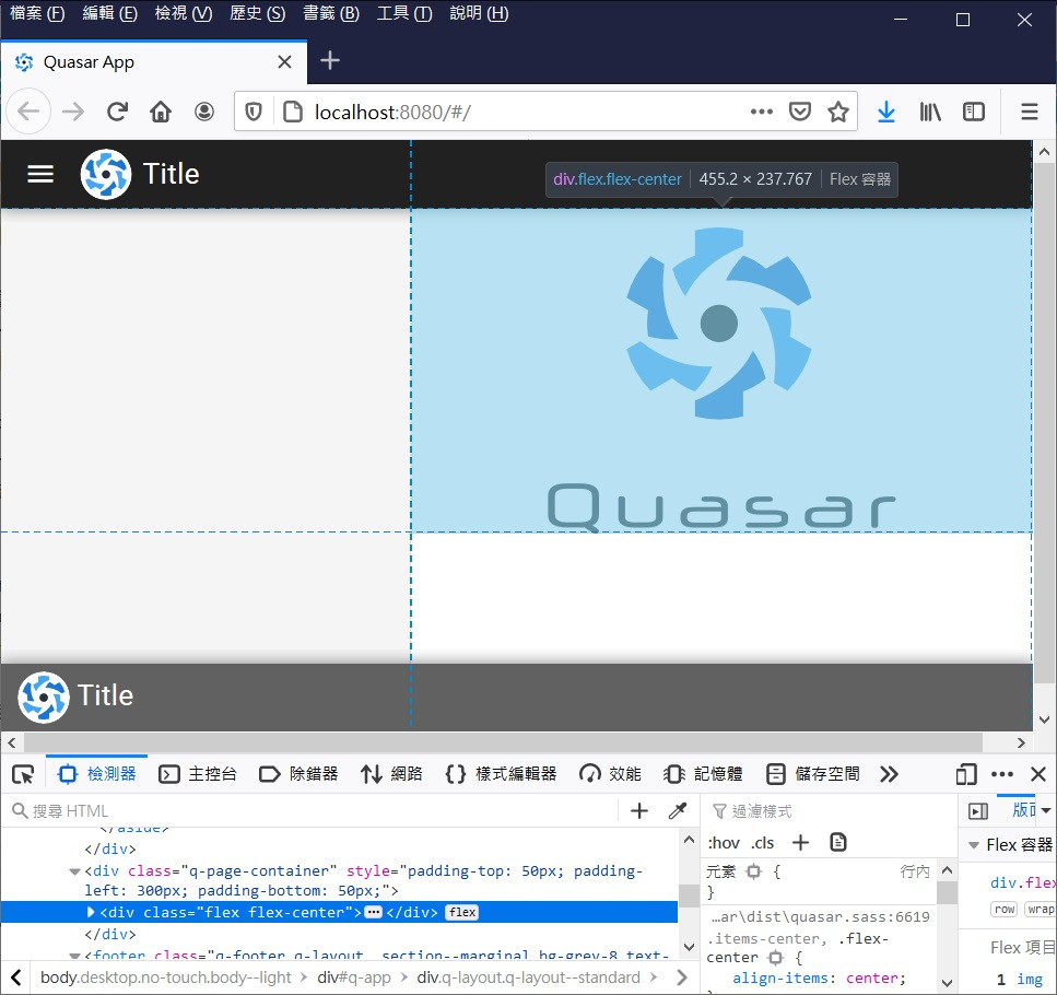
src/pages/Index.vue的程式碼如下:
<template>
  <q-page class="flex flex-center">
    <img
      alt="Quasar logo"
      src="~assets/quasar-logo-full.svg"
    >
  </q-page>
</template>

<script>
export default {
  name: 'PageIndex'
}
</script>
<q-layout> 會根據header,drawer和footer標籤的高度、寬度
透過Javascriptd控制,給予<q-page-container>相對的padding大小
確保<q-page>的內容不會被header、drawer和footer覆蓋到
A QPage needs a QLayout because QLayout controls all the offsets of a page, keeping account of the space that header/footer/drawer use, according to its view property configuration.
https://quasar.dev/layout/page


當<q-drawer>是overlay的模式
<q-page-container>的左右padding則不會有任何改變
<q-page>會根據你的瀏覽器高度,設定一個最小的高度
方便我們對裡面的元件置中
By default, your QPage component will have a min-height CSS property set on it to ensure that the content fills the screen at all times, even when the content is just a few lines.
https://quasar.dev/layout/page

當我們把src/pages/Index.vue的<q-page>改成<div>
會發現Quasar的Logo不會在頁面垂直方向的正中央
<template>
  <div class="flex flex-center">
    <img
      alt="Quasar logo"
      src="~assets/quasar-logo-full.svg"
    >
  </div>
</template>
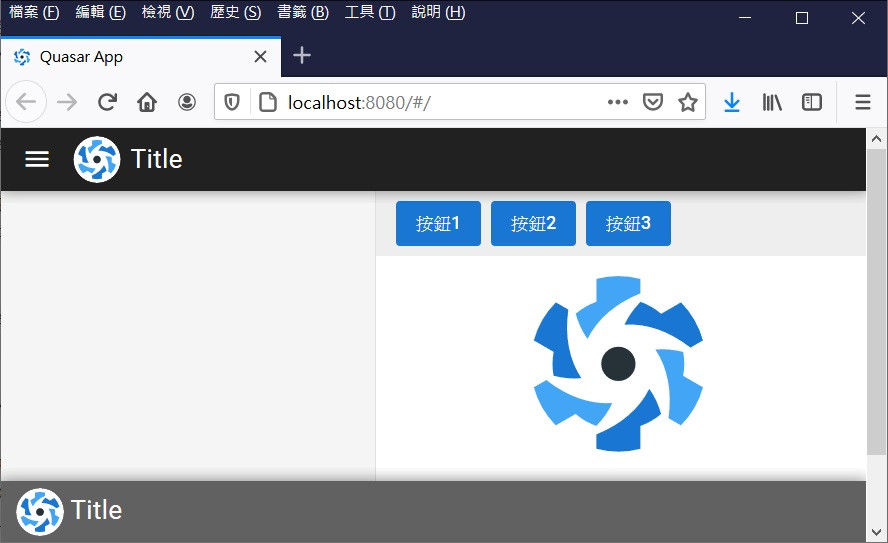
如果我們希望某個頁面上方,固定顯示一個Toolbar
可以使用Quasar的<q-page-sticky>
The QPageSticky component helps in placing DOM elements / components wrapped by it into a static position within the content area of your QPage, no matter where the user scrolls.
https://quasar.dev/layout/page-sticky
<template>
  <q-page class="flex flex-center">
    <img
      alt="Quasar logo"
      src="~assets/quasar-logo-full.svg"
    >
    <q-page-sticky expand class="bg-grey-3"  position="top">
      <div class="full-width q-pa-sm q-gutter-sm">
        <q-btn color="blue-8" unelevated label="按鈕1"></q-btn>
        <q-btn color="blue-8" unelevated label="按鈕2"></q-btn>
        <q-btn color="blue-8" unelevated label="按鈕3"></q-btn>
      </div>
    </q-page-sticky>
  </q-page>
</template>
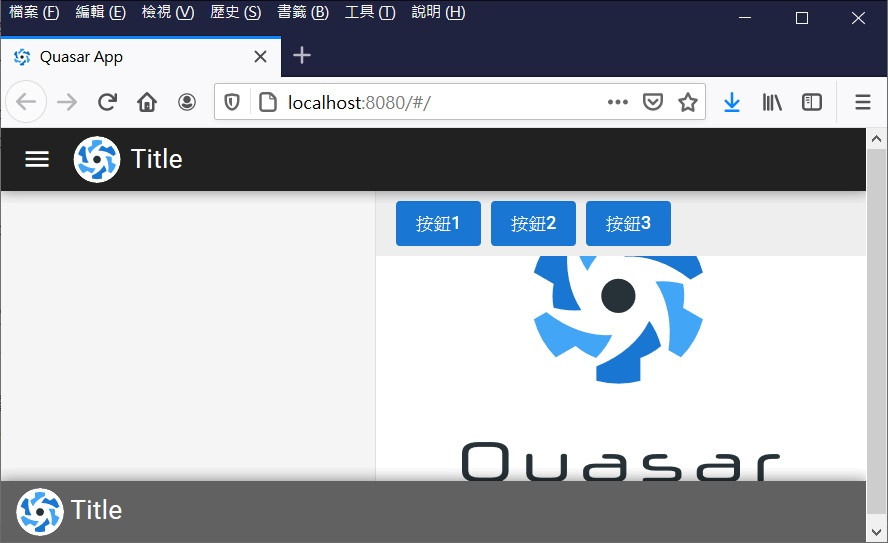
這邊要注意的是,<q-page-sticky>會擋到<q-pqge>的內容
如果有使用<q-page-sticky>,記得在<q-pqge>上方賦予額外的padding
<template>
  <q-page class="flex flex-center custeom_q-page">
   ...
  </q-page>
</template>

<script>
export default {
  name: 'PageIndex'
}
</script>

<style lang="scss">
  .custeom_q-page {
    padding-top: 55px;
  }
</style>
這兩天介紹的Quasar的Layout系統看起來雖然沒有什麼
但是如果沒有Quasar的Layout系統,其實要處理很多繁瑣的細節
以今天的內容為例,如果用原生的HTML & CSS & Javascript手刻:
跟我之前在研究,在使用Bootstrap的專案上撰寫Sidebar差不多
有興趣可以參考下方延伸閱讀自行體驗看看。

 iThome鐵人賽
 看影片追技術