通過鎖鏈的時間軸之後,來到比較和藹可親的區塊了,這邊就是把文字與圖片做個排版,應該沒什麼特別的技巧。
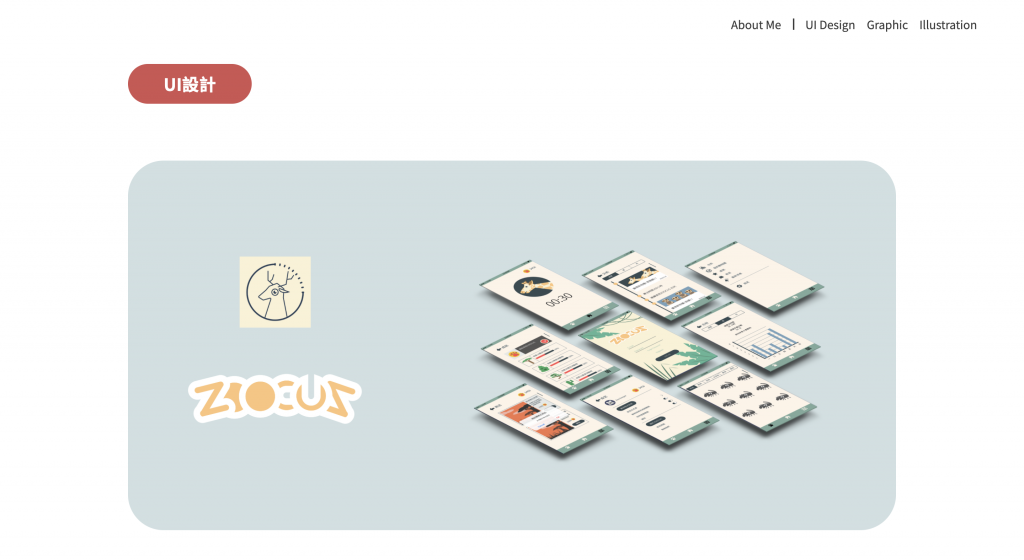
我將UI區塊設計成兩個部分,分為上方的Logo與mock-up展示區,以及下方的使用說明區
要把上圖排成下圖的樣子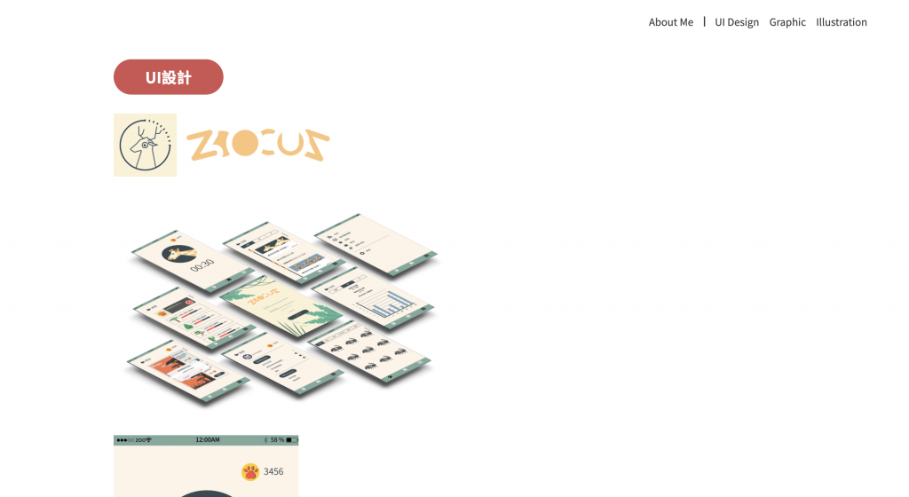
<div class="ui-bigbox">
   <div class="left-img">
        <img src="./img/ui-app-icon.png" alt="" height="100px">
        <img src="./img/ui-app-logo.png" alt="" height="100px">
   </div>
   <img src="./img/ui-app-mockup.png" alt="" height="400px">
</div>
.ui-bigbox{
    height: 500px;
    background-color: #44858c42;
    display: flex;
    flex-flow: row wrap;
    padding: 10px 15px;
    border-radius: 50px;
    align-items: center;
    justify-content: space-around;
    margin: 80px auto;
}
.ui-bigbox .left-img{
    display: flex;
    flex-flow: column;
    align-items: center;
    height: 300px;
    justify-content: space-around;
}
首先將左邊兩張圖片使用flex-flow: column; 進行排版,再將這個群組與右邊大張圖片進行左右排版。儘管下一個UI區塊也會用到這個大方塊,只要使用同一個class就能一次排版完囉!
使用資訊區的排版下次再講囉!
下一章 Keep Going 10 - UI 區塊2
※本文章所使用之圖片皆為本人作品,內容則為本人之經驗分享

 iThome鐵人賽