Hi, 我是魚板伯爵今天要教大家 Button 這個元件,教學內容只會擷取片段程式碼,建議大家搭配完整程式碼來練習。
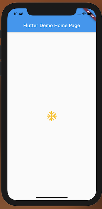
可以加入小圖標的按鈕
color:Icon的顏色highlightColor:當按鈕按下時的顏色splashColor:當按鈕按下時的水波顏色icon:按鈕IcononPressed:按鈕按下時所調用的邏輯,若為null則不使用iconSize: Icon大小,預設為24class DemoIconButton extends StatelessWidget {
const DemoIconButton({Key? key}) : super(key: key);
@override
Widget build(BuildContext context) {
return Container(
child: IconButton(
iconSize: 50,
color: Colors.amber,
// 水波和觸發顏色為透明
highlightColor: Colors.transparent,
splashColor: Colors.transparent,
icon: Icon(Icons.ac_unit),
onPressed: () {
log("click", name: "INFO");
},
),
);
}
}
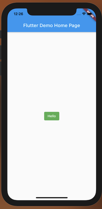
文字按鈕
style:利用TextButton.styleFrom變更按鈕顏色、風格child:子元件onPressed:點擊按鈕時觸發的邏輯onLongPress:長壓按鈕時觸發的邏輯class DemoTextButton extends StatelessWidget {
const DemoTextButton({Key? key}) : super(key: key);
@override
Widget build(BuildContext context) {
return Container(
child: TextButton(
child: Text(
"Hello",
style: TextStyle(color: Colors.white),
),
style: TextButton.styleFrom(
backgroundColor: Colors.green,
),
onPressed: () {
log("click", name: "INFO");
},
onLongPress: () {
log("long click", name: "INFO");
},
),
);
}
}
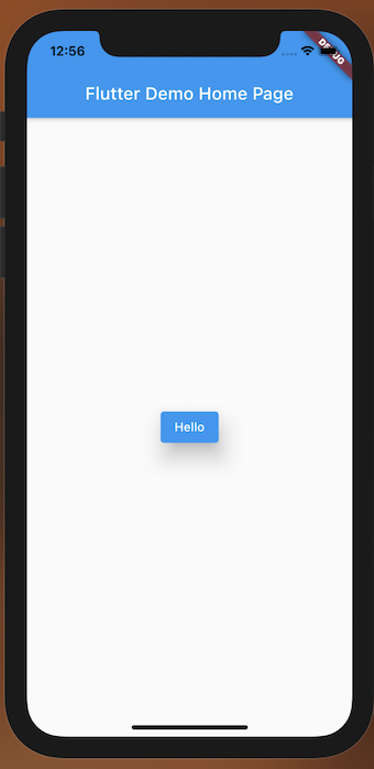
會有編框的按鈕
style:利用OutlinedButton.styleFrom變更按鈕顏色、風格child:子元件onPressed:點擊按鈕時觸發的邏輯onLongPress:長壓按鈕時觸發的邏輯class DemoOutlinedButton extends StatelessWidget {
const DemoOutlinedButton({Key? key}) : super(key: key);
@override
Widget build(BuildContext context) {
return Container(
child: OutlinedButton(
child: Text("Hello"),
style: OutlinedButton.styleFrom(
primary: Colors.white,
backgroundColor: Colors.blueGrey,
),
onPressed: () {
log("click", name: "INFO");
},
onLongPress: () {
log("long click", name: "INFO");
},
),
);
}
}
這個按鈕會有漂浮的感覺。
style:利用ElevatedButton.styleFrom變更按鈕顏色、風格child:子元件onPressed:點擊按鈕時觸發的邏輯onLongPress:長壓按鈕時觸發的邏輯class DemoElevatedButton extends StatelessWidget {
const DemoElevatedButton({Key? key}) : super(key: key);
@override
Widget build(BuildContext context) {
return Container(
child: ElevatedButton(
child: Text("Hello"),
style: ElevatedButton.styleFrom(
elevation: 20,
),
onPressed: () {
log("click", name: "INFO");
},
),
);
}
}
若將onPressed後面帶null的話,按鈕就會變成灰色不能按。
class DemoNullButton extends StatelessWidget {
  const DemoNullButton({Key? key}) : super(key: key);

  @override
  Widget build(BuildContext context) {
    return Container(
      child: OutlinedButton(
        child: Text("Hello"),
        onPressed: null,
      ),
    );
  }
}


 iThome鐵人賽
 看影片追技術