各位看官應該都知道,Flex 是 Bootstrap 預設的排版方式,威爾豬自己也超愛用 Flex,它有效的解決了以前垂直置中的麻煩,且相對簡單很多。Tailwind 使用方法其實和 Bootstrap 大同小異,只是寫法更精簡了點,威爾豬每次用這種 Class,都會擔心語法錯亂,也怕忘記 CSS 正確寫法,然後就被釘在牆上了。
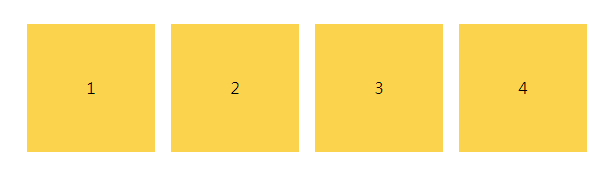
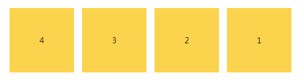
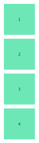
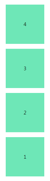
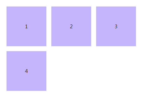
分成水平、垂直和反方向排列,class 為 flex-row、flex-row-reverse、flex-col、flex-col-reverse,一般預設即為 flex-row,看以下範例:
<div class="flex flex-row">
    <div class="w-32 h-32 mx-2 bg-yellow-300">1</div>
    <div class="w-32 h-32 mx-2 bg-yellow-300">2</div>
    <div class="w-32 h-32 mx-2 bg-yellow-300">3</div>
    <div class="w-32 h-32 mx-2 bg-yellow-300">4</div>
</div>
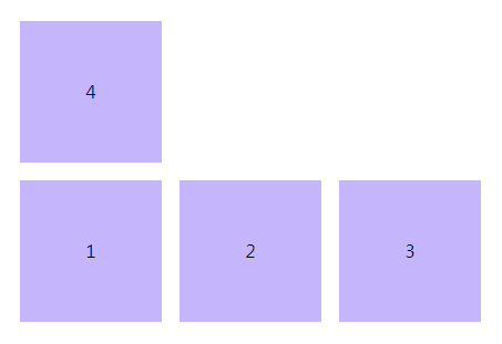
<div class="flex flex-row-reverse">
    <div class="w-32 h-32 mx-2 bg-yellow-300">1</div>
    <div class="w-32 h-32 mx-2 bg-yellow-300">2</div>
    <div class="w-32 h-32 mx-2 bg-yellow-300">3</div>
    <div class="w-32 h-32 mx-2 bg-yellow-300">4</div>
</div>
<div class="flex flex-col">
    <div class="w-32 h-32 mx-2 bg-green-300">1</div>
    <div class="w-32 h-32 mx-2 bg-green-300">2</div>
    <div class="w-32 h-32 mx-2 bg-green-300">3</div>
    <div class="w-32 h-32 mx-2 bg-green-300">4</div>
</div>
<div class="flex flex-col-reverse">
    <div class="w-32 h-32 mx-2 bg-green-300">1</div>
    <div class="w-32 h-32 mx-2 bg-green-300">2</div>
    <div class="w-32 h-32 mx-2 bg-green-300">3</div>
    <div class="w-32 h-32 mx-2 bg-green-300">4</div>
</div>
Wrap 使用時機為子元素超出父層寬度要自動換行時,class 分為 flex-wrap、flex-wrap-reverse、flex-no-wrap,一般預設即為 flex-no-wrap,看以下範例:
<div class="flex flex-wrap">
    <div class="w-32 h-32 mx-2 bg-purple-300">1</div>
    <div class="w-32 h-32 mx-2 bg-purple-300">2</div>
    <div class="w-32 h-32 mx-2 bg-purple-300">3</div>
    <div class="w-32 h-32 mx-2 bg-purple-300">4</div>
</div>
<div class="flex flex-wrap-reverse">
    <div class="w-32 h-32 mx-2 bg-purple-300">1</div>
    <div class="w-32 h-32 mx-2 bg-purple-300">2</div>
    <div class="w-32 h-32 mx-2 bg-purple-300">3</div>
    <div class="w-32 h-32 mx-2 bg-purple-300">4</div>
</div>
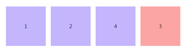
常用 Order 的時機為桌機板圖文需要左右互換,手機板則正常圖紋上下排列。威爾豬剛學 Order 時,時常錯亂,知道它可以自訂排序,但怎麼排都跟威爾豬心中想的不一樣,到底是要 order-1 還是 order-12?不過 Tailwind 只需要記住把想要放在最後的使用 order-last 就好了。看以下範例:
<div class="flex">
    <div class="w-32 h-32 mx-2 bg-purple-300">1</div>
    <div class="w-32 h-32 mx-2 bg-purple-300">2</div>
    <div class="w-32 h-32 mx-2 bg-red-300 order-last">3</div>
    <div class="w-32 h-32 mx-2 bg-purple-300">4</div>
</div>
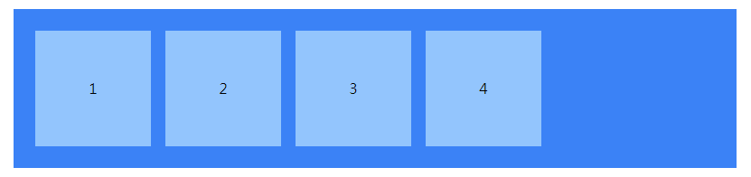
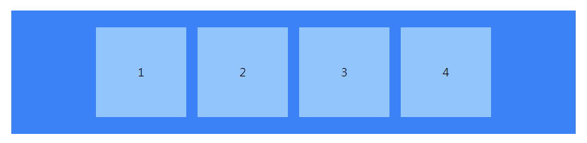
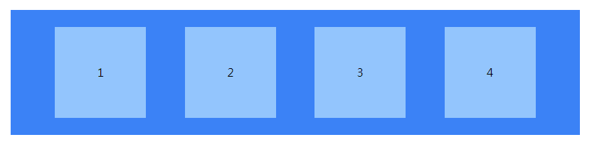
看倌們應該都知道 Flex 就是讓元素水平排列,Justify Content 可以當成是前、中、後水平排列的位置,看以下範例:
預設即為 justify-content: flex-start;
<div class="flex justify-start bg-blue-500">
    <div class="w-32 h-32 mx-2 bg-blue-300">1</div>
    <div class="w-32 h-32 mx-2 bg-blue-300">2</div>
    <div class="w-32 h-32 mx-2 bg-blue-300 order-last">3</div>
    <div class="w-32 h-32 mx-2 bg-blue-300">4</div>
</div>
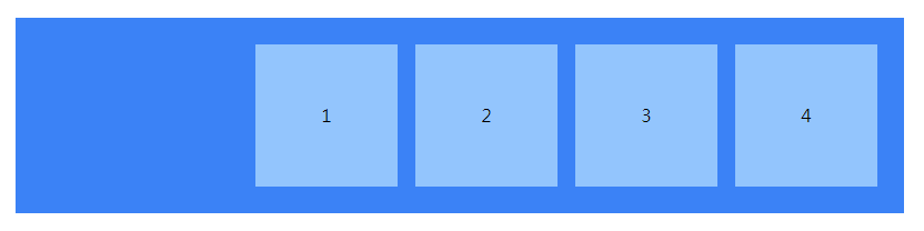
<div class="flex justify-center bg-blue-500">
    <div class="w-32 h-32 mx-2 bg-blue-300">1</div>
    <div class="w-32 h-32 mx-2 bg-blue-300">2</div>
    <div class="w-32 h-32 mx-2 bg-blue-300 order-last">3</div>
    <div class="w-32 h-32 mx-2 bg-blue-300">4</div>
</div>
<div class="flex justify-end bg-blue-500">
    <div class="w-32 h-32 mx-2 bg-blue-300">1</div>
    <div class="w-32 h-32 mx-2 bg-blue-300">2</div>
    <div class="w-32 h-32 mx-2 bg-blue-300 order-last">3</div>
    <div class="w-32 h-32 mx-2 bg-blue-300">4</div>
</div>
將元素左右兩側貼齊父層,並使每個元素間距離相等。
<div class="flex justify-between bg-blue-500">
    <div class="w-32 h-32 mx-2 bg-blue-300">1</div>
    <div class="w-32 h-32 mx-2 bg-blue-300">2</div>
    <div class="w-32 h-32 mx-2 bg-blue-300 order-last">3</div>
    <div class="w-32 h-32 mx-2 bg-blue-300">4</div>
</div>
將元素左右兩側保持與父層同等的距離,並使每個元素間距離相等。
<div class="flex justify-around bg-blue-500">
    <div class="w-32 h-32 mx-2 bg-blue-300">1</div>
    <div class="w-32 h-32 mx-2 bg-blue-300">2</div>
    <div class="w-32 h-32 mx-2 bg-blue-300 order-last">3</div>
    <div class="w-32 h-32 mx-2 bg-blue-300">4</div>
</div>
將每個元素間距離和左右兩側與父層距離相等。
<div class="flex justify-enenly bg-blue-500">
    <div class="w-32 h-32 mx-2 bg-blue-300">1</div>
    <div class="w-32 h-32 mx-2 bg-blue-300">2</div>
    <div class="w-32 h-32 mx-2 bg-blue-300 order-last">3</div>
    <div class="w-32 h-32 mx-2 bg-blue-300">4</div>
</div>
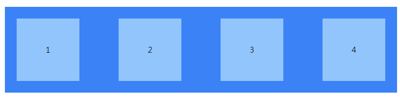
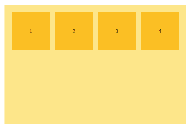
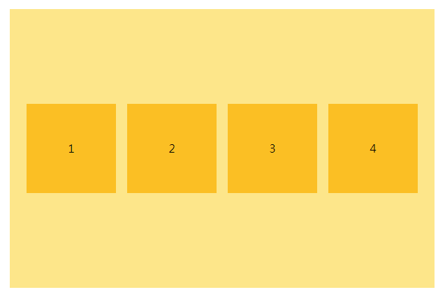
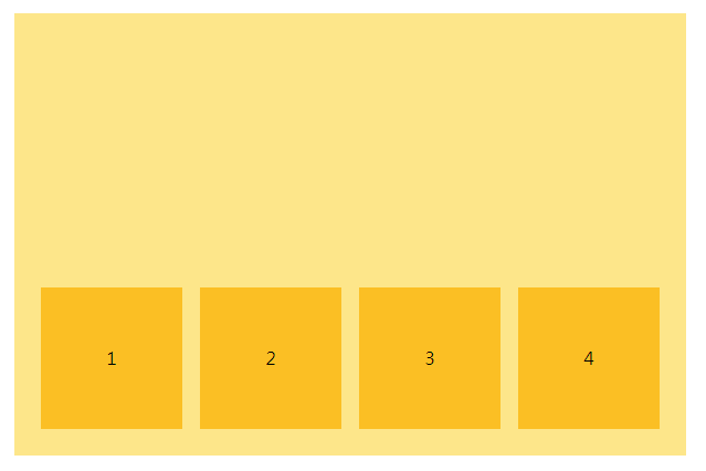
剛剛的 Justify Content 為水平排列位置,Align Items 為垂直排列位置,也是分成上、中、下來排列。看以下範例:
預設即為 align-items: flex-start;
<div class="flex items-start bg-yellow-200">
    <div class="w-32 h-32 mx-2 bg-yellow-400">1</div>
    <div class="w-32 h-32 mx-2 bg-yellow-400">2</div>
    <div class="w-32 h-32 mx-2 bg-yellow-400 order-last">3</div>
    <div class="w-32 h-32 mx-2 bg-yellow-400">4</div>
</div>
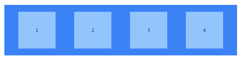
<div class="flex items-center bg-yellow-200">
    <div class="w-32 h-32 mx-2 bg-yellow-400">1</div>
    <div class="w-32 h-32 mx-2 bg-yellow-400">2</div>
    <div class="w-32 h-32 mx-2 bg-yellow-400 order-last">3</div>
    <div class="w-32 h-32 mx-2 bg-yellow-400">4</div>
</div>
<div class="flex items-end bg-yellow-200">
    <div class="w-32 h-32 mx-2 bg-yellow-400">1</div>
    <div class="w-32 h-32 mx-2 bg-yellow-400">2</div>
    <div class="w-32 h-32 mx-2 bg-yellow-400 order-last">3</div>
    <div class="w-32 h-32 mx-2 bg-yellow-400">4</div>
</div>
聰明的你現在知道垂直置中該怎麼寫了吧。基本上只要了解這些,應該絕大部分的版型都可以完成了,還有一些威爾豬沒有提到,除非一些很特殊的部分,到時再來看看 Flex 還有什麼其他的用法吧。以上就是今天的內容,那咱們明天見。


 iThome鐵人賽
 看影片追技術