其實威爾豬本來沒打算寫 Filter,因為總覺得在一般情形下不太常會用到,但又覺得這好像也算是 Tailwind v2.1 以上版本的好用的功能之一,其實用過 Photoshop 或寫過 CSS 濾鏡的看倌們,應該都知道這些濾鏡效果會讓圖片做出哪些變化,不知道的就讓威爾豬一個一個來說明吧。
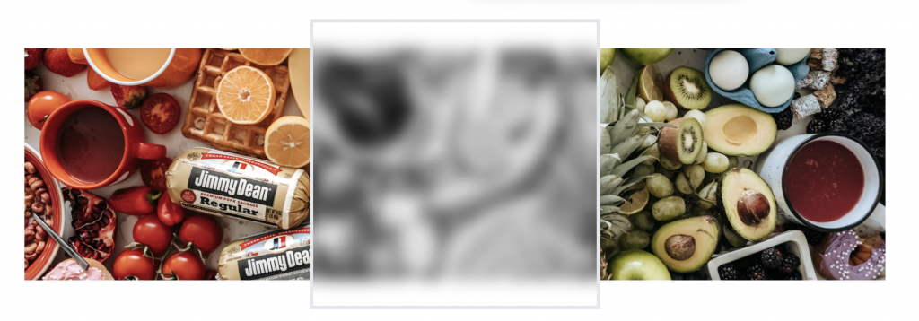
讓元素產生虛化效果。使用方式為 blur-{尺寸},威爾豬在 Unsplash 找了一張風景圖,太久沒出國了(這次沒有小姊姊)。範例如下:
<img src="..." class=" ... filter blur-sm">
<img src="..." class=" ... filter blur">
<img src="..." class=" ... filter blur-md">
<img src="..." class=" ... filter blur-lg">
<img src="..." class=" ... filter blur-xl">
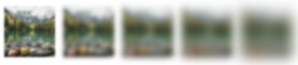
預設模糊度如下表:
| class | blur |
|---|---|
| blur-none | 0 |
| blur-sm | 4px |
| blur | 8px |
| blur-md | 12px |
| blur-lg | 16px |
| blur-xl | 24px |
| blur-2xl | 40px |
| blur-3xl | 64px |
當然可以到 tailwind.config.js 再自行自定義或額外添加:
  // tailwind.config.js

  module.exports = {
    ...
    theme: {
      ...
      extend: {
        blur: {
          xs: '2px',
          '4xl': '72px',
        }
      }
    },
    ...
  }
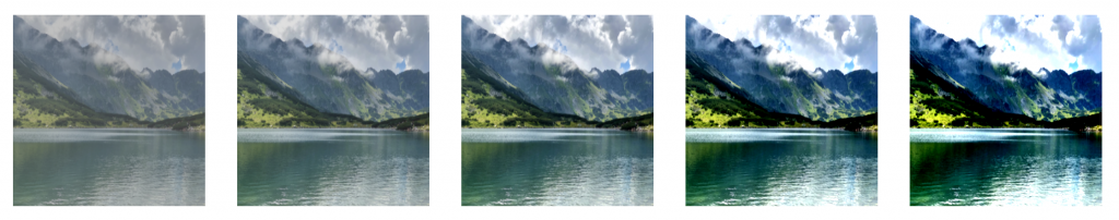
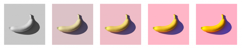
讓元素加亮效果。使用方式為 brightness-{數值},威爾豬另外在 Unsplash 找了一張圖,範例如下:
<img src="..." class=" ... filter brightness-50">
<img src="..." class=" ... filter brightness-75">
<img src="..." class=" ... filter brightness-100">
<img src="..." class=" ... filter brightness-150">
<img src="..." class=" ... filter brightness-200">
預設亮度如下表:
| class | brightness |
|---|---|
| brightness-0 | 0 |
| brightness-50 | 0.5 |
| brightness-75 | 0.75 |
| brightness-90 | 0.9 |
| brightness-95 | 0.95 |
| brightness-100 | 1 |
| brightness-110 | 1.1 |
| brightness-125 | 1.25 |
| brightness-150 | 1.5 |
| brightness-200 | 2 |
修改方式一樣到 tailwind.config.js 額外添加:
  // tailwind.config.js

  module.exports = {
    ...
    theme: {
      ...
      extend: {
        brightness: {
         25: '.25',
         175: '1.75',
       }
      }
    },
    ...
  }
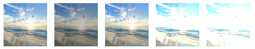
如果 Brightness 是增減黑色,那 Contrast 可以說是增減灰色。使用方式為 contrast-{數值},威爾豬一樣在 Unsplash 找了一張圖,範例如下:
<img src="..." class=" ... filter contrast-50">
<img src="..." class=" ... filter contrast-75">
<img src="..." class=" ... filter contrast-100">
<img src="..." class=" ... filter contrast-150">
<img src="..." class=" ... filter contrast-200">
預設對比度如下表:
| class | contrast |
|---|---|
| contrast-0 | 0 |
| contrast-50 | 0.5 |
| contrast-75 | 0.75 |
| contrast-90 | 0.9 |
| contrast-95 | 0.95 |
| contrast-100 | 1 |
| contrast-110 | 1.1 |
| contrast-125 | 1.25 |
| contrast-150 | 1.5 |
| contrast-200 | 2 |
修改方式到 tailwind.config.js 額外添加:
  // tailwind.config.js

  module.exports = {
    ...
    theme: {
      ...
      extend: {
        contrast: {
          25: '.25',
          175: '1.75',
        }
      }
    },
    ...
  }
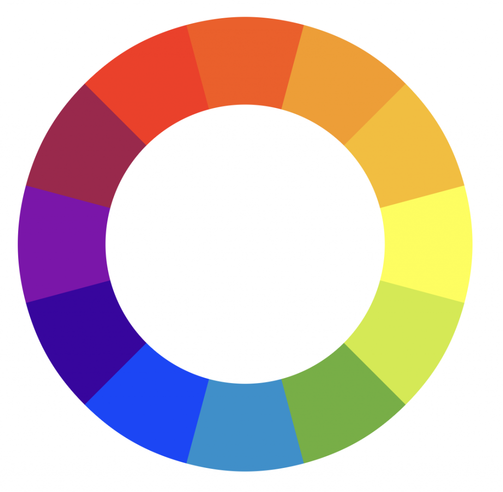
設計師們一定都知道色相環是什麼,為了讓不太清楚配色的同學們,威爾豬在 維基百科 上借用了12色相圖:
色相旋轉就是根據元素現在的顏色,各自旋轉相對應的角度 (-180º ~ 180º),威爾豬在 Unsplash 找了一張圖,範例如下:
<img src="..." class=" ... filter -hue-rotate-180">
<img src="..." class=" ... filter -hue-rotate-90">
<img src="..." class=" ... filter hue-rotate-30">
<img src="..." class=" ... filter hue-rotate-60">
<img src="..." class=" ... filter hue-rotate-90">
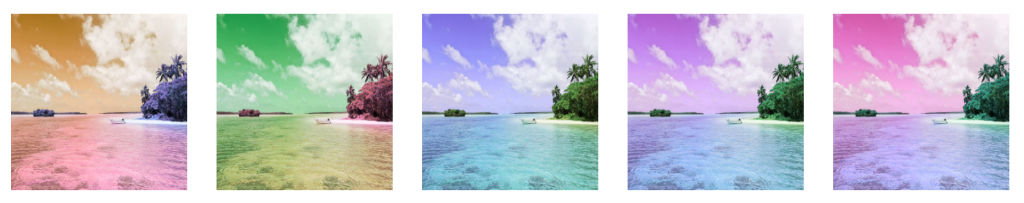
預設旋轉角度如下表:
| class | hue-rotate |
|---|---|
| hue-rotate-0 | 0deg |
| (-)hue-rotate-15 | (-)15deg |
| (-)hue-rotate-30 | (-)30deg |
| (-)hue-rotate-60 | (-)60deg |
| (-)hue-rotate-90 | (-)90deg |
| (-)hue-rotate-180 | (-)180deg |
修改方式到 tailwind.config.js 額外添加:
  // tailwind.config.js

  module.exports = {
    ...
    theme: {
      ...
      extend: {
        hueRotate: {
          '-270': '-270deg',
          270: '270deg',
        }
      }
    },
    ...
  }
調整元素色彩鮮豔程度。使用方式為 saturate -{數值},威爾豬在 Unsplash 找了一張圖,範例如下:
<img src="..." class=" ... filter saturate-0">
<img src="..." class=" ... filter saturate-50">
<img src="..." class=" ... filter saturate-100">
<img src="..." class=" ... filter saturate-150">
<img src="..." class=" ... filter saturate-200">
預設飽和度如下表:
| class | saturate |
|---|---|
| saturate-0 | 0 |
| saturate-50 | 0.5 |
| saturate-100 | 1 |
| saturate-150 | 1.5 |
| saturate-200 | 2 |
修改方式到 tailwind.config.js 額外添加:
  // tailwind.config.js

  module.exports = {
    ...
    theme: {
      ...
      extend: {
        saturate: {
          25: '.25',
          75: '.75',
        }
      }
    },
    ...
  }
讓元素呈現灰階色彩或全色彩。使用方式為 grayscale 、 grayscale-0。
預設灰度如下表:
| class | grayscale |
|---|---|
| grayscale-0 | 0 |
| grayscale | 1 |
修改方式到 tailwind.config.js 額外添加:
  // tailwind.config.js

  module.exports = {
    ...
    theme: {
      ...
      extend: {
        grayscale: {
          50: '50%',
        }
      }
    },
    ...
  }
讓元素呈現反轉顏色或正常渲染。使用方式為 invert 、 invert-0。
預設負片如下表:
| class | invert |
|---|---|
| invert-0 | 0 |
| invert | 1 |
修改方式到 tailwind.config.js 額外添加:
  // tailwind.config.js

  module.exports = {
    ...
    theme: {
      ...
      extend: {
        invert: {
          25: '.25',
          50: '.5',
          75: '.75',
        }
      }
    },
    ...
  }
讓元素呈現棕褐色還是全色彩,有一點點像 iPhone 的夜覽模式。使用方式為 sepia 、 sepia-0。
預設棕色度如下表:
| class | sepia |
|---|---|
| sepia-0 | 0 |
| sepia | 1 |
修改方式到 tailwind.config.js 額外添加:
  // tailwind.config.js

  module.exports = {
    ...
    theme: {
      ...
      extend: {
        sepia: {
          25: '.25',
          75: '.75',
        }
      }
    },
    ...
  }
威爾豬一樣在 Unsplash 找了一張圖,三種範例如下:
<img src="..." class="filter grayscale">
<img src="..." class="filter invert">
<img src="..." class="filter sepia">
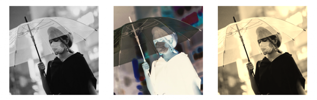
上面效果圖分別為灰度、負片、棕色
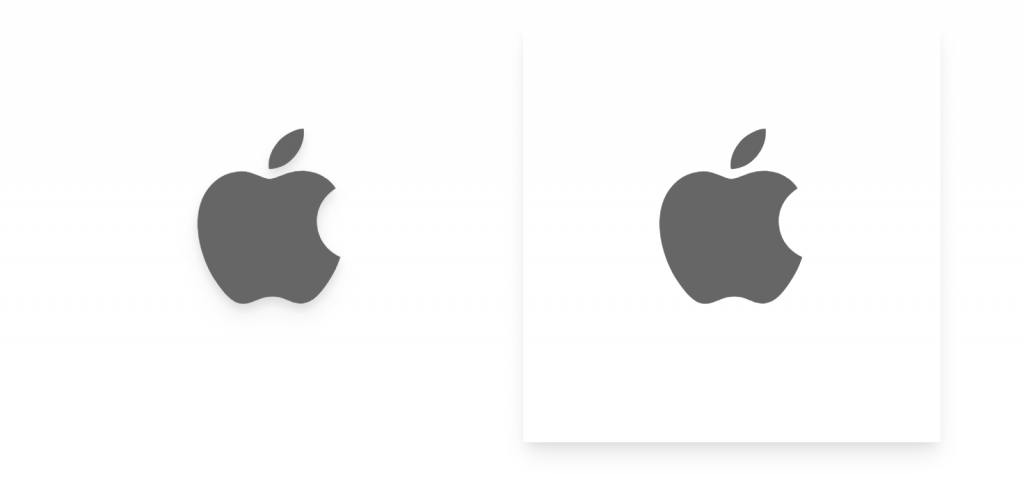
這個 Filter 很酷,一般來說我們使用 PNG 檔案,Shadow 指令是會包含整個圖片的長寬邊陰影,但使用 Drop Shadow 就只會在圖像上有陰影。威爾豬借用了 apple 官方網站的 Logo,範例如下:
<svg class="filter drop-shadow-lg">
  <path d="...">
</svg>
<svg class="filter shadow-lg">
  <path d="...">
</svg>
預設陰影大小如下表:
| class |
|---|
| drop-shadow-sm |
| drop-shadow |
| drop-shadow-md |
| drop-shadow-lg |
| drop-shadow-xl |
| drop-shadow-2xl |
| drop-shadow-none |
修改方式到 tailwind.config.js 額外添加:
  // tailwind.config.js

  module.exports = {
    ...
    theme: {
      ...
      extend: {
        dropShadow: {
          '3xl': '0 35px 35px rgba(0, 0, 0, 0.25)',
        }
      }
    },
    ...
  }
除了元素本身可以 Filter 外,也可以使元素下方的物件 Filter,除了 Drop Shadow 沒有之外,其餘使用方式為 backdrop-{濾鏡名稱},如:backdrop-blur、backdrop-sepia ... 等。威爾豬在 Unsplash 找了一張圖,圖片為底圖,中間另一區塊下指令 backdrop-filter,範例如下:
<div class="relative">
  <img class="w-full h-64 object-cover" src="...">
  <div class="absolute">
    <div class="border-4 backdrop-filter backdrop-blur backdrop-grayscale ..."></div>
  </div>
</div>
對了,Filter 是可以同時交互混用的。威爾豬有做了上述範例的 DEMO,有興趣的同學可以看看。
以上就是今天的內容,我們明天見。


 iThome鐵人賽
 看影片追技術