這篇想和大家聊聊CSS Flex到底是什麼東西
它是個超好用的排版工具,也是它拯救了我 (詳情可看Day 2)
用它來做網頁非常容易達到響應式
因為它有極強大的適應能力,可以隨著網頁縮放去改變比例
是個目前很夯的排版神器(grid也是)
Flex常見的語法有:
那到底該怎麼使用Flex呢?
別急別急,讓我和各位娓娓道來
1.display
首先,先看一下我們的HTML代碼:
<div class="flex_container">
    <div class="font box box_normal">1</div>
    <div class="font box box_short">2</div>
    <div class="font box box_normal">3</div>
    <div class="font box box_short">4</div>
    <div class="font box box_long">5</div>
    <div class="font box box_short">6</div>
    <div class="font box box_normal">7</div>
    <div class="font box box_short">8</div>
    <div class="font box box_long">9</div>
    <div class="font box box_normal">10</div>
</div>
CSS:
.flex_container {
    border:solid 5px rgb(216, 30, 30);
    height:950px;
    margin:2%;
}
.font {
    color:#fff;
    text-align:center;
    font-size:50px;
}
.box {
    background-color:rgb(124, 185, 25);
    margin:0.5%;
    width:275px;
}
.box_normal {
    height:200px;
    line-height:200px;
}
.box_short {
	height:100px;
    line-height:100px;
}
.box_long {
    height:300px;
    line-height:300px;
}
在還沒設置display:flex前長這樣: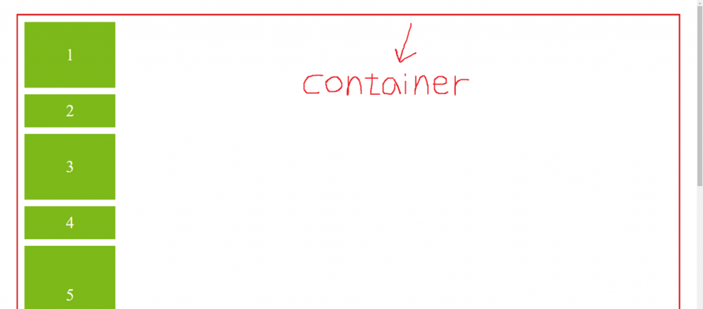
我現在在css裡設置display:flex
(注意:是設置在container喔!因為display是外容器(container)屬性,設置在裡面的box是沒用的,因為它們都是內元件(item)屬性)
.flex_container {
    display:flex;
}
結果如下圖所示: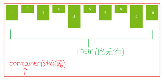
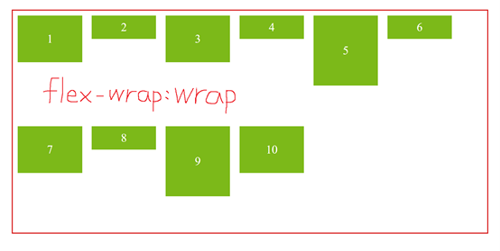
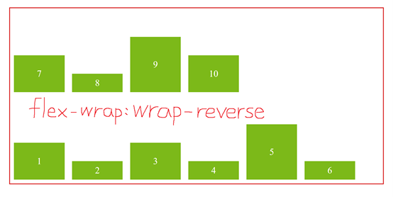
2.flex-wrap
我們現在已經成功啟用flex了
但我們的box卻都擠在同一列,導致我們原本設定的box樣式都不一樣了,把我的box還來R!!!
會擠在一起的原因是,你沒有告訴它能不能換行,因為flex的預設是不換行的
這時flex-wrap的作用就來了,它是用來告訴flex「能不能換行」
如果能換行,它就會在超過container預設的寬度時自動換行
可用屬性有以下三種:
讓我們看以下範例
CSS:
.flex_container {
    flex-wrap:nowrap | wrap | wrap-reverse;
}
結果如下圖所示: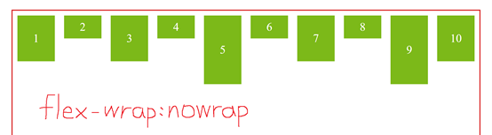
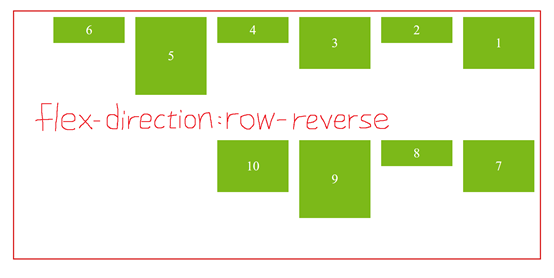
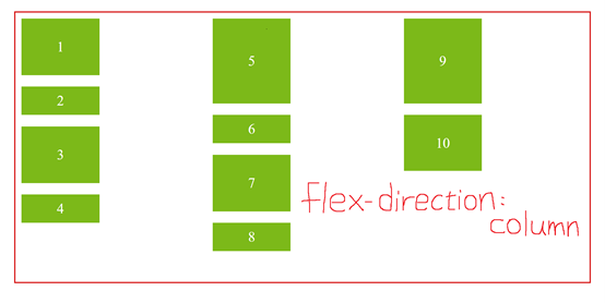
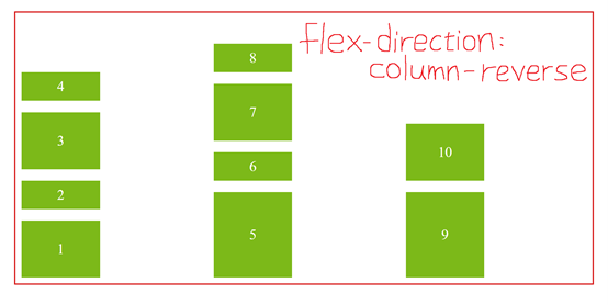
3.flex-direction
Flex有分「主軸(row)」和「交錯軸(column)」,你也可以把它想成矩陣的形式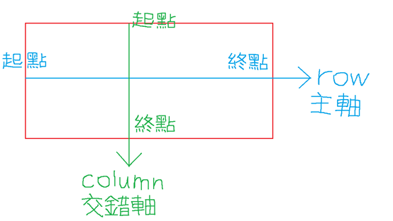
Flex-direction決定的是內元件的「排列方向」
可用屬性有以下四種:
讓我們看以下範例
CSS:
.flex_container {
    flex-direction:row | row-reverse | column | column-reverse;
}
結果如下圖所示: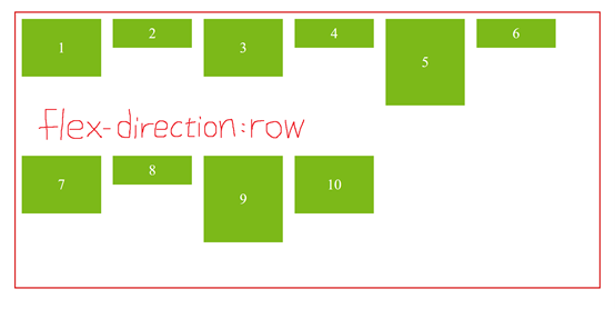
4.flex-flow
flex-flow是flex-direction和flex-wrap的縮寫
它可以接受兩個屬性的值,沒有前後順序之分,中間用空格隔開即可
CSS:
.flex_container {
    flex-direction:column;
	flex-wrap:wrap;
}
可寫成
.flex_container {
    flex-flow:column wrap;
}
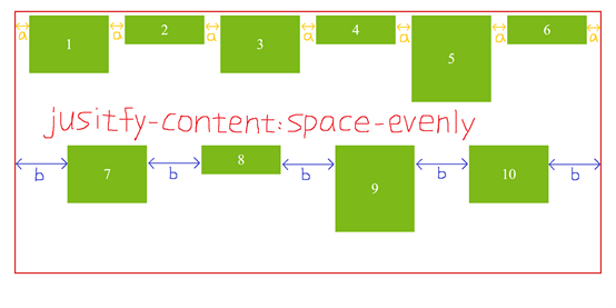
5.justify-content
justify-content是用來控制Flex「水平對齊」的位置,也就是主軸方向
以主軸的「起點」和「終點」來做依據
可用屬性有以下六種:
讓我們看以下範例
CSS:
.flex_container {
    justify-content:flex-start | flex-end | center | space-between | space-around | space-evenly;
}
結果如下圖所示:
從主軸的「起點」開始排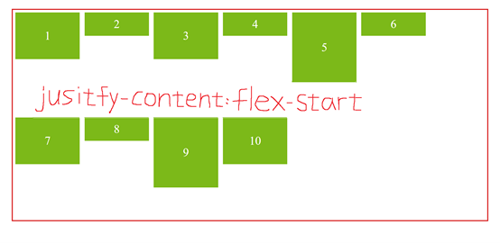
從主軸的「終點」開始排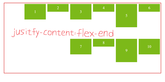
排在「起點」和「終點」的中間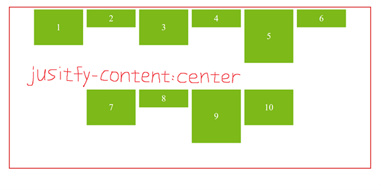
Space-between是平均分配「元素」位置,但左右兩側會貼齊主軸的起點、終點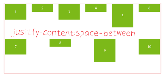
這裡想把space-around和space-evenly拿來一起講
因為常常會有人分不清楚這兩者的差異
Space-around是平均分配「元素」位置,但左右兩側的間距會較小
Space-evenly是「元素」和「左右兩側」的間距皆相同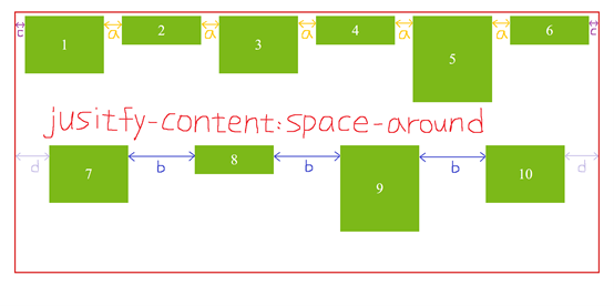
6.align-item
和jusitfy-content的用法類似,但它是用來控制「垂直對齊」的位置,也就是交錯軸方向
可用屬性有以下五種:
讓我們看以下範例
CSS:
.flex_container {
    align-items:stretch | flex-start | flex-end | center | baseline;
}
結果如下圖所示:
Stretch是align-item的預設值,會往交錯軸方向將內元素全部填滿
如果你有設置height,則不會起作用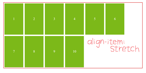
從交錯軸的「起點」開始排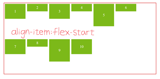
從交錯軸的「終點」開始排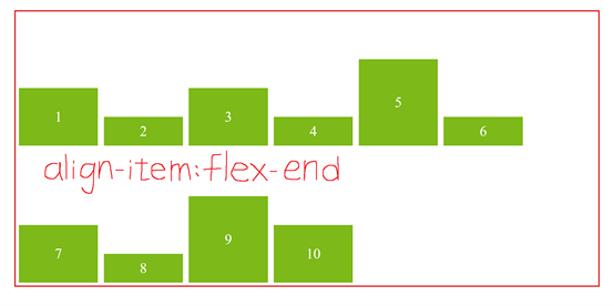
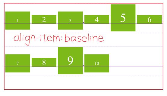
這邊想把center和baseline拿來一起講
因為這兩個真的長的超像超像世界無敵像 (認真)
但還是有些微差異在
請看center的圖,上面有兩條紫色的線,它們都剛好對齊在數字的中間
再看baseline的圖,你會發現紫色的線在數字的下方
沒錯!差異就在這裡
不管字體大小,baseline都是以「字體下方」去做對齊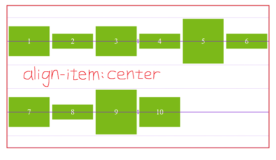
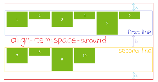
7.align-content
align-content是用來控制Flex的「行」在「水平方向」的對齊位置
所以如果想使用align-content,一定要設flex-wrap:wrap
因為它是控制「行」,一定要有多行才能觸發
可用屬性有以下七種:
讓我們看以下範例
CSS:
.flex_container {
	flex-wrap:wrap; /*一定要有才能觸發flex-content!*/
    align-content:stretch | flex-start | flex-end | center | space-around | space-between | space-evenly;
}
結果如下圖所示:
Stretch是align-content的預設值,每行將拉伸以填滿剩餘空間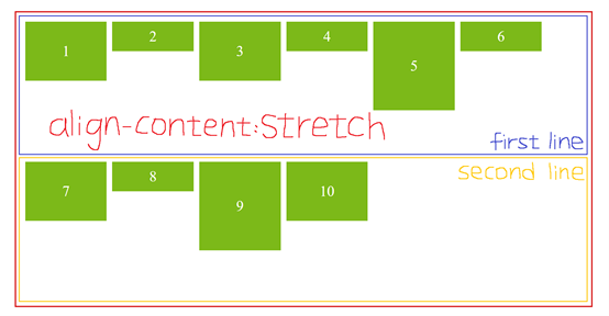
從交錯軸的「起點」開始排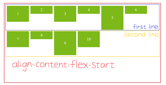
從交錯軸的「終點」開始排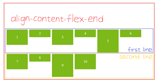
排在「起點」和「終點」的中間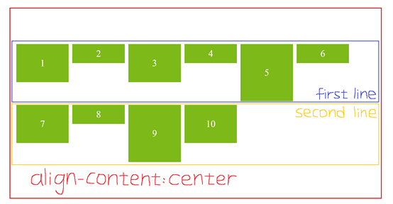
Space-around是平均分配「行」的位置,但上下兩側的間距會較小
Space-between是平均分配「行」的位置,但上下兩側會貼齊交錯軸的起點、終點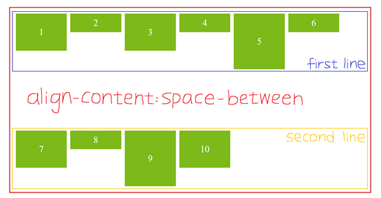
Space-evenly是「元素」和「上下兩側」的間距皆相同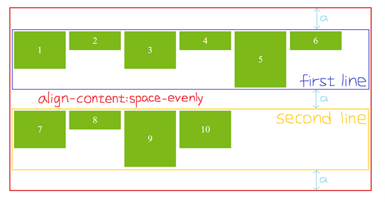
8.align-self
align-self和align-item的功能一樣,但它是針對「單一」對象
可用屬性有以下五種:
讓我們看以下範例
CSS:
(這裡我們將align-self設置在box_short上,也就是box2、4、6、8)
.box_short {
    align-self:stretch;
}
結果如下圖所示:
Stretch是預設值,box_short會往交錯軸方向將內元素全部填滿
如果你有設置height,則不會起作用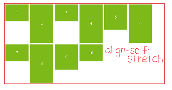
box_short會從交錯軸的「起點」開始排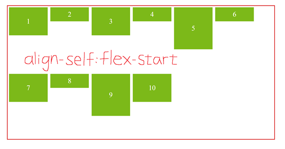
box_short會從交錯軸的「終點」開始排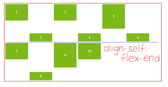
box_short會排在「起點」和「終點」的中間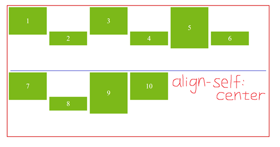
box_short會排在「字體下方」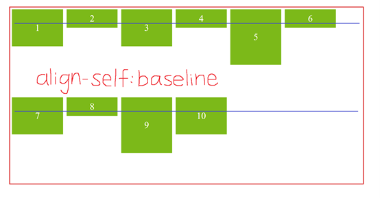
9.order
order預設值為0,它可以重新定義內元件的排列順序,順序會依照數值的大小排列
讓我們看以下範例
CSS:
.box_normal {
    order:1;
}
.box_short {
    order:2;
}
結果如下圖所示: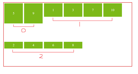
CSS:
.box_normal {
    order:-1;
}
.box_short {
    order:1;
}
結果如下圖所示: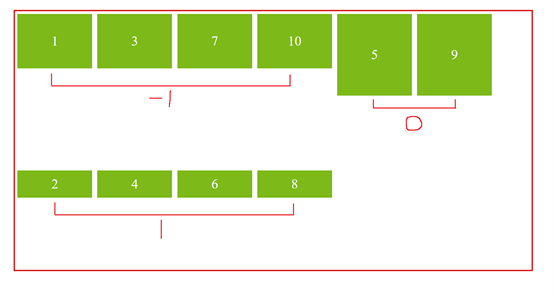
10.Flex (flex-grow、flex-shrink、flex-basis)
這裡想和大家聊聊Flex的空間分配
Flex是flex-grow、flex-shink、flex-basis的縮寫
那它們到底是什麼呢?別急!我立馬說給你聽
但首先,請先去HTML把4~10的box都刪掉
並把container的height改成220px,並加上width:1800px
.flex_container {
    height:220px;
    width:1800px;
}
結果如下圖所示: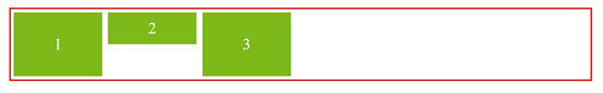
好,事不宜遲,趕緊向各位介紹這三種屬性
Flex-grow
Flex-grow預設值為0,它會依照你設定的值去分配剩餘空間
我們現在在box_short設置flex-grow:1,等於把剩餘空間分成「1等分」給box_short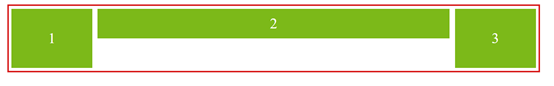
再把box_normal設置flex-grow:2,就等於把剩餘空間分成「3等分」,再分別分給3個box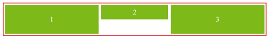
Flex-shrink
Flex-shrink是當空間不夠時,所壓縮的比例,預設值為1,代表大家所壓縮的比例一樣
我們現在先把三個box都設置flex-shrink:0,代表三個box都不被壓縮,它就會直接爆出container外面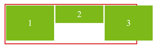
再試試只把flex-shrink:0設置在box_normal,這樣就會只壓縮box_short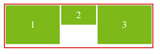
至於壓縮的多寡,是根據不同box的寬度去分配,請看以下範例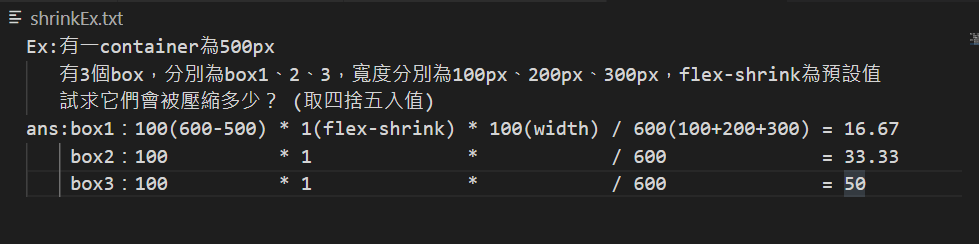
Flex-basis
Flex-basis和width本質上一樣,但優先順序較width高,預設值為auto
如果我們同時在box_short設置Flex-basis:50px、width:100px
則box_short的寬會是50px,而不是100px
以上就是Flex的介紹
非常的長,但希望各位能耐心看完,保證收穫良多!!
只要你會Flex,就沒有什麼網頁難的倒你了!
另外,想和各位分享一個Flex的小遊戲 (無業配啦哈哈)
https://flexboxfroggy.com/#zh-tw
是個用Flex幫青蛙回家的小遊戲,可以讓你快速理解Flex的操作
想多了解Flex的人可以去玩看看唷!
參考資料:
https://cssreference.io/flexbox/ (大推這個網站,裡面寫的很詳細,且有全部CSS語法的使用方式、例子)
https://ithelp.ithome.com.tw/articles/10208741


 看影片追技術