前幾天都比較專注在文字上的CSS動態,今天就來看看圖片的吧!
比起一堆文字,放圖片絕對能夠說個好故事!
可是一張圖片不夠說明怎麼辦?那就在使用者Hover的時候才把資訊顯示出來吧!
不管是攝影師的圖片作品牆、還是部落格文章列表,加上Hover動態特效,
讓圖片活起來!
先來看看成果:
| 顯示更多資訊 | 資訊轉出來! | 就是...裝飾的線匡 |
|---|---|---|
 |
 |
 |
我讓所有的img-container都有共同的設定:
.img-container{
    width: 200px;
    height: 300px;
    margin-right: 20px;
    margin-bottom: 20px;
    transition: 0.5s;
    cursor: pointer;
    overflow: hidden;
}
圖片Hover後從模糊→清晰,吊吊使用者胃口!
只有當使用者跟圖片互動時,才能看到圖片清晰的原貌~
使用CSS Filter的功能。
*hover 前:1.圖片模糊 2.標題不動 3.敘述透明 4.讓文字背景的黑色(偽元素)在下方待命
*hover 後:1.圖片模糊變清晰 2.標題往上移動 3.敘述出現&往上移 4.讓文字背景的黑色上移動
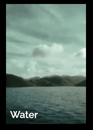
//html
<div class="img-container img-container__1"
data-title="Water"
data-des="The origin of everything. Be like the flow.">
//懶得做元素,直接把文字塞到html裡面

    <div class="img" ></div>
</div>

//Scss
//&的SCSS意思是同一層!SCSS也可以這樣使用在class名稱
//所以下面我其實是外層包著.img-container{}
//這樣就等於img-container__1

&__1{
      background
      :url('https://source.unsplash.com/random/640x960?sea');
			//用unsplash 的random 圖片
      background-size: 100%;
      background-position: center;
      position: relative;

      &:before{
        content:attr(data-title);
				//讀取元素裡面的文字
        text-shadow: 1px 1px 20px black;
				//背景有時候太亮,文字看不到,我下點陰影,
				//但在第三個數值裡面設定讓他發散一點,陰影才不會太重

        position: absolute;
        bottom: 10px;
        left: 10px;
        z-index: 1;
        transition: .5s;
     }

      &:after{
        content:attr(data-des);
				//讀取元素裡面的文字
        text-shadow: 1px 1px 20px black;
        position: absolute;
        bottom: 10px;
        left: 10px;
        font-size: 12px;
        transform: translate(0, 40px);
				//先讓文字往下移動
        opacity: 0;
				//先讓文字消失
        z-index: 1;
        transition: .5s;
     }

      .img{
        @extend .img-container__1;
				//這是SCSS的用法,意思是我要.img-container__1裡面的設定
        width: 100%;
        height: 100%;
        filter: blur(1px);
				//先模糊,這邊因為外面還有包一層,才不會連邊界都糊糊的
        transition: .5s;
        position:relative;

				//這一塊就是文字hover後出現的黑幕!
        &:before{
          content:'';
          position:absolute;
          top:100%;
					//讓他往下移動,因為最外層有設定 overflow: hidden所以看不到
          left:0;
          width: 100%;
          height: 100%;
          transition: .5s;
          background: linear-gradient(to bottom, transparent 0%, rgba(0,0,0,0.8) 80%);
					//就是一個漸層:透明->黑色
          opacity: .5;
        }


      }

			//Hover開始!
      &:hover{
        &:before{
            bottom: 40px; //這個是標題,讓他往上移動=離底部遠一點
          }
        &:after{
          transform: translate(0, 0px);
          opacity: 1;
					//這個是敘述,讓敘述歸回原位,opacity =1 出現
        }
        .img{
        background-size: 105%; //讓圖片有點放大效果
        filter: blur(0);//讓圖片不模糊

          &:before{
            top: 0%; //讓字後面的黑幕整個蓋住圖片
          }
        }
      }
    }
因為其他效果很多,所以模糊的尺度不太明顯。
Filter還有很多參數可以玩,大家也可以試試看~
超簡單的圖片效果,只要用css的rotate就可以做到,看起來很俏皮~
//html
<div class="img-container img-container__3">
    <div class="text">
      <span>Universe</span>
      <p>You are your own universe. Explore yourself now.</p>
    </div>
  </div>
</div>

//scss
&__3{
      background
      :url('https://source.unsplash.com/random/640x960?universe');
      background-size: 100%;
      background-position: center;
      display: flex;
      justify-content: center;
      align-items: center;

      .text{
        width: 80%;
        text-align: center;
        background: rgba(34, 49, 63, .6);
        padding: 10px 0;
        transform: rotateX(-90deg);
				//主要是動這邊, 相當於rotate3d(1, 0, 0, -90).
        transform-origin: 50% 50%;
        transition: 0.5s;
        opacity: 0;

        p{
          font-size: 14px;
        }
      }

      &:hover{
        .text{
          transform: rotateX(0deg); //轉出來!
          opacity: 0.8;
        }
      }
    }
  }
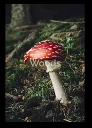
Day1 有做過連結的文字底線效果,傳送門
這次一樣用scale來做四方方的線框效果!
*hover 前:1. 背景綠色 2. 圖片透明度0 3.左右邊框透明,在y=0的地方待命 4. 上下邊框透明,在x=0的地方待命
*hover 後:1. 背景不動啦 2. 圖片變微透明 3.左右邊框出現!往上下長 4. 上下邊框出現,往左右長
最底層其實是一個綠綠的東西,hover時候,
上面的圖片讓他透明一點就會有綠色濾鏡效果囉!
這邊的線框其實只需要兩個偽元素就作成!
一個比較扁,一個比較長,就會有交叉的曲線。
//html
<div class="img-container img-container__2">
    <img src="https://source.unsplash.com/random/640x960?woods" alt="">
    <div class="text">Woods</div>
</div>

//scss
&__2{
      background: #234F1E;//綠底壓在最下面
      background-size: 100%;
      background-position: center;
      position: relative;

        &:before, &:after{
          content:'';
          position:absolute;
          transition: all .5s ease-in;
        }

				//扁的線框,所以是上下的線!用border做
        &:before{
          width: 80%;
          height: 60%;
          left: 10%; //讓他左右置中 [(1 - 80%)/2]
          top:20%; //讓他上下置中 [(1 - 60%)/2]
          border-top: 1px solid transparent;
          border-bottom: 1px solid transparent;
					//先讓線是透明的
          transform: scale(0,1);
					//先讓x座標是0, 之後變成1就會左右長出來~
					//y座標還是要先設定,不然會變成從最中間長出來,不信你可以試試看
        }

				//細長的線框,所以是左右的線!用border做
        &:after{
          width: 60%;
          height: 80%;
          left: 20%;
          top:10%;
          border-right: 1px solid transparent;
          border-left: 1px solid transparent;
          transform: scale(1,0);
					//先讓y座標是0, 之後變成1就會上下長出來~
        }

			//範例的蘑菇圖
      img{
        width: 100%;
        height: 100%;
        opacity: 1;
        transition: .5s;
      }

      .text{
        position: absolute;
        top: 50%;
        left: 50%;
        transform: translate(-50%,-50%);
				//讓x,y軸移回自己身體的一半=置中
        opacity: .5;
        transition: opacity .5s ease-in;
      }

			//Hover!
      &:hover{
        &:before{
          border-top: 1px solid white;
          border-bottom: 1px solid white;
          transform: scale(1,1);
        }
        &:after{
          border-right: 1px solid white;
          border-left: 1px solid white;
          transform: scale(1,1);
        }

        img{
           opacity: .7;
        }

        .text{
          opacity: 1;
        }
      }

    }
今天的code
主要是參考codepen這裡:CodePen Home
Awesome Image Hover in Pure CSS
另外也很喜歡這個效果,適合活潑的品牌~有機會再試試看!
這些動態都不難,但能夠設計出來真的不簡單~
有任何錯誤或意見請批評指教

 iThome鐵人賽
 看影片追技術