前兩天都是展現Data而已,今天來試做看看互動&換資料的動態!
折線圖也是滿常見的樣式,
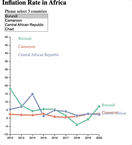
這次以非洲的通膨為主題,主要功能為
1.可以有三個國家資料做比較
2.點擊把其中一個國家隱藏
老樣子先看成果:
主要流程如下:
- 基本繪製:svg定位、x & y軸
- 資料讀取&整理
- 繪製線段、點、label & legend
- 資料互動:監聽legend點擊
- 資料更新的監聽:監聽selection change
- 資料更新:線段等的位置移動
參考
更換data的動態是參考這個:Connected scatter plot with dropdown to select group,
隱藏線段是參考這個: Connected scatter plot with interactive legend
//1. 基本繪製
const margin = {top: 10, right: 100, bottom: 30, left: 30},
    width = 460 - margin.left - margin.right,
    height = 400 - margin.top - margin.bottom;

//1. 基本繪製: append the svg to the body of the page
const svg = d3.select("#my_data")
    .append("svg")
    .attr("width", width + margin.left + margin.right)
    .attr("height", height + margin.top + margin.bottom)
    .append("g")
    .attr("transform",`translate(${margin.left},${margin.top})`);

// 1. 基本繪製 add X-axis
  const x = d3.scaleLinear()
  .domain([2012, 2020])
  .range([0, width]);

  svg.append("g")
  .attr("transform", `translate(0, ${height})`)
  .call(d3.axisBottom(x).tickFormat(d3.format("d")));//.tickFormat(d3.format("d"))是把數字變成字串

  //1. 基本繪製 dd Y-axis
  const y = d3.scaleLinear()
      .domain( [-10,50])
      .range([height, 0 ]);//上面是起點,要把-10往下推,就讓他y變高高

  svg.append("g")
      .call(d3.axisLeft(y));
//2. 資料讀取&整理
let countriesData = []
let time = []
for(i = 2012; i <=2020; i++){
  time.push(i);
}

//2.資料讀取&整理:開始讀資料
d3.csv('https://raw.githubusercontent.com/africadatahub/adh-africa-inflation/main/data/africa_inflation_data.csv')
.then(data=>{

  //2. 資料準備:create countries
 countriesData = data.map(d=>d.country);

  //2. 資料準備:加入下拉選單
  d3.select('#countrySelect')
  .selectAll('option')
  .data(countriesData)
  .join('option')
  .attr('value', d=> d)
  .text(d=> d)

  //2. 資料準備:先有個初始資料
  let allGroup = ['Burundi','Chad','Gabon'];

  //2. 資料準備:將拿到的資料整理成好讀版
	//整理成這樣的陣列:[{name: 國家名稱, values: [{2012: 0.18}, {2013: 0.25}...]}
	//,{name: 國家, ...}]
  let dataReady = allGroup.map(groupName => {
        return {
          name: groupName,
          values: data.reduce((pre,data)=>{
               if(data.country == groupName){
                  result = time.map(year=>{
                    return {time: year, value: data[year]}
                  })
                }
              return result
            }, [])
          }
        })

  //2. 資料準備:   colorScale 把國家配對成一個一個顏色
  let myColor = d3.scaleOrdinal().domain(countriesData).range(d3.schemeSet2);
//3. 繪製:Line Maker
     const line = d3.line()
        .x(d=>x(+d.time))
        .y(d=>y(+d.value));

    //3. 繪製:drawlines
    let lines = svg.selectAll('myLines')
        .data(dataReady)
        .join("path")
        .attr("class", d => d.name.replace(/\s*/g,""))
				//class name用國家名稱,但有些國家名稱有空格,所以把空格拔掉
        .attr("d", d => line(d.values))
        .attr("stroke", d => myColor(d.name))
        .style("stroke-width", 4)
        .style("fill", "none");

        //3. 繪製:add points Group
    let pointsGroup = svg.selectAll('myDots')
            .data(dataReady)
            .join('g')
            .style('fill', d=>myColor(d.name))
            .attr('class',d=>d.name.replace(/\s*/g,""))

    //3. 繪製:add points
   let points = pointsGroup.selectAll('myPoints')
            .data(d=>d.values)
            .join('circle')
            .attr('cx', d=>x(d.time))
            .attr('cy', d=>y(d.value))
            .attr('stroke','white')
            .attr('r',5);


        //3. 繪製:Add labels
    let label = svg.selectAll()
        .data(dataReady)
        .join('g')
        .append('text')
        .attr('class',d=>d.name.replace(/\s*/g,""))
        .datum(d=>{return {name: d.name, value: d.values[d.values.length -1]}})
        .attr('transform', d =>`translate( ${x(d.value.time) + 10} ,${y(d.value.value)} )`)
        .text(d=>d.name)
        .style('height', '30px')
        .style('fill',d=>myColor(d.name))
        .style("font-size", 15);

    //3. 繪製:加上圖例
    myLegend = svg.selectAll('myLegend')
        .data(dataReady)
        .join('g')
        .append('text')
        .attr('x', 30)
        .attr('y', (d,i)=> 10 + i*30)
        .text(d=>d.name)
        .style('fill',d=>myColor(d.name))
        .style('font-size',15)
//4.資料互動:Interactive: hide line
//監聽圖標的點擊
  myLegend.on('click',function(e,d){
    currentOpacity = d3.selectAll('.'+d.name.replace(/\s*/g,"")).style('opacity');
    d3.selectAll('.'+d.name.replace(/\s*/g,"")).style('opacity',currentOpacity == 1 ? 0 : 1);
  })
//5.資料change data: 監聽器
    d3.select('#countrySelect').on('change', function(){
			//用d3 的nodes()拿到被點擊的節點
      let selected = d3.selectAll('#countrySelect>option:checked').nodes();
			//固定只取三個
      if(selected.length != 3) return;
      allGroup = [];
      d3.selectAll('#countrySelect>option:checked')
      .each((item)=>{
        allGroup.push(item)
      });

		//有變動時我就呼叫update囉,請看下一小節
      update();
    })
//6. 資料更新
   function update(){
    dataReady = allGroup.map(groupName => {
        return {
          name: groupName,
          values: data.reduce((pre,data)=>{
               if(data.country == groupName){
                  result = time.map(year=>{
                    return {time: year, value: data[year]}
                  })
                }
              return result
            }, [])
          }
        });

    lines.data(dataReady)
          .join()
          .transition()
          .duration(1000)
          .attr("class", d => d.name.replace(/\s*/g,""))
          .attr("d", d => line(d.values))
          .attr("stroke", d => myColor(d.name))
          .style("stroke-width", 4)
          .style("fill", "none");

    pointsGroup.data(dataReady)
          .join()
          .transition()
          .duration(1000)
          .style('fill', d=>myColor(d.name))
          .attr('class',d=>d.name.replace(/\s*/g,""))

    points.data(d=>d.values)
          .join()
          .transition()
          .duration(1000)
          .attr('cx', d=>x(d.time))
          .attr('cy', d=>y(d.value))
          .attr('stroke','white')
          .attr('r',5);

    label.data(dataReady)
        .join()
        .attr('class',d=>d.name.replace(/\s*/g,""))
        .datum(d=>{return {name: d.name, value: d.values[d.values.length -1]}})
        .transition()
        .duration(1000)
        .attr('transform', d =>`translate( ${x(d.value.time) + 10} ,${y(d.value.value)} )`)
        .text(d=>d.name)
        .style('height', '30px')
        .style('fill',d=>myColor(d.name))
        .style("font-size", 15);

    myLegend.data(dataReady)
            .join()
            .transition()
            .duration(1000)
            .attr('y',(d,i)=> 10 + i*30)
            .attr('x', 30)
            .text(d=>d.name)
            .style('fill',d=>myColor(d.name))
            .style('font-size',15);


  }


})
今天的code在這裡
當然還有太多細節可以調整,譬如說資料標籤重疊的地方,以及option多選的介面,還有一次強迫選3條...
等之後有時間再回頭來!QQ
有任何錯誤或想法歡迎批評指教!