
今天我們要來介紹React裡很強大的一個工具!沒錯就是Style Components!廢話不多說,我們直接開始吧!
Style Components其實是一個滿新的東西,主要功能是結合的JS和CSS,也就是所謂的CSS in JS,而當這個功能和React中的自定義組件一起使用時,效率就快很多了。
今天阿森會先介紹怎麼安裝這個插件,而介紹一個就相當於介紹完React中新增插件的方法了,因為大多都大同小異。
再來我會舉昨天HeroSection的內容作為例子,介紹自定義組件如何和Style Components一起合作。
當你今天要安裝任何一個插件時,所需要的步驟都一樣,就是→google他→找到npm doc→找到npm install或yarn add的code→到你的terminal貼上。
就是這麼簡單!
所以我們先搜尋Style Components npm:
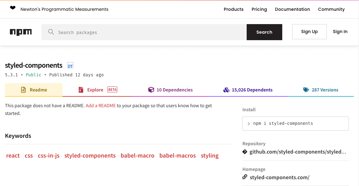
會找到這個網站,這時候右邊install的指令就是我們的目標的,把他複製起來貼在你react workspace資料夾的terminal:

按下enter後就會自動安裝了,要確定是否安裝或是版本可以打開前面提到的package.json做確認。

這樣你就完成插件的安裝了!
接下來我舉昨天提到過的例子,我們再打開一次HeroSection資料夾中的index.js:
import React, { useState } from 'react'
	import {HeroContainer,
					HeroBg,
				  HeroContent,
					HeroH2,
					HeroH2Wrapper
} from './HeroElements'

const HeroSection = () => {
const [hover, setHover] = useState(false)
const onHover = () => {
    setHover(!hover)
}

    return (
        <HeroContainer >
            <HeroBg />
            <HeroContent>
                <HeroH2Wrapper>
                <HeroH2>Hi</HeroH2>
                <HeroH2>I'm Sen Chao!</HeroH2>
                <HeroH2>Nice to meet</HeroH2>
                <HeroH2>you!</HeroH2>
                </HeroH2Wrapper>
            </HeroContent>
        </HeroContainer>
    )
}

export default HeroSection
在React中,大寫開頭的tag就是你自定義的tag,所以我們這裡有:
HeroContent, HeroH2, HeroH2Wrapper, HeroContainer, HeroBg這幾個Tag。
但這時候React其實是讀不懂的,他預設的Tag只有像是div, img, ul等,所以我們可以用Style Components來做設定,而通常我們會再創一個叫做Elements的js檔,這裡就是HeroElements.js。
import styled from "styled-components";
import meblur from '../../images/bandblur.jpg'

export const HeroContainer = styled.div`
    display: flex;
    justify-content: center;
    align-items: center;
    padding: 0 30px;
    height: 950px;
    position: relative;
    z-index: 1;
    background-size: cover;
    width: 100%;
    background-image: url(${meblur});
    background-size: cover;
    background-position: center;

    &:before{
        content: '';
        position: absolute;
        top: 0;
        left: 0;
        right: 0;
        bottom: 0;
        background: linear-gradient(120deg, #ee7752, #23d5ab);
        background-size: 400% 400%;
        animation: change 10s ease-in-out infinite;
        opacity: 0.4;
        z-index: 2;
    }

    @keyframes change{
        0%{

    background-position: 0 50%;

    }

    50%{

    background-position: 100% 50%;
    }

    100%{

    background-position: 0 50%;

    }
    }
`

export const HeroBg = styled.div`
    position: absolute;
    top: 0;
    right: 0;
    bottom: 0;
    left: 0;
    width: 100%;
    height: 100%;
    overflow: hidden;
    background: linear-gradient(-45deg, #ee7752, #e73c7e, #23a6d5, #23d5ab);

`

export const HeroContent = styled.div`
    z-index: 3;
    max-width: 1200px;
    width: 100%;
    position: absolute;
    padding: 8px 24px;
    display: flex;
    flex-direction: column;
    align-items: center;

`

export const HeroH1 = styled.h1`
    color: #fff;
    font-size: 48px;
    text-align: center;

    @media screen and (max-width: 768px) {
        font-size: 40px;
    }

    @media screen and (max-width: 480px) {
        font-size: 32px;
    }
`

export const HeroP = styled.p`
    margin-top: 24px;
    color: #fff;
    font-size: 24px;
    text-align: center;
    max-width: 600px;

    @media screen and (max-width: 768px) {
        font-size: 24px;
    }

    @media screen and (max-width: 480px) {
        font-size: 18px;
    }
`

export const HeroH2 = styled.h2`
    position: relative;
    font-size: 7vh;
    letter-spacing: 15px;
    color: lightcyan;
    text-transform: uppercase;
    width: 100%;
    text-align: center;
    justify-content: center;
    -webkit-box-reflect: below 1px linear-gradient(transparent, #0008);
    line-height: 0em;
    outline: none;
    text-shadow: none;
    z-index: -10;
    margin-bottom: 10%;
    border: none;


    &:hover{

        animation: animate 6s linear infinite ;

    }

    @media screen and (max-width: 768px){
        font-size: 2vh;
        margin-bottom: 10%;
    }

    @keyframes animate
    {
        0%, 20%, 26%, 35%{
            color: #0e3742;
            text-shadow: none;
        }
        10%, 22%, 30%, 50%, 100%
        {
            color: #fff;
            text-shadow: 0 0 10px #03bcf4,
            0 0 20px #03bcf4,
            0 0 40px #03bcf4,
            0 0 80px #03bcf4,
            0 0 160px #03bcf4;
        }
    }
`

export const HeroH2Wrapper = styled.div`
    position: relative;
    justify-content: center;
    display: block;
    left: 0;
    align-items: center;
    min-height: 100vh;
    background: transparent;
    top: 25vh;
    z-index: -10;
    width: 100%;

`
在這裡可以看到一開始一定會先使用這句:
import styled from "styled-components";
之後對他做操作,像是這樣:
export const HeroH2Wrapper = styled.div
這裡就指派了Wrapper會以div的形式export到網頁中,最後會用``把css特性包裹起來。
在Style Components裡如果要設定media等效果,只要在每一個元件中直接寫就好,跟一般css要統一設定不太一樣,我個人是覺得更方便了一些,像是這些部分:
export const HeroH2 = styled.h2`

    ...


    &:hover{

        animation: animate 6s linear infinite ;

    }

    @media screen and (max-width: 768px){
        font-size: 2vh;
        margin-bottom: 10%;
    }
`
他其實就是把css元件化,所以在定義和使用上都更加方便,實際編寫的時候也不會太困難,真的是很好用的一個library。
今天大概講了Style Components的使用方法,之後的NFT網站我也會用css和Style Components做混搭,那今天就先這樣,希望大家都學會使用這樣一個厲害的工具了!那我們明天再見吧!


 iThome鐵人賽
 看影片追技術