
上一篇我們講了如何建立你的第一個React網頁,那今天阿森會介紹我們寫網頁會用到怎樣的架構,就讓我們開始吧!
這裡就拿我之前寫過的網也來當範例吧!
那我這個網頁主要可以分為幾個部分:
HeroSection:

About:

Experience:

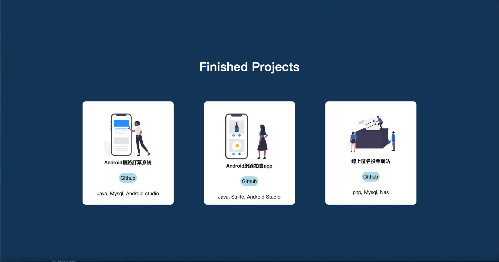
Projects:
Contact:

還有一直都在最上面的NavBar:

如果用手機開會出現的Sidebar:

大慨是以上六個部分。
接下來就讓我們看看workspace裡長什麼樣子吧!

那這裡面比較重要的東西有兩個,一個是src資料夾,裡面存放我們主要撰寫的程式碼、圖片等等,我們下一節再說。
再來是package.json這個檔案,在這個json檔裡寫的是我們用一共用到哪些插件,插件的版本是多少等等資訊,像這樣:
{
  "name": "smooth",
  "homepage": "https://cooksen.github.io/mywebpage",
  "version": "0.1.0",
  "private": true,
  "dependencies": {
    "@testing-library/jest-dom": "^5.11.4",
    "@testing-library/react": "^11.1.0",
    "@testing-library/user-event": "^12.1.10",
    "aos": "^2.3.4",
    "copy-to-clipboard": "^3.3.1",
    "gh-pages": "^3.2.3",
    "react": "^17.0.2",
    "react-dom": "^17.0.2",
    "react-icons": "^4.2.0",
    "react-router-dom": "^5.2.0",
    "react-scripts": "4.0.3",
    "react-scroll": "^1.8.3",
    "styled-components": "^5.3.0",
    "web-vitals": "^1.0.1"
  },
  "scripts": {
    "start": "react-scripts start",
    "build": "react-scripts build",
    "test": "react-scripts test",
    "eject": "react-scripts eject",
    "predeploy": "npm run build",
   "deploy": "gh-pages -d build"
  },
  "eslintConfig": {
    "extends": [
      "react-app",
      "react-app/jest"
    ]
  },
  "browserslist": {
    "production": [
      ">0.2%",
      "not dead",
      "not op_mini all"
    ],
    "development": [
      "last 1 chrome version",
      "last 1 firefox version",
      "last 1 safari version"
    ]
  }
}
在合作開發中做版本核對也是很重要的一環,到時候就會需要來對這一塊。
接下來在我的src資料夾裡一共有這些資料夾和檔案:

所以當他在讀我的檔案時,會先找index.js,再來會讀取到我的App.js,這兩個檔案分別長這樣:
index.js:
import React from 'react';
import ReactDOM from 'react-dom';
import App from './App';

ReactDOM.render(
  <React.StrictMode>
    <App />
  </React.StrictMode>,
  document.getElementById('root')
);
App.js:
import { BrowserRouter as Router } from 'react-router-dom'
import './App.css';
import Home from './pages';

function App() {
  return (
    <Router>
      <Home />
    </Router>

  );
}

export default App;
之後我會把所有的元件都擺放在pages這個資料夾中的index.js,再以Home的名稱將他export:
/pages/index.js:
import React from 'react'
import Navbar from '../components/Navbar'
import Sidebar from '../components/Sidebar'
import { useState } from 'react'
import HeroSection from '../components/HeroSection'
import InfoSection from '../components/InfoSection'
import { homeObjOne, homeObjTwo, homeObjThree } from '../components/InfoSection/Data'
import InfoSec2 from '../components/InfoSec2'
import Services from '../components/Services'
import Projects from '../components/Projects'
import Contact from '../components/contact'

export const Home = () => {
const [isOpen, setIsOpen] = useState(false)

const toggle = () => {
    setIsOpen(!isOpen)
}
    return (
        <>

         <Sidebar isOpen={isOpen} toggle = { toggle }/>
         <Navbar toggle = {toggle} />
         <HeroSection />
         <InfoSection {...homeObjOne}/>

         <InfoSec2 {...homeObjTwo}/>
         <Services />
         <Projects />
         <Contact {...homeObjThree} />
        </>
    )
}

export default Home
這裡就可以很清楚看到我components的架構了,我會在compnents資料夾中為每個元件再創一個資料夾,這裡是我整個components資料夾的內容和HeroSection,其實我每個元件打開都長這樣:

裡面會有一個index.js和Elements.js,前者是主要顯示的內容,後者是利用style-components代替css的裝飾用檔案。
index.js:
import React, { useState } from 'react'
import { HeroContainer, HeroBg} from './HeroElements'
import {
    HeroContent, HeroH2, HeroH2Wrapper
} from './HeroElements'

const HeroSection = () => {
const [hover, setHover] = useState(false)
const onHover = () => {
    setHover(!hover)
}

    return (
        <HeroContainer >
            <HeroBg />
            <HeroContent>
                <HeroH2Wrapper>
                <HeroH2>Hi</HeroH2>
                <HeroH2>I'm Sen Chao!</HeroH2>
                <HeroH2>Nice to meet</HeroH2>
                <HeroH2>you!</HeroH2>
                </HeroH2Wrapper>
            </HeroContent>
        </HeroContainer>
    )
}

export default HeroSection
HeroElements.js:
import styled from "styled-components";
import meblur from '../../images/bandblur.jpg'

export const HeroContainer = styled.div`
    display: flex;
    justify-content: center;
    align-items: center;
    padding: 0 30px;
    height: 950px;
    position: relative;
    z-index: 1;
    background-size: cover;
    width: 100%;
    background-image: url(${meblur});
    background-size: cover;
    background-position: center;

    &:before{
        content: '';
        position: absolute;
        top: 0;
        left: 0;
        right: 0;
        bottom: 0;
        background: linear-gradient(120deg, #ee7752, #23d5ab);
        background-size: 400% 400%;
        animation: change 10s ease-in-out infinite;
        opacity: 0.4;
        z-index: 2;
    }

    @keyframes change{
        0%{

    background-position: 0 50%;

    }

    50%{

    background-position: 100% 50%;
    }

    100%{

    background-position: 0 50%;

    }
    }
`

export const HeroH1 = styled.h1`
    color: #fff;
    font-size: 48px;
    text-align: center;

    @media screen and (max-width: 768px) {
        font-size: 40px;
    }

    @media screen and (max-width: 480px) {
        font-size: 32px;
    }
`

export const HeroP = styled.p`
    margin-top: 24px;
    color: #fff;
    font-size: 24px;
    text-align: center;
    max-width: 600px;

    @media screen and (max-width: 768px) {
        font-size: 24px;
    }

    @media screen and (max-width: 480px) {
        font-size: 18px;
    }
`
當然HeroElements中一定不只這些,但相信透過這樣展示大家可以大概了解Style-components的作用,如果不了解也不用擔心!明天阿森會就這個題目在做一次詳細的介紹。
而透過上面這樣的結構,可以讓我們在設計時更有效率,之後若要進行維護也會更加輕鬆,這裏阿森推薦大家都可以照這樣的結構來開發喔!
今天大概介紹了我開發網頁習慣用的架構,如果你有更好的辦法也不一定要用我的!那明天我會繼續介紹Style components這個插件,那今天就先這樣吧!


 看影片追技術