好的網站除了內容傳達之外,顏色是進入網站的第一印象,可以針對文字大小、框線、背景色...等做變化,是網站中不可或缺的樣式,現在讓我們來看看顏色及背景的使用技巧吧
以井字號為首加上六個英文數字,如果六個連續相同數值,可以寫成三位數。
例如:黑色#000000可簡寫成#000
RGB由紅色(Red)、綠色(Green)、藍色(Blue)組成,寫法為「rgb(紅色值、綠色值、藍色值)」。數值介於0-255之間,0代表最暗,數字越大越明亮。
例如:rgb(255,255,255) ⇒ 白色 、 rgb(0,0,0) ⇒黑色
如果要指定透明度,可用不透明度Alpha值,不透明度介於0-1之間,0為透明,1為不透明。寫法為「rgba(紅色值、綠色值、藍色值、不透明度)」。
例如:rgba(255,255,255,0.5)
直接寫顏色名稱。
例如:紅色(red)、藍色(blue)
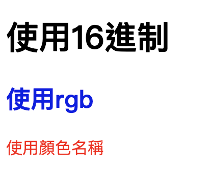
<h1>使用16進制</h1>
<h2>使用rgb</h2>
<p>使用顏色名稱</p>
/*使用十六進制*/
h1{
	color: #000000
}
/*使用rgb*/
h2{
	color: rgba(27,0,230)
}
/*使用顏色名稱*/
p{
	color: red;
}
色彩配色以下是我自己常用的
改變元素的背景顏色。樣式設定方式與顏色相同。
範例:
<div class="text">
  背景色區塊
</div>
.text{
  /* 色碼設定 */
	background-color:#000;
  /* RGB設定 */
	/* background-color:rgb(0,0,0); */
  /* 顏色名稱設定 */
	/* background-color:black;  */
	color:#fff;
	padding:5px 10px;
  width:120px;
}

.bg-single{
  background-image: url('./img/people.png'), url('./img/bg.png');
  width: 100%;
  height: 100vh;
  background-size: 45%, cover;
  background-position: 80% bottom,center bottom;
  background-repeat: no-repeat;
}
background-image(背景圖):前者為聖誕老公公,後者為背景圖
background-size(背景圖片尺寸):聖誕老公公圖片寬度為45%,背景圖為填滿
background-position(背景圖片位置):聖誕老公公位置在水平80%垂直在下方,背景圖為水平置中垂直在下方
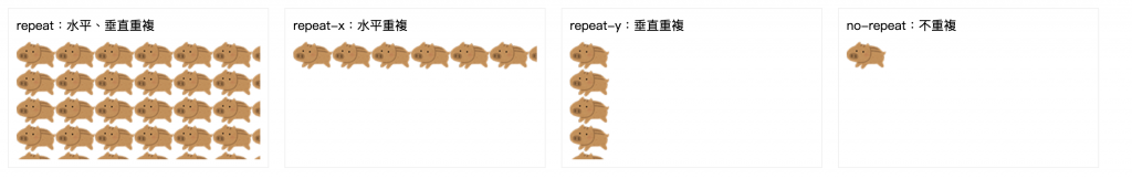
background-repeat為不重複
background其他屬性稍後會在做詳細介紹
以下範例是使用這兩張圖片做堆疊
結果:
<div class="box box1">
  <div class="head">repeat:水平、垂直重複</div>
  <div class="body"></div>
</div>
<div class="box box2">
  <div class="head">repeat-x:水平重複</div>
  <div class="body"></div>
</div>
<div class="box box3">
  <div class="head">repeat-y:垂直重複</div>
  <div class="body"></div>
</div>
<div class="box box4">
  <div class="head">no-repeat:不重複</div>
  <div class="body"></div>
</div>
.box{
  width: calc(25% - 50px);
  border: 1px solid #efefef;
  margin: 10px;
  padding: 10px;
}
.box .body{
  margin-top: 10px;
  height: 150px;
  background-image: url('../img/pig.png');
}
.box1 .body{
  background-repeat: repeat;
}
.box2 .body{
  background-repeat: repeat-x;
}
.box3 .body{
  background-repeat: repeat-y;
}
.box4 .body{
  background-repeat: no-repeat;
}
background-position:水平設定 垂直設定
<div class="box box1">
    <div class="head">水平:left 垂直:top</div>
    <div class="body"></div>
  </div>
  <div class="box box2">
    <div class="head">水平:left center</div>
    <div class="body"></div>
  </div>
  <div class="box box3">
    <div class="head">水平:left 垂直:bottom</div>
    <div class="body"></div>
  </div>
  <div class="box box4">
    <div class="head">水平:center 垂直:top</div>
    <div class="body"></div>
  </div>
  <div class="box box5">
    <div class="head">水平:center center</div>
    <div class="body"></div>
  </div>
  <div class="box box6">
    <div class="head">水平:center 垂直:bottom</div>
    <div class="body"></div>
  </div>
  <div class="box box7">
    <div class="head">水平:right 垂直:top</div>
    <div class="body"></div>
  </div>
  <div class="box box8">
    <div class="head">水平:right center</div>
    <div class="body"></div>
  </div>
  <div class="box box9">
    <div class="head">水平:right 垂直:bottom</div>
    <div class="body"></div>
  </div>
  <div class="box box10">
    <div class="head">水平:30% 垂直:80%</div>
    <div class="body"></div>
  </div>
.box{
  width: calc(100% / 3 - 50px);
  border: 1px solid #efefef;
  margin: 10px;
  padding: 10px;
}
.box .body{
  background-color: #efefef;
  background-repeat: no-repeat;
  margin-top: 10px;
  height: 90px;
  background-image: url('../img/pig.png');
}
.box1 .body{
  background-position: left top;
}
.box2 .body{
  background-position: left center;
}
.box3 .body{
  background-position: left bottom;
}
.box4 .body{
  background-position: center top;
}
.box5 .body{
  background-position: center center;
}
.box6 .body{
  background-position: center bottom;
}
.box7 .body{
  background-position: right top;
}
.box8 .body{
  background-position: right center;
}
.box9 .body{
  background-position: right bottom;
}
.box10 .body{
  background-position: 30% 80%;
}
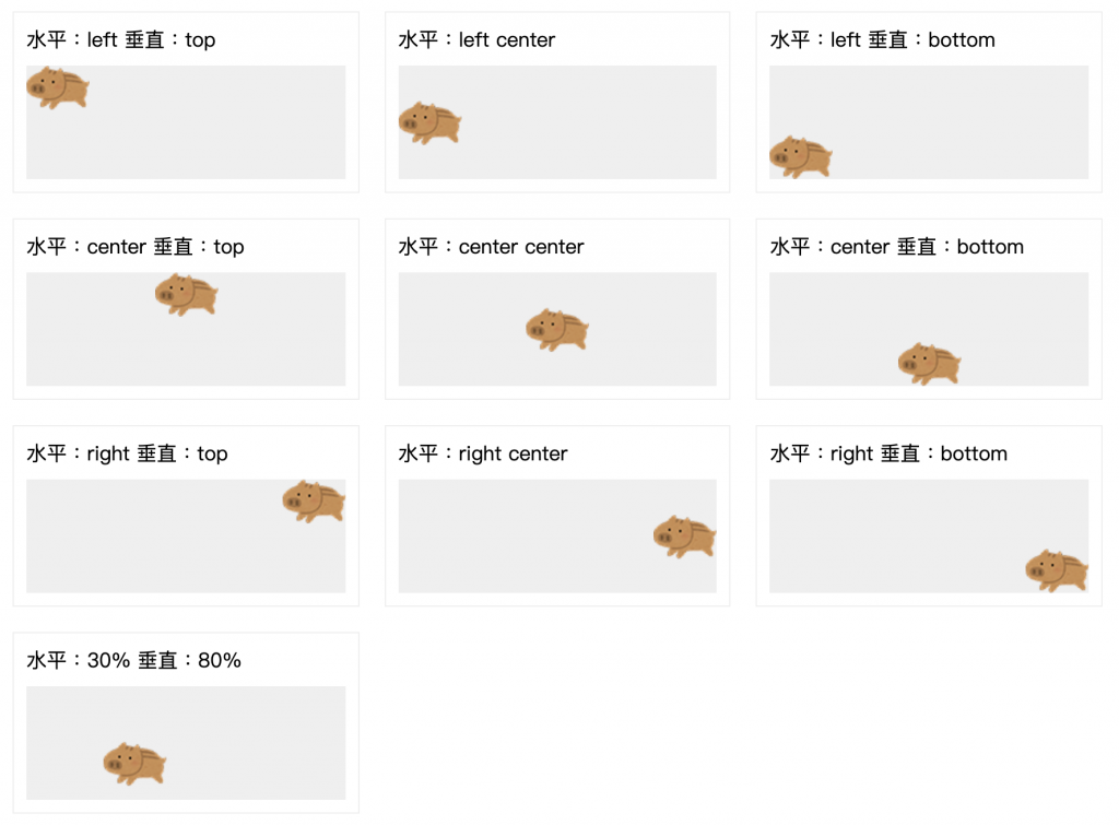
以上範例是針對不同的設定,背景圖的位置
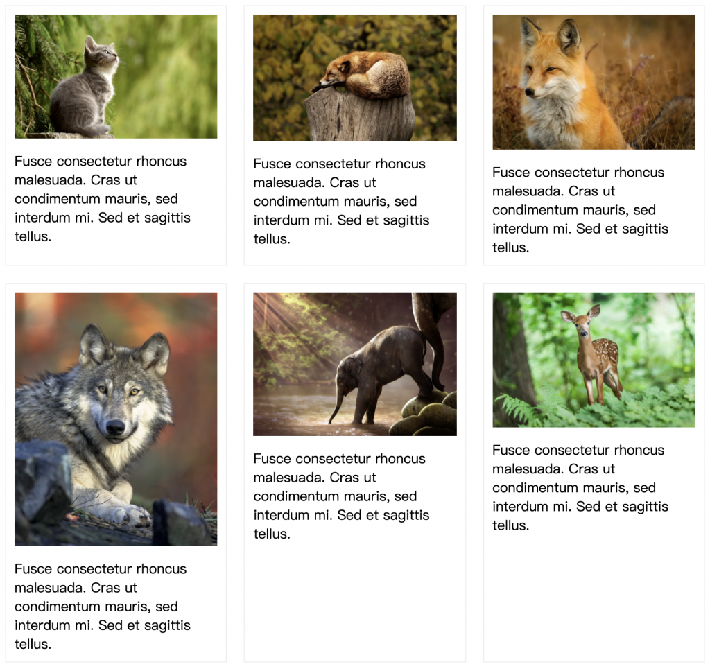
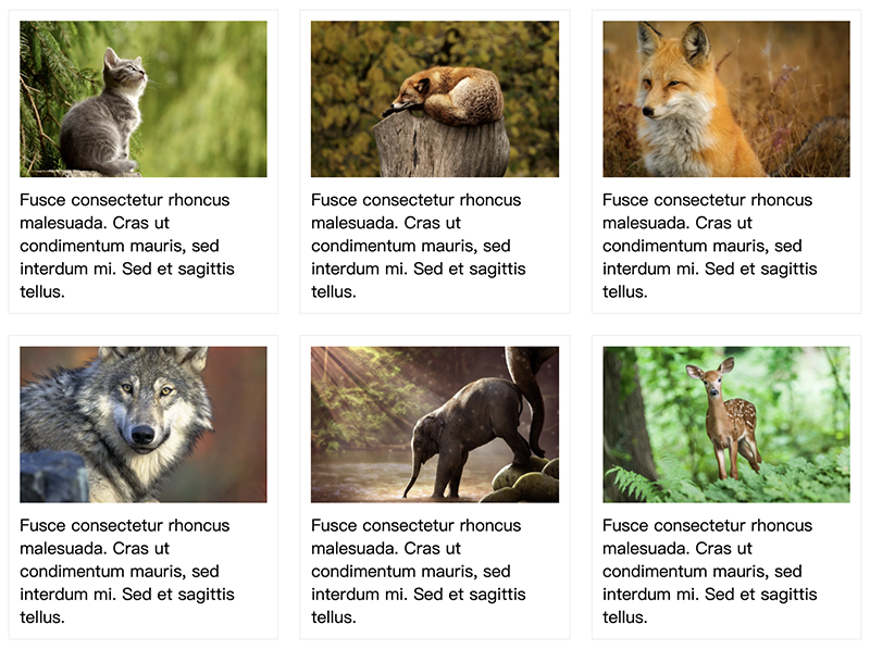
我自己比較常用的地方是有圖片的列表資訊,有時候客戶上傳圖片尺寸不一樣,導致圖片高度不一致,所以會設定高度,將圖片填滿在框框裡面,不管客戶上傳各式的尺寸,版面看起來也都會一致。
以下這是設置圖片,在class="img"沒設置高度,所以圖片尺寸不同就會導致跑版
<div class="box box1">
    <div class="img">
      <img src="img/img1.jpg" alt="">
    </div>
    <div class="body"> Fusce consectetur rhoncus malesuada. Cras ut condimentum mauris, sed interdum mi. Sed et sagittis tellus.</div>
  </div>
  <div class="box box2">
    <div class="img">
      <img src="img/img2.jpg" alt="">
    </div>
    <div class="body"> Fusce consectetur rhoncus malesuada. Cras ut condimentum mauris, sed interdum mi. Sed et sagittis tellus.</div>
  </div>
  <div class="box box3">
    <div class="img">
      <img src="img/img3.jpg" alt="">
    </div>
    <div class="body"> Fusce consectetur rhoncus malesuada. Cras ut condimentum mauris, sed interdum mi. Sed et sagittis tellus.</div>
  </div>
  <div class="box box4">
    <div class="img">
      <img src="img/img4.jpg" alt="">
    </div>
    <div class="body"> Fusce consectetur rhoncus malesuada. Cras ut condimentum mauris, sed interdum mi. Sed et sagittis tellus.</div>
  </div>
  <div class="box box5">
    <div class="img">
      <img src="img/img5.jpg" alt="">
    </div>
    <div class="body"> Fusce consectetur rhoncus malesuada. Cras ut condimentum mauris, sed interdum mi. Sed et sagittis tellus.</div>
  </div>
  <div class="box box6">
    <div class="img">
      <img src="img/img6.jpg" alt="">
    </div>
    <div class="body"> Fusce consectetur rhoncus malesuada. Cras ut condimentum mauris, sed interdum mi. Sed et sagittis tellus.</div>
  </div>
.box{
  width: calc(100% / 3 - 50px);
  border: 1px solid #efefef;
  margin: 10px;
  padding: 10px;
}
.box .img img{
  width: 100%;
}
.box .img{
  margin-bottom: 10px;
}
.box{
  width: calc(100% / 3 - 50px);
  border: 1px solid #efefef;
  margin: 10px;
  padding: 10px;
}
.box .img{
  background-position: center center;
  background-repeat: no-repeat;
  background-size: cover;
  height: 150px;
  margin-bottom: 10px;
}
.box1 .img{
  background-image: url('../img/img1.jpg');
}
.box2 .img{
  background-image: url('../img/img2.jpg');
}
.box3 .img{
  background-image: url('../img/img3.jpg');
}
.box4 .img{
  background-image: url('../img/img4.jpg');
}
.box5 .img{
  background-image: url('../img/img5.jpg');
}
.box6 .img{
  background-image: url('../img/img6.jpg');
}
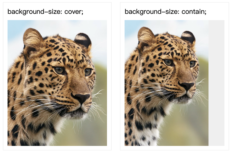
<div class="box box1">
  background-size: cover;
  <div class="img"></div>
</div>
<div class="box box2">
  background-size: contain;
  <div class="img"></div>
</div>
.box{
  width: calc(100% / 3 - 50px);
  border: 1px solid #efefef;
  margin: 10px;
  padding: 10px;
}
.box .img{
  margin-top: 10px;
  height: 300px;
  background-repeat: no-repeat;
  background-color: #efefef;
  background-image: url('../img/img.jpg');
}
.box1 .img{
  background-size: cover;
}
.box2 .img{
  background-size: contain;
}
<div class="box box1"></div>
<div class="box box2"></div>
.box{
width: 100%;
height: 600px;
background-size: cover;
background-repeat: no-repeat;
}
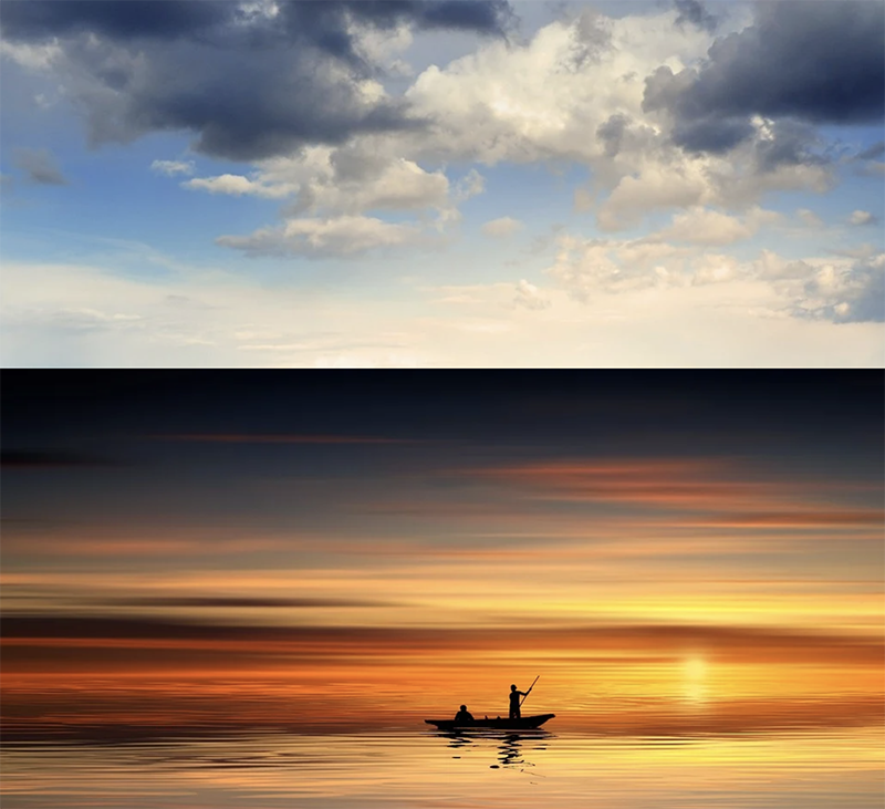
.box1{
background-attachment: fixed;
background-image: url('img1.jpg');
}
.box2{
background-image: url('img2.jpg');
}
將第一張背景圖樣式設定為fixed,不會隨畫面滾動,下方背景圖向上滾動就會有滾動視差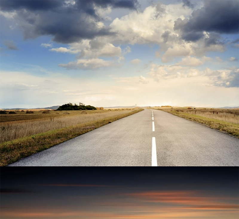
backgorund: [color] [image] [position] [size] [repeat] [attatchment] [origin] [clip]
需要注意的是,如果background-size與background-position同時存在時,要用斜線隔開
.box{
	background: #000 url(img/bg.png) no-repeat center bottom/cover;
}
background:linear-gradient(方向, 顏色1 位置, 顏色2 位置);
用英文或角度表示,預設是由上往下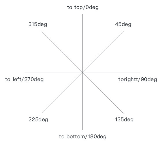
範例:
由上而下 to bottom,下面這五種寫法,產生出來的結果會是一樣的
.box{
  width: 200px;
  height: 200px;
  background:linear-gradient(rgba(240,249,255,1), rgba(161,219,255,1));
  /* background:linear-gradient(to bottom, rgba(240,249,255,1), rgba(161,219,255,1)); */
  /* background:linear-gradient(180deg,rgba(240,249,255,1), rgba(161,219,255,1)); */
  /* background:linear-gradient(to top, rgba(161,219,255,1), rgba(240,249,255,1)); */
  /* background:linear-gradient(to bottom, rgba(240,249,255,1) 0%, rgba(161,219,255,1) 100%); */
}

起點顏色到終點顏色0%-100%,至少會有兩個顏色,如果中間會再有第三個顏色,用百分比設置第三個顏色位置。
.box {
  width: 200px;
  height: 200px;
  background: -moz-linear-gradient(top, rgba(180, 227, 145, 1) 0%, rgba(97, 196, 25, 1) 50%, rgba(180, 227, 145, 1) 100%);
  background: -webkit-linear-gradient(top, rgba(180, 227, 145, 1) 0%, rgba(97, 196, 25, 1) 50%, rgba(180, 227, 145, 1) 100%);
  background: linear-gradient(to bottom, rgba(180, 227, 145, 1) 0%, rgba(97, 196, 25, 1) 50%, rgba(180, 227, 145, 1) 100%);
}

.box {
  width: 200px;
  height: 200px;
  background: -moz-linear-gradient(-45deg, rgba(109,179,242,1) 50%, rgba(30,105,222,1) 50%);
  background: -webkit-linear-gradient(-45deg, rgba(109,179,242,1) 50%,rgba(30,105,222,1) 50%);
  background: linear-gradient(135deg, rgba(109,179,242,1) 50%,rgba(30,105,222,1) 50%);
}

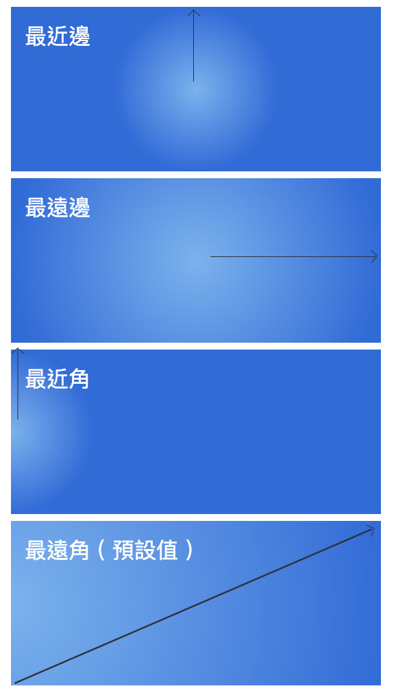
background:radial-gradient(形狀 長度 at 位置, 顏色1 位置, 顏色2 位置);
有圓形(circle)及橢圓形(ellipse),圓形設定尺寸時,只需要給一個數值;橢圓形需給x軸與y軸的尺寸
範例:圓形,漸層半徑80px
background:radial-gradient(circle 80px,#FFB76B,#D83900);

範例:橢圓形,漸層半徑水平200px,垂直100px
background:radial-gradient(ellipse at 200px 100px,#FFB76B,#D83900);

可使用關鍵字或是設定尺寸
    <div class="box closest-side">最近邊</div>
    <div class="box farthest-side">最遠邊</div>
    <div class="box closest-corner">最近角</div>
    <div class="box farthest-corner">最遠角 ( 預設值 )</div>
.box{
  width: 250px;
  height: 100px;
  margin-bottom: 5px;
  padding: 10px;
  color: #fff;
}
.closest-side{
  background:radial-gradient(circle closest-side at center,rgba(109,179,242,1),rgba(30,105,222,1));
}
.farthest-side{
  background:radial-gradient(circle farthest-side at center,rgba(109,179,242,1),rgba(30,105,222,1));
}
.closest-corner{
  background:radial-gradient(circle closest-corner at left,rgba(109,179,242,1),rgba(30,105,222,1));
}
.farthest-corner {
  background:radial-gradient(circle farthest-corner at left,rgba(109,179,242,1),rgba(30,105,222,1));
}
這是我常用的漸層產生器網站 Colorzilla Gradients ,設定好顏色之後,就可以複製旁邊的語法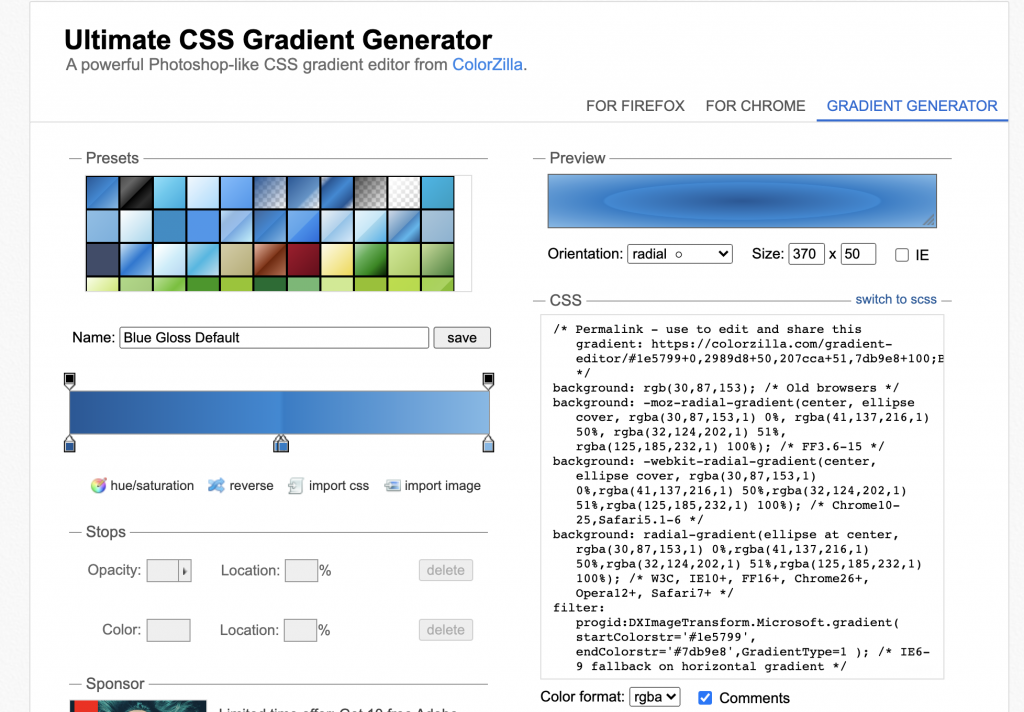
相信你對顏色、背景圖及漸層背景使用有一定的了解,依據網站主視覺顏色傳達形象,來營造出網頁整體的視覺風格。
參考資料:
https://www.oxxostudio.tw/articles/202008/css-gradient.html


 iThome鐵人賽
 看影片追技術