敝人很常踩到詐騙網站,第一屏就是一個慶祝的小動畫,
恭喜我中獎(好想中威力彩啊)
網頁也很常有這種獎勵使用者的小動畫,譬如說送出一個訂單、
或是幫忙寫了一個評價,我自己是看到這樣的動畫心情都滿好的,
所以自己也來做一個!
也先慶祝完賽的大家們 ٩(✿∂‿∂✿)۶
我還在跑呢...
這次主要是使用:
- 使用SCSS來控制樣式(寬度、左右、顏色)和動畫(2種旋轉和50種掉落位置)
- 使用JS來製作彩帶、三角形和長方形等DOM
主要參考:
SCSS寫法主要參考這邊,
用SCSS的@for讓animation變得很乾淨~
JS參考這個影片
我自己另外用CSS做了三角形和彩帶,讓畫面感豐富一點!
還有很多細節可以調整。(譬如說三角形和長方形直直下來不是很開勳)
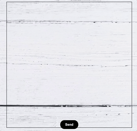
//HTML就是一個box啦!不寫了
//SCSS
//略過不重要的container&button夜市
//重點來了!
$colors: (red, green, blue, yellow, purple, orange, pink);
$num: 50;

@for $i from 0 through $num {
  $w: random(20); //寬度的隨機變數
  $l: random(100); //位置left的隨機變數


//長方形的傢伙
  .confetti{
    &:nth-child(#{$i}){
      position: absolute;
      width: #{$w}px;
      height: #{$w*0.4}px;
      background-color: nth($colors, random(7));
      top: -10%;
		//unquote()會讓這一串出來沒有引號,才會正常運作不然拿掉試試看
		//做了一個向上噴射再次往下掉的動畫 & 一直旋轉的動畫
		//animation-delay和不同的duration會讓大家位置錯開,就算是同一個left
      animation: drop-#{$i} unquote(5+random()+"s") unquote(random()+"s") 1,
spin-#{random(3)} 0.3s ease infinite;
      }
    }

//三角形的東東
  .tri{
		//JS是先生出50個長方形再長出三角形的,就依照順序 50 + 1/ 50+2...這樣下去辣
    &:nth-child(#{$num + $i}){
        position: absolute;
        top: -10%;
        border-bottom: #{$w * 1.5}px solid nth($colors, random(7));
        border-right: #{$w/2}px solid transparent;
        border-left: #{$w/2}px solid transparent;
        animation: drop-#{$i} unquote(5+random()+"s") unquote(random()+"s") 1,
spin-#{random(3)} 0.3s ease infinite;
         }
  }

//彩帶
  .ribbon{
    &:nth-child(#{$num*2 + $i}){
      position: absolute;
      top: -10%;
      animation: drop-#{$i} unquote(5+random()+"s") unquote(random()+"s") 1, spin-#{random(3)} 0.3s ease infinite;

      &:before{
        content: '';
        width: #{$w}px;
        height: #{$w}px;
        position: absolute;
        border-radius: 50%;
        border-left: 5px solid nth($colors, random(7));
        transform: translate(35%,-90%);
      }
      &:after{
        content: '';
        width: #{$w}px;
        height: #{$w}px;
        position: absolute;
        border-radius: 50%;
        border-right: 5px solid nth($colors, random(7));
      }
    }
}

//這個會做出50個版本,讓大家都掉在不同地方
  @keyframes drop-#{$i} {
   0%{
      top: 100%;
      left: 50%;
    }
    10%{
      top: -10%;
    }
    100% {
      top: 150%;
      left: unquote($l+"%");
      opacity: 0;
    }
  }
}

//旋轉!就兩個版本辣
  @keyframes spin-1{
    to{
      transform: rotate3d(1,0,0,360deg);
    }
  }
  @keyframes spin-2{
    to{
      transform: rotate3d(0,1,0,360deg);
    }
  }
//JS

function confettiFalling() {

	var box = document.getElementById("box");

	//先清空,才可以一直點擊~
      box.innerHTML = '';

    //做50個!長方形
	for (var i = 0; i < 50; i++) {
		var div = document.createElement("div");
		div.classList.add("confetti");
		box.appendChild(div);
	}

    //做50個!三角形
	for (var i = 0; i < 50; i++) {
		var div = document.createElement("div");
		div.classList.add("tri");
		box.appendChild(div);
	}

  //做50個!彩帶
  for (var i = 0; i < 50; i++) {
		var ribbon = document.createElement("div");
		ribbon.classList.add("ribbon");
		box.appendChild(ribbon);
	}

}

const button = document.querySelector('button');
button.addEventListener('click',()=>{confettiFalling();});
今天的code在這裡
再次先恭喜完賽的各位~~(還有陸陸續續要跑向終點的大家~)
有任何!請批評指教!!!!!!!


 iThome鐵人賽
 看影片追技術